Autumn Forest Floor
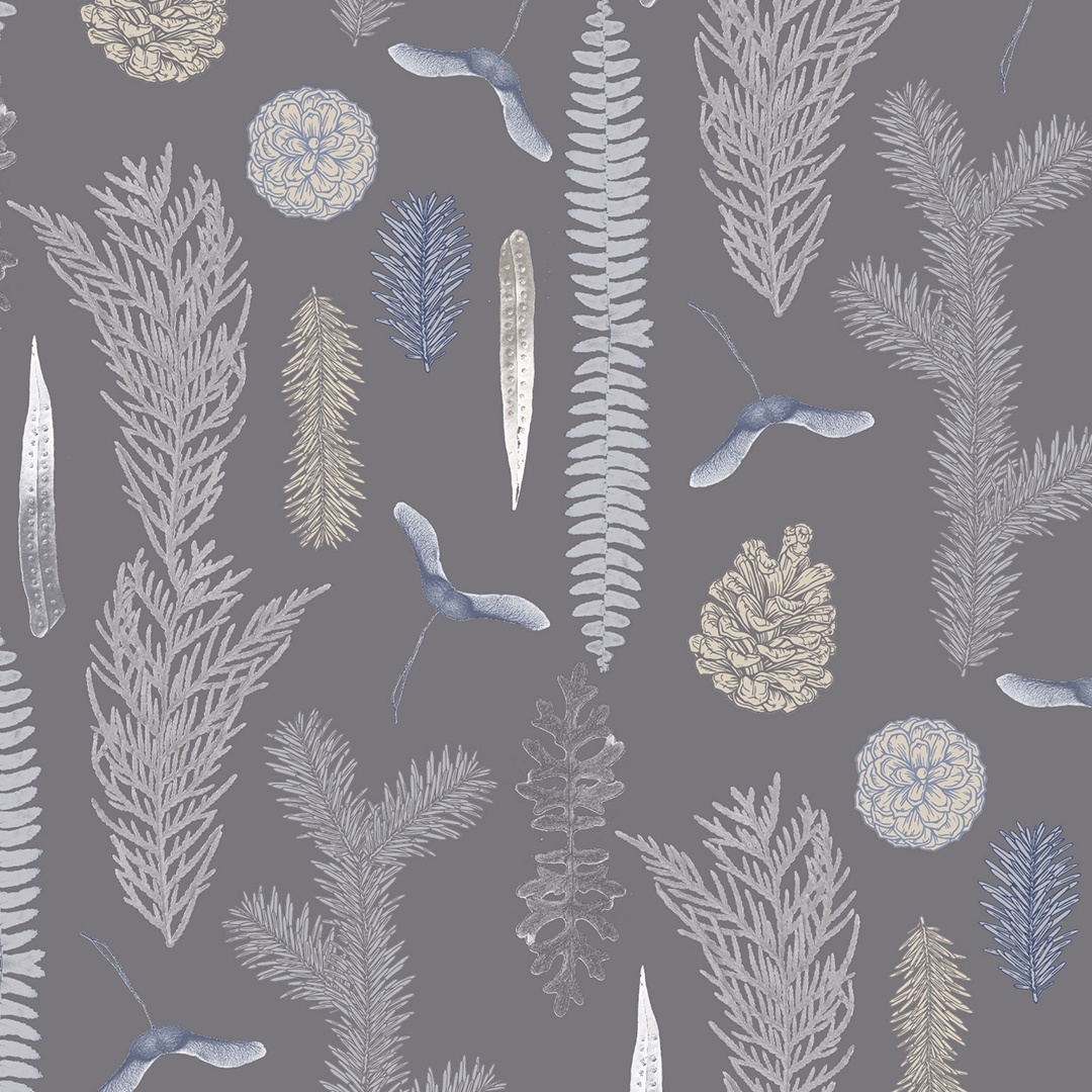
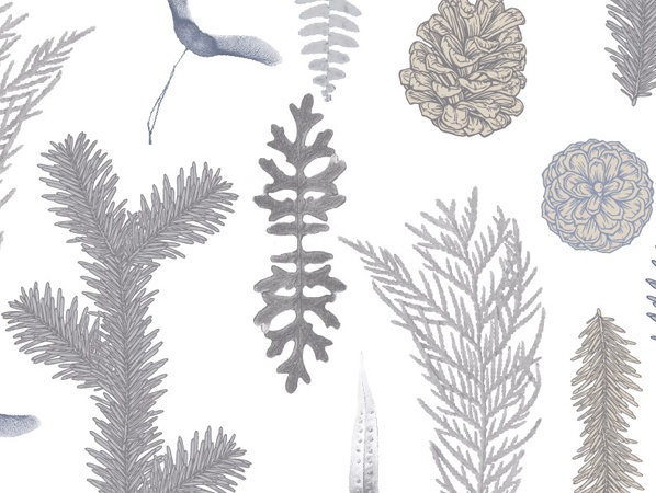
Inspiration for this series came from images of undisturbed, solemn forest floors, caught in the grip of a chilly autumn morning. Imagine the undergrowth swathed in early morning mist and layered in a thin, crisp layer of as yet unthawed frost. Fittingly this pattern is populated with detailed close-up studies of items you’d expect to find scattered on the ground in this setting: leaves, pine sprigs, bits of fern, moss and pinecones.
As a digital print commission the design experiments with mixed media techniques, blending digitally manipulated photographs with outline drawings. The colour palette, consisting of a beautiful ensemble of grey, beige and blue, was selected by Kidspattern.
This project was a part of my ongoing collaboration with Kidspattern. If you’d like to learn more about them please visit their website HERE. Alternatively, view the archive of our previous projects HERE, in which I discuss in detail the history and nature of our work.
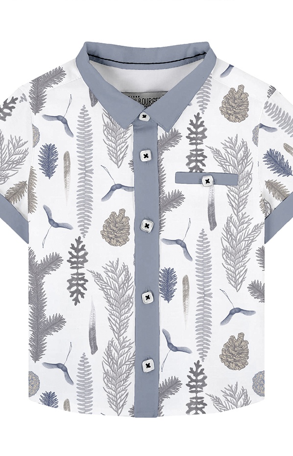
All clothing-mockups presented here are provided courtesy of Kidspattern and are used for visualisation purposes only.
Horizontal Arrangement
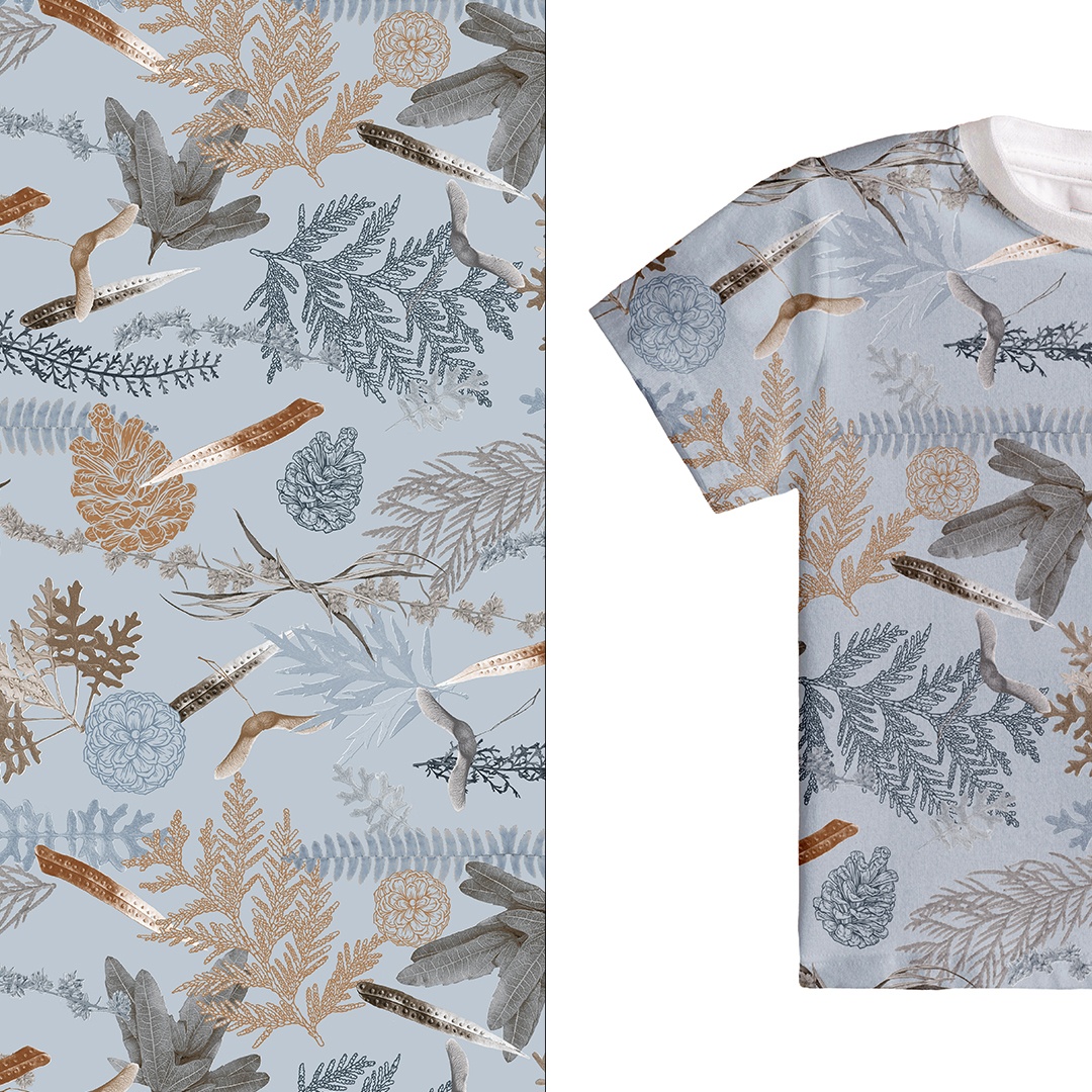
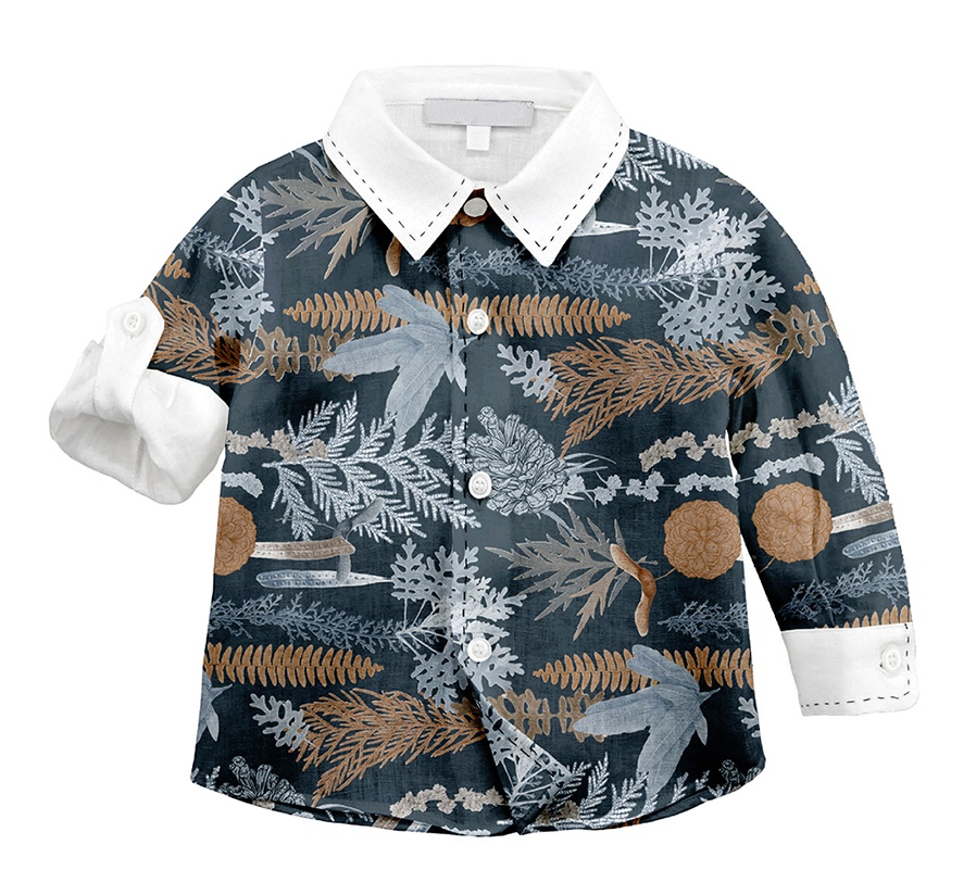
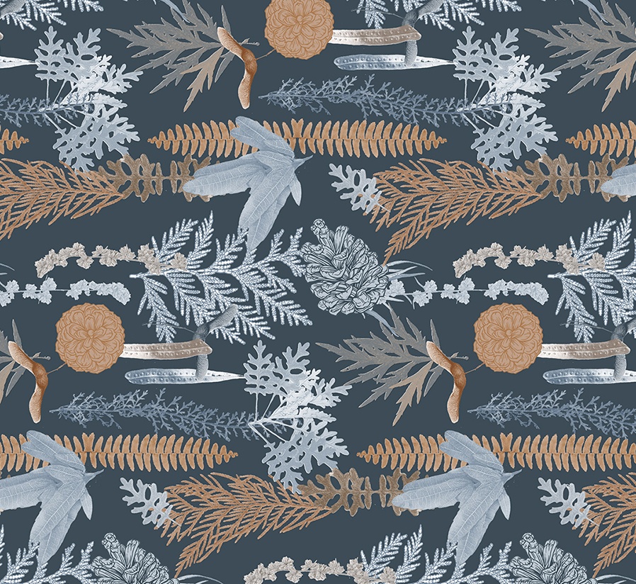
Visualised on this shirt for a boy (18 to 36 months) is the main selected pattern. The use of a dark aegean blue as the primary background colour makes this version of the pattern more fitting for use in the Autumn part of the collection.
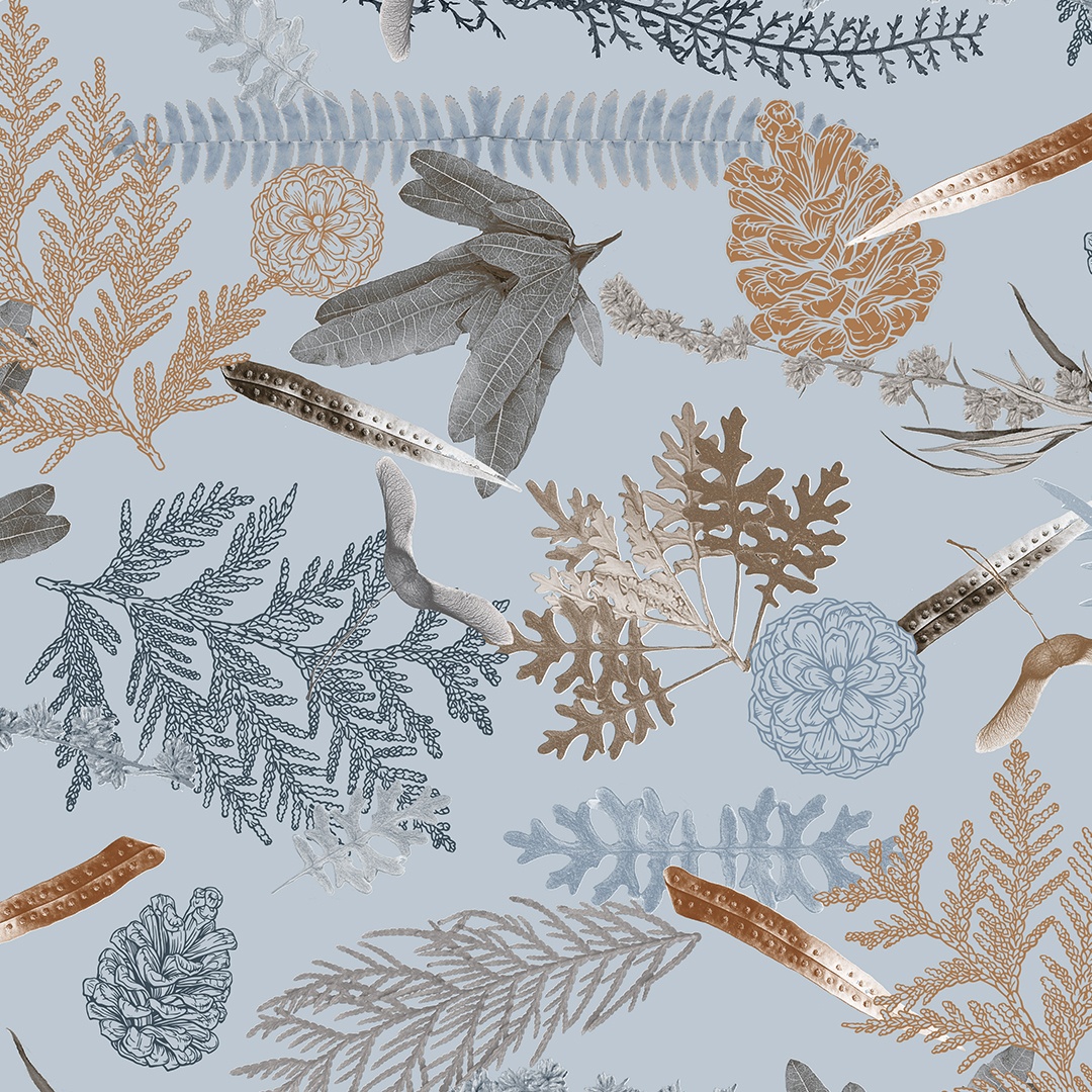
To make the base module for the repeating pattern the composing elements were arranged into horizontal stripes. Then, to highlight the intricate details of the elements within these stripes, they were displayed in a relatively large size. The cool light-blue used for some of the leaves contrasts wonderfully against the warmer rust colouring used in others. I think it makes it seem as if some of the elements are genuinely touched by a fine silvery coating of frost. It is ironic that this effect seems to work particularly well on leaves from a plant known as Silver Dust.
Please feel free to browse through other colour and arrangement solutions of this design below:
Version 1
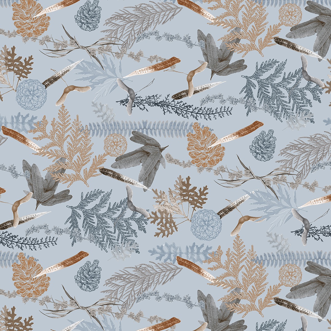
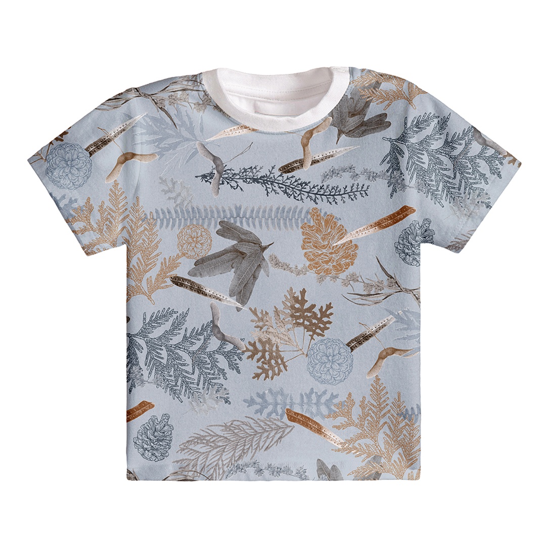
This version of the pattern is much softer and fresher because the dark background has been substituted for a lighter blue. The composing elements are also arranged a little more dynamically because the orderly lines have been broken up and instead the pieces are more naturalistically scattered around in their placement.
Version 2
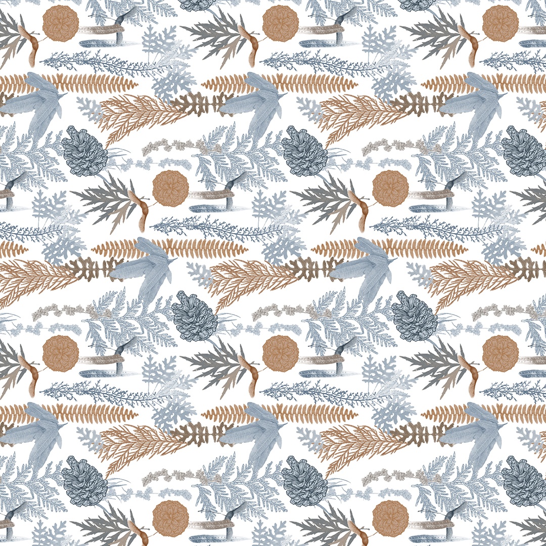
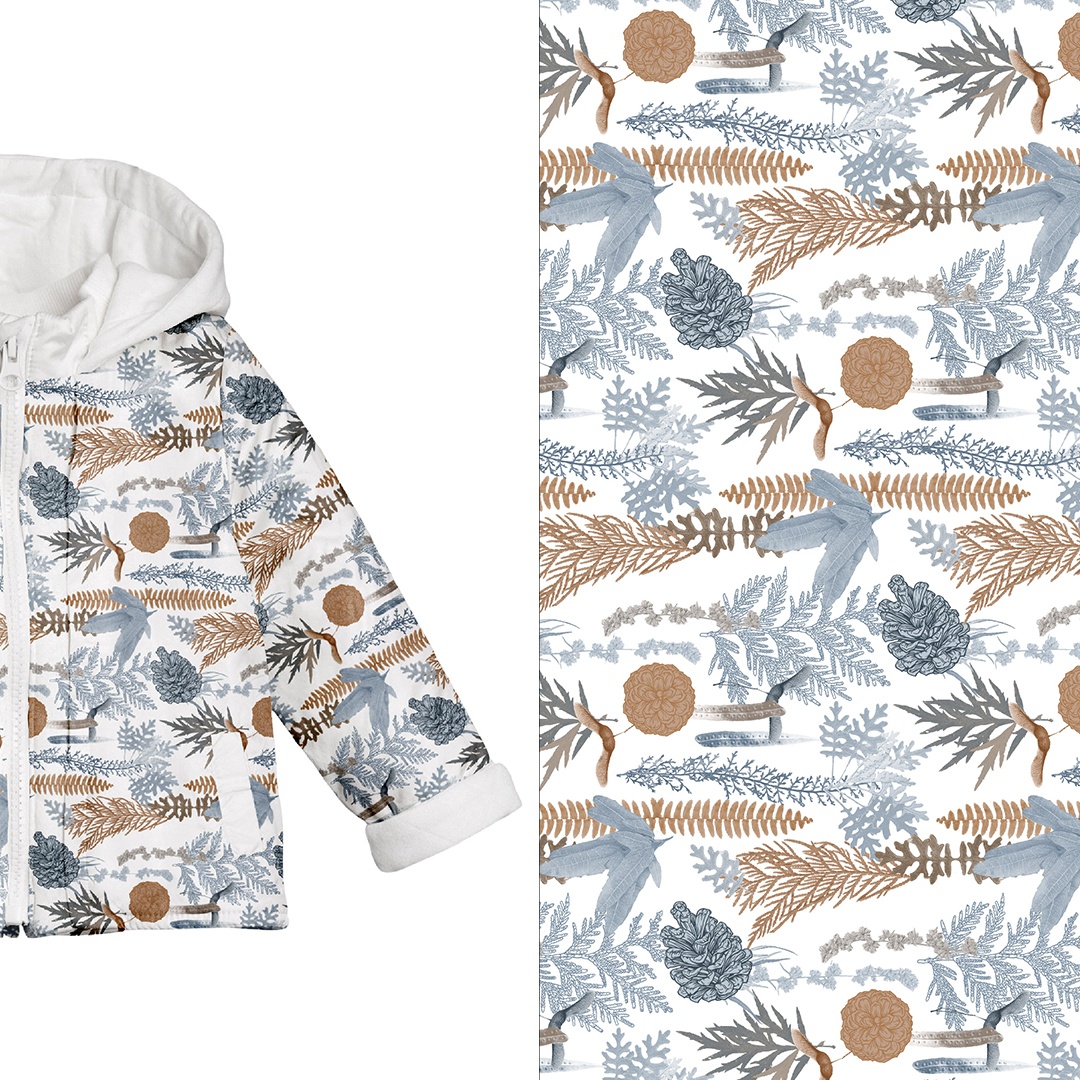
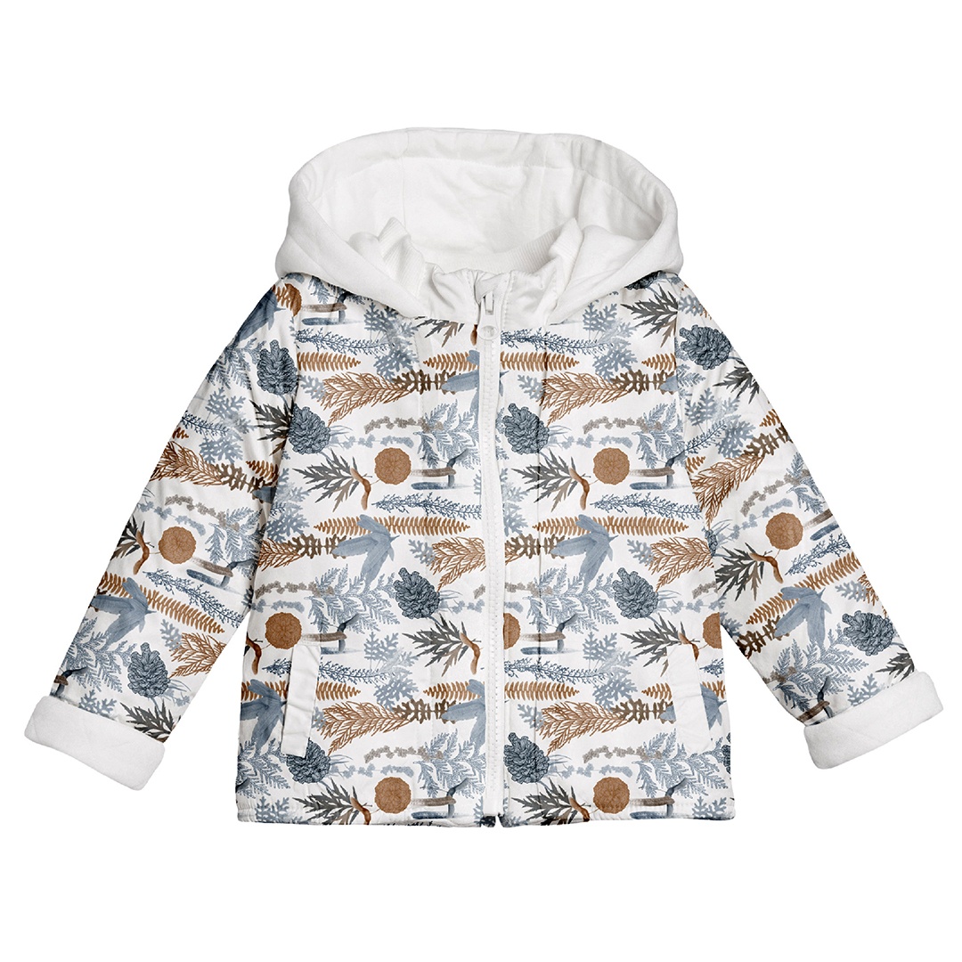
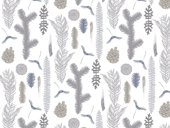
As standard this pattern was applied onto a basic white background, although it worked equally well in all colour combinations. To the left you can appreciate the full colour palette that was used because it is distributed across all the composing elements here. The colours and elements combine well in this design to create organically flowing stripes that smoothly transition across the material of the jacket.
Vertical Arrangement
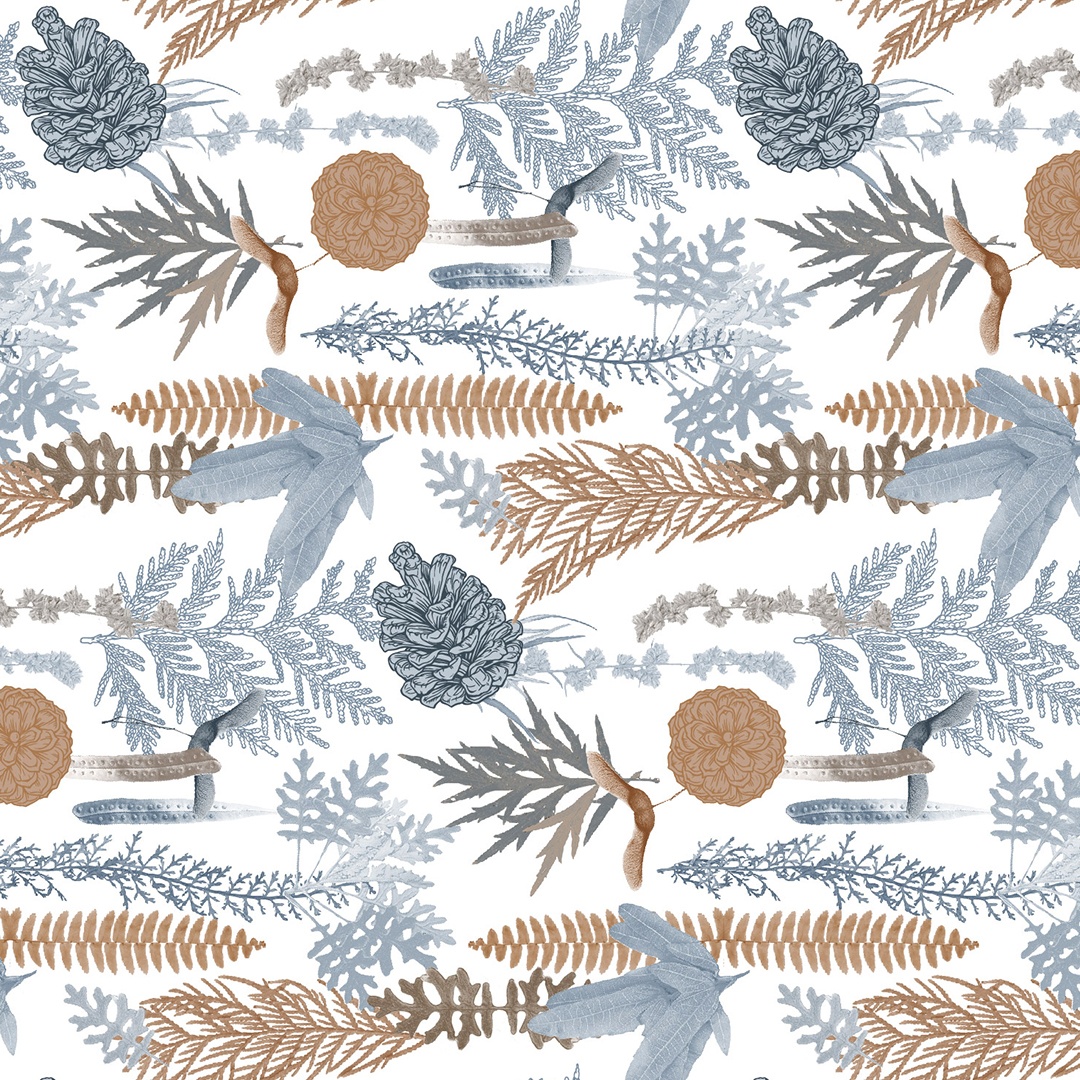
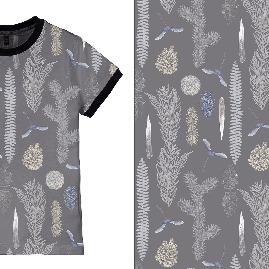
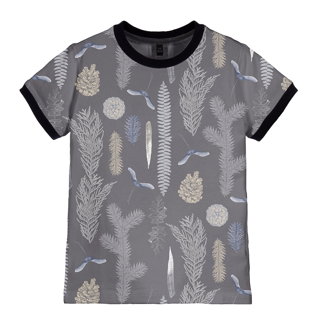
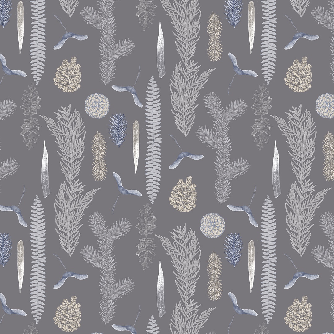
This composition took inspiration from the concept of a botanical herbarium, which is full of dried-up specimens that are catalogued systematically into an impressive and encyclopaedic treasure trove of natural wonders. Consequently, in this version the composing elements are spaced-out more and arranged in vertical stripes. Thus generating the impression that they are being presented to the viewer consciously as part of an organised collection.
Colour Options
This version of the pattern places it on a grey background that, given it is a winter pattern, makes it feel appropriately heavy, rich and moody. This colouring also makes the pattern feel more muted and reserved and thus more masculine. This implication was important as this it was a pattern aimed at boys.
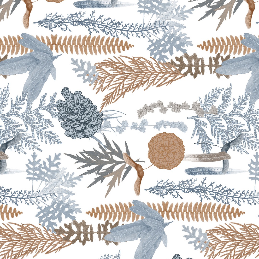
Below I’ve added a much lighter white-background option.


