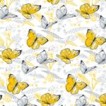
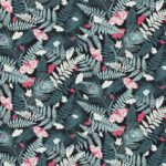
Autumn Garden
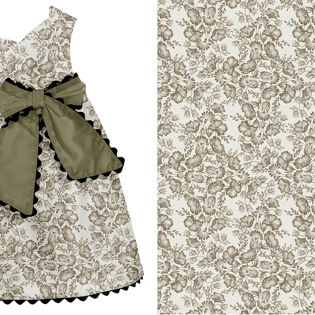
This is a showcase of two patterns I designed with Kidspattern, for a client’s kidswear collection. I’ve grouped these together as they share a similar neutral palette and both make use of hand-illustrated elements. Additionally, they draw inspiration from nature and bring to mind an early autumn garden, full of flowers, with birds chirping in the bushes.
If you’d like to learn more about my work with Kidspattern please click to visit ‘Kidswear Pattern Design Archives’ , which discusses the history and nature of our collaboration. Alternatively, following the link to visit Kidspattern’s Website
Technique
Both patterns were turned into vector graphics to ready them for flat printing. Elements with transitional shading were broken down into layers of Pantone tints, which makes these designs much more cost effective and appropriate for screen-printing.
All clothing mockups presented here are provided courtesy of Kidspattern and are used for visualisation purposes only.
Retro Bouquet
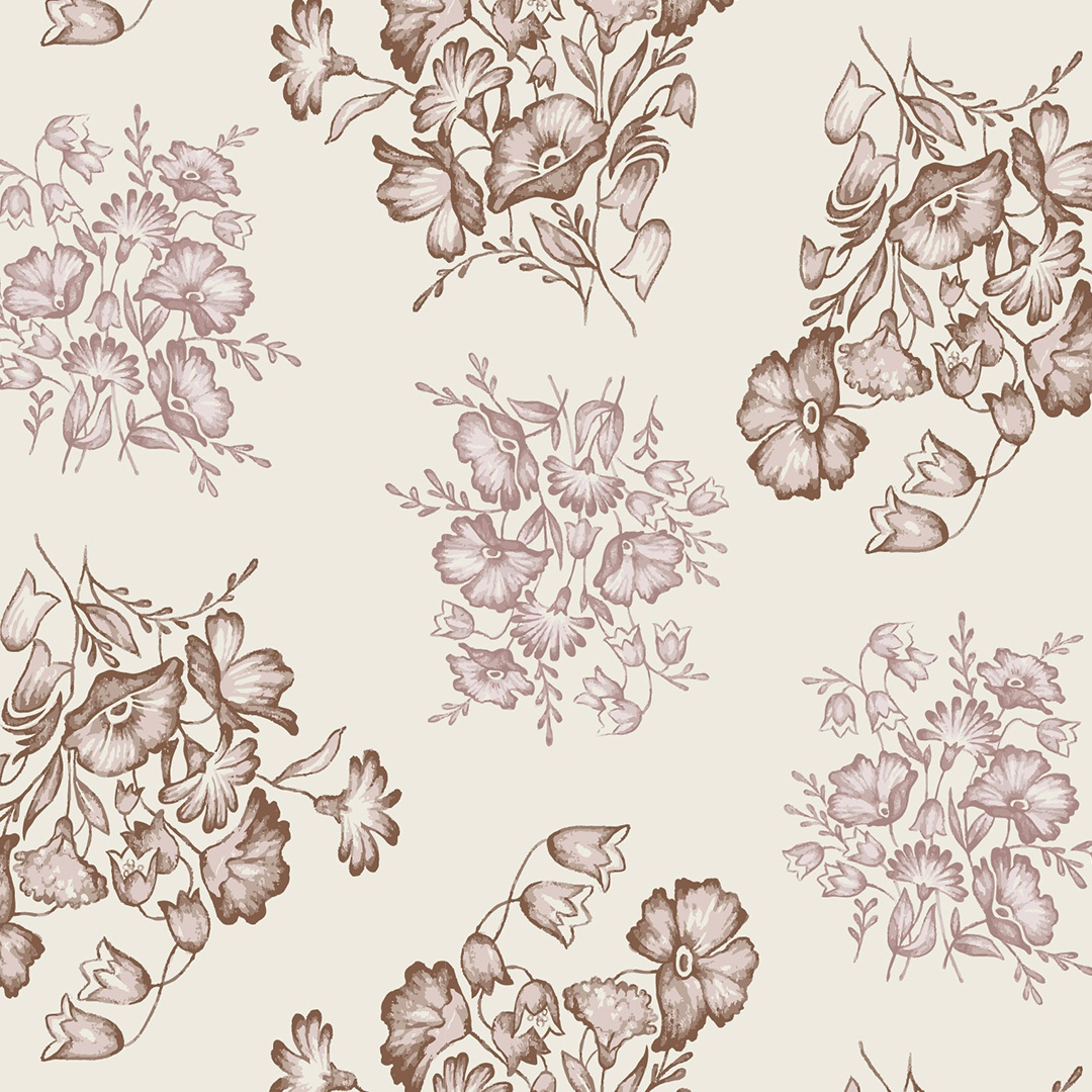
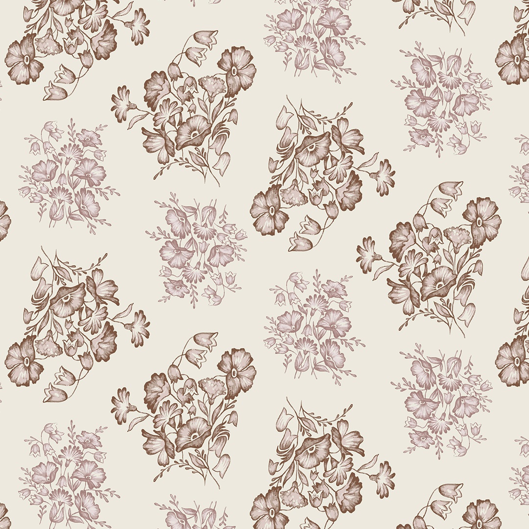
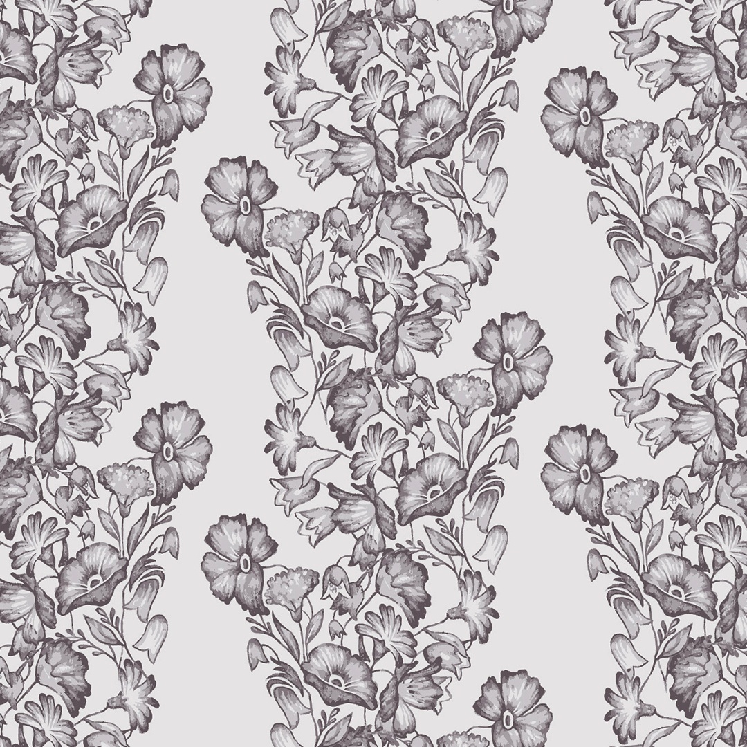
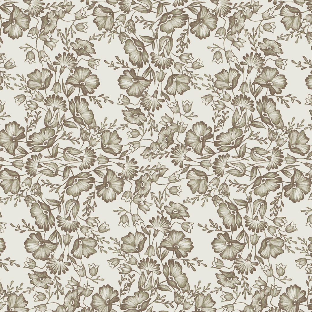
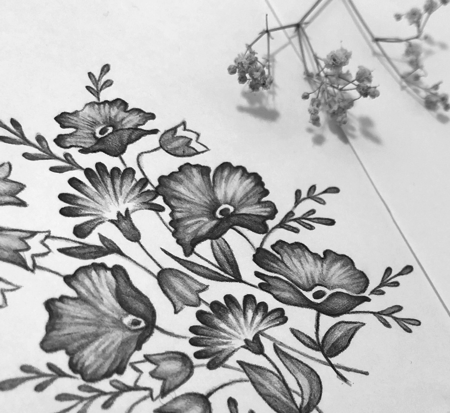
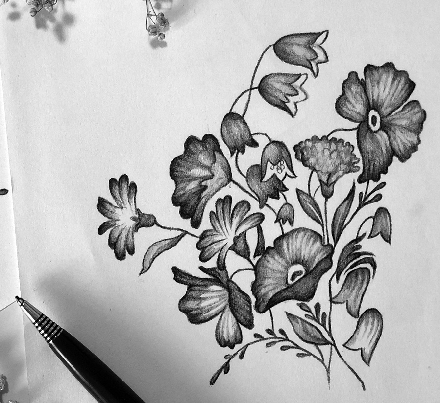
This floral pattern is based on hand-drawn pencil illustrations of bouquets full of wild, meadow flowers. It was also inspired by the folksy motifs that are often painted on wooden country furniture, rustic ceiling beams and kitchen utensils. It calls to my mind pressed flowers kept in-between the yellowed pages of an old diary, as a precious keepsake of a memorable day. I’m really enamoured with this pattern’s sentimental and nostalgic feel.
During the development of my designs I experiment with many potential colour and arrangement combinations. Here is a selection of three different versions.
Bouquet Pattern 1
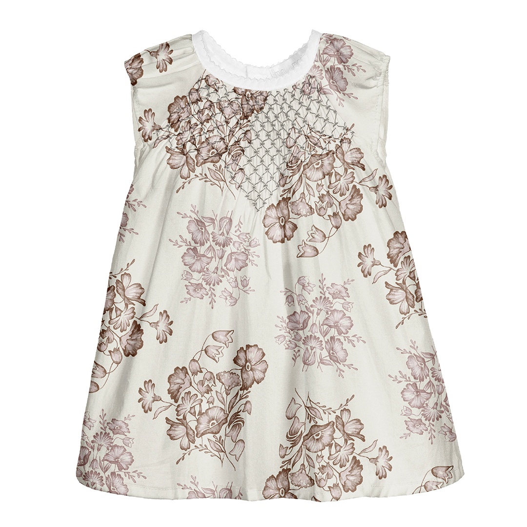
Here is the first version, which has the bouquets repeated in regular modules with plenty of space in-between the elements. It is visualised in a relatively large size on a creamy dress. I enjoy working in neutral and monotone palettes, which usually are suitable for any season. This sepia set, however, makes the flower bouquets appear as if they’re faded and dried up, making it even more fitting for an autumnal collection.
Bouquet Pattern 2
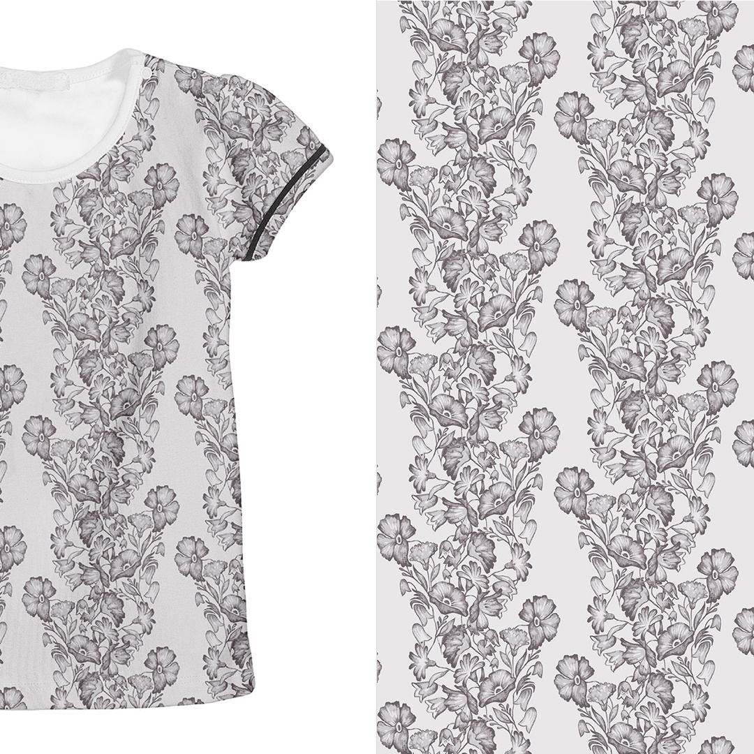
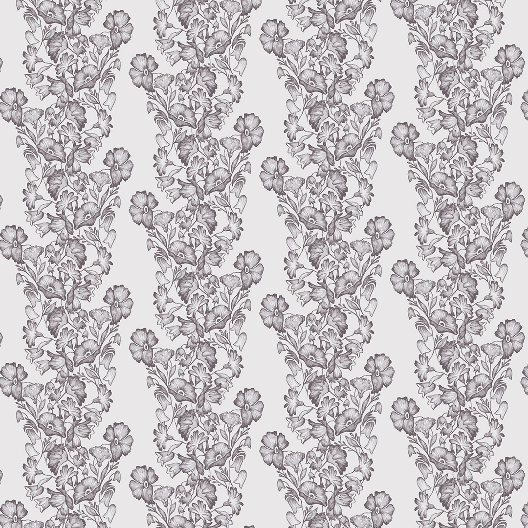
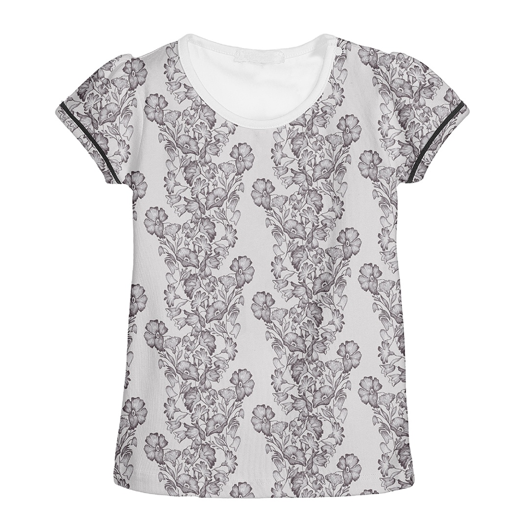
In the second version of this pattern the florals are arranged into vine-like columns, which work as stripes once placed on fabric. This arrangement accentuates the folksy undertones here, displaying the flowers as if they were draped over the person wearing the t‑shirt. Its dusty, smoke-grey palette also feels nostalgically reminiscent of black-and-white photographs, like the kind you can imagine buried away in the attic of an old cottage.
Bouquet Pattern 3
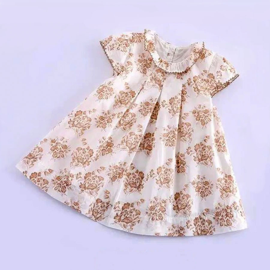
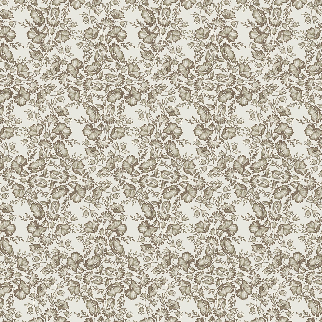
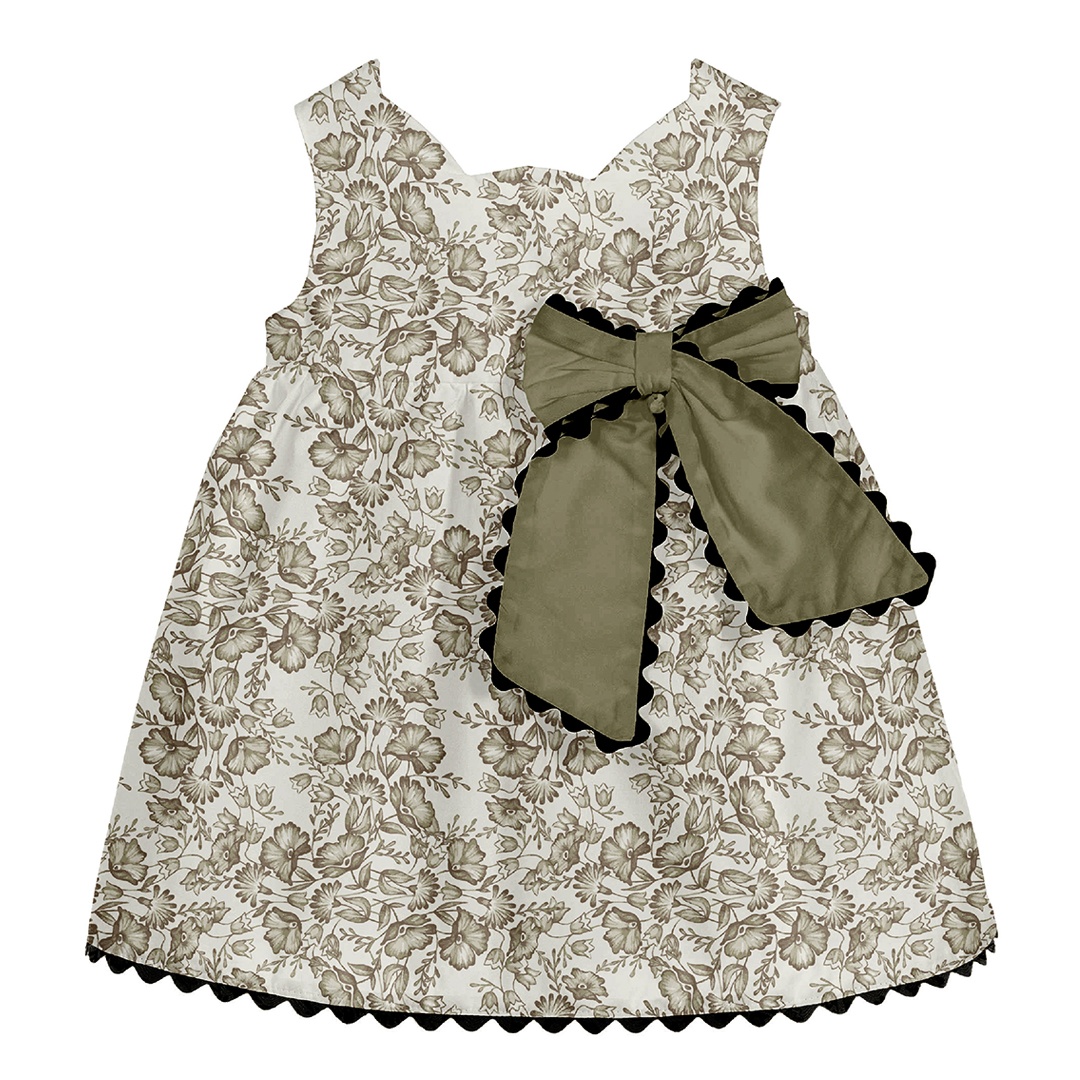
Lastly, the bouquets are arranged here into a check. This causes the print to be much fuller and busier, especially in this smaller size. To conclude this monotone trio of patterns I recoloured this version in khaki olive green. I feel this works particularly well because it compliments the rustic and homespun mood one might want to evoke if using this pattern specifically for an early Autumn Collection.
Bird in a Bush
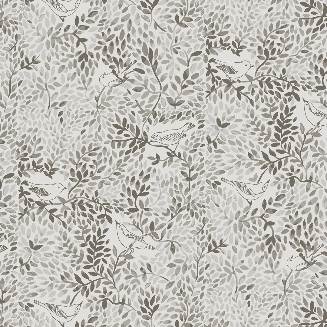
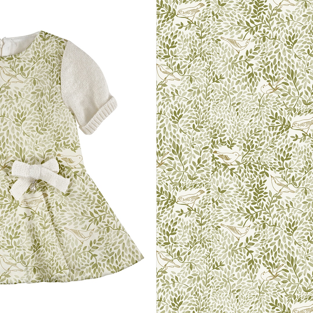
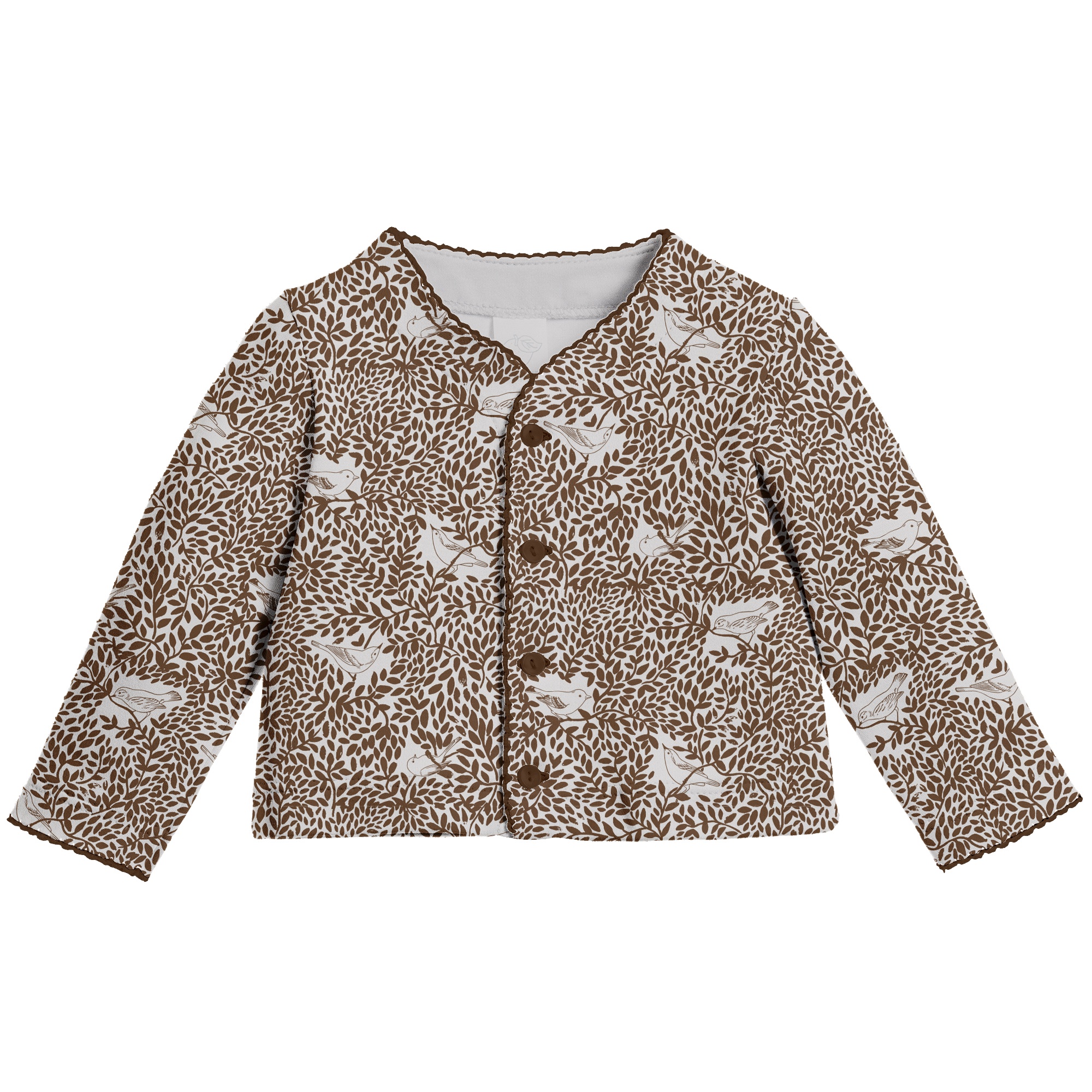
This design is built up from some hand-painted watercolours of leaves that I produced. They create a wonderful maze of trailing vines. In their branches I have hidden some pencil outlines of small, curious birds. I’d like to share two versions of this pattern, both of which are intended for clothing for young children under 18 months.
Selection
The main version of the ‘Birds on Branches’ pattern attempts to maintain the watercolour effect. This was achieved by layering flat tints of one Pantone on top of another, creating a transition similar to a true gradient. The first colour option is a soft warm grey, the second one is a light olive-green that I chose to visualise on a baby dress. For the third we offered the client a flat, simplified, single-colour version of this pattern. This turned out to be a more contrasting solution but it was still kept in neutral tones, which meant it was still appropriate for the younger age groups being aimed at.


