Autumnal Treasures
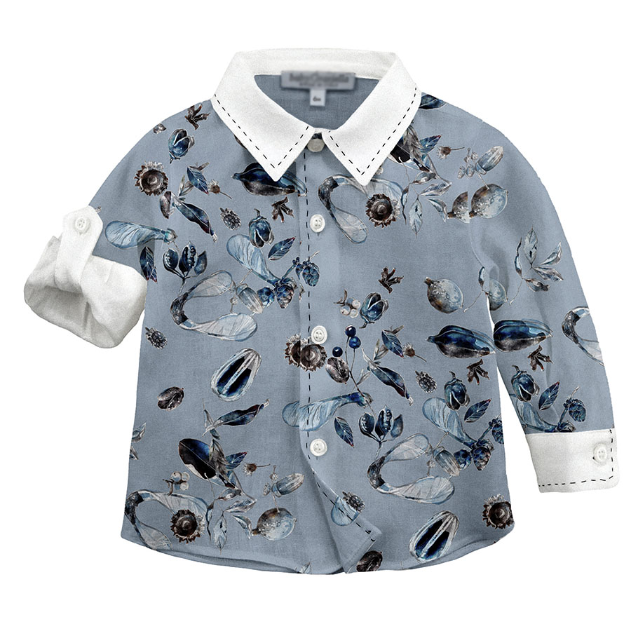
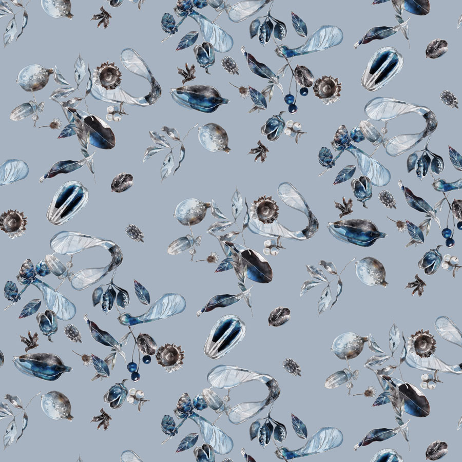
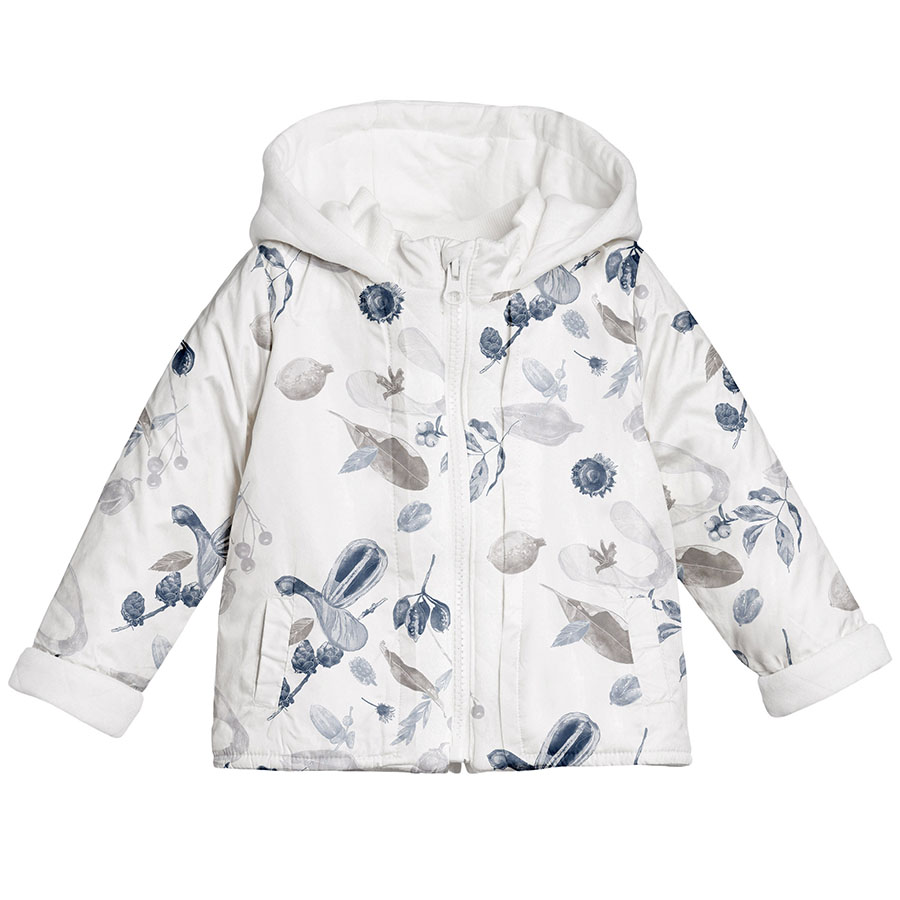
Autumnal Treasures, is a design inspired by precious little finds brought home from an autumnal walk in the forest. Foraging in nature’s pantry not only keeps us connected to the changing seasons, but also mindful of the reassuring, anticipative cycle of growth.
This project was a part of my ongoing collaboration with Kidspattern. If you’d like to learn more about them please visit their website HERE. Alternatively, view the archive of our previous projects HERE, in which I discuss in detail the history and nature of our work.
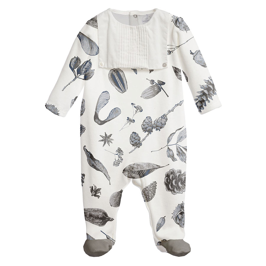
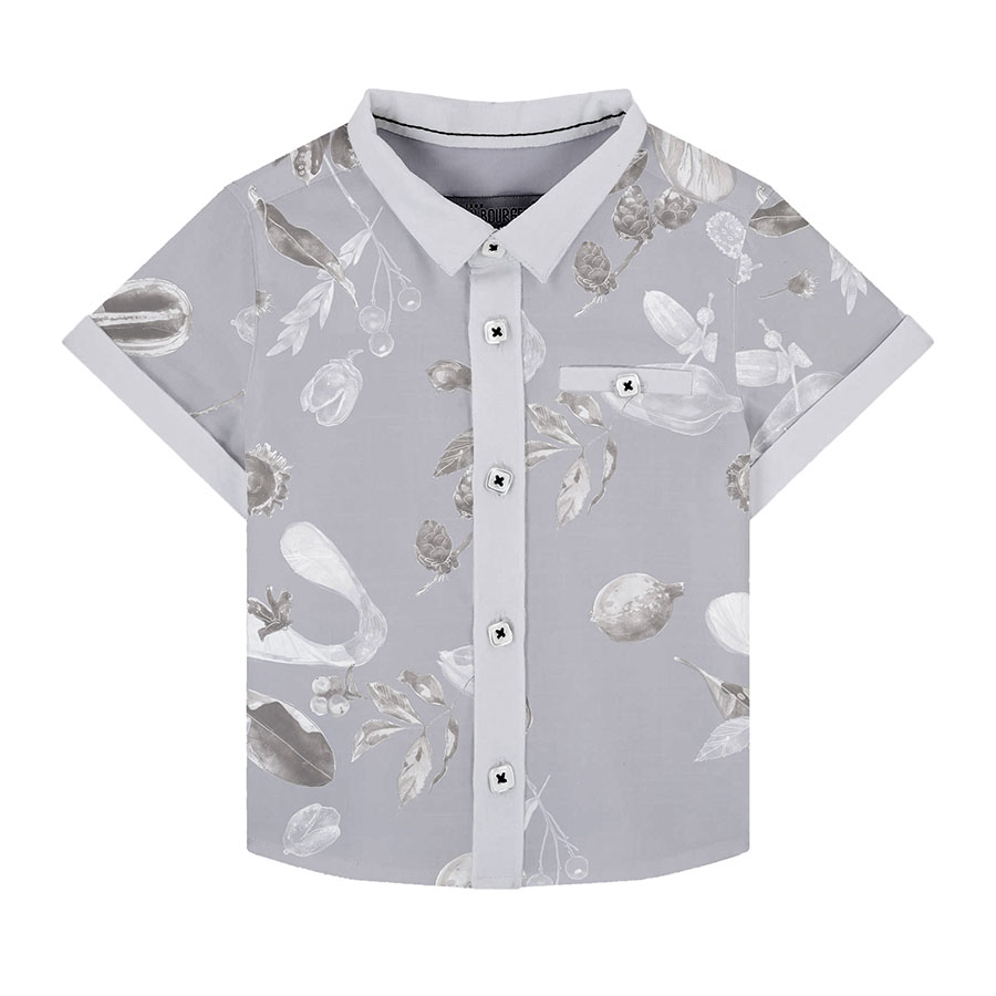
All clothing-mockups presented here are provided courtesy of Kidspattern and are used for visualisation purposes only.
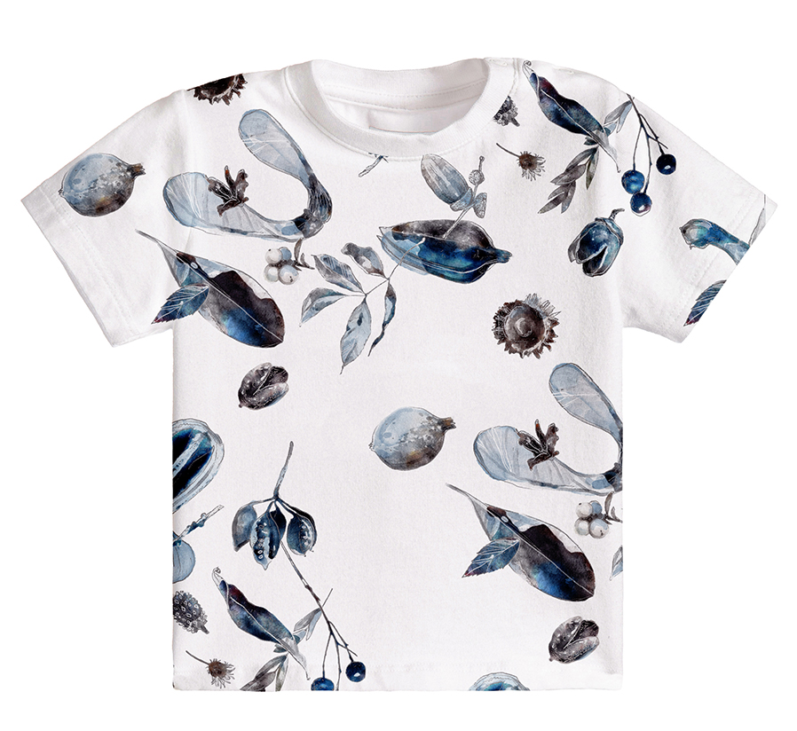
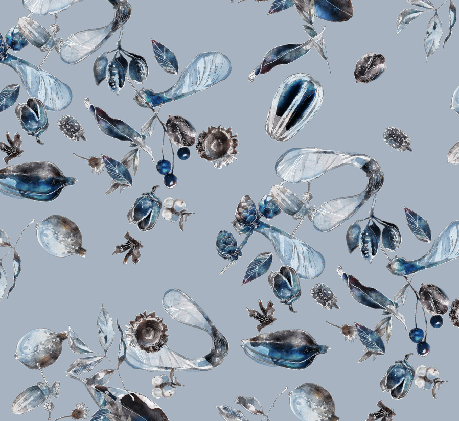
Overview
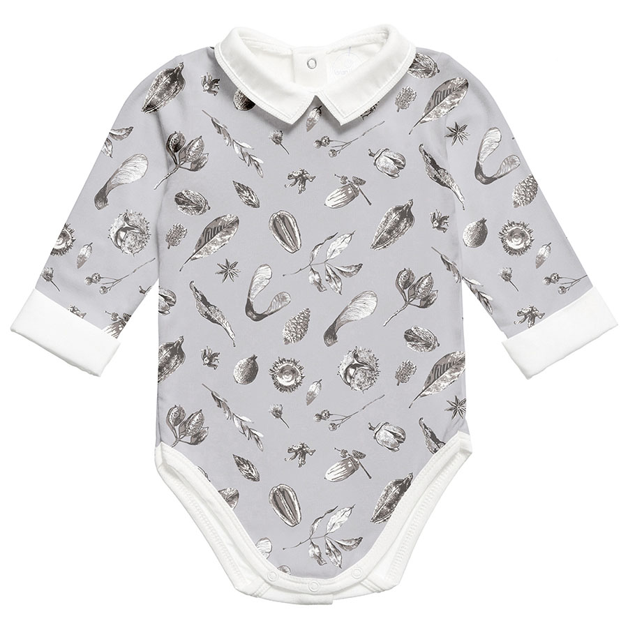
This design is from a pattern development series commissioned for a client’s Autumn Collection aimed at boys aged 6 – 36 months old. The original colour palette prepared for this group by trend and colour specialist Kidspattern, consists of a selection of refined greys complemented with two shades of universal blue.
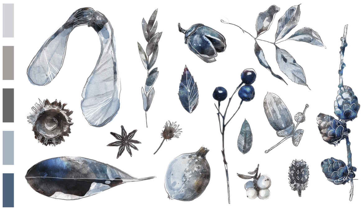
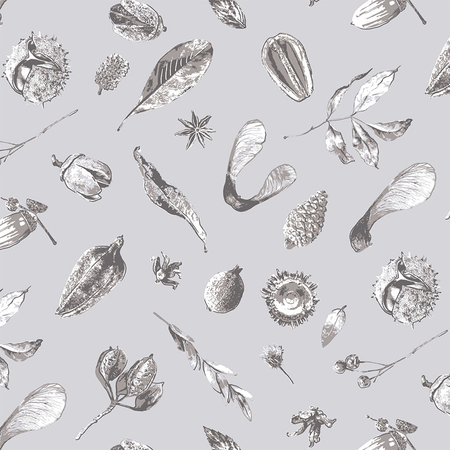
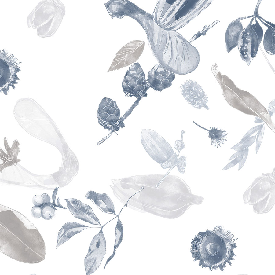
Celebration of the season was represented in an abundant selection of versatile natural elements like nuts and seedpods. These were complemented by a fascinating little collection of acorns, chestnuts, pine cones, leaves and sycamore helicopter seeds arranged amongst dried twigs, berries and leaves.
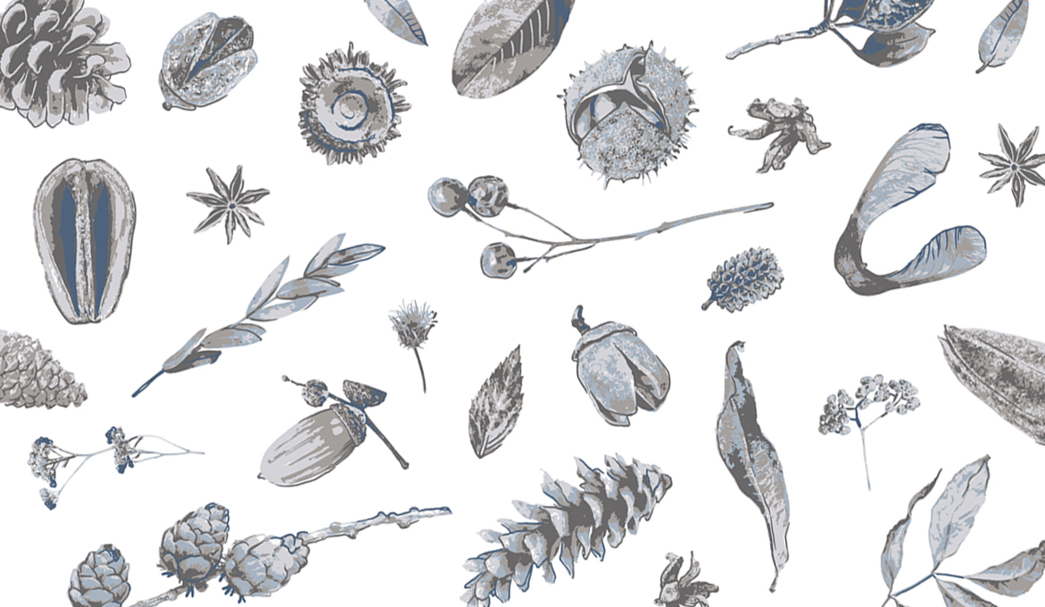
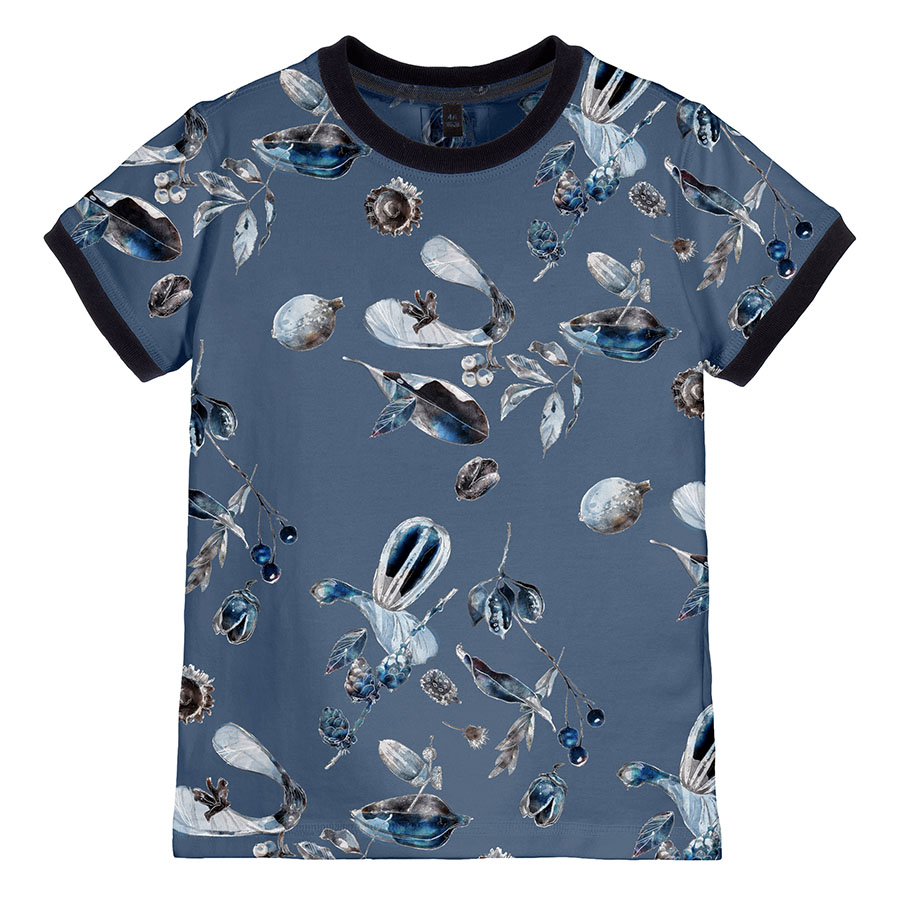
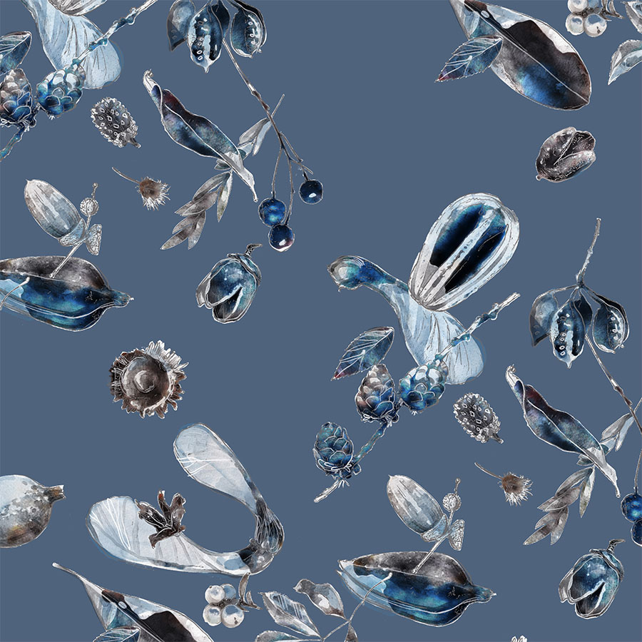
These elements were rendered in two different techniques, depending on the method of print available for the item of clothing. The first was prepared for screen print and as such is limited to 3 – 4 base flat Pantone colours. Whilst the second was set up as a digital print and thus explored more of a fluid, watercolour effect that seemed more fitting for such an organic theme.
This effect was first developed in the previous design from the same Collection — Clematis (view HERE). It involved a bespoke combination formed from a base, which was made from manipulation of photographic material, topped with an additional layer of digital drawing. You can see the artwork’s details in the close-ups provided above.
Newborn Collection
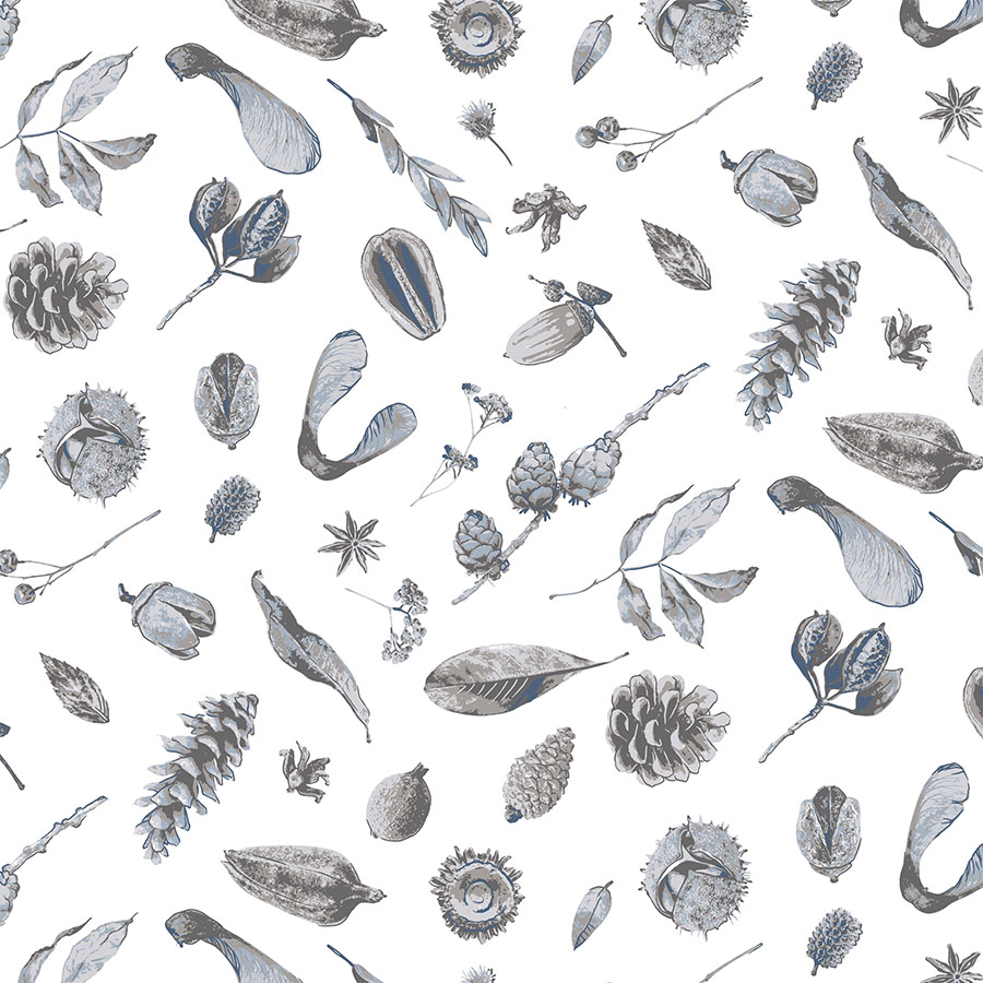
The first version of the pattern has the elements in a regular and balanced arrangement with even spacing, with the lines of twigs marking a subtle rhythm in the composition. Here the design is presented in both large and small sizes and in two colour ways.
One version focuses on just the grey side of the palette, whilst the other incorporates shades of blue. A simpler method of print made this design more appropriate for the younger age group.
Watercolour Effect
These designs explore coloured backgrounds in both dark and medium blues. They also differ in the size of the pattern and the spacing of the transitional, dynamic arrangement that the elements are scattered in.
The watercolour effect technique allows for smooth transitions between deep full-bodied colours. These options were aimed at the older age groups.
Monochrome
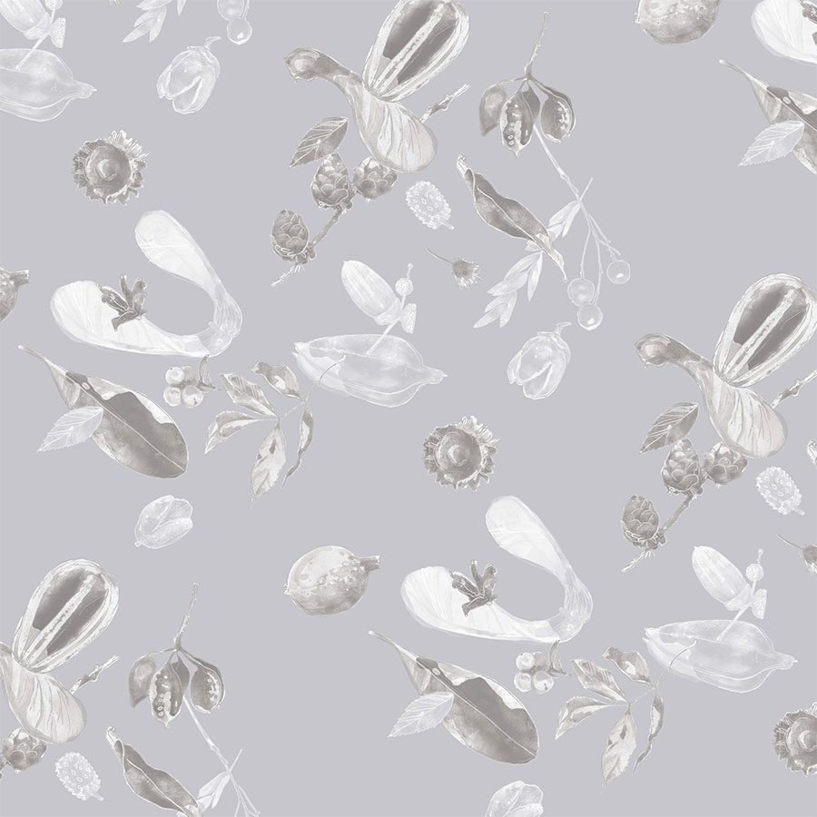
In order to create a more pared back and subtle option to balance out the bold vivid one, for this version, groups of elements were reworked in pale, monochrome shades from the palette.
This resulted in a lighter and more understated design, which was matched with a white background as well as a misty grey. The arrangement remains scattered and the visualisation presents two different sizes this could be used in.
“Nature gives to every time and season some beauties of its own.”


