Kaleidoscope
The charming butterfly is indicative of the arrival of the spring sun, and hence around the world, it is viewed as representing change, hope, and life. Moreover, because of their fascinating life cycle, they’re symbolic of metamorphosis, renewal, and the transitory, fragile nature of beauty itself.
Among various superstitions around butterflies, the most common one is that they are a serendipitous indication of good luck.
This pattern design project was a part of my ongoing collaboration with Kidspattern. If you’d like to learn more about them please visit their website HERE. Alternatively, view the archive of our previous projects HERE, in which I discuss in detail the history and nature of our work.
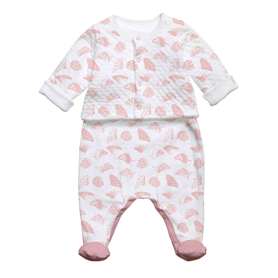
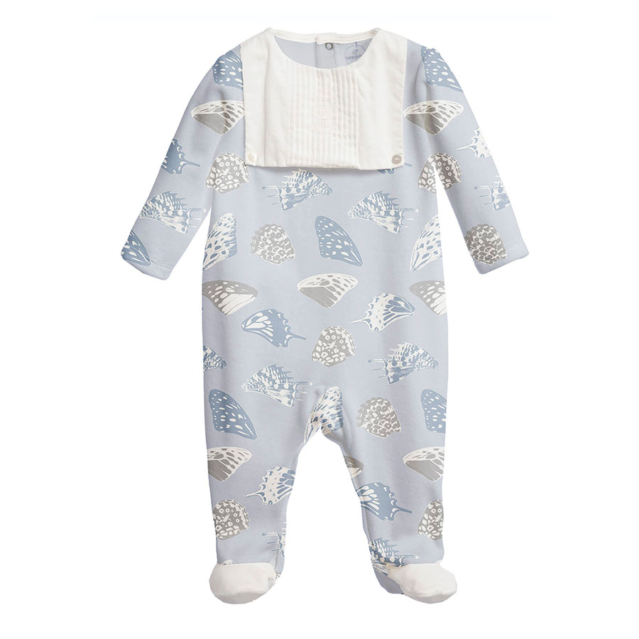
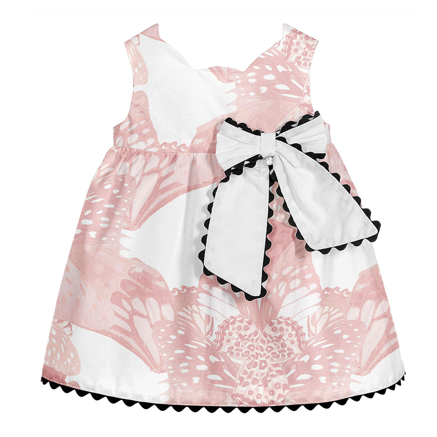
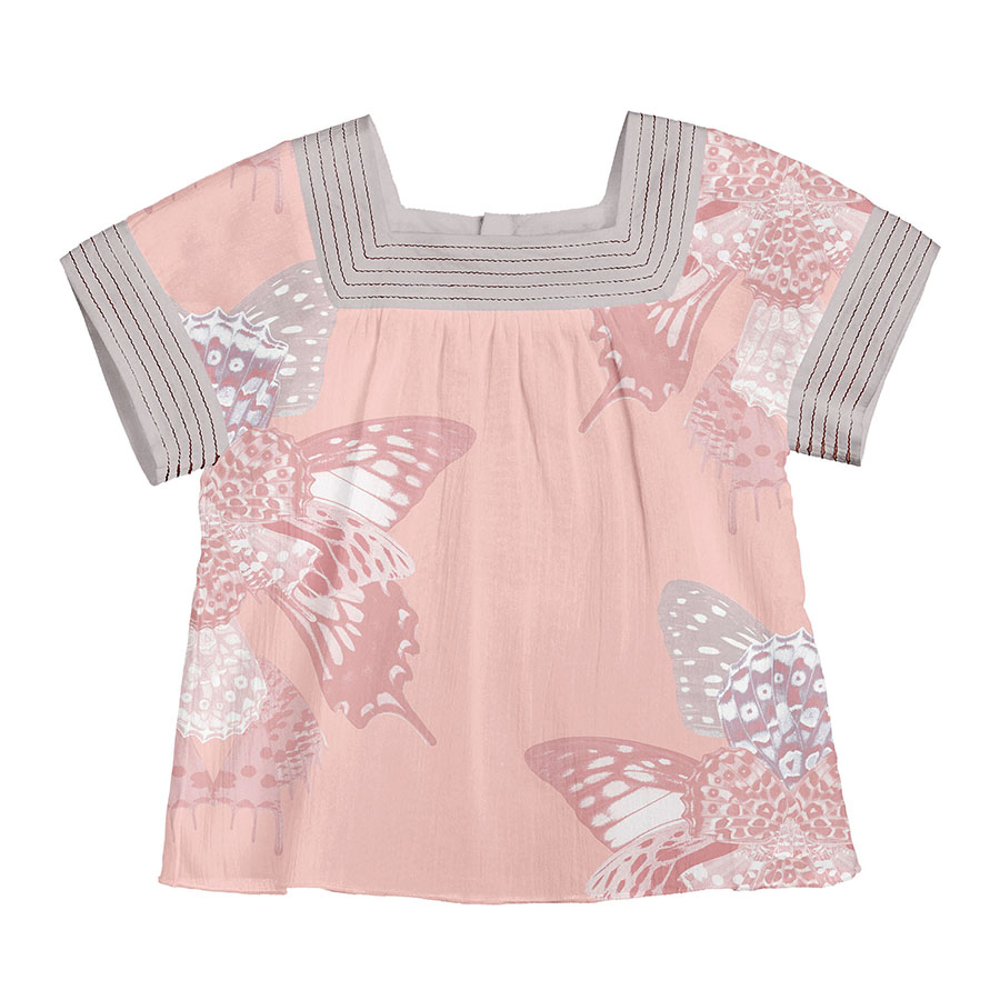
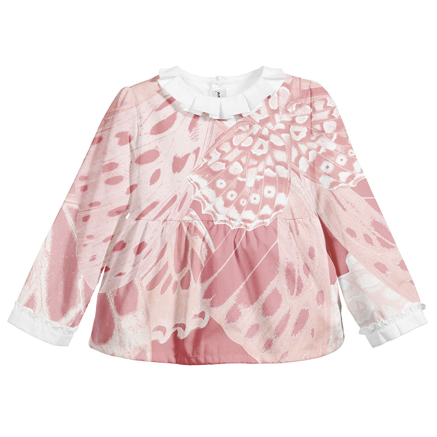
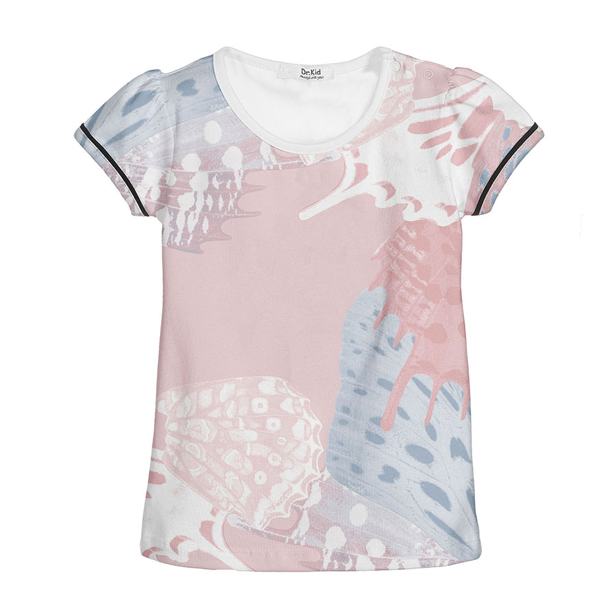
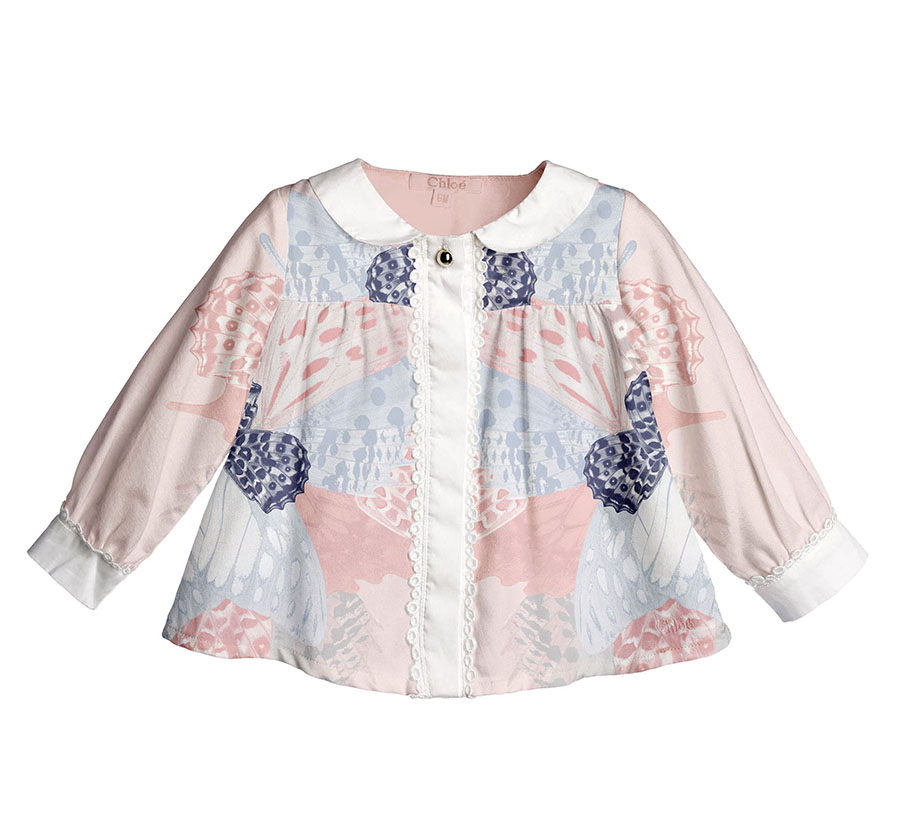
All clothing-mockups presented here are provided courtesy of Kidspattern and are used for visualisation purposes only.
Overview
There are more than 17,500 recorded butterfly species, which makes for a tremendous variety of ornamental marking combinations on their wings. These unique patterns, alike other prints found in the animal kingdom, have been a great source of inspiration for a multitude of designers. Most famously, these references feature strongly in many works of Alexander McQueen.
Some of the butterfly wing speckles are evocative of leopard or cheetah spots, which would explain the reason why they are as popular amongst the animal print lovers.
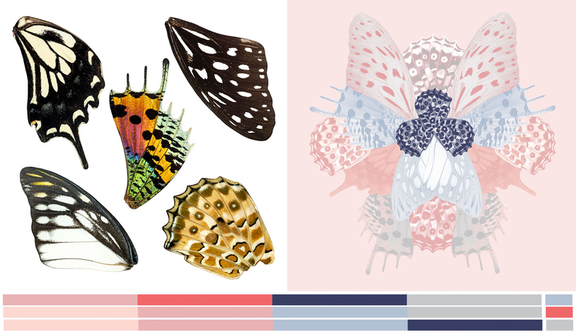
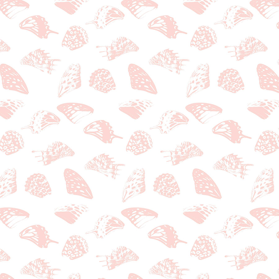
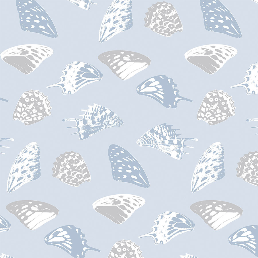
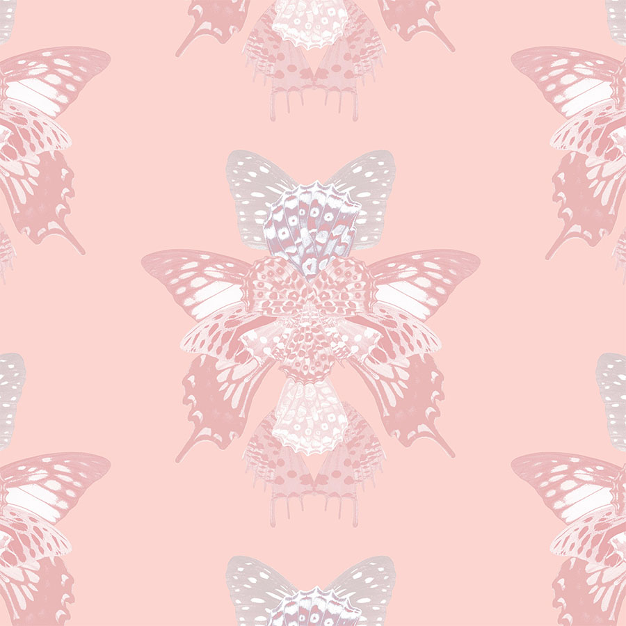
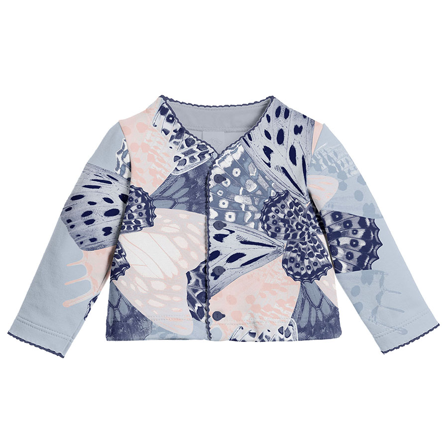
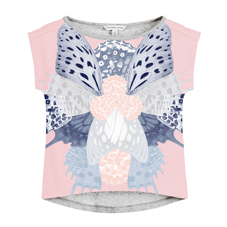
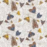
Inspired by this ongoing theme, this pattern series was based on photographs of real butterfly wings taken by Kidspattern. This design formed one of a commissioned course of pattern development for a client’s Spring — Summer Collection. “The Butterfly Wings Kaleidoscope” was intended as a digital print addressed to girls up to 36 months old. You can also view a corresponding design for boys inspired by moths HERE.
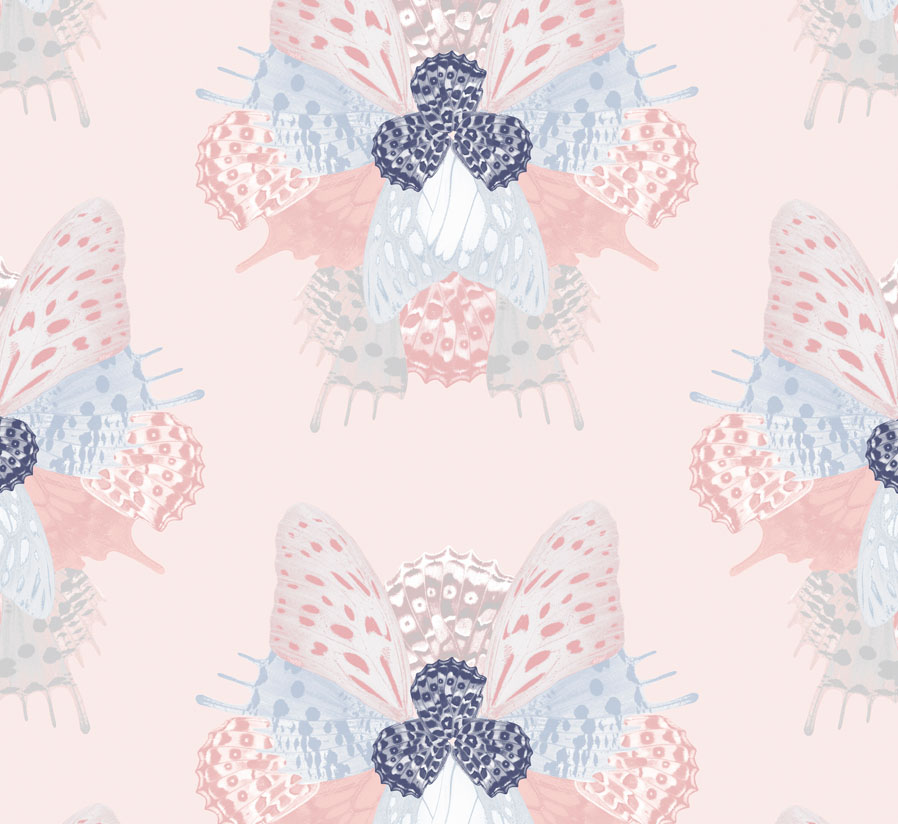
These photographs of butterfly wings were digitally manipulated and recoloured to fit the colour palette for their intended age group. The overall colour theme was designed by Kidspattern and is a feminine selection of dreamy pinks and soft grey, contrasted by spots of dark navy and coral. This was split into three age groups — of which you can view each one above starting from the bottom strip for Newborn (0−9 months old) followed by Baby (8−18 months) and finally the Kids Line (up to 36 months) on top.
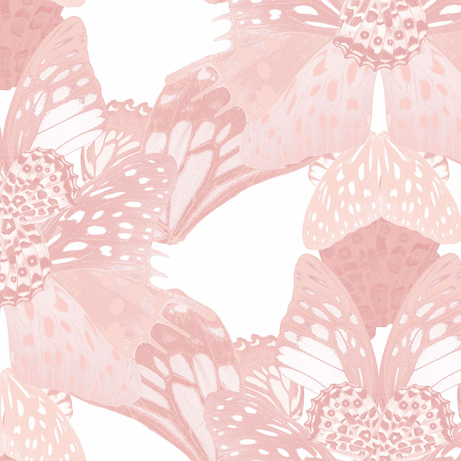
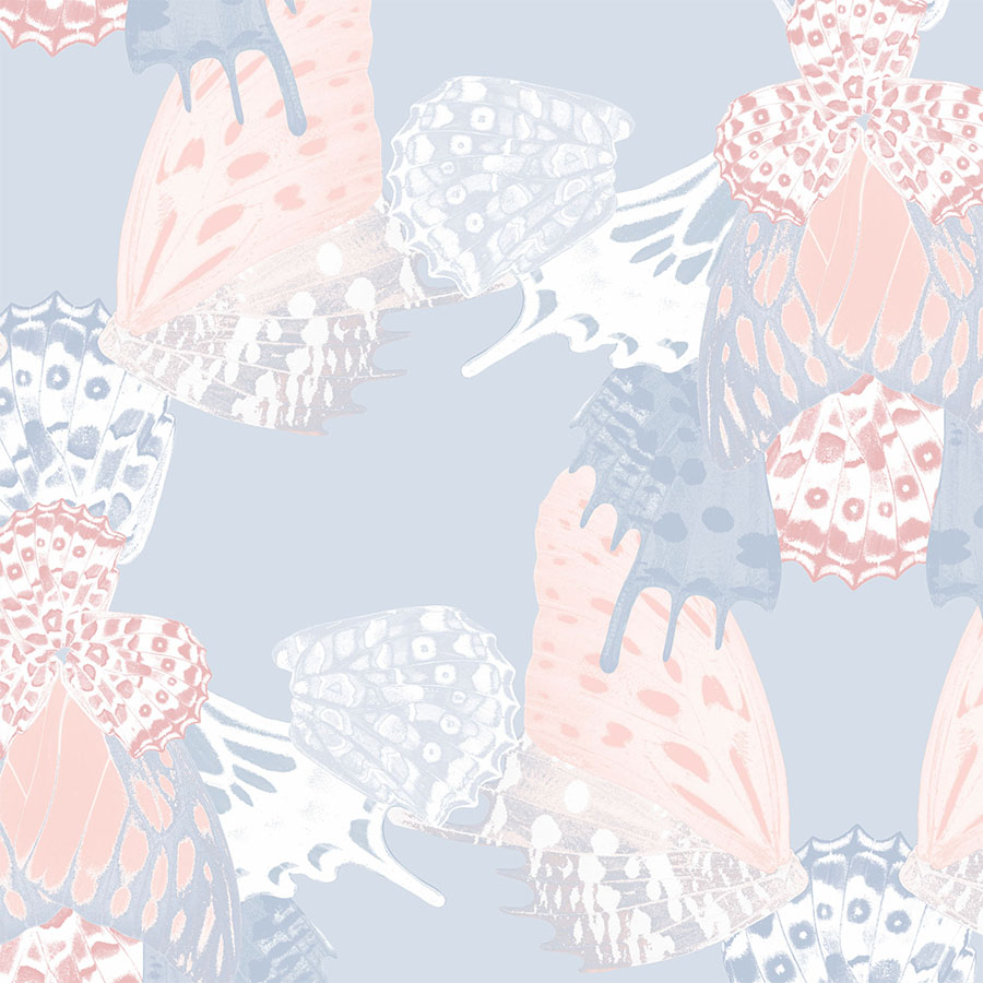
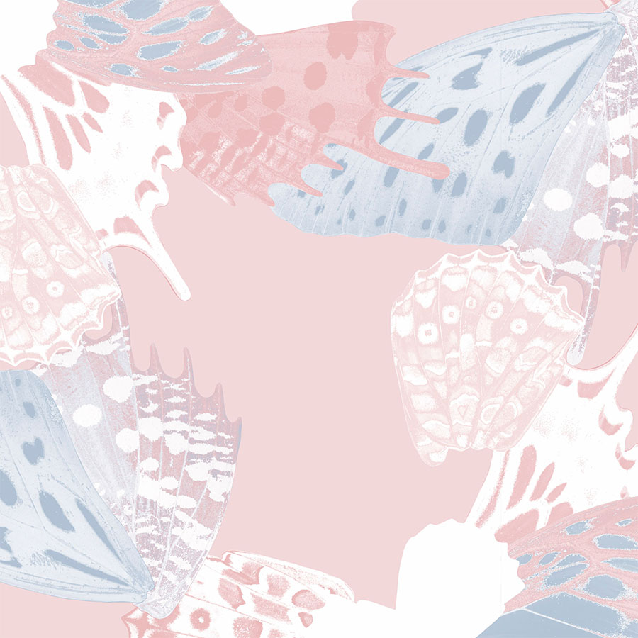
These elements were then arranged into a kaleidoscopic composition that formed the main base for the pattern repeat module. Below, the development of this series is pictured across various colour-ways, placements and arrangements.
Elements and Colour Scheme
Newborn Line
This group included patterns created with simplified and smaller versions of the wings.
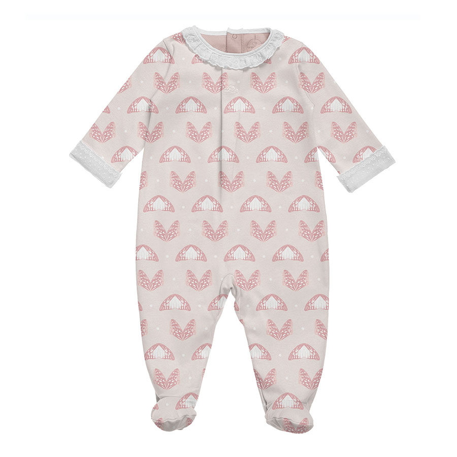
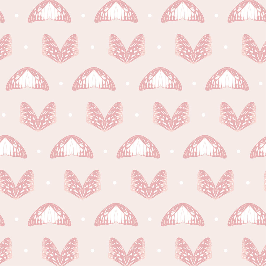
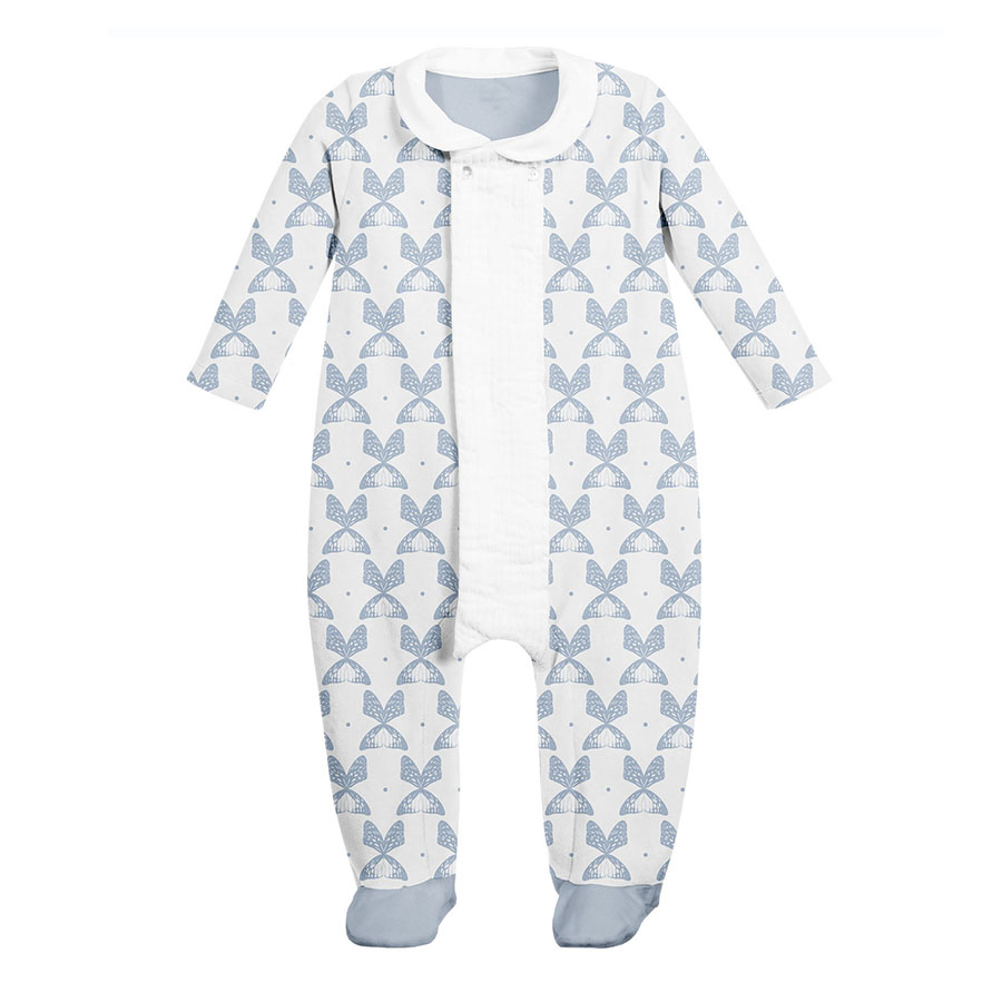
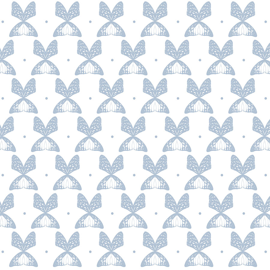
The first pattern presents two options, with the additional use of small dots between the elements to accentuate the calming simple repeat and balance out the spacing. These are presented on two different backgrounds (one light pink and the other white). They also differ with the total use of colours, starting at three and reducing it all the way to just one in the blue version.
The second idea sees all the single butterfly wings scattered regularly. Here this is visualised in two different sizes and presented on both: white and coloured backgrounds. For the latter, in order to make the elements stand out, a white flat shape was added underneath each single colour print.
Pink and Coral
This is a selection of patterns focusing solely on the pink aspect of the palette. The module is recoloured in monochrome shades and repeated regularly.
The following options explore three different coloured backgrounds: white, light and medium coral, as well as being visualised in various sizes: medium, large and oversize.
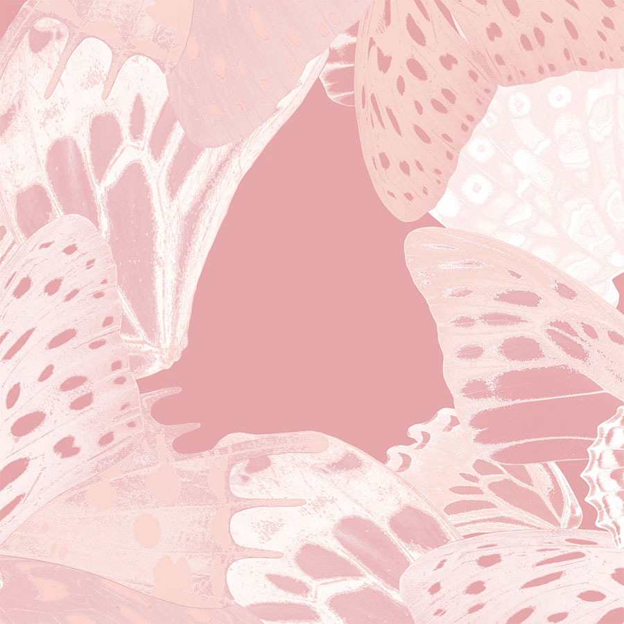
These versions vary in the spacing between each module and the placement of the elements on the garment. In the last pattern, the high resolution original photograph enabled this design to be majorly enlarged. This really allows the fine intricacies of the scales that make up a butterfly wing to shine though.
Pastel Fantasy
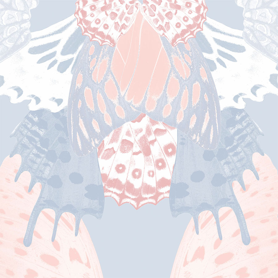
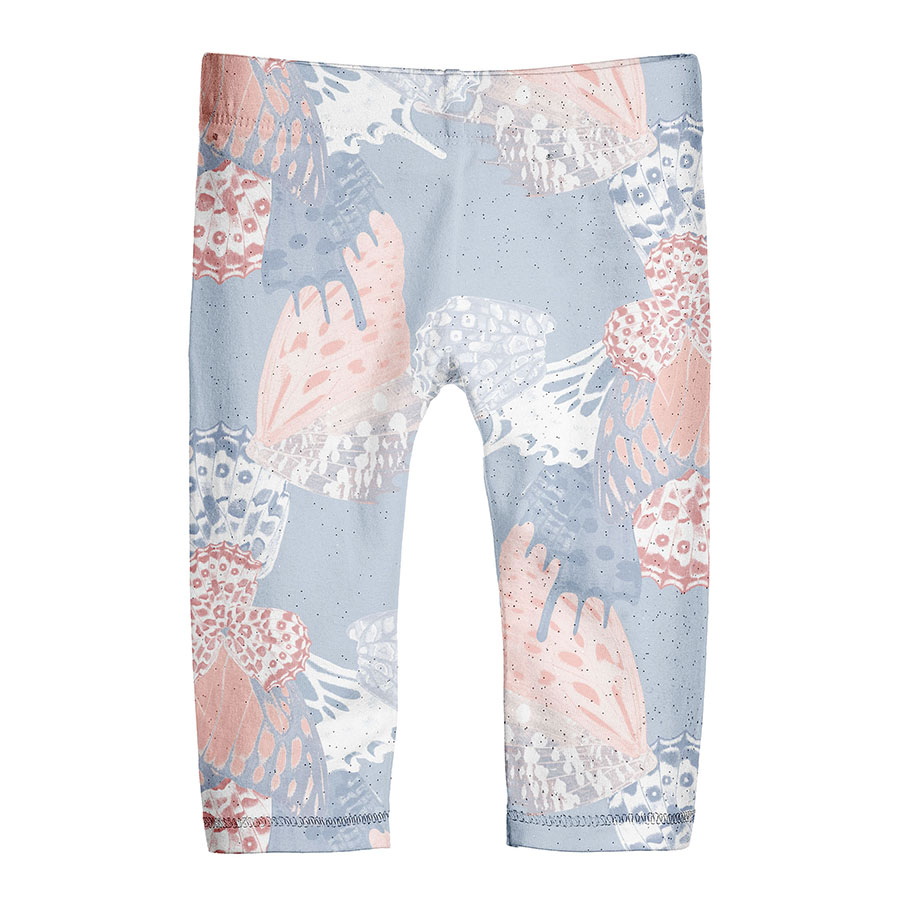
The introduction of the light blue into the mix results in a dreamy, pastel colour combination. A particularly interesting effect was achieved on some of the elements by recolouring in a gradient between the two main shades.
Presented here, is two patterns using different coloured backgrounds: blue and pink, which are both visualised in two different sizes. In the first version, the modules were connected to each other in an evenly spaced arrangement. Whilst, the other pattern acts as an oversize placement illustration, which offers a modern textural print.
Dark Navy
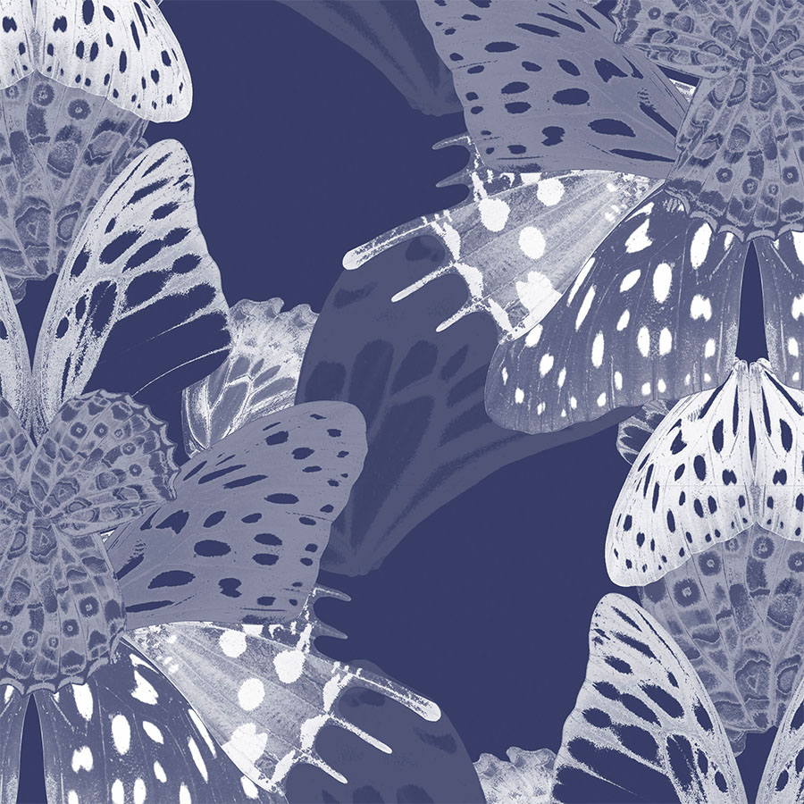
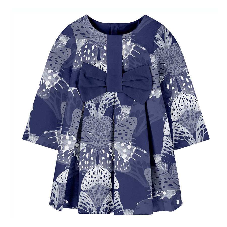
Lastly, these patterns incorporate the use of more contrasting elements of the palette. The focus was shifted towards the blue aspect, setting the baby blue and the dark navy as backdrops.
It was important to provide an idea of how this pattern could also be used quite successfully on a dark background. Recoloured in monochrome, with the layers of butterfly wings building up in gradient all the way to white, this design is highly dimensional.
“Happiness is like a butterfly: the more you chase it, the more it will elude you, but if you turn your attention to other things, it will come and sit softly on your shoulder.”


