Country Garden
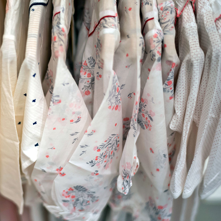
This pattern series was inspired by a vision of a homely back-garden in bloom. Commissioned for a Spring-Summer collection, as such, it offers a spectacle of humble, whimsical flowers that are bursting with creativity. As a full floral print it is a joyful celebration of the nature’s awakening after winter slumber as it bursts into boundless new growth.
This project was a part of my ongoing collaboration with Kidspattern. If you’d like to learn more about them please visit their website HERE. Alternatively, view the archive of our previous projects HERE, in which I discuss in detail the history and nature of our work.
All clothing-mockups presented here are provided courtesy of Kidspattern and are used for visualisation purposes only.
Starting Point
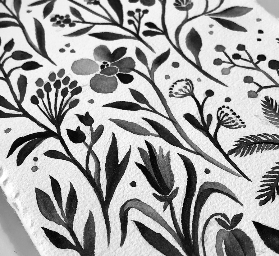
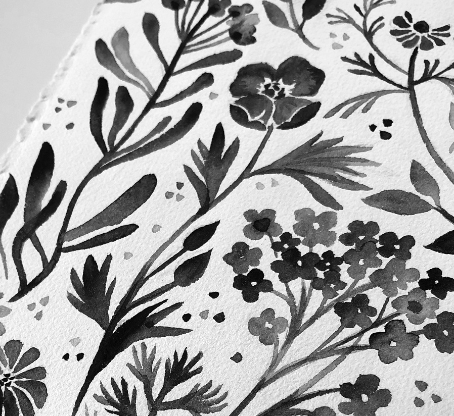
Elements for this pattern originated on the pages of my sketchbook. In this digital age, I delight in an opportunity to begin a design with real pencil or brush and actual paper. I don’t usually reach out for watercolours but this time I’ve decided to make an effort to broaden my tool vocabulary. These simplified garden flowers are mostly imaginary and were created by just letting myself doodle away and seeing what bubbled up. I tried to come up with a plethora of shapes of the flowers, stems and leaves, so that the pattern had a nice variety to it.
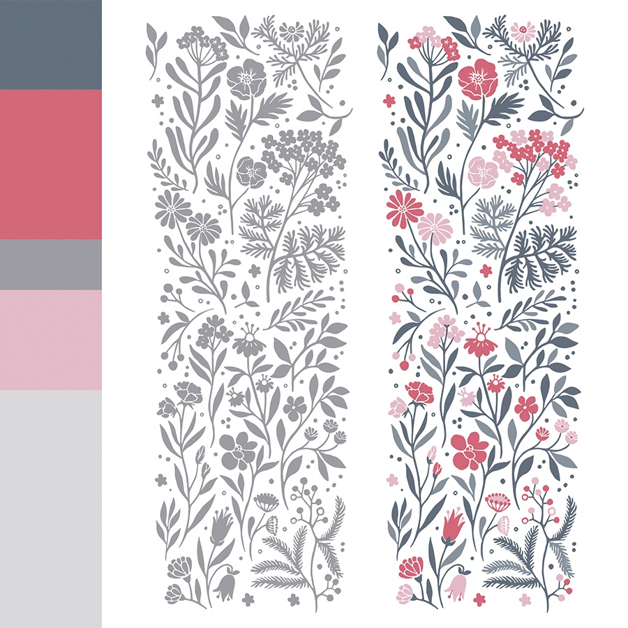
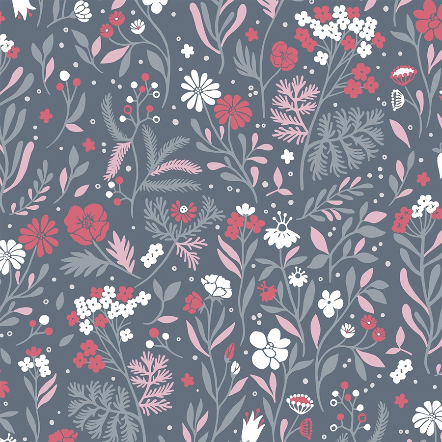
Afterwards I scanned the pages, I cleaned it up digitally and simplified some of the elements. To adapt the pattern to make it vector-ready for easy screen printing, I live-traced the original design and recoloured it using Adobe Illustrator. You can view the finished repeat module below. Additionally, I have attached the brief palette contributed by colour and trend specialist Kidspattern.
Main Pattern
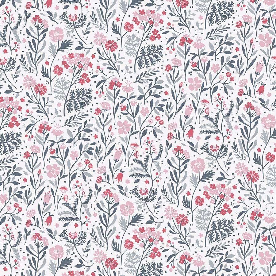
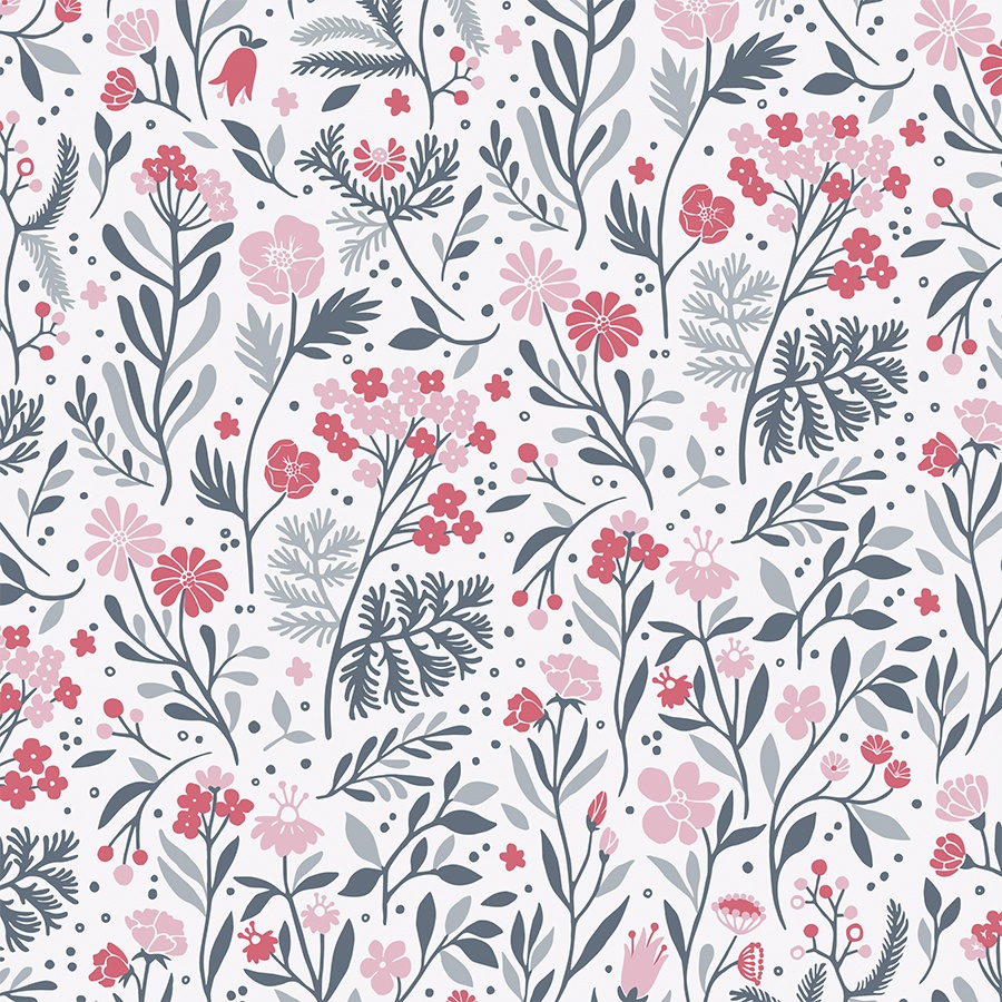
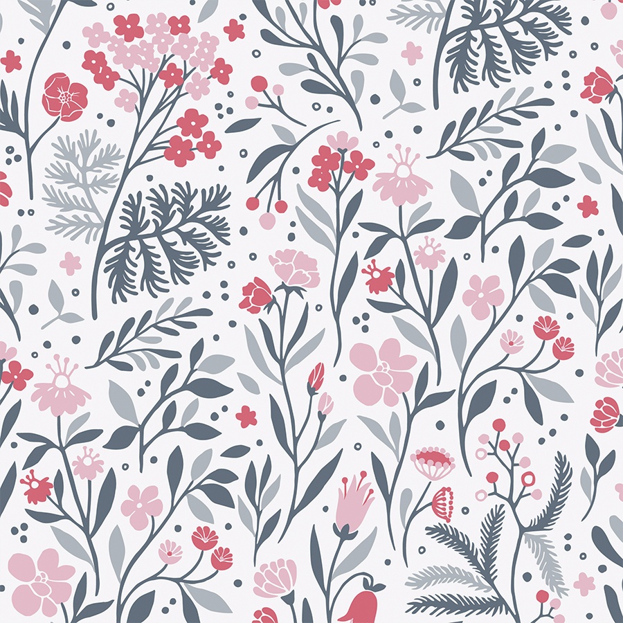
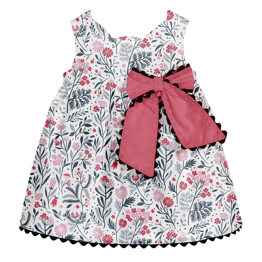
This version is very universal and works equally well in both large and small sizes. Placing it against a white background makes it seem very light and fresh. To recolour these simplified shapes I used the four main colours from the brief’s palette.
I feel the stylising of the various florals, gives them a lovely, whimsically rustic feel. The little dots that I introduced also add to the design’s playfulness, as well as balancing out the rhythm of the components.
Dark Background
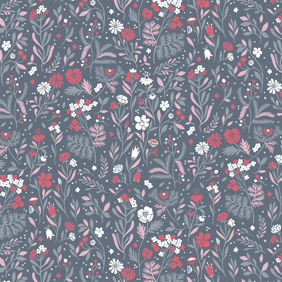
In this alternative colourway, the only accents that break up the stillness evoked by the dark-sage background are occasional pops of white, blush and dark-coral flowers, popping out as if from amongst the shrubs.
Pattern in Print
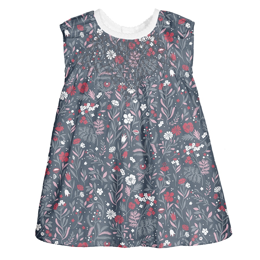
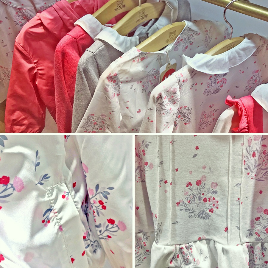
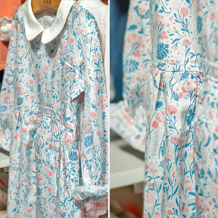
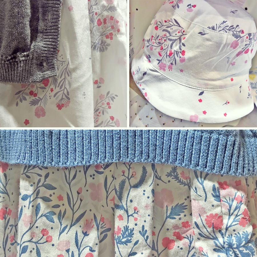
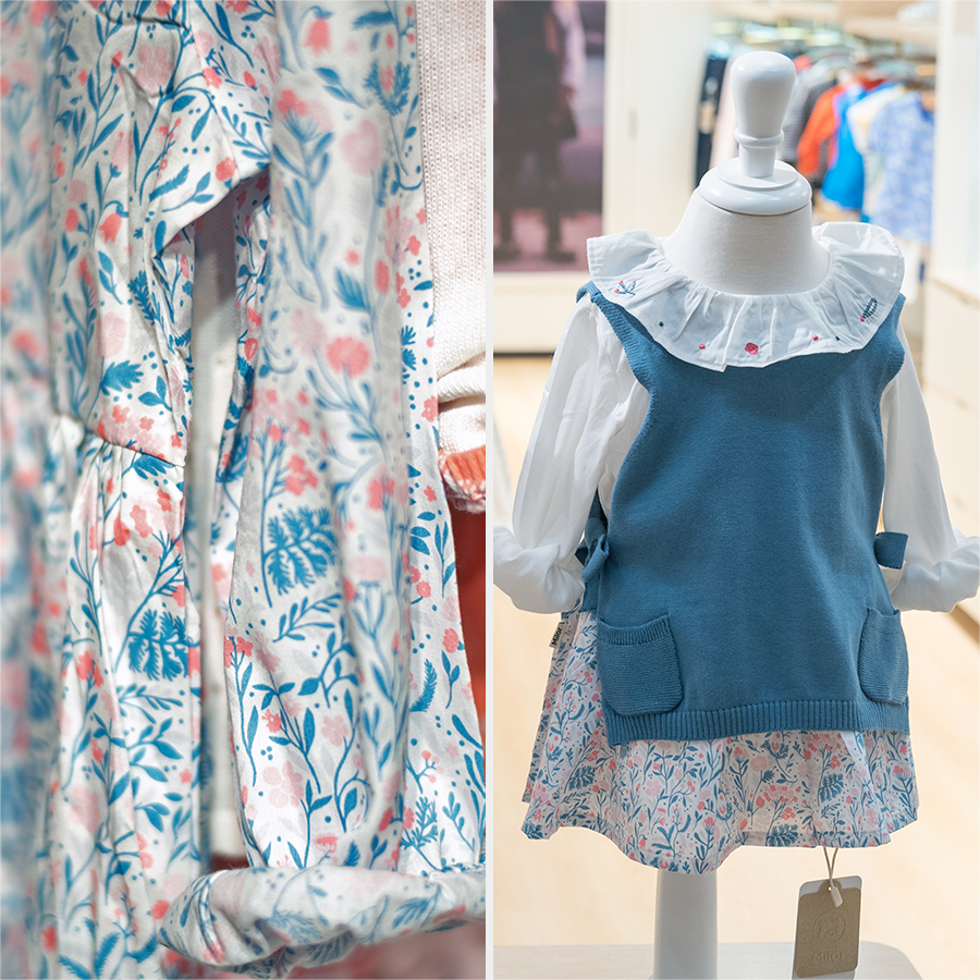
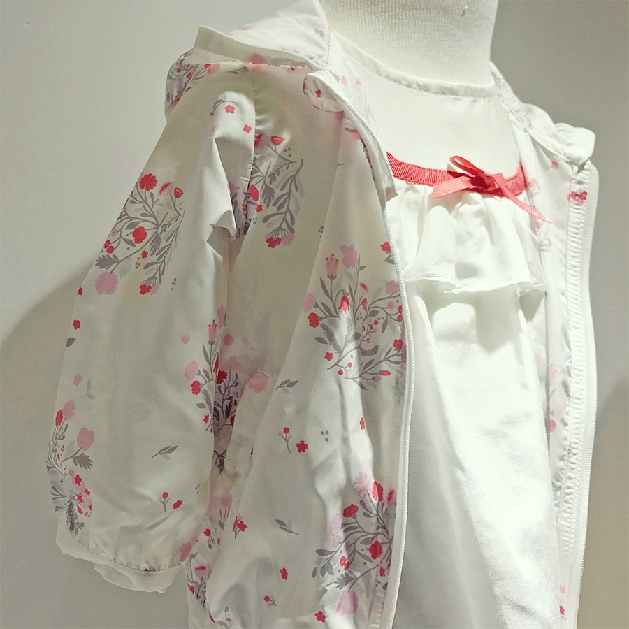
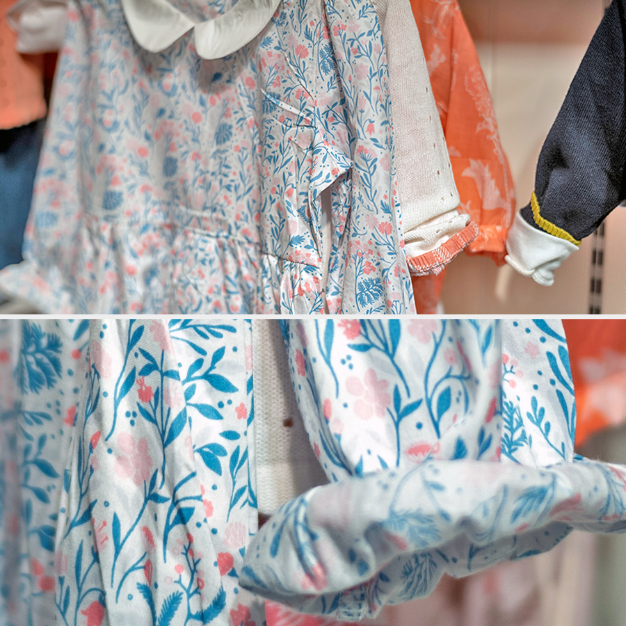
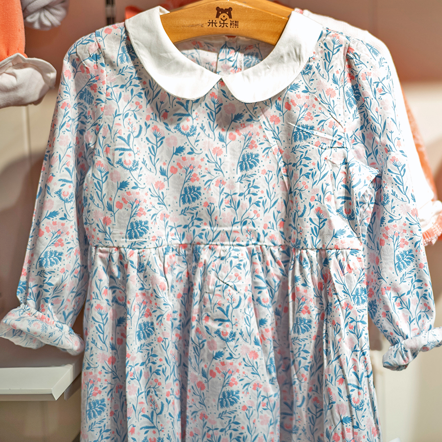
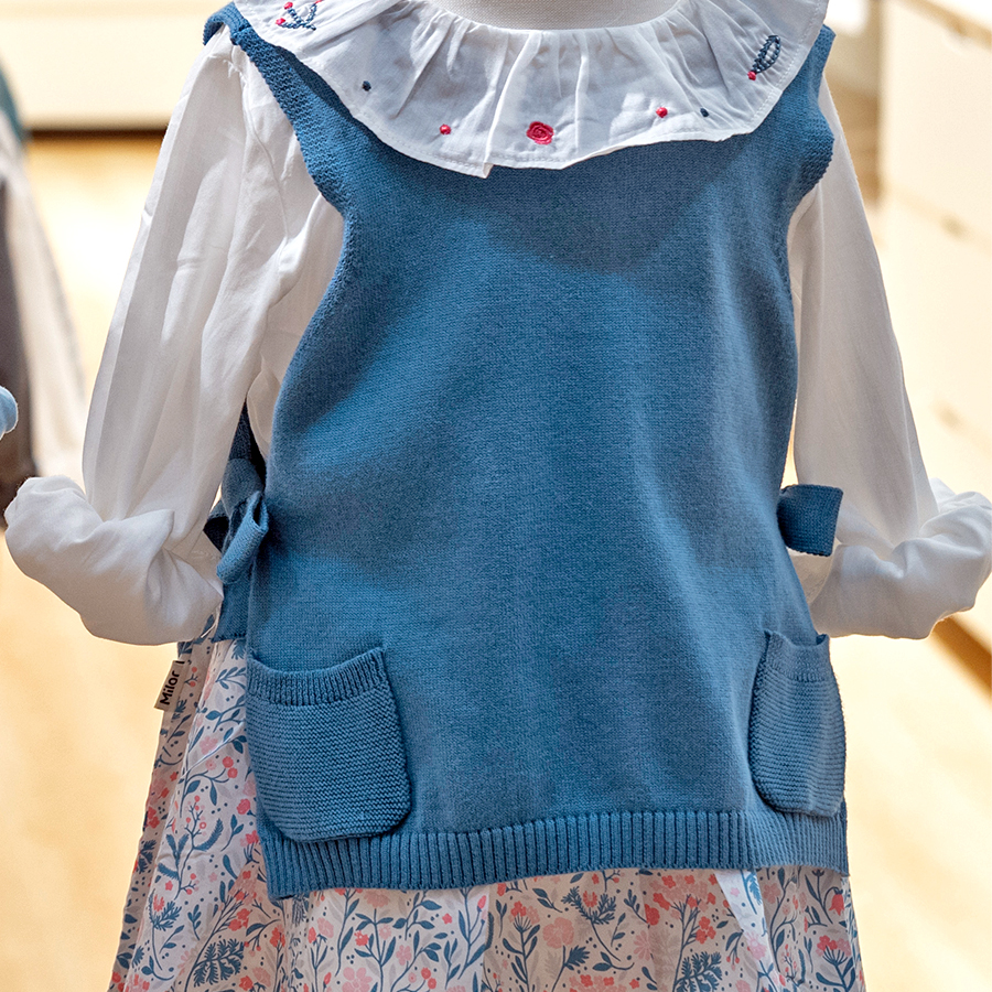
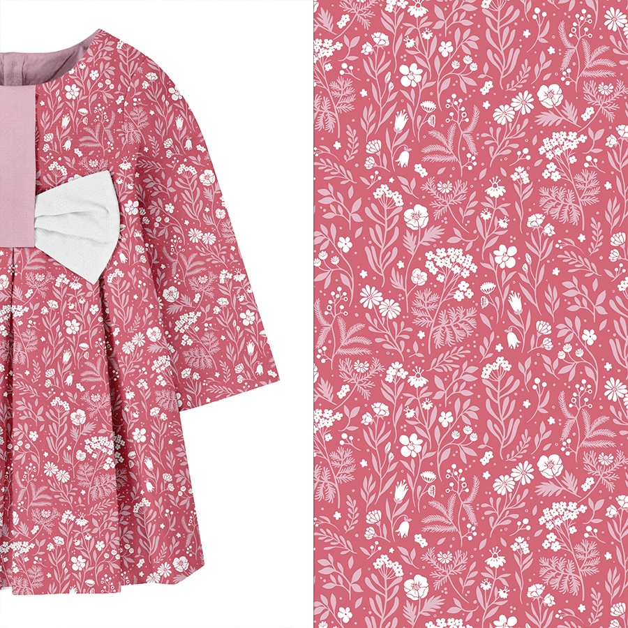
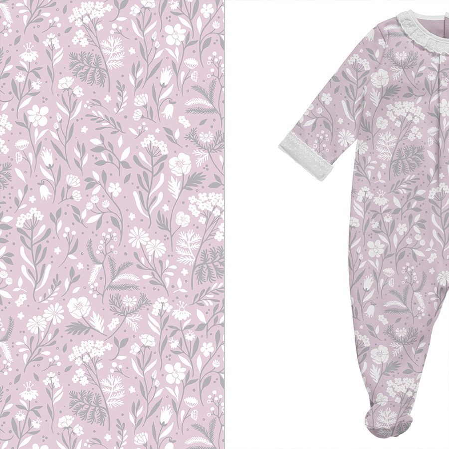
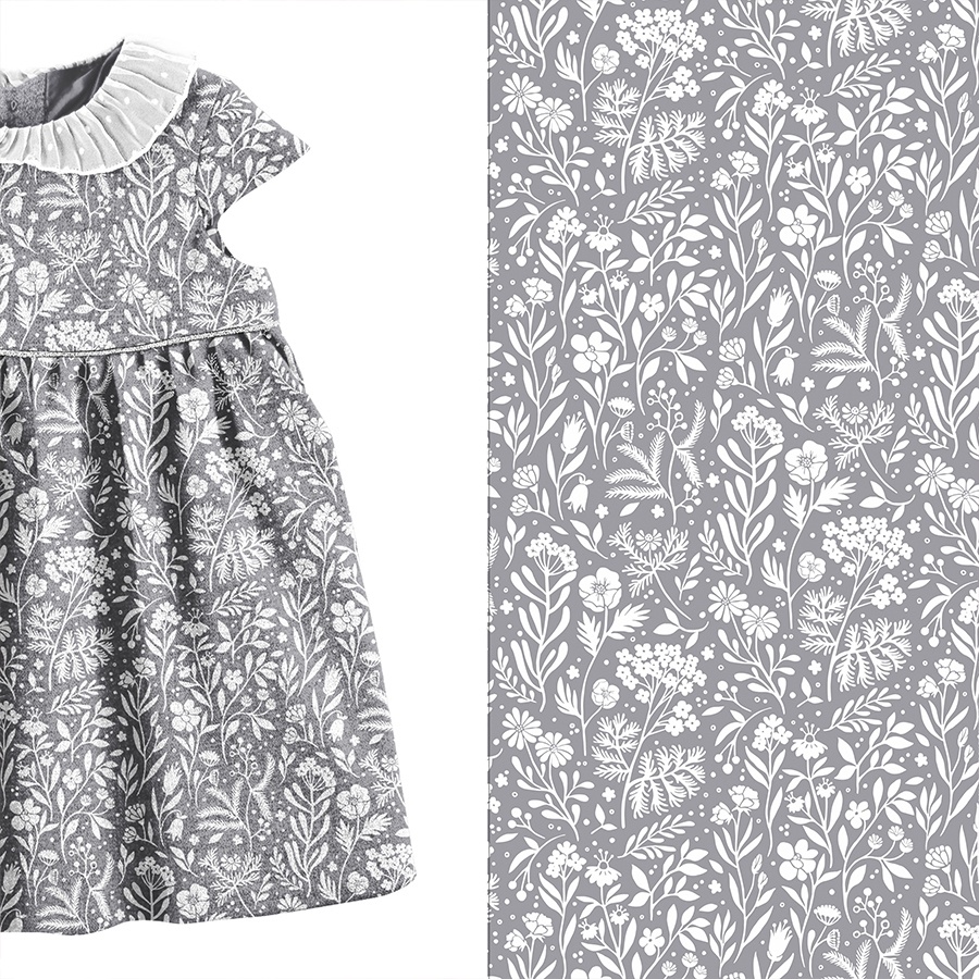
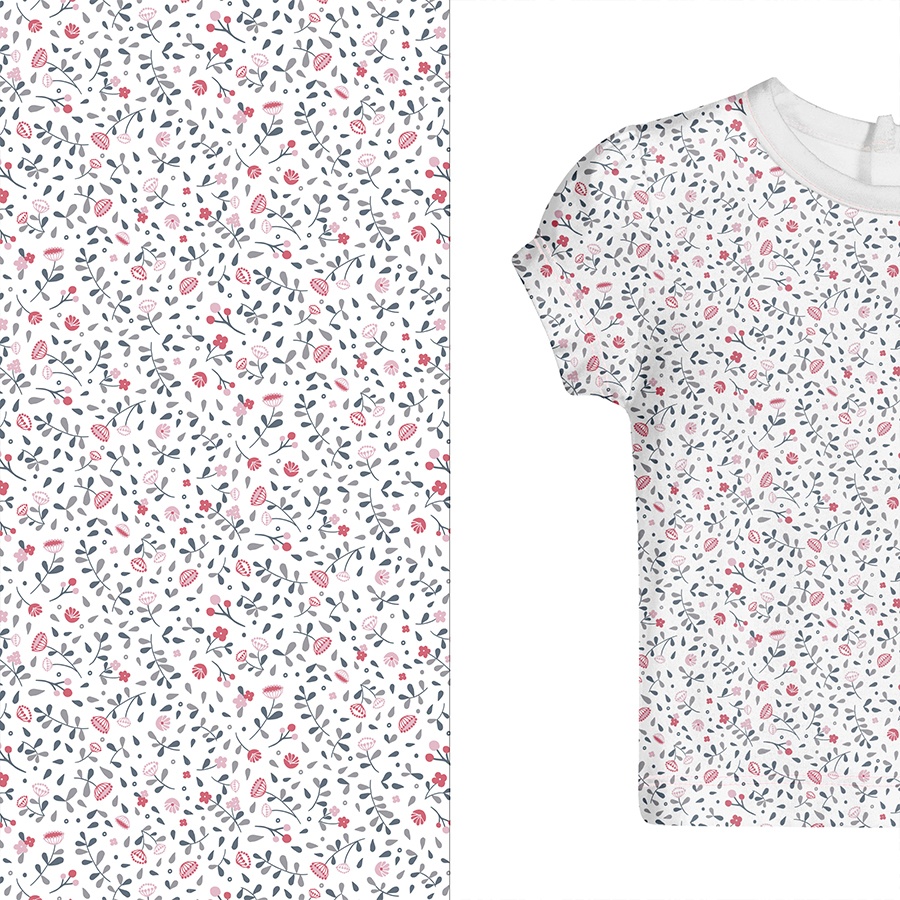
Here are few examples of how this pattern turned out in print and was used across various numerous first clothing samples. These were produced to launch our client’s Spring-Summer Collection and display at trading fairs.
Please note that these images are provided courtesy of the client and Kidspattern and are used for portfolio purposes only.
Alternative Colourways
The aim of this development was to try different colour combinations, keep reducing the number of used colours and continue simplifying. “Country Garden” pattern therefore evolved as follows:
Firstly, re-imagined in much smaller size and only monochrome pinks.
Secondly, aimed at Newborn section of the collection, hence recoloured into softer shades of grey and pink.
Thirdly, only as white silhouettes, positioned against a grey background. Having been desaturated, now it seems much more of a texture, especially when used in this small size.
In addition, I picked few simple elements to create a plain, secondary pattern, which was meant to work as a petite print to compliment the more elaborate version of it in a set. This also is more appropriate for the younger age group of the SS Collection.
“Gardening is how I relax. It’s another form of creating and playing with colors.”


