Cutout Florals
Paper crafting has a long standing tradition in the arts. From practices like origami to fashioning paper into lanterns and fans, since it was invented in 100BC China, paper was considered a tool for making art.
In this modern, digital interpretation of cut-out florals, we aimed to evoke the decorative aspect of this established practice and find new ways to bring it into the context of surface design.
This project was a part of my ongoing collaboration with Kidspattern. If you’d like to learn more about them please visit their website HERE. Alternatively, view the archive of our previous projects HERE, in which I discuss in detail the history and nature of our work.
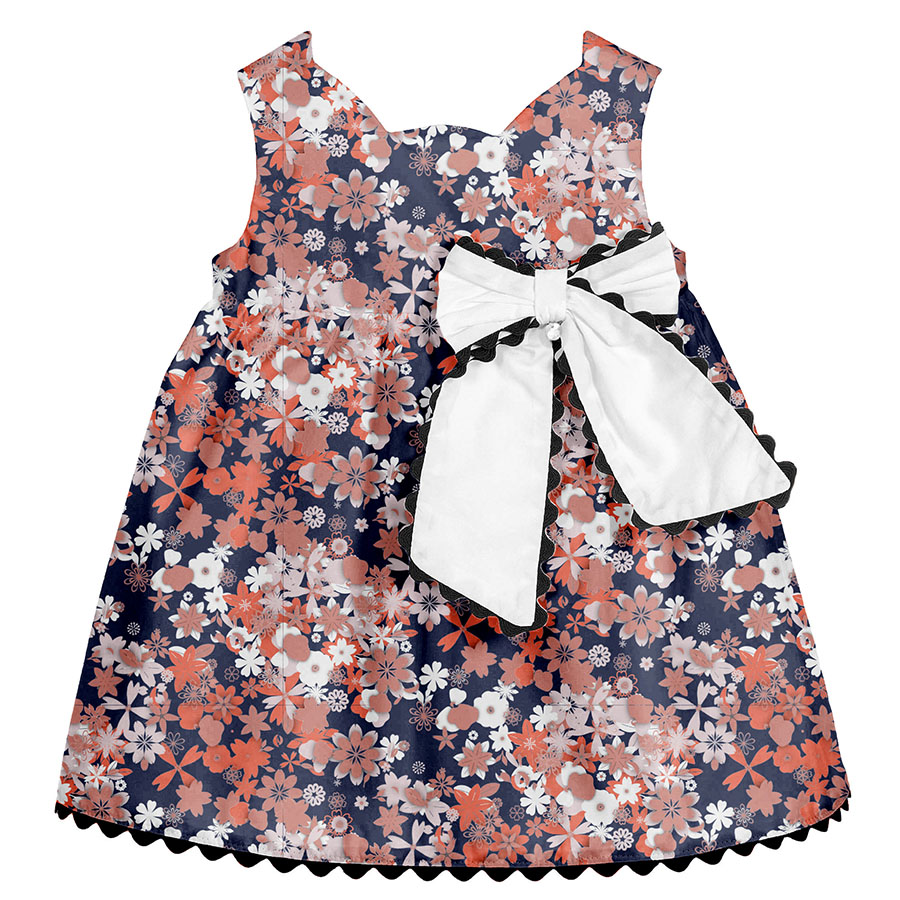
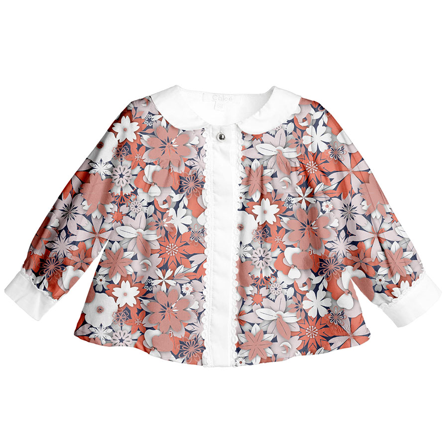
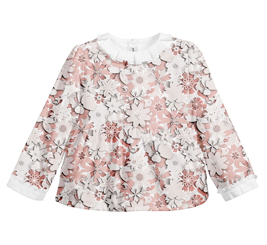
All clothing-mockups presented here are provided courtesy of Kidspattern and are used for visualisation purposes only.
THEME INSPIRATION
Generally associated with Chinese origins, paper floral decors became hugely popular in Mexico, where they were used to decorate churches and home altars.
Furthermore, in Victorian England they reached their ultimate finery as real flowers were disassembled and traced onto paper as a template to create life-like imitations.
Ever since Chanel’s Spring/Summer 2009 Haute Couture Show, the art of paper flowers has been experiencing its blooming renaissance.
It is now widely used in luxury interior décor, especially for displays at special events and as a part of other aspects of Visual Merchandising.
OVERVIEW
This cut-out floral pattern development series was commissioned for a client’s Autumn-Winter Collection for a group aimed at girls aged up to 36 months old.
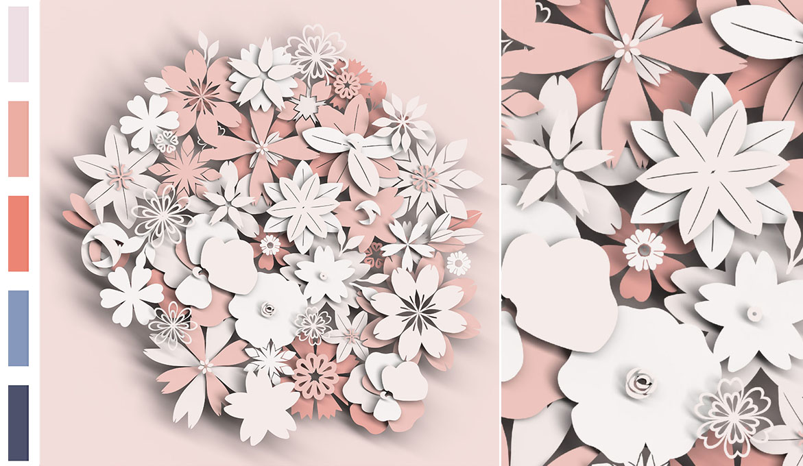
Above I have attached a strip detailing the colour palette, which was designed by Kidspattern. It is a gorgeous selection of fresh corals matched with a pale pink and contrasted with a duo of classic blues (a medium and a dark tone).
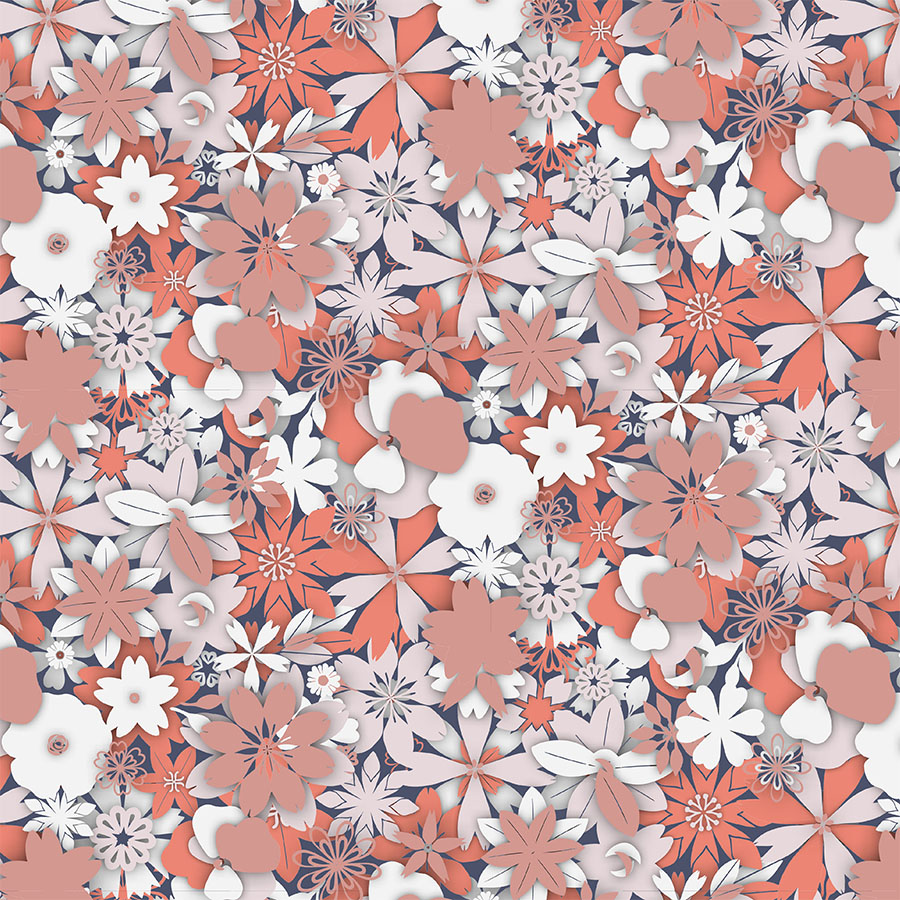
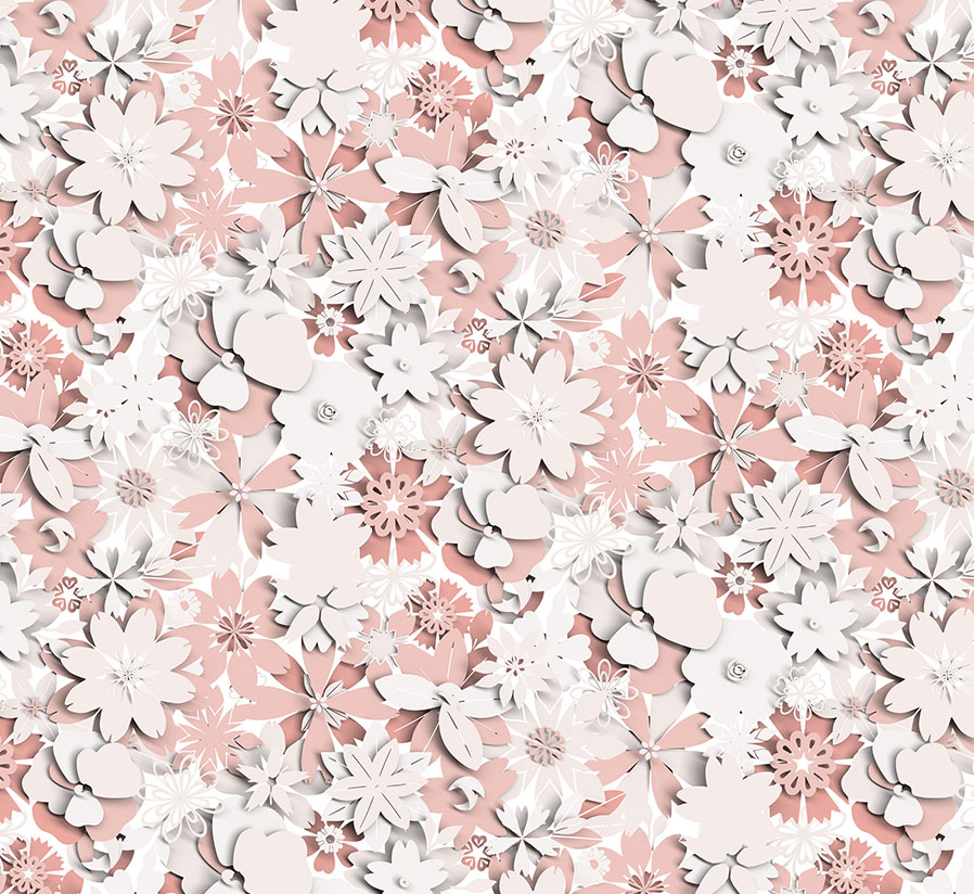
The main module for this design was created by using cut-out shapes resembling simple floral paper cuts. These were layered on top of each other, which created a shadow effect and increased the designs’ sense of dimensionality.
The final result was rendered in a 3D making software by Kidspattern and as such was planned to work as a digital print. Later on, however, the design was additionally developed as a flat vector version and thus adapted for screen-print.
Above you can view the key version of this pattern, which uses all the corals from the palette. The dimensional flower heads are peeking out from the surface of the fabric and are organised in a tight order and a regular repeat. It was suggested to use in a medium size to maintain a good quality of print.
Below feel free to browse through the development of some of the arrangements, which explore the spacing between all the elements and various colour-ways.
White on White
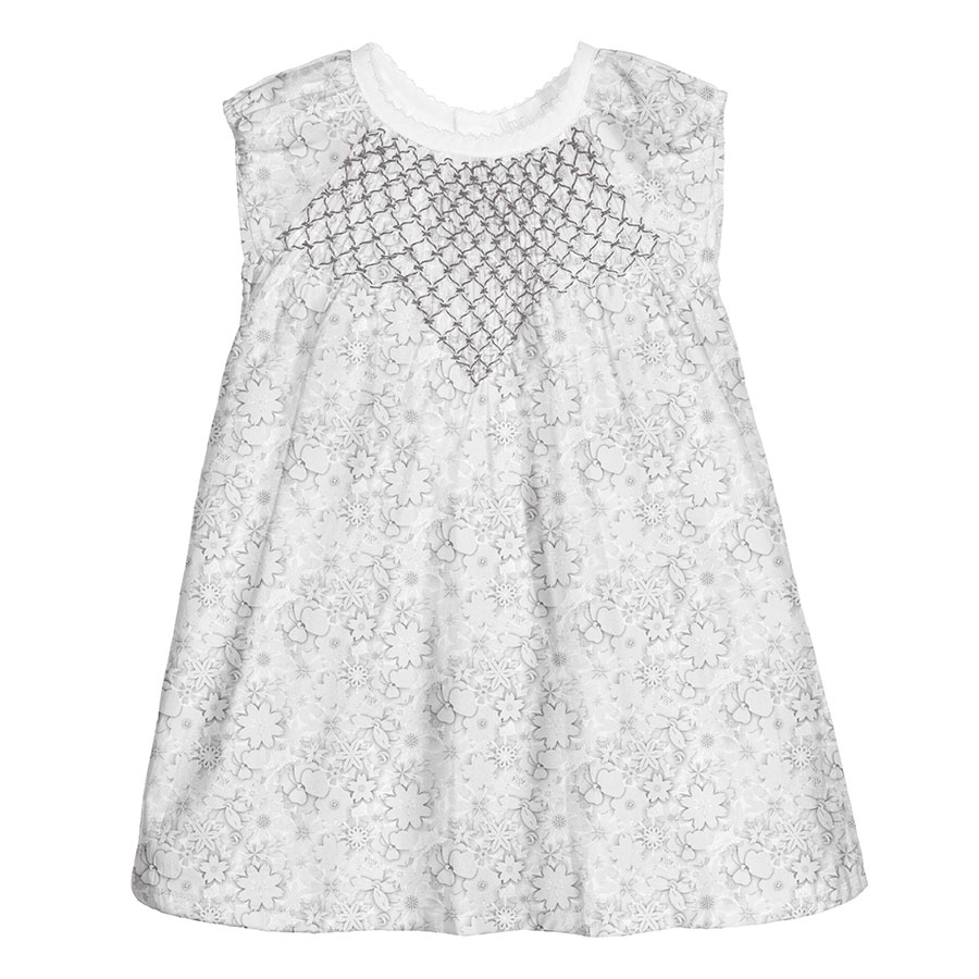
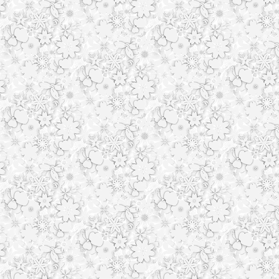
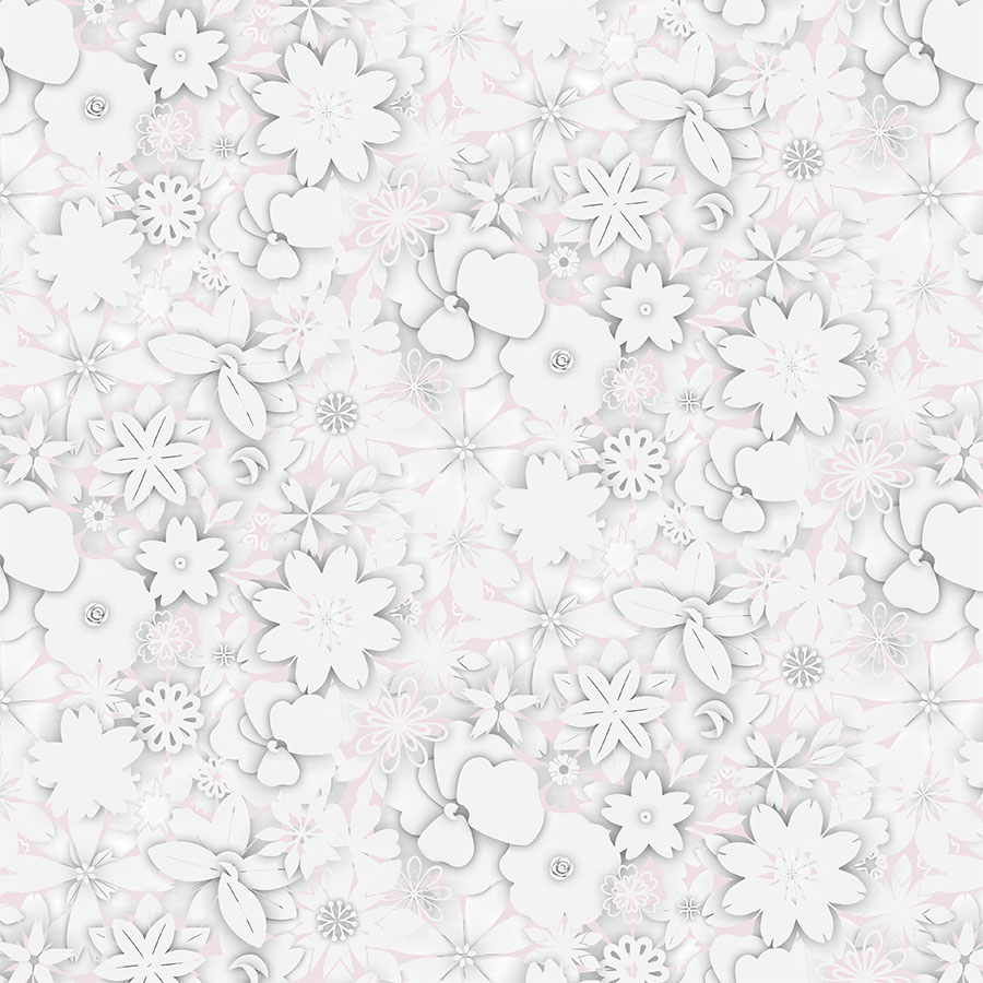
As a response to this popular trend, the floral module was pared back and recoloured using only white. Then it was repeated in a regular and dense composition, in order to create this subtle and textural design.
Here, the design is visualised in a relatively small size for a fresh and understated result. The minimal idea was proposed, so that only the layer with the shadowing would eventually be printed onto a white fabric.
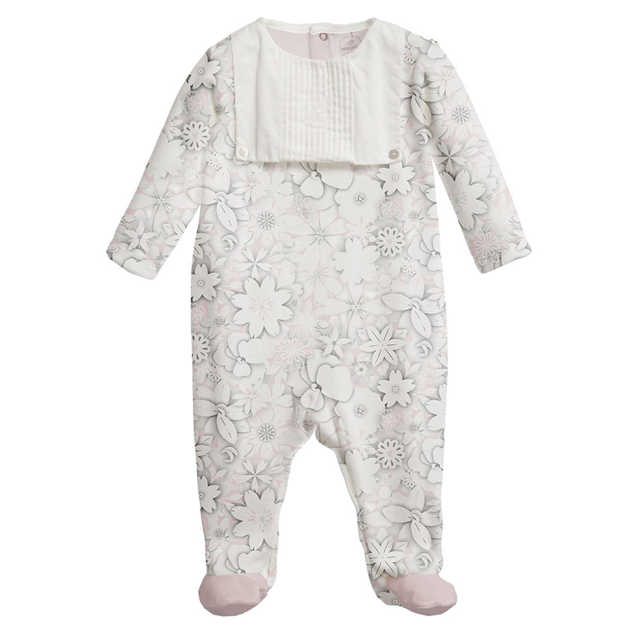
This design was also reworked to fit a small group of items aimed at Newborns. A touch of colour was added in the form of a pale pink background and it was suggested to be used in a larger size to assist in printing on thick cotton.
Dark AW Background
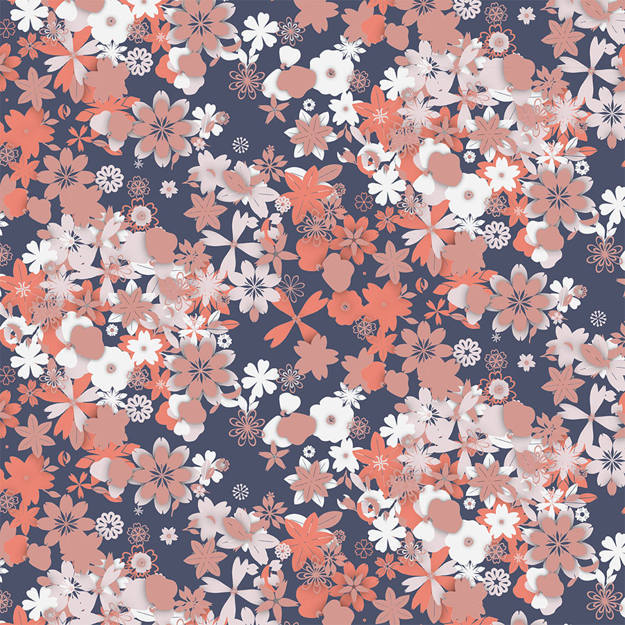
Here, both designs now incorporate a fuller range of the colour palette and coordinate with its dark shades. Pulsating with colours and shapes it is full of a visual rhythm.
First, visualised in a larger size, the florals are recoloured in more contrasting shades, which offers a more defined and bold solution.
Whilst, the second arrangement has the flower heads dispersed in a much looser composition, visualised in a much smaller size, this makes a great complimentary print.
Placement Print
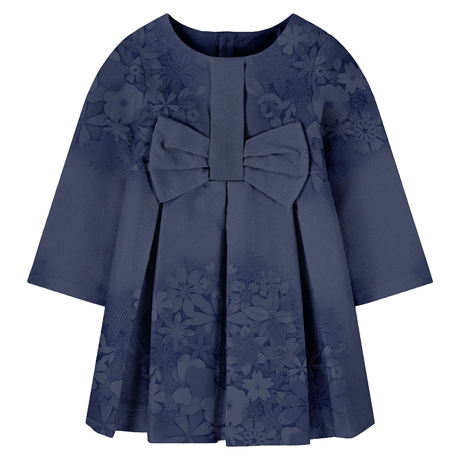
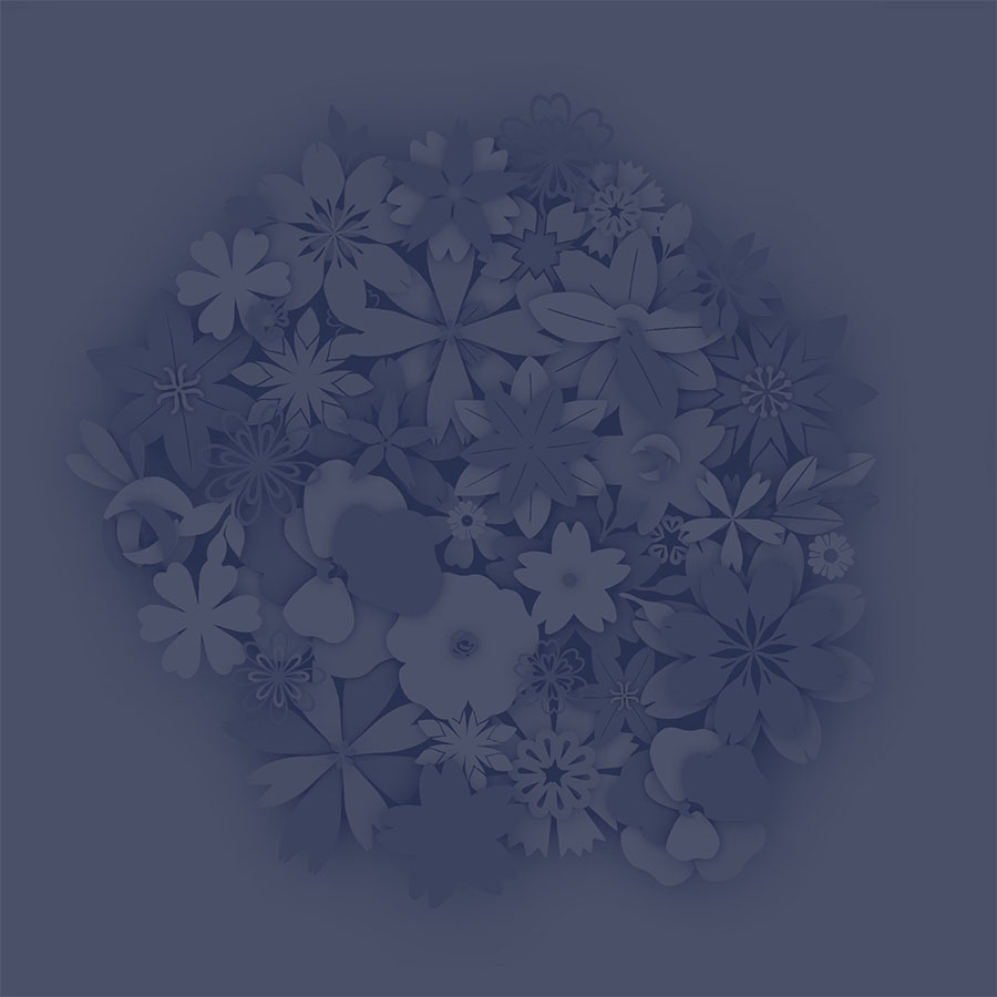
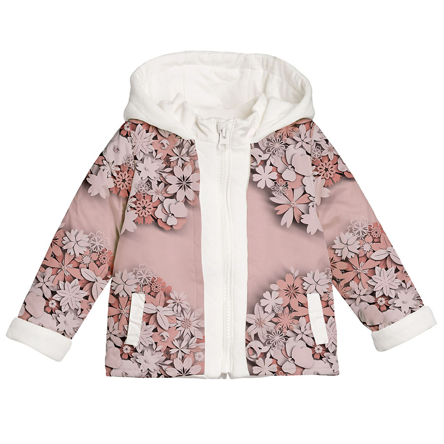
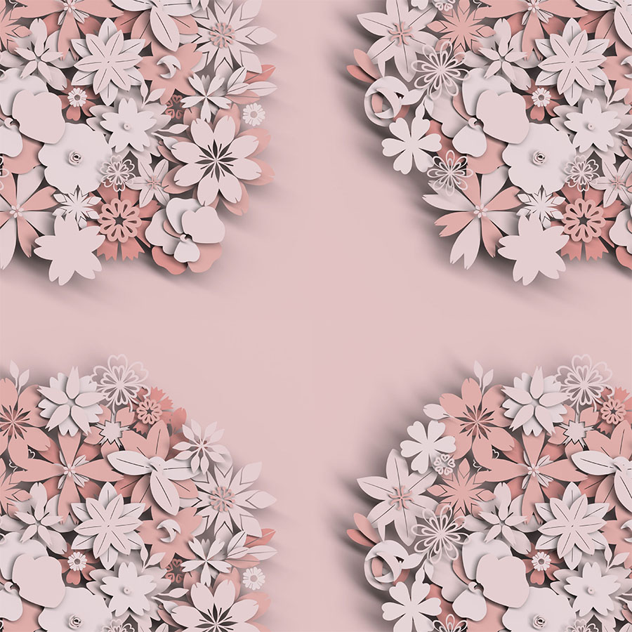
Continuing with the idea of “colour on colour” trend, the module was fully immersed in a smooth monotone (corals and dark navy blue) and placed on a matching background for full blending. The florals were arranged into bouquet composition allowing for even spacing in between.
This experimental visualisation expressed an idea for this design to be used as an oversized placement print. Especially effective when printed in a large size on a jacket, or alternatively, alongside the hem of the dress with matching details on top of the garment in a balancing transitional composition.
“Life is too short to say no to paper flowers”


