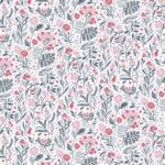
Floral Outlines
The concept for this series originated in the beauty found in the simplicity of drawings created by using a single continuous line. Additional inspiration came from minimal and understated ‘Botanical drawings’ by Ellsworth Kelly.
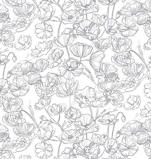
Ultimately, this pattern’s main distinguishing feature is its mark-making technique. The result presents free hand, linear, slightly abstract and expressive modern florals, which are loosely based on wild poppies in bloom.
This project was a part of my ongoing collaboration with Kidspattern. If you’d like to learn more about them please visit their website HERE. Alternatively, view the archive of our previous projects HERE, in which I discuss in detail the history and nature of our work.
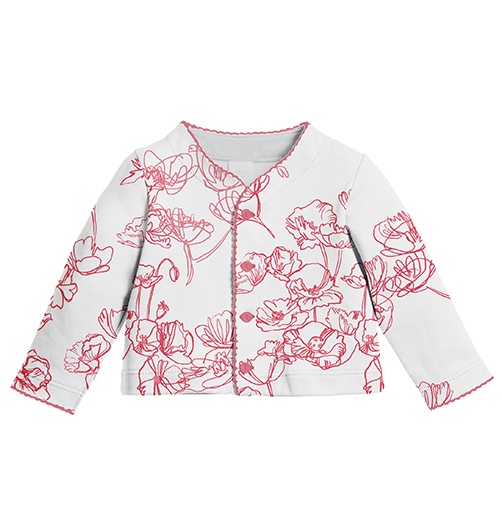
All clothing-mockups presented here are provided courtesy of Kidspattern and are used for visualisation purposes only.
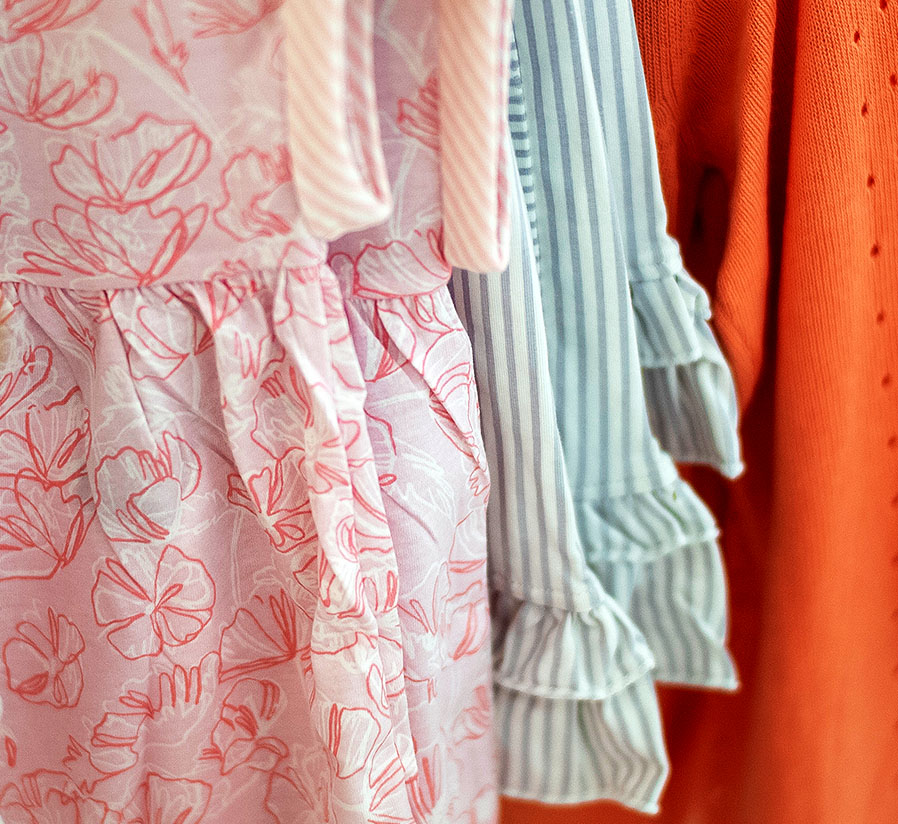
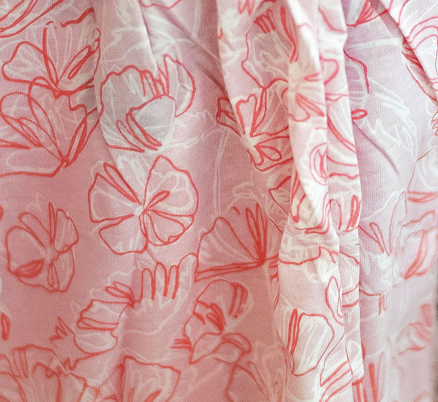
Drawing Element
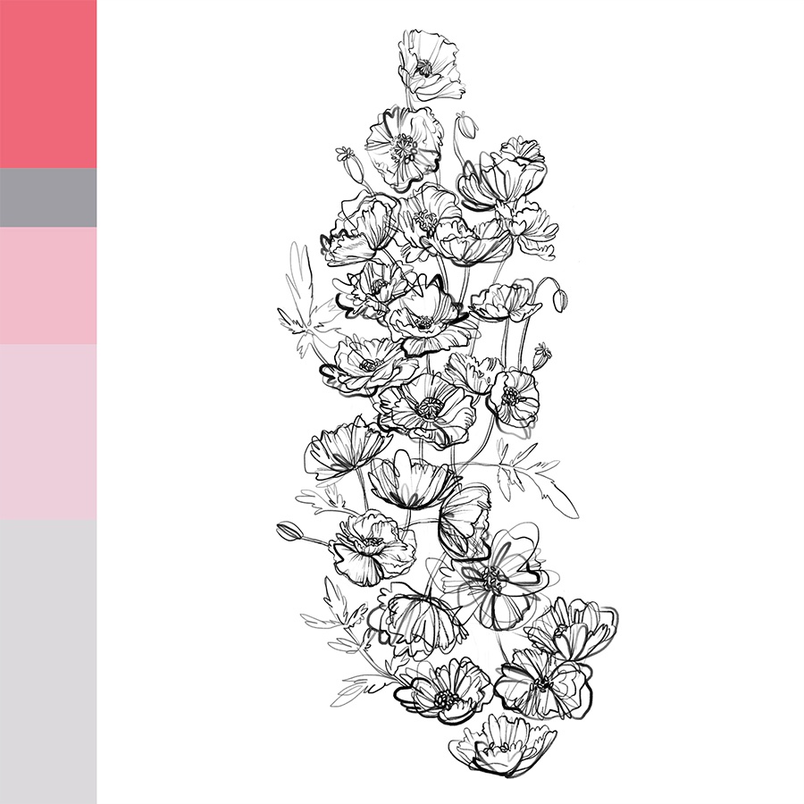
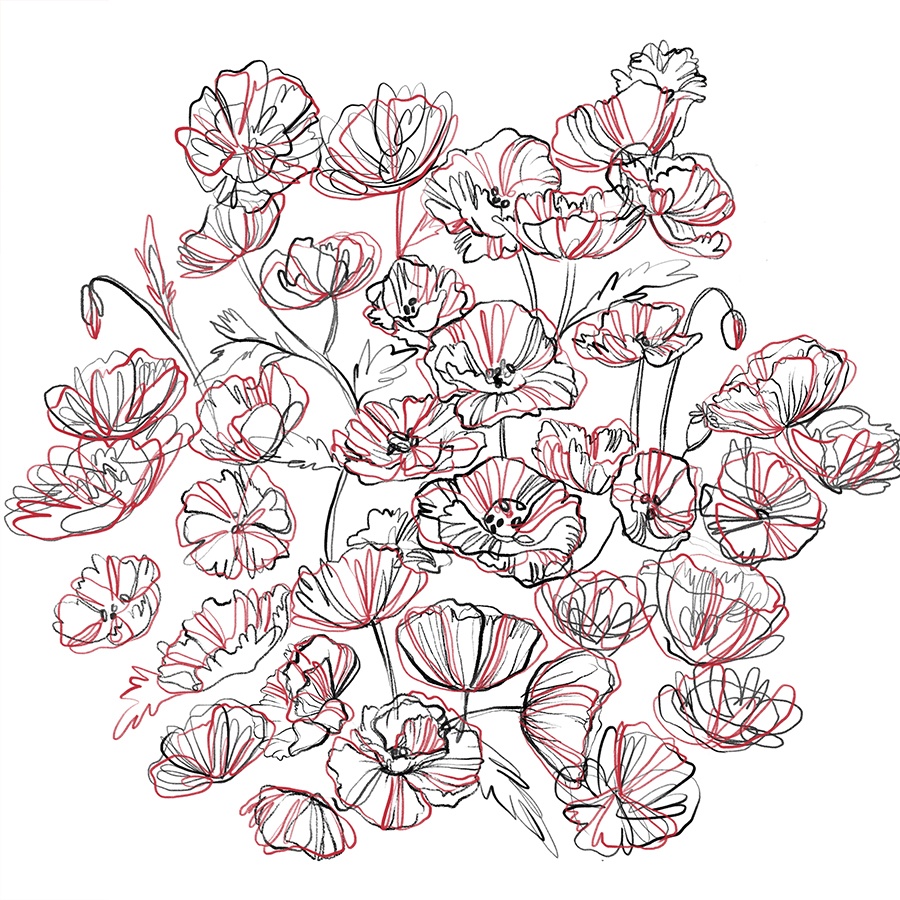
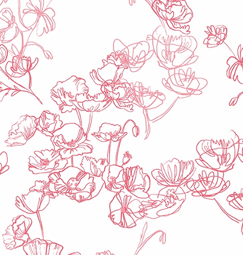
The brief for this pattern was a little challenging for me as I usually draw using quite a meticulous, clean outline. However, I purposefully shook things up here, experimenting with adopting a looser grip on my stylus to get the desired effect. These drawings later became the core repeat module for the designs in this series.
In order to add a pop of colour I layered separate outline drawings, in two different colours, on top of each other. Additionally, you can view the intended palette composed by talented colour-specialist Kidspattern.
Alternative Version
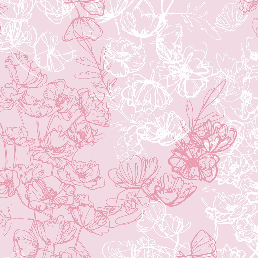
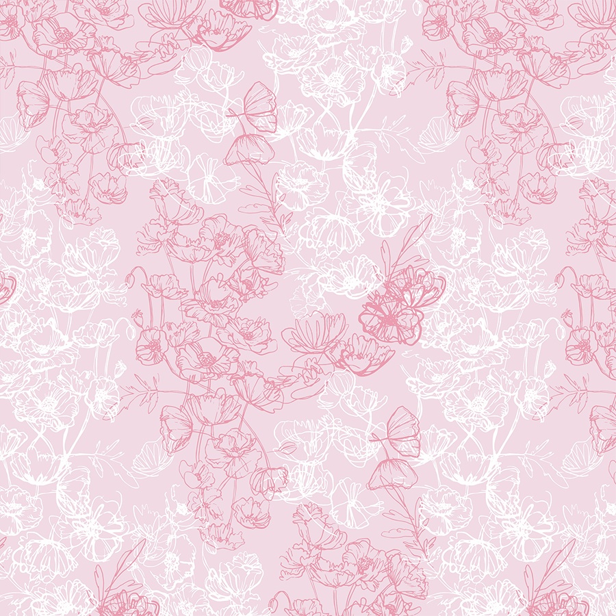
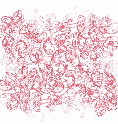
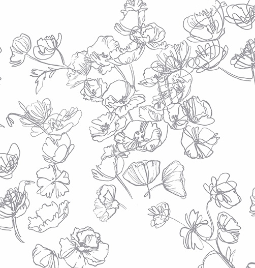
In this additional version of the pattern I have used two pantones but separated them, one apiece, into different areas of the overall module. One of them blends into the background, whilst the other one stands out, creating an interesting dynamic.
This arrangement has become much fuller, with almost all the space being filled up with vibrant and expressive lines of the florals creating a textured look.
Additional Solutions and Placement Ideas
As Kidspattern we supply our clients with ideas of alternative solutions and arrangements for the commissioned designs. Feel free to browse through the selection of these attached below.
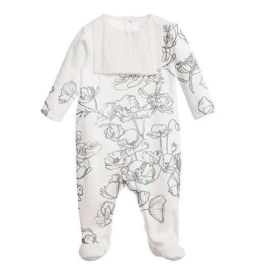
This assortment includes options aimed at the Newborn Collection, which are typically basic, simple, one-colour prints. In this instance, the designs were intentionally spacious, oversized and a little abstracted. I’ve included both colour ways: greyscale and in two shades of pink.
The strength of this design lies in the contrast that is created by the dynamic and bright line cutting out from the neutral background. The arrangement embraces the high volume of negative space surrounding the expressive lines, which contributes to making this print very light, fresh, modern feeling, and thus very apt for a Spring-Summer Collection.
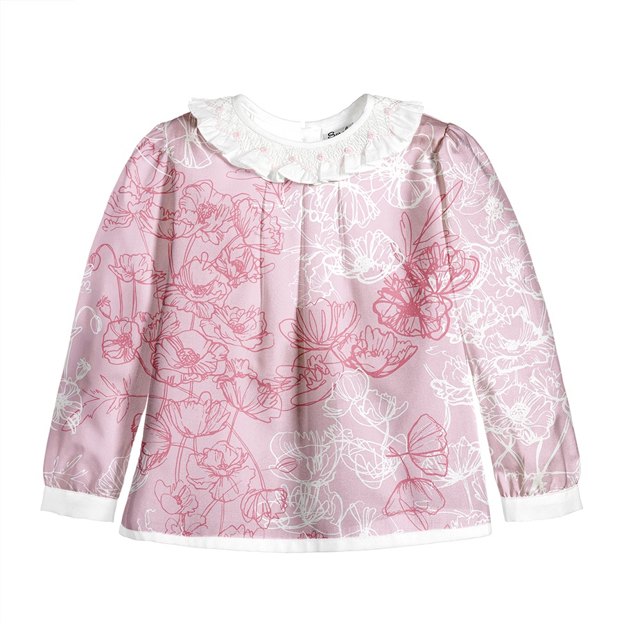
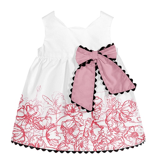
Additionally I’ve attached potential solutions of how the florals might be used as a placement print.
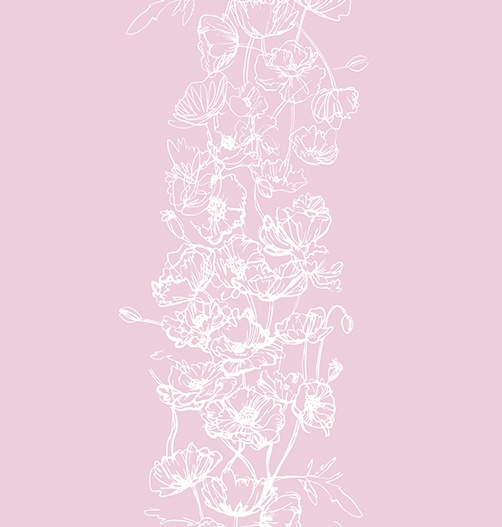
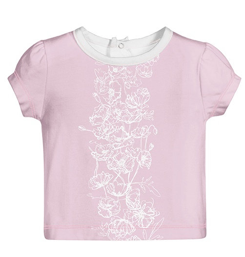
First, in form of a decorative panel placed along the middle section of a top. In this example the recolouring of the line-drawing into white makes it blend into background more and gives the impression of a strip of an abstract texture.
Second one, has the floral module arranged as a border that rings the hem of a girl’s dress. It was visualised in a large size that emphasises the expressiveness of the line. I’ve also used 2 shades of pink, on top of each other, to create some interesting layering.
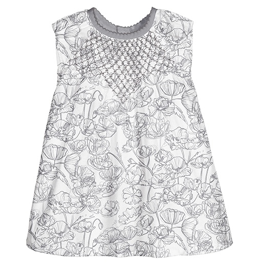
To conclude, I’ve included a full-print, greyscale version of the final floral pattern, where I took two layers of outlines and stacked them, one on top of the other, in hues of the same colour. With the design being placed against a white background it really highlights the linear contrast.
Pattern in Print
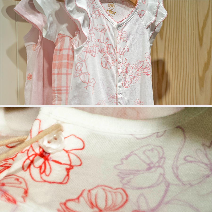
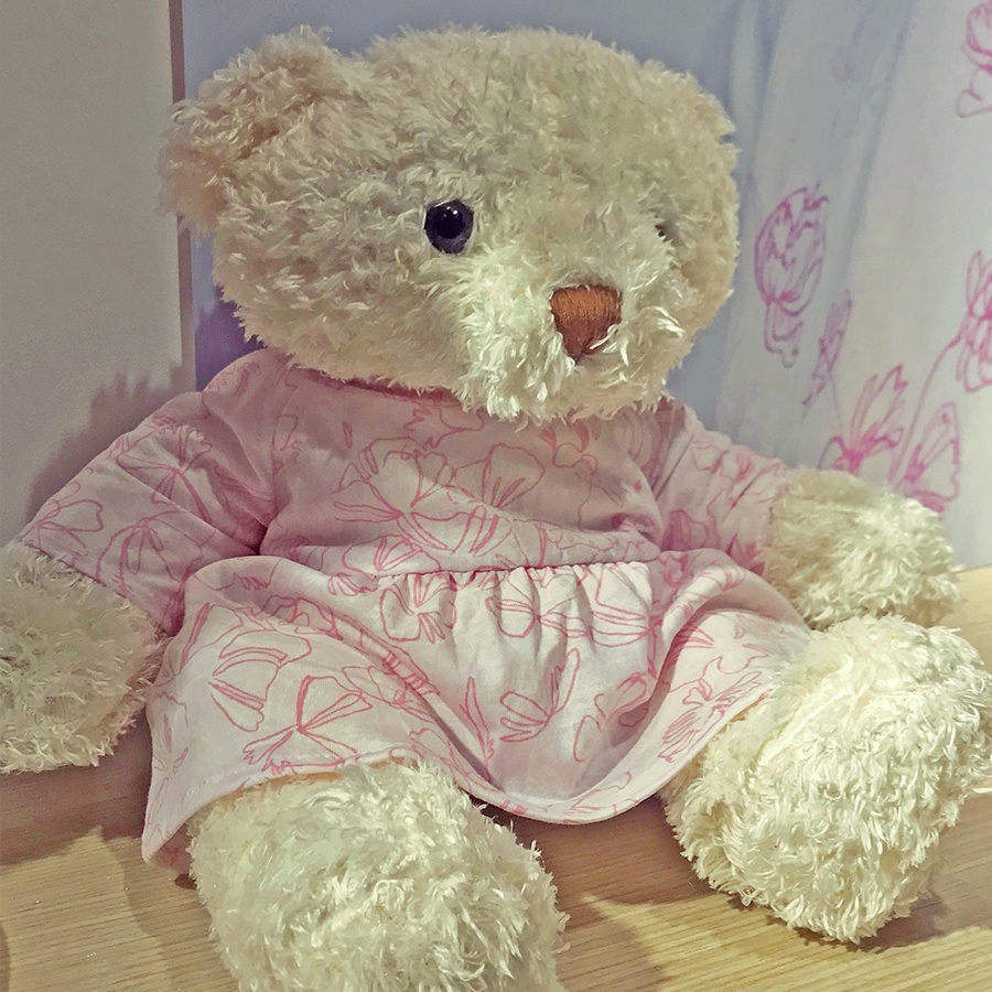
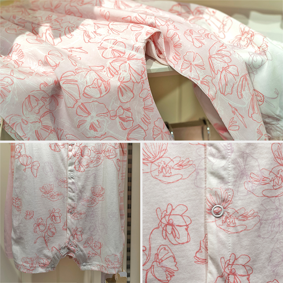
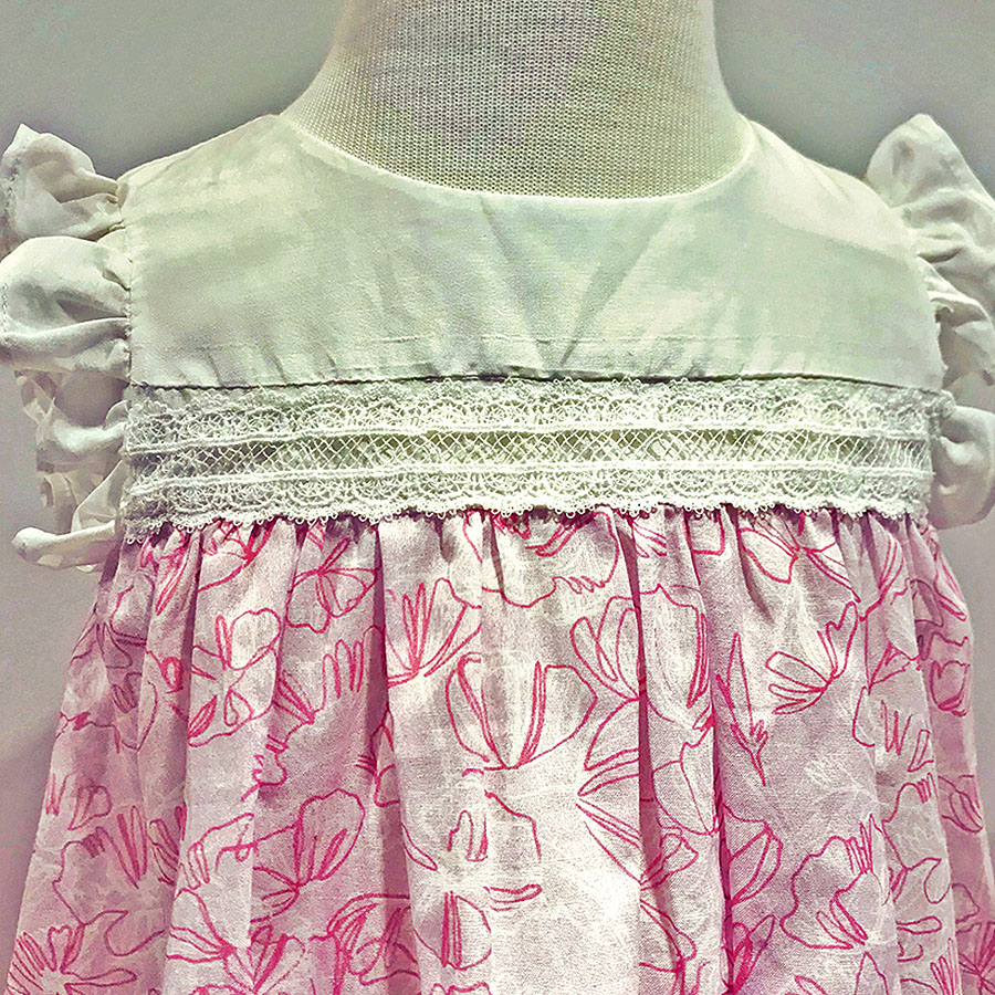
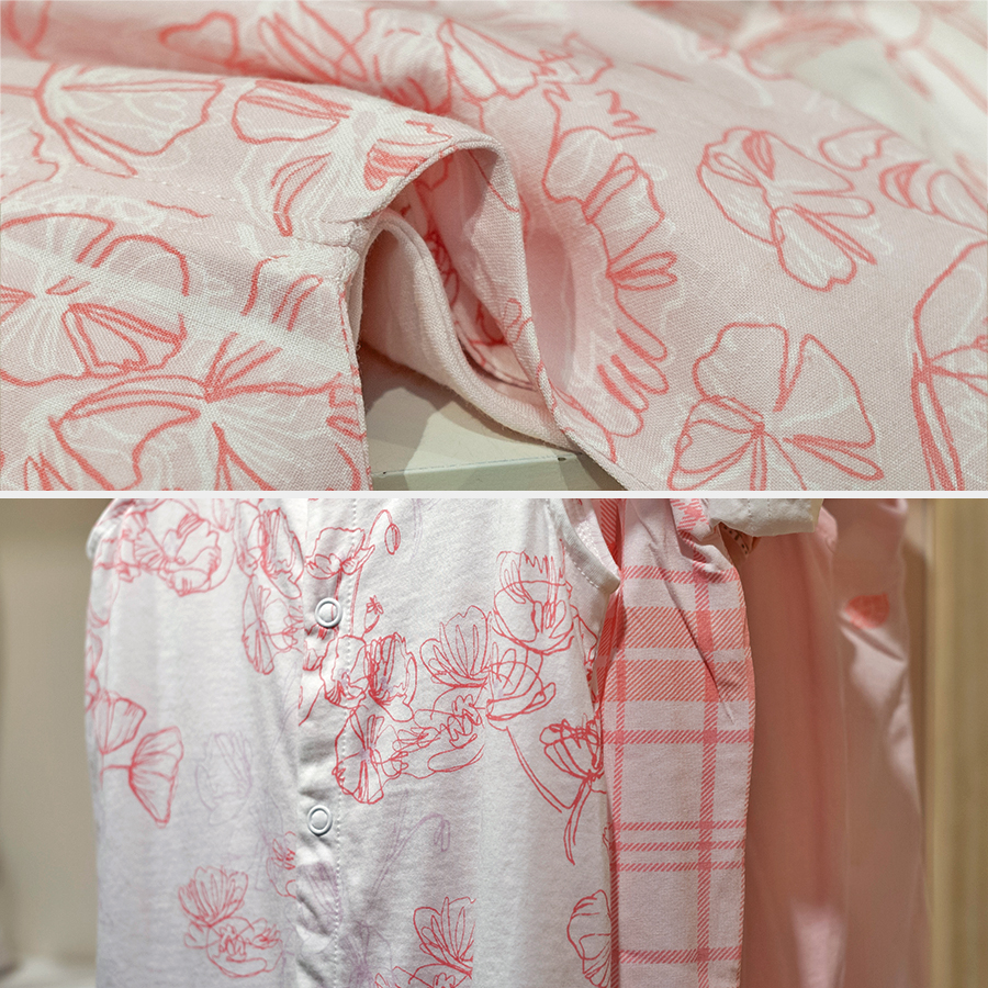
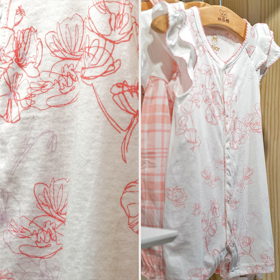
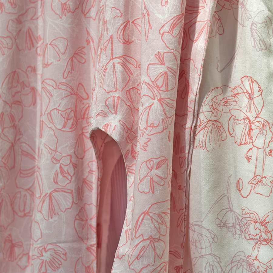
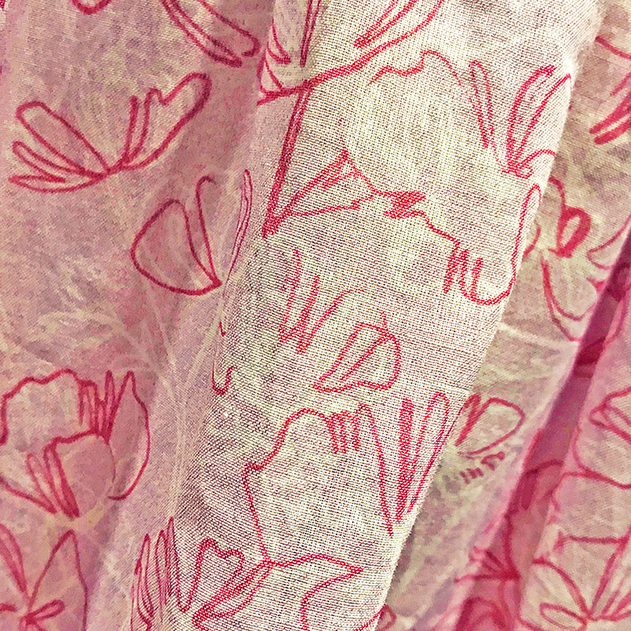
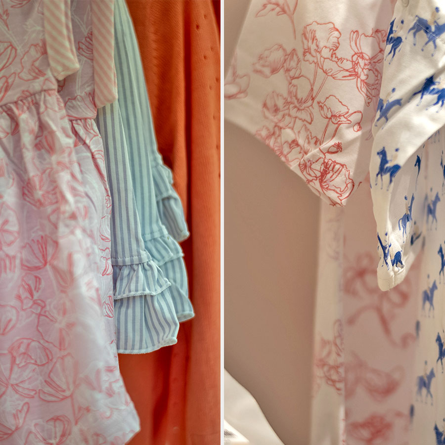
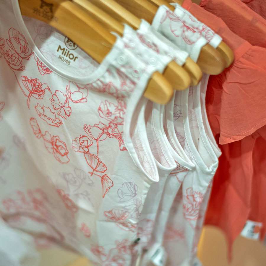
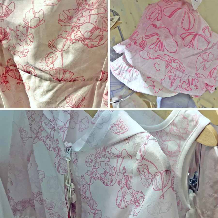
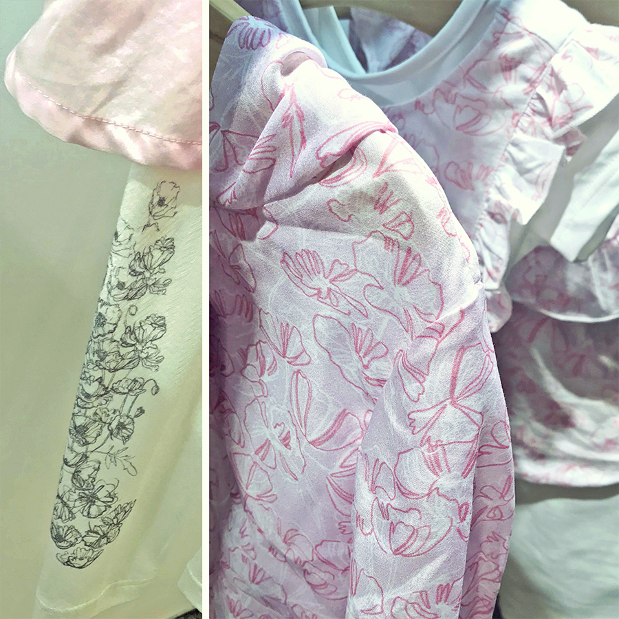
Here’s a selection of different products from this ‘Floral Outline’ pattern series, which incorporate it in multiple ways. These were some of our client’s first samples made to launch their Spring-Summer Collection at trading fairs.
Please note that these images are provided courtesy of the client and Kidspattern and are used for portfolio purposes only.
The serpentine line, or the line of grace, by its waving and winding at the same time different ways, leads the eye in a pleasing manner along the continuity of its variety
— from “Analysis of Beauty“


