Fuchsia
The idea for this in-season floral pattern came from the admiration of the truly fabulous, exquisite shape and coloration of fuchsias in bloom. The florets are bursting with a vivacious display of deep pink, red and purple, with undertones of rose and lavender; all in perfect and enchanting harmony.
Radiant fuchsia, therefore, instills confidence and emanates elegance, optimism and vitality. Often described as a magenta, and as a combination of red and violet, fuchsia contains the passion and power of red, restrained by the introspection and dreaminess of violet.
This project was a part of my ongoing collaboration with Kidspattern. If you’d like to learn more about them please visit their website HERE. Alternatively, view the archive of our previous projects HERE, in which I discuss in detail the history and nature of our work.
All clothing-mockups presented here are provided courtesy of Kidspattern and are used for visualisation purposes only.


Pattern Development
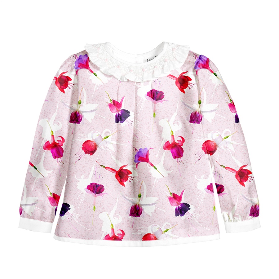
This series was designed with Kidspattern as a part of a commission for our Client’s Spring-Summer collection aimed at girls aged 18–36 months. The signature pattern was planned as a photo based digital print. Its appeal lies in the wonderfully vibrant colour palette of fuchsias, ranging from juicy pinks and reds to luscious purples and violets. These colours excel here at creating a fun, bold and effervescent spring design.
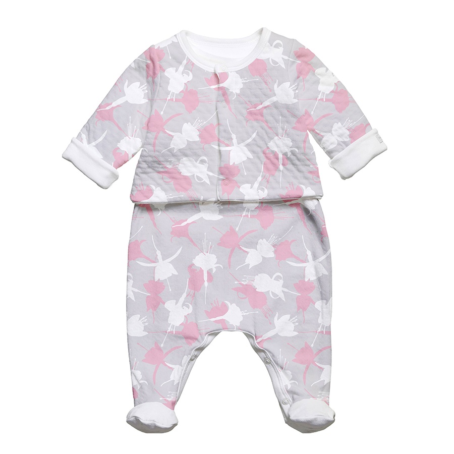
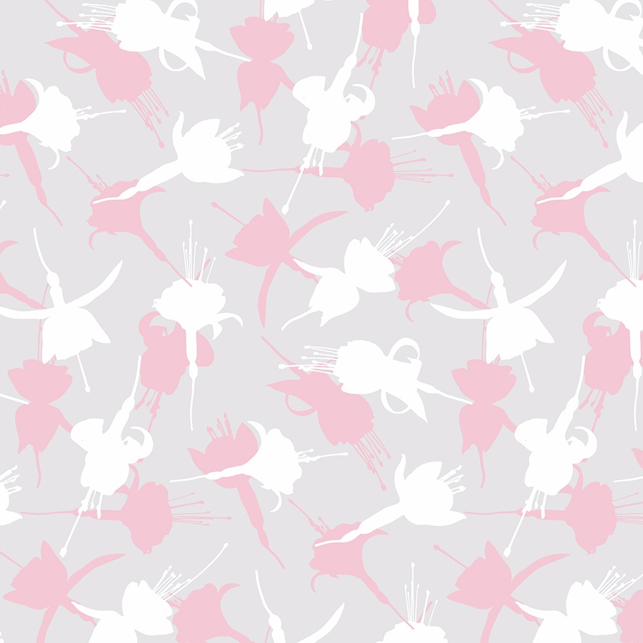
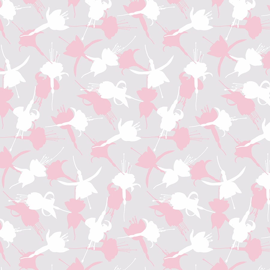
Newborn
Lastly, as Kidspattern, we always provide our clients with a simplified version of each pattern to use in their newborn collection. In this instance, we used only the floral silhouettes, in two colours, distributed in a regular arrangement on a light grey background.
This muting of the colour palette was thought to be more age appropriate and contributing to the overall result which is a much calmer, delicate and soft design that is also straightforward to print.
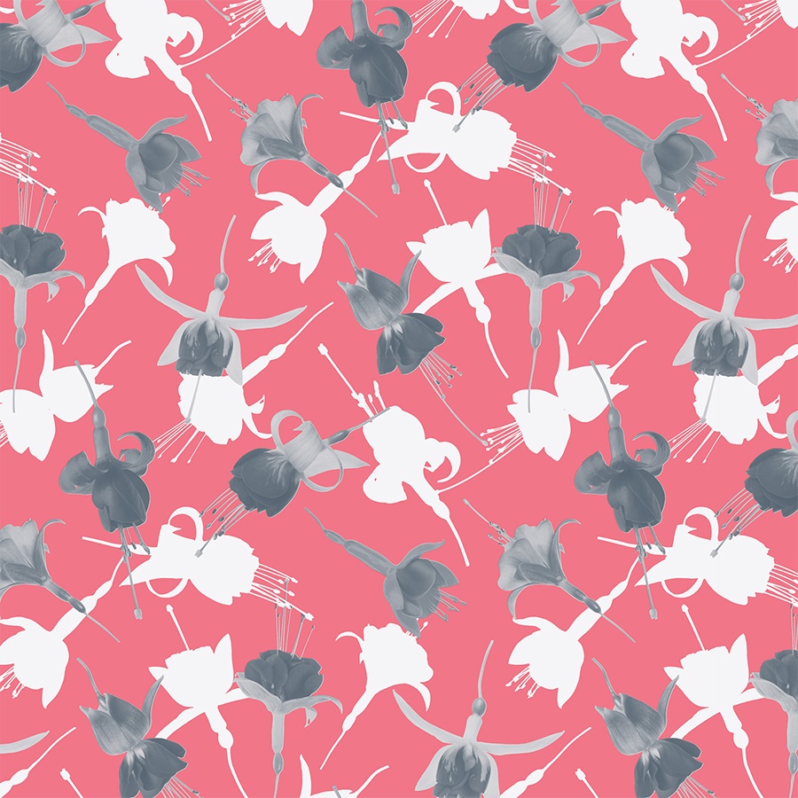
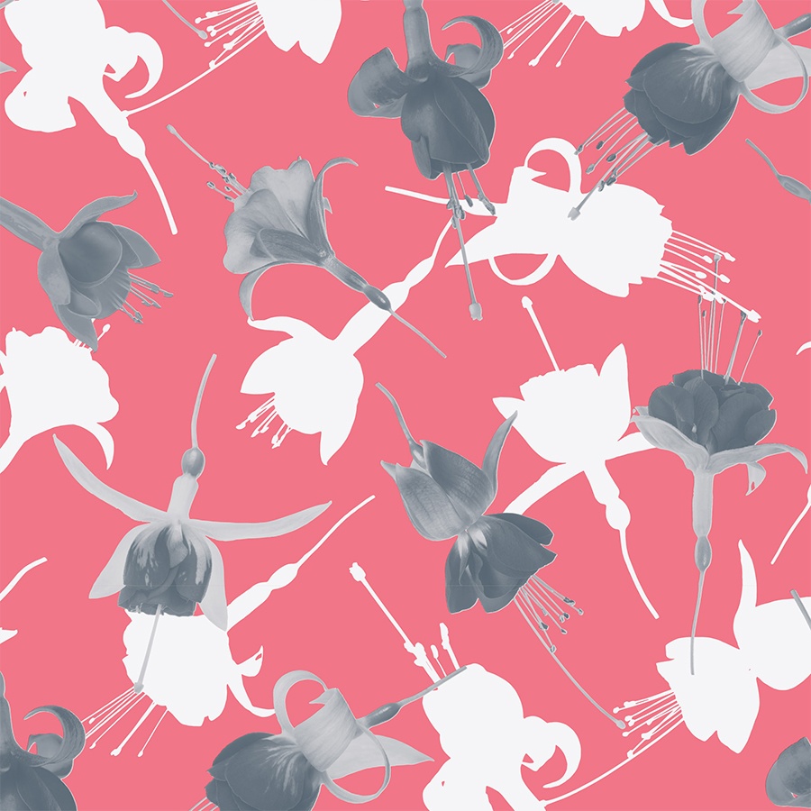
Dark Background
Here, the buds were muted by recolouring them into greyscale. To build contrast, they were tossed amongst the white silhouettes, and then juxtaposed against a deep coral background.
We kept the regularly scattered arrangement of all the elements and visualised them in a relatively large size, so that the pattern maintains a good level of detail in print.
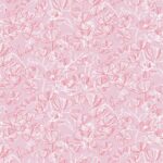
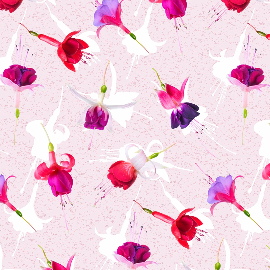
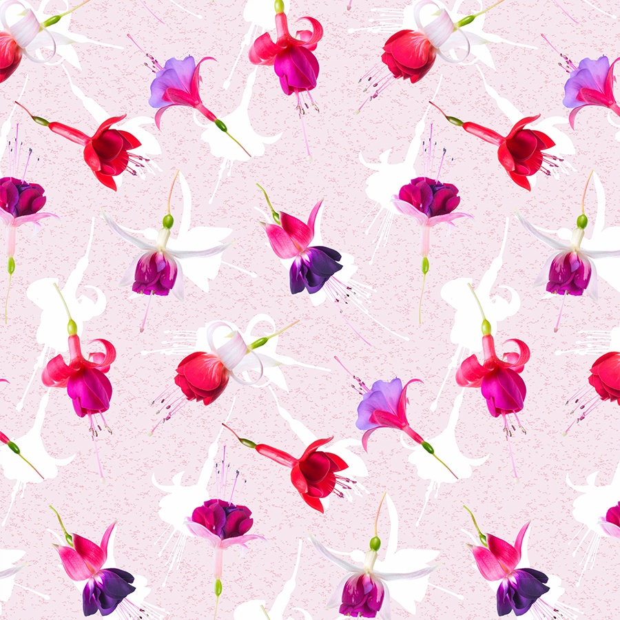
Alternative Colourways
In this version, the photo pattern was set against a light-pink, speckled background that was spotted with flat, white silhouettes of each flower. This mixture of different gradations of texture contributes to the dynamism and integrity of the composition. Additionally, the flowers were enlarged in order to give one a chance to marvel at their intricate forms.
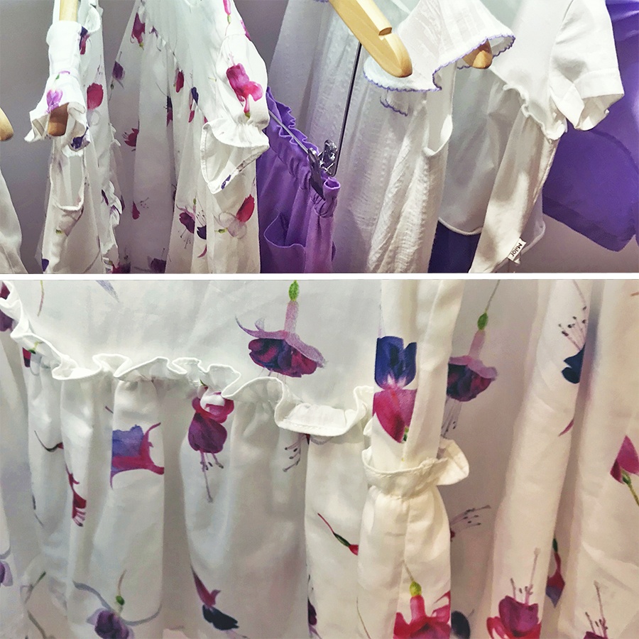
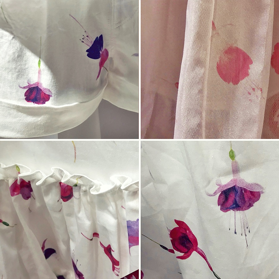
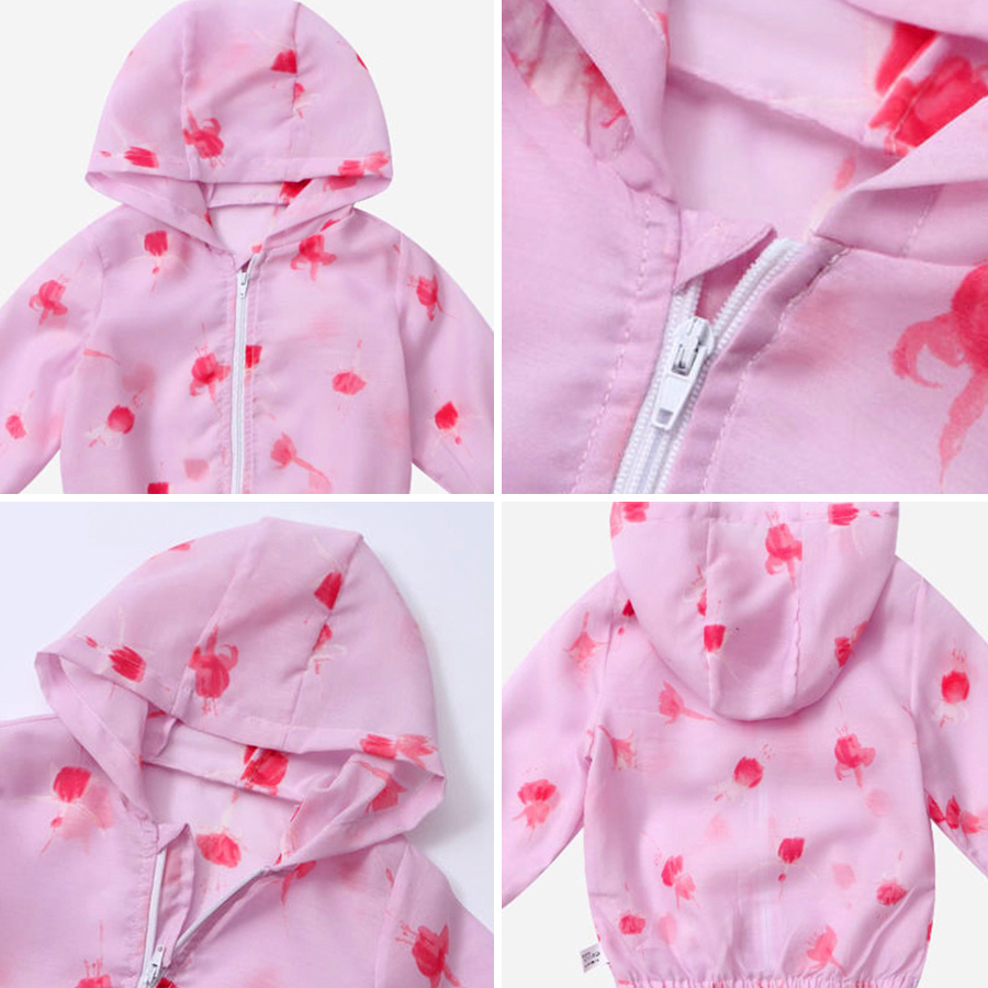
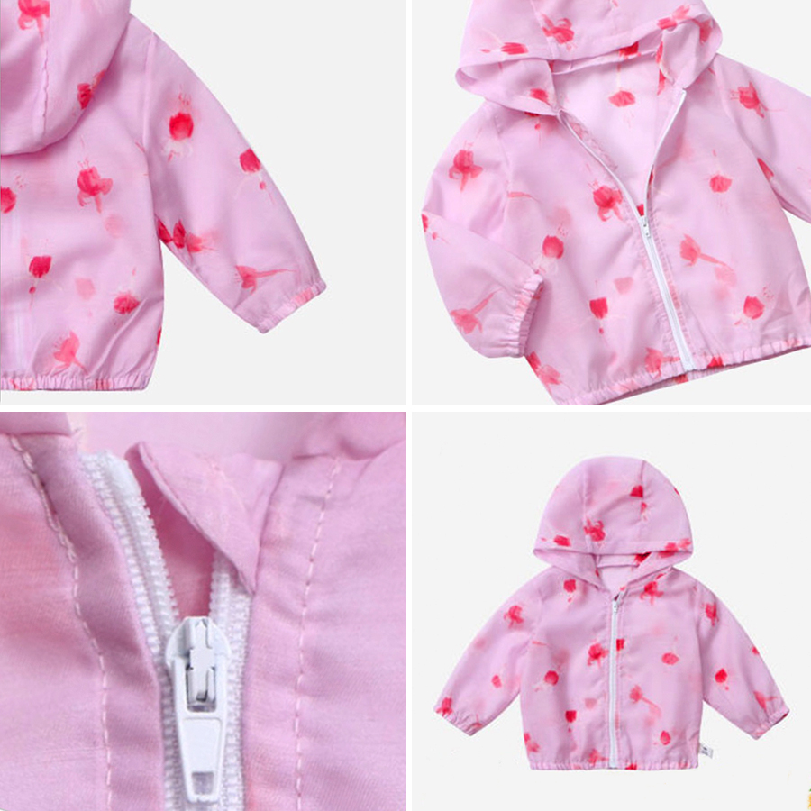
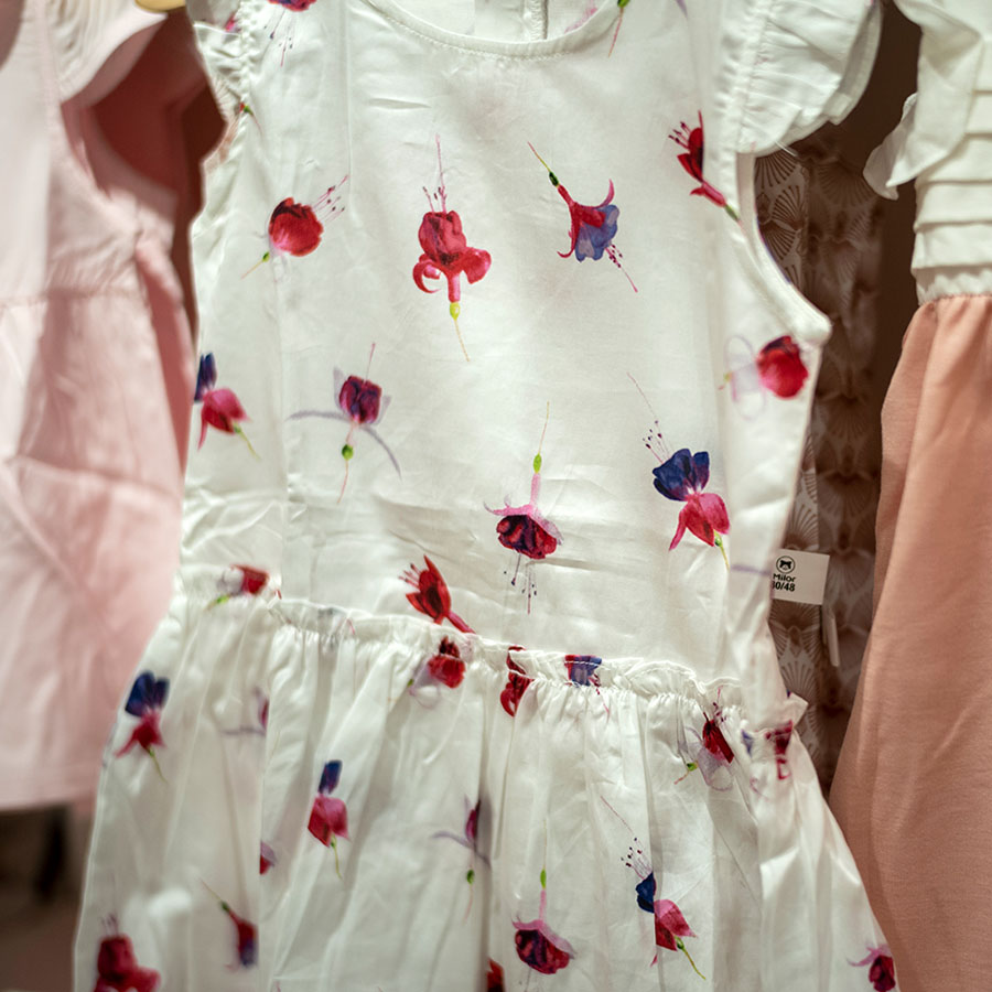
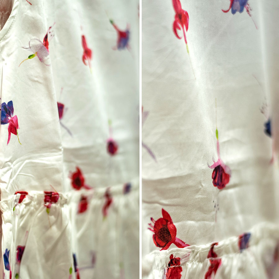
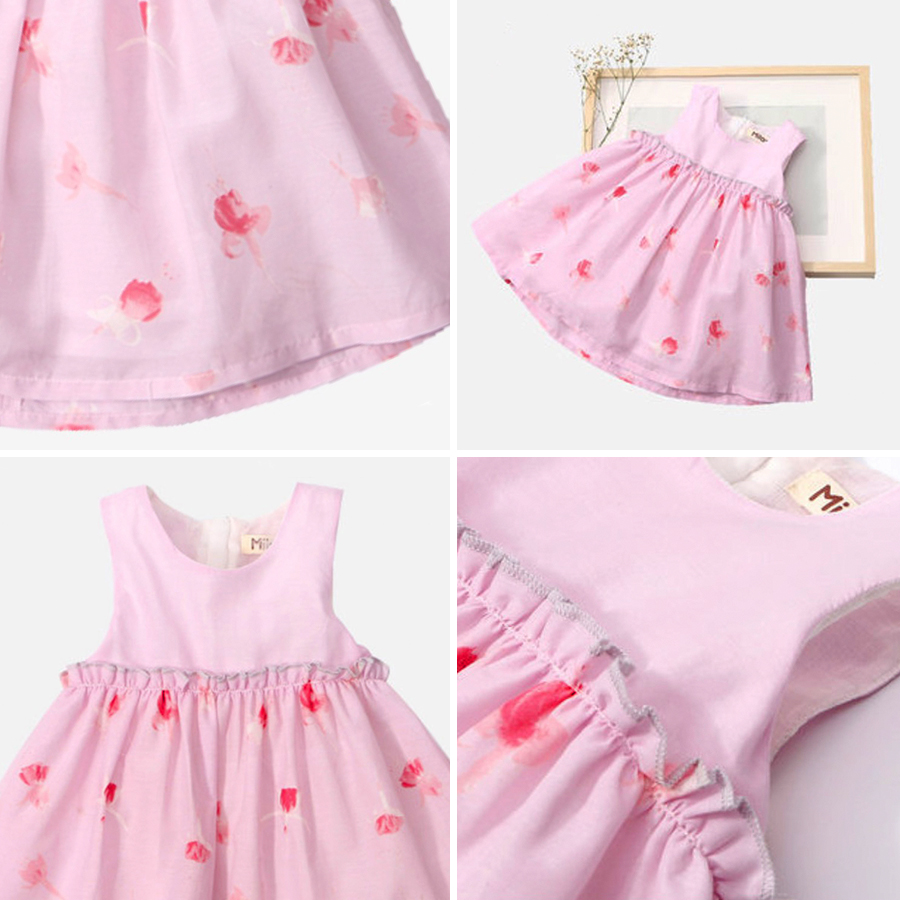
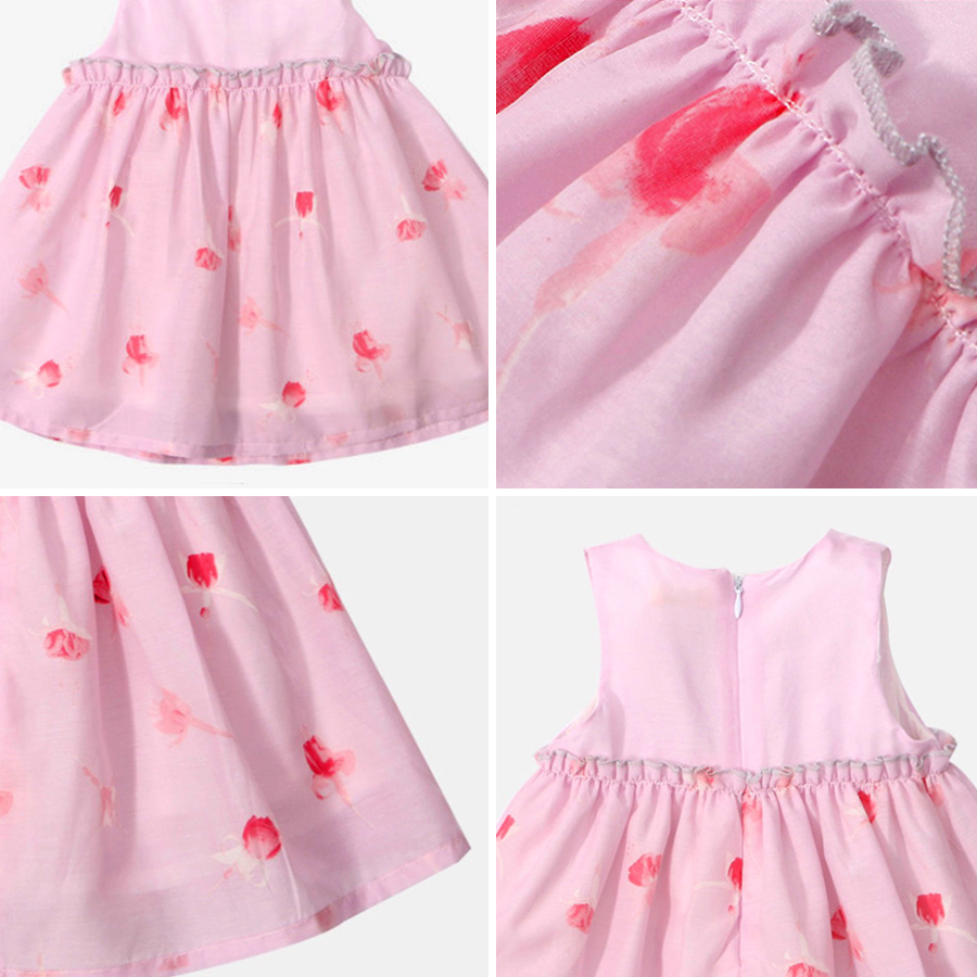
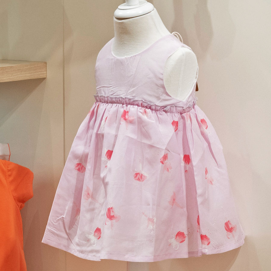
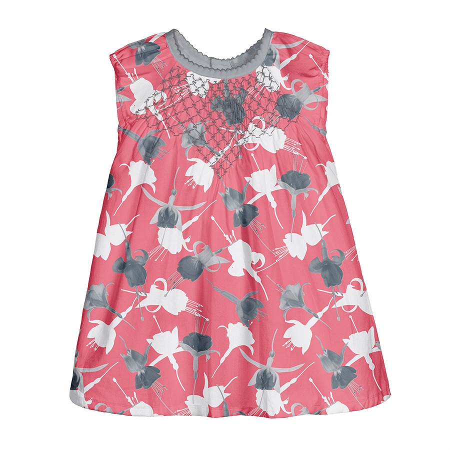
Pattern in Print
Additionally, I’d like to share couple of quick examples of the final Fuchsia pattern in print. These are Client’s first clothing samples, made for the launch of their Spring-Summer collection.
Please note that these images are provided courtesy of the client and Kidspattern and are used for portfolio purposes only.