Graphic Botanicals
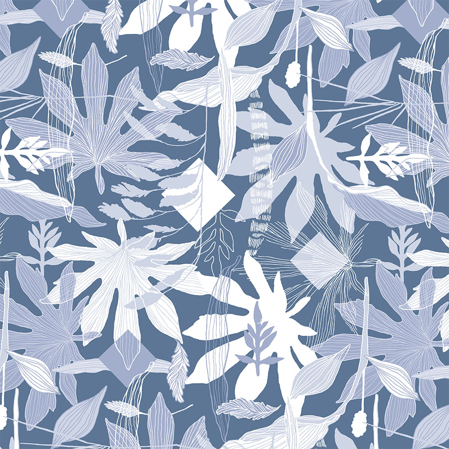
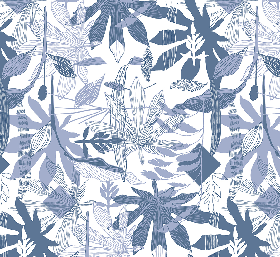
The inspiration for this surface pattern series was derived from the dialogue between geometric and organic elements. This is reflected in the interconnection of digital flat shapes with the hand drawn free-flowing line drawings.
By juxtaposing organised geometrical order, with nature’s elegant shapes, this design contributes to the ongoing relationship between the two.
This surface pattern design project was a part of my ongoing collaboration with Kidspattern. If you’d like to learn more about them please visit their website HERE. Alternatively, view the archive of our previous projects HERE, in which I discuss in detail the history and nature of our work.
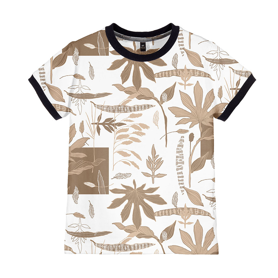
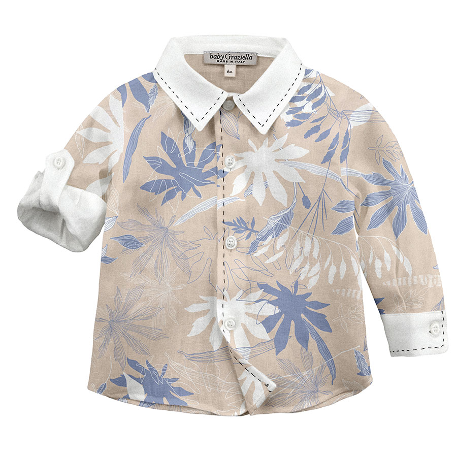
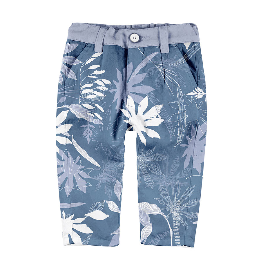
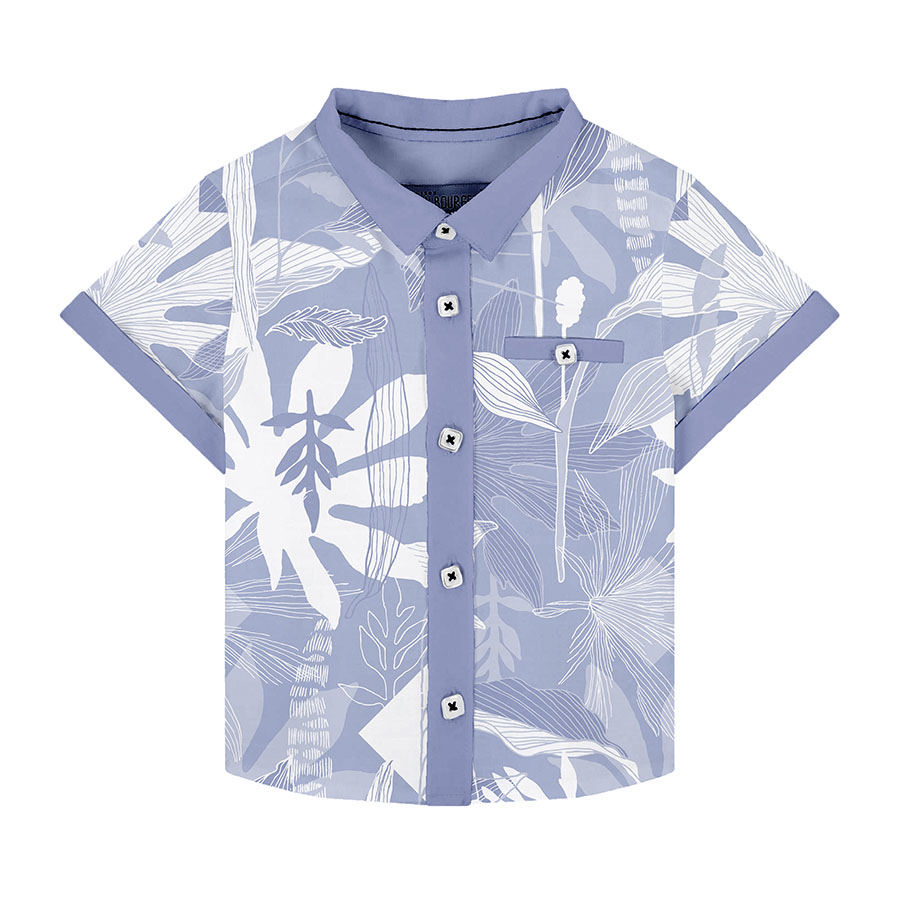
All clothing-mockups presented here are provided courtesy of Kidspattern and are used for visualisation purposes only.
Surface Pattern Brief
This surface pattern series is a briefed commission for a Spring — Summer Collection for boys aged up to 36 months old.
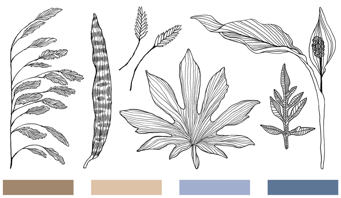
Below you can view the colour palette composed by Kidspattern: two shades of brown matched with a duo of blues (light and dark). The palette is also shared with another pattern set from the same group. To view “Leaf Veins” please click HERE.
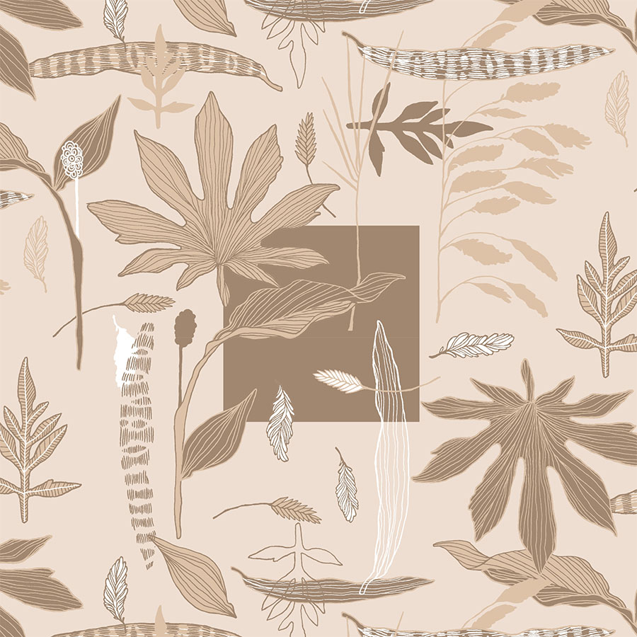
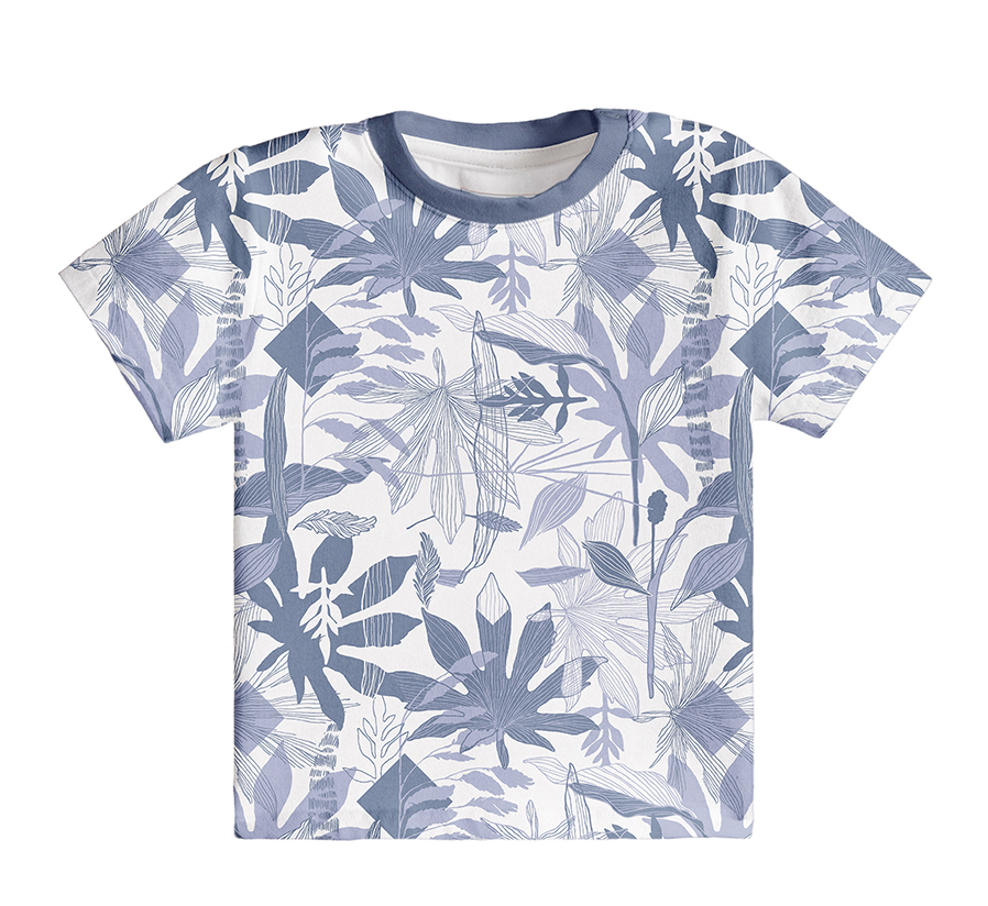
To create the elements used in this surface pattern, the process began with a linear outline of differently shaped leaves and botanicals with a digital ink pen. The main concept for this design involved using these in a graphic composition structured around a flat, dark anchor point. This contrast was created by juxtaposing geometrical shapes with natural ones, bringing in both abstract and organic qualities to the design.
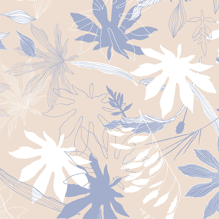
Further arrangements have the elements brought closer together, so that they start layering on top of one other. This resulted in an interesting overlapping effect, making this series very dimensional. These patterns are fuelled by interactions between the lines and shapes of each element within the graphic composition.
Geometric Shape
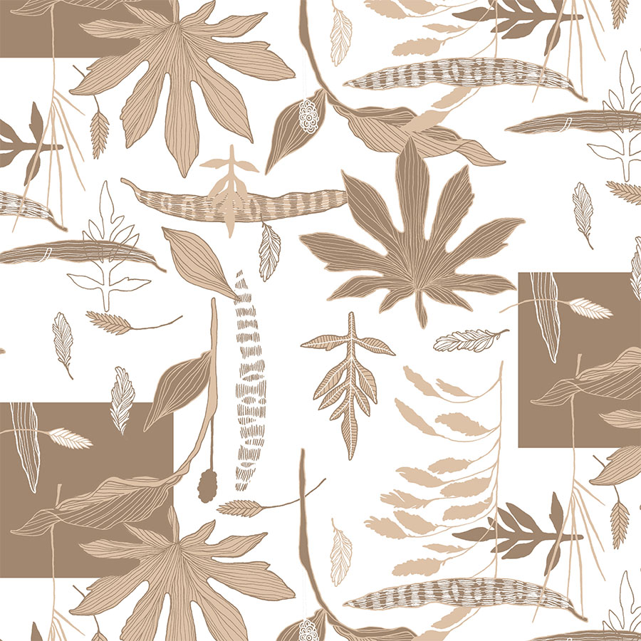
This is the main arrangement of this surface pattern series featuring an addition of a bold graphic square. The square acts as a focal point, whilst the remaining elements are arranged and ordered neatly as a surrounding flat lay.
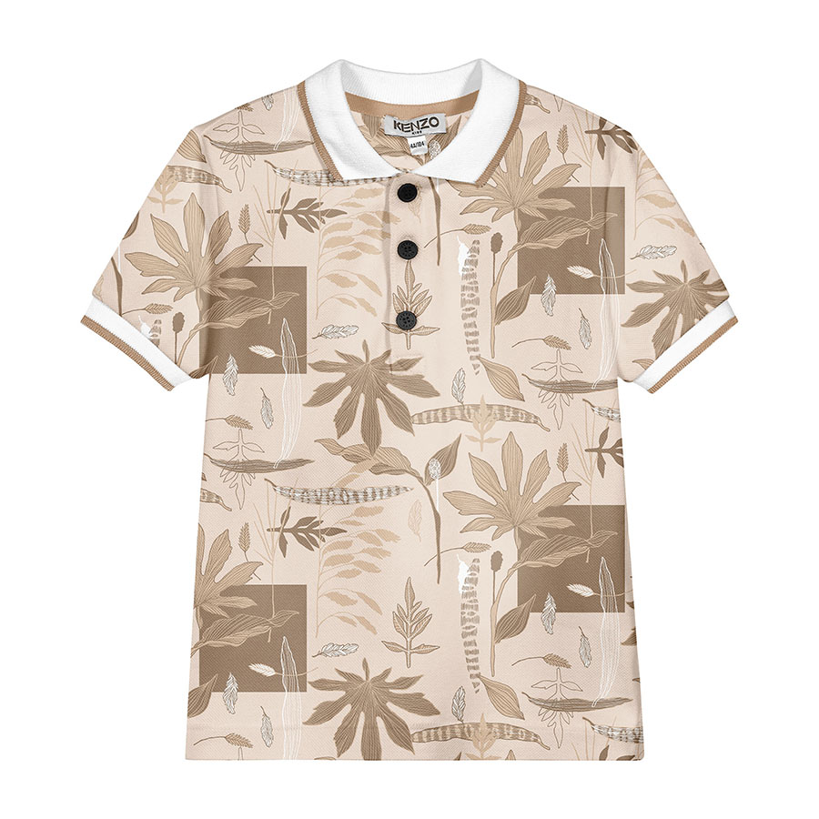
Here, the design is recoloured in brown shades from the palette, and is visualised in both large and medium sizes on a white, as well as tinted brown backgrounds. This arrangement was selected by the client and went to print.
Additional Spacing
In both of these surface pattern versions, the botanical elements are spread further apart and are also rotated. This offers a more spacious and irregular arrangement. The total number of colours used here is reduced to only two.
In the first recolouring, for variation, the pattern is placed atop a light cream background to combine the blues and browns from the palette.
Blue Jungle
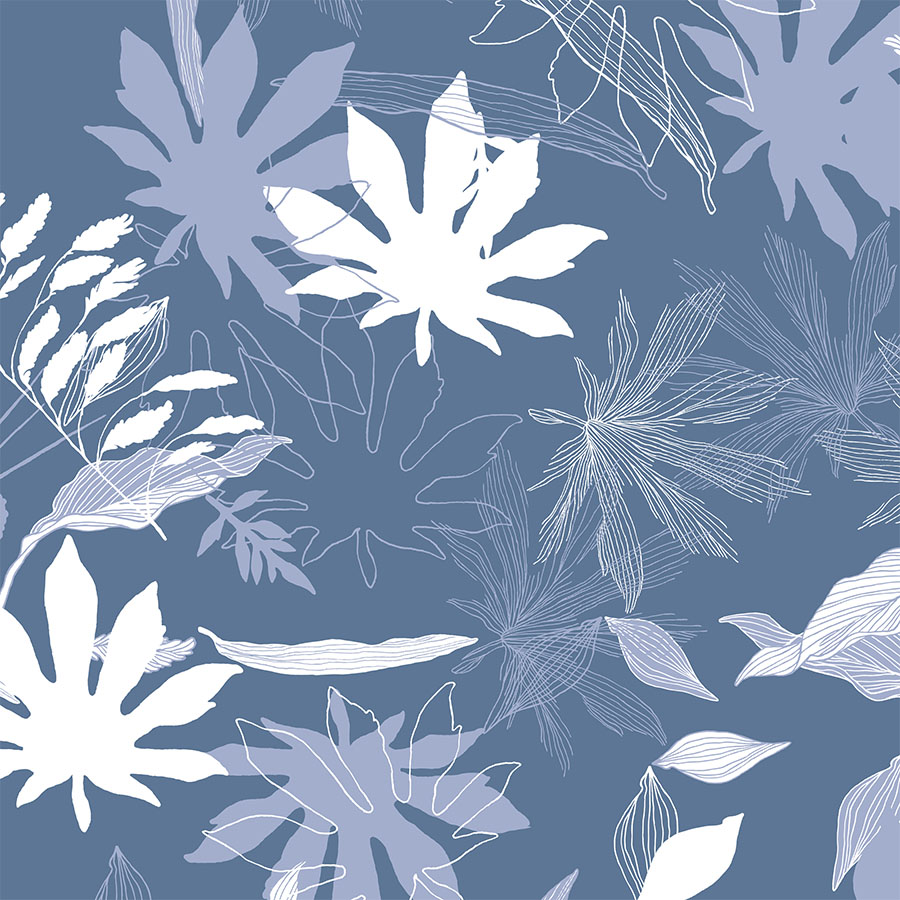
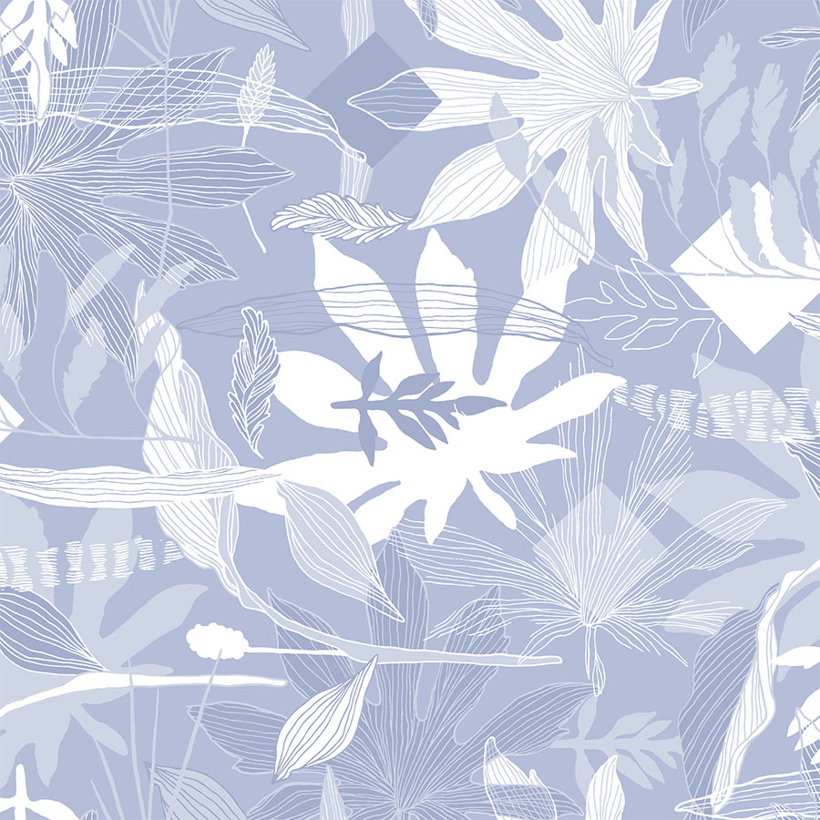
In these surface patterns, all parts of the elements are overlaying each other, which creates a sensation of a dense foliage. In this close-up, you can see more of the details of the intertwining drawings.
To end, these are recoloured in a monochrome blue with an addition of white. Placed atop both light and dark blue backgrounds they are visualised in both: medium and large sizes.
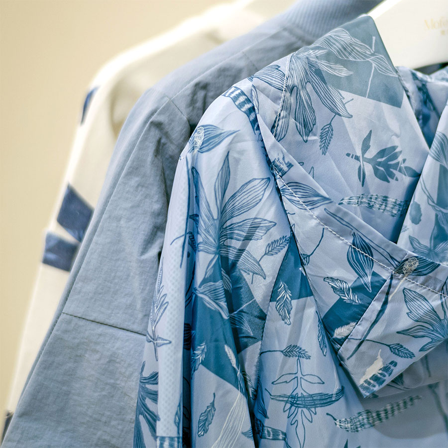
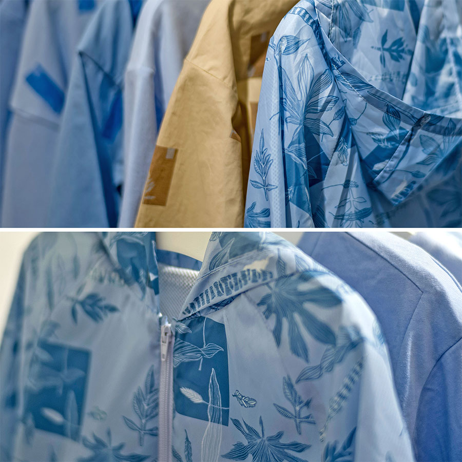
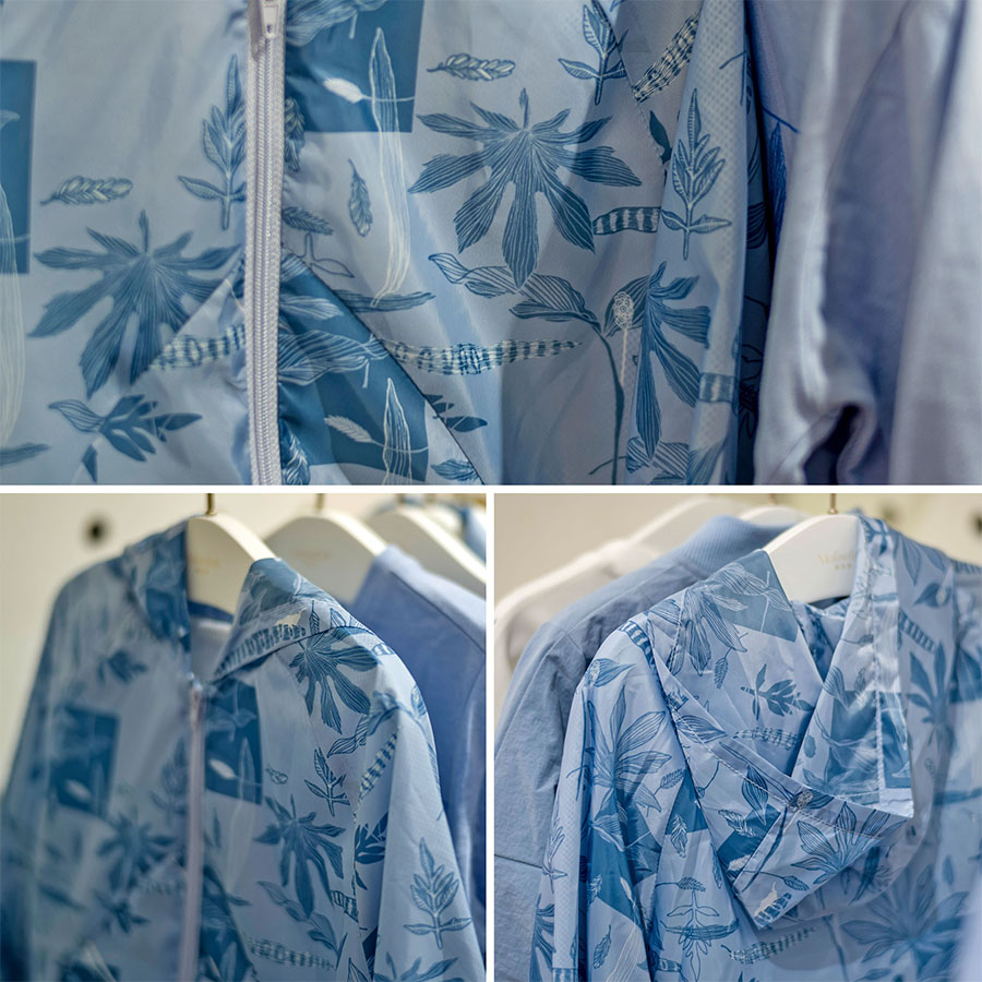
Surface Pattern in Print
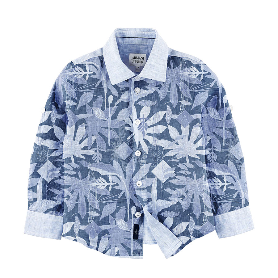
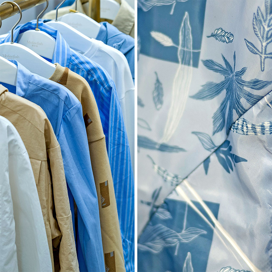
Please browse through a slideshow selection of a few examples of this pattern in print. These are photographs from the launch of the client’s Spring-Summer Collection in their brand shop. Here you may observe how the pattern was used and how it fits within the wider context of the colour group.
Please note that these images are provided courtesy of the client and Kidspattern and are used for portfolio purposes only.
“I’m like a plant, I reach for the sun.”


