Urban Jungle
Impenetrable and unknowable, the tropical rainforest has an abundance of inhabitants and is bursting with life. This wealth of inspiration contributes to it being one of the most prevalent trends in pattern design.
As a motif it speaks to our human desire for adventure; our wanderlust for travelling to and exploring exotic lands; and our deep need for growth, represented in the jungle’s dense vegetation.
Indeed our natural yearning to reconnect with nature and escape the built environment seems to make our Jungle fantasies more relevant than ever.
This surface pattern design project was a part of my ongoing collaboration with Kidspattern. If you’d like to learn more about them please visit their website HERE. Alternatively, view the archive of our previous projects HERE, in which I discuss in detail the history and nature of our work.
All clothing-mockups presented here are provided courtesy of Kidspattern and are used for visualisation purposes only.
Surface Pattern Design — Case Study
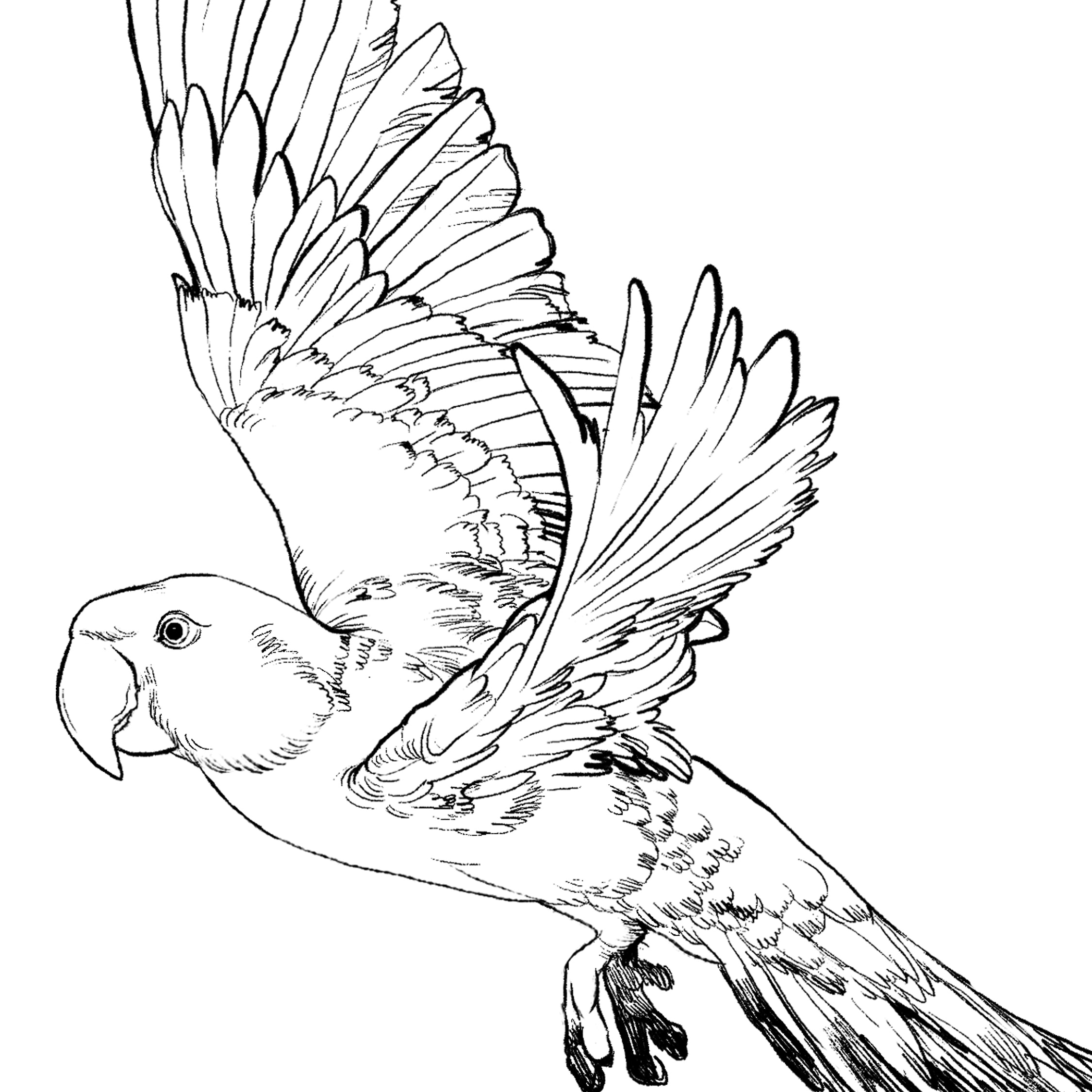
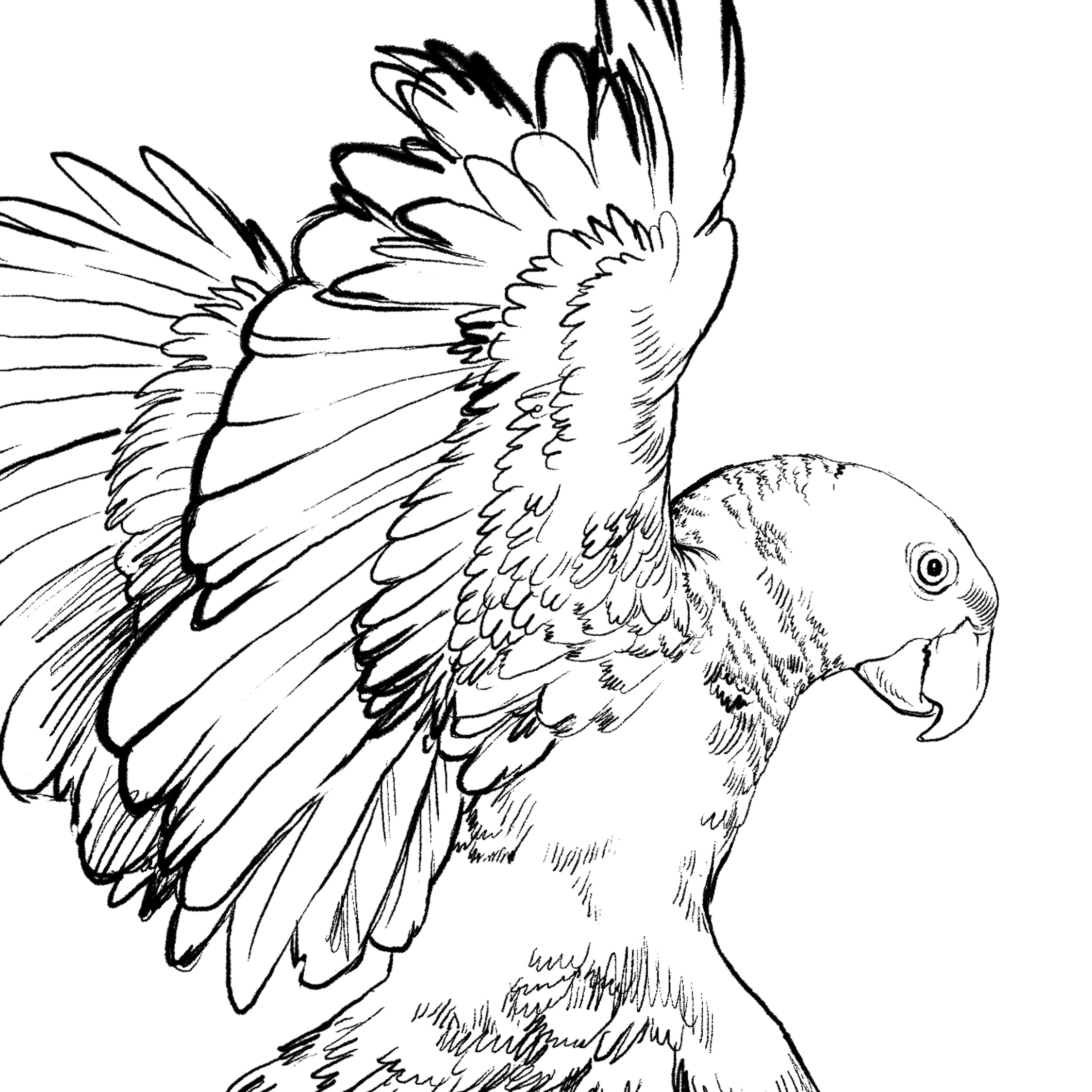
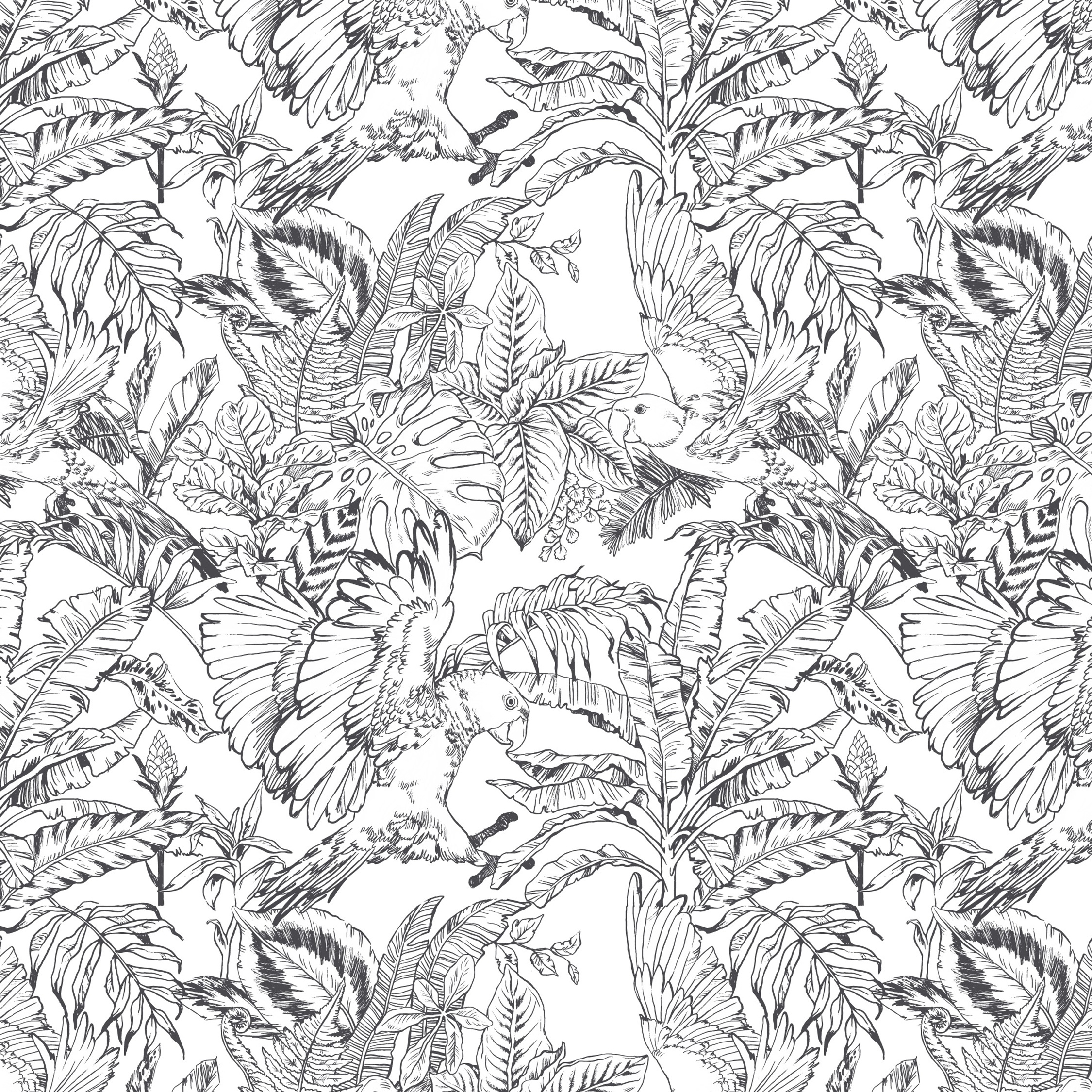
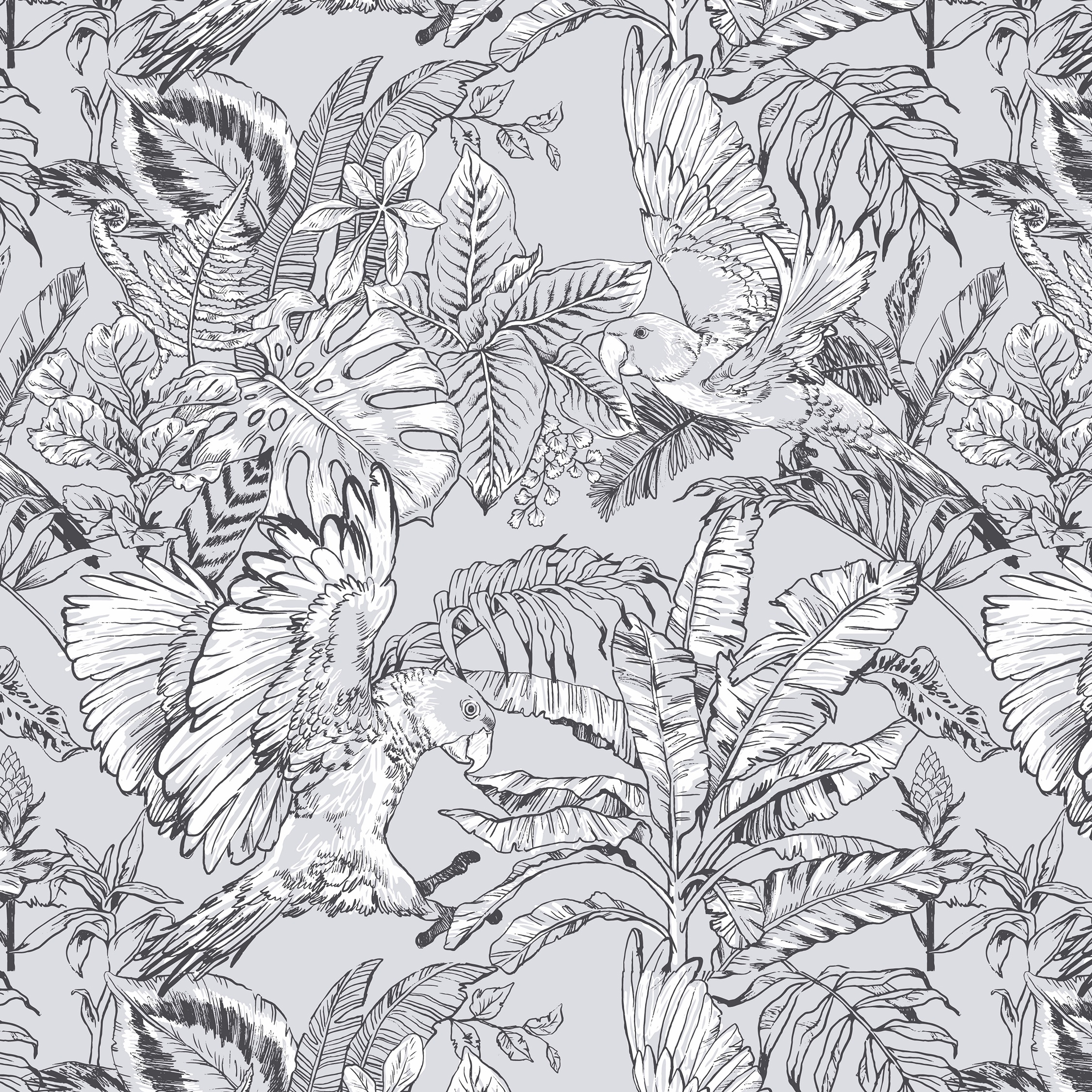
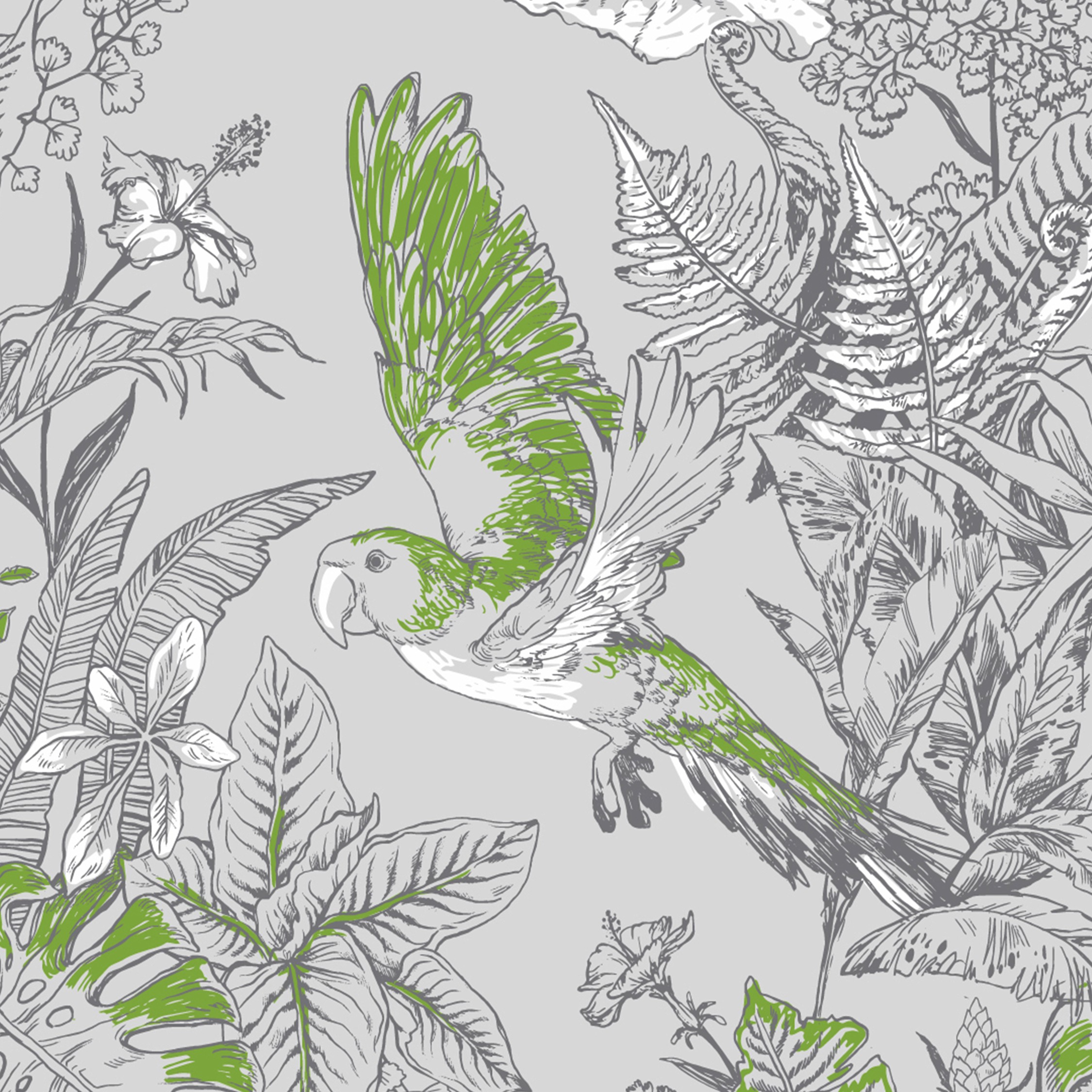
This jungle-inspired surface pattern design series was developed with Kidspattern as a commission for a client’s Spring-Summer kidswear collection. I’ve based my illustration around one of the jungle’s most recognisable inhabitants, the parrot and portrayed two of these splendid beasts in flight, navigating their way through a labyrinth of rich foliage.
In creating the hand-drawn elements here I worked with a ‘leaky ink’ pen. This gave the outlines a more expressive and dynamic feel, whilst the pattern remained a straightforward single colour print.
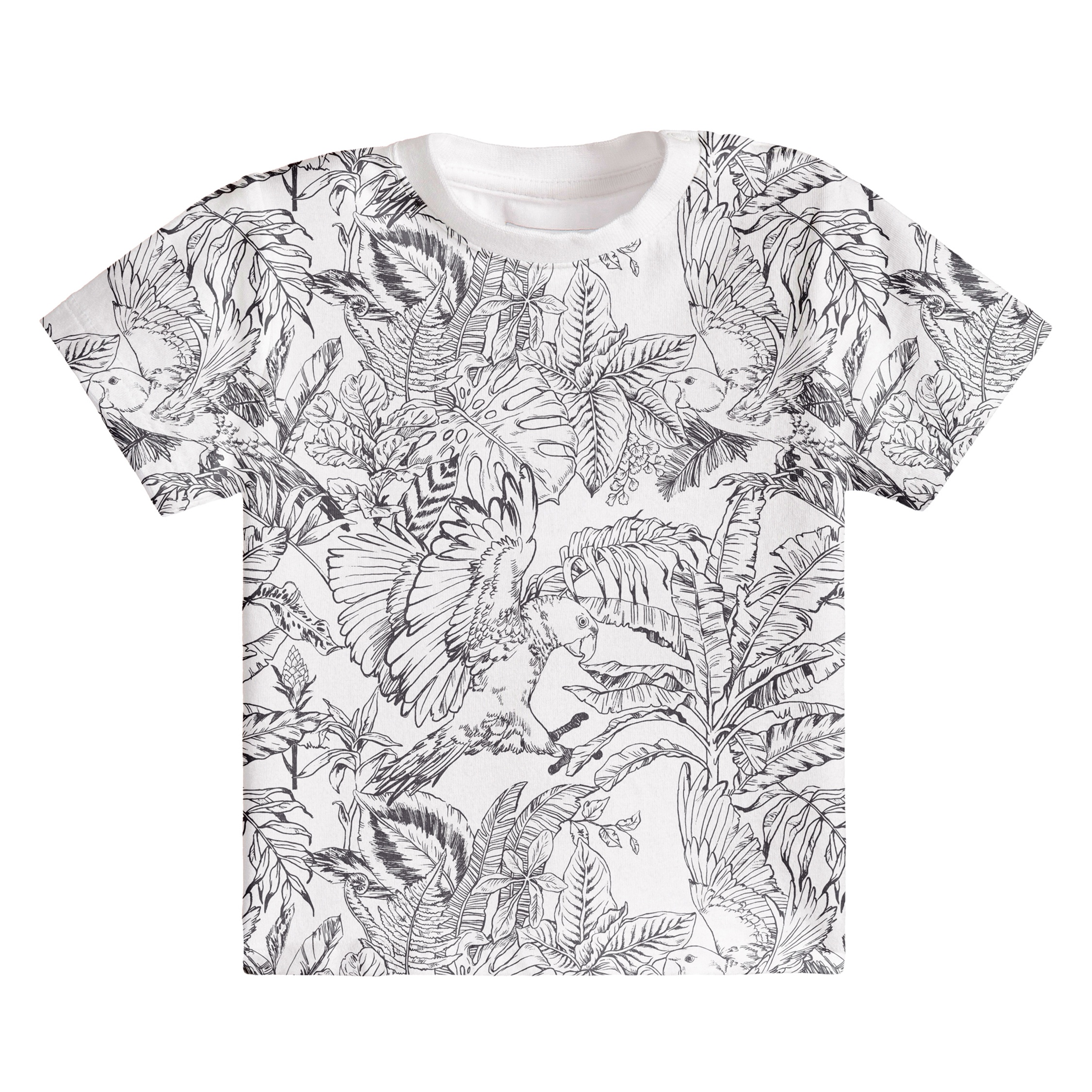
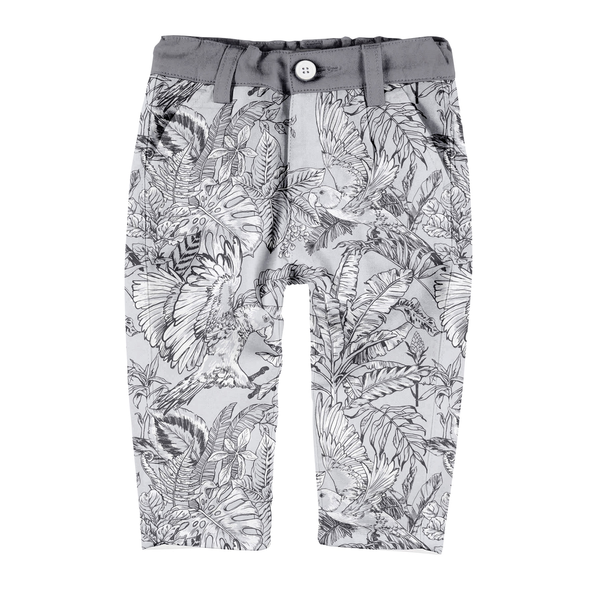
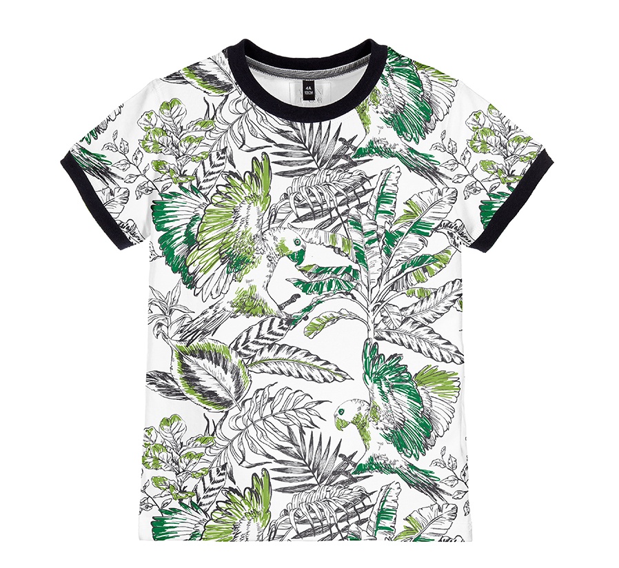
The module was arranged in simple repeat and presented on a unisex white t‑shirt, which contrasted well with the dark lines of the drawing. An additional colourway had the design positioned against a grey background, with an extra layer of white highlights on top.
GENDER SPECIFIC VARIATIONS
Jungle Pattern for Boys
At this point in the surface pattern’s development it was decided that the design should be split into two complementary versions — one more tailored for boys and the other more so for girls.
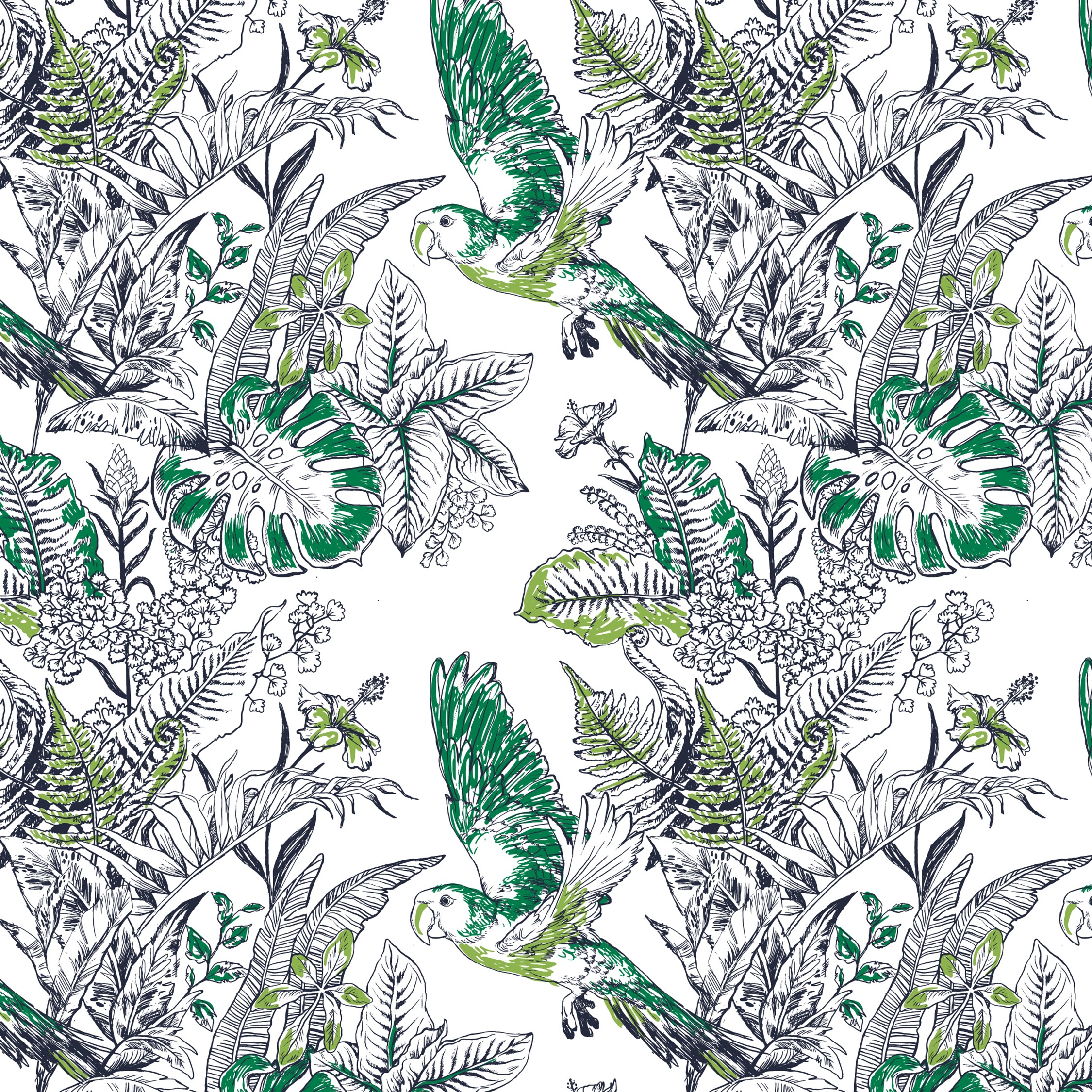
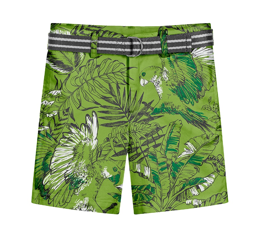
To fit in with the broader colour palette of the collection we introduced two saturated greens to be used as highlights. These were presented in a scribbly, ‘colouring-in’ book, style that matched the energy of the dynamic lines within the drawing. Below you can view the version of the surface pattern design that was developed for boys. Alongside it I’ve attached a recoloured version, placed on a vibrant green background and visualised on a pair of summer shorts.
Girls: Version 1
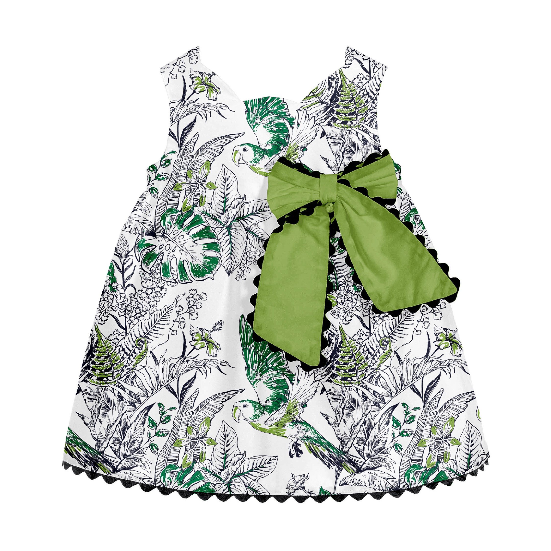
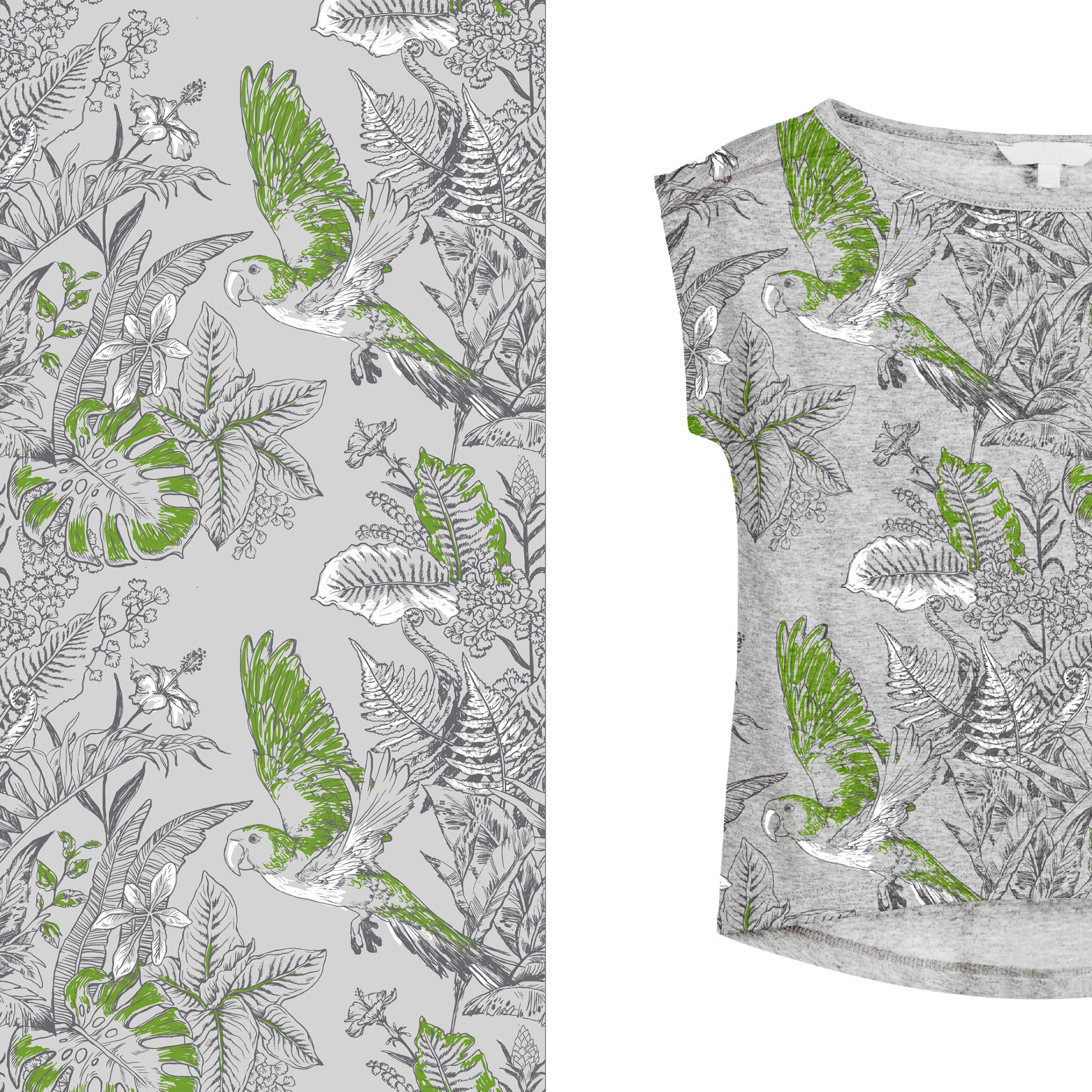
Here is an alternate version of the surface pattern that was developed for the girls range within the collection (aged up to 36 months). It was coloured in broadly the same way as the design for boys and thus was set up to partner it.
Note though that this version did present a more muted, alternative colourway, which blends in well when used on a grey, textured cotton. Here the green and white accents are still present but set a more subtle, gentler, visual rhythm.
Girls: Version 2
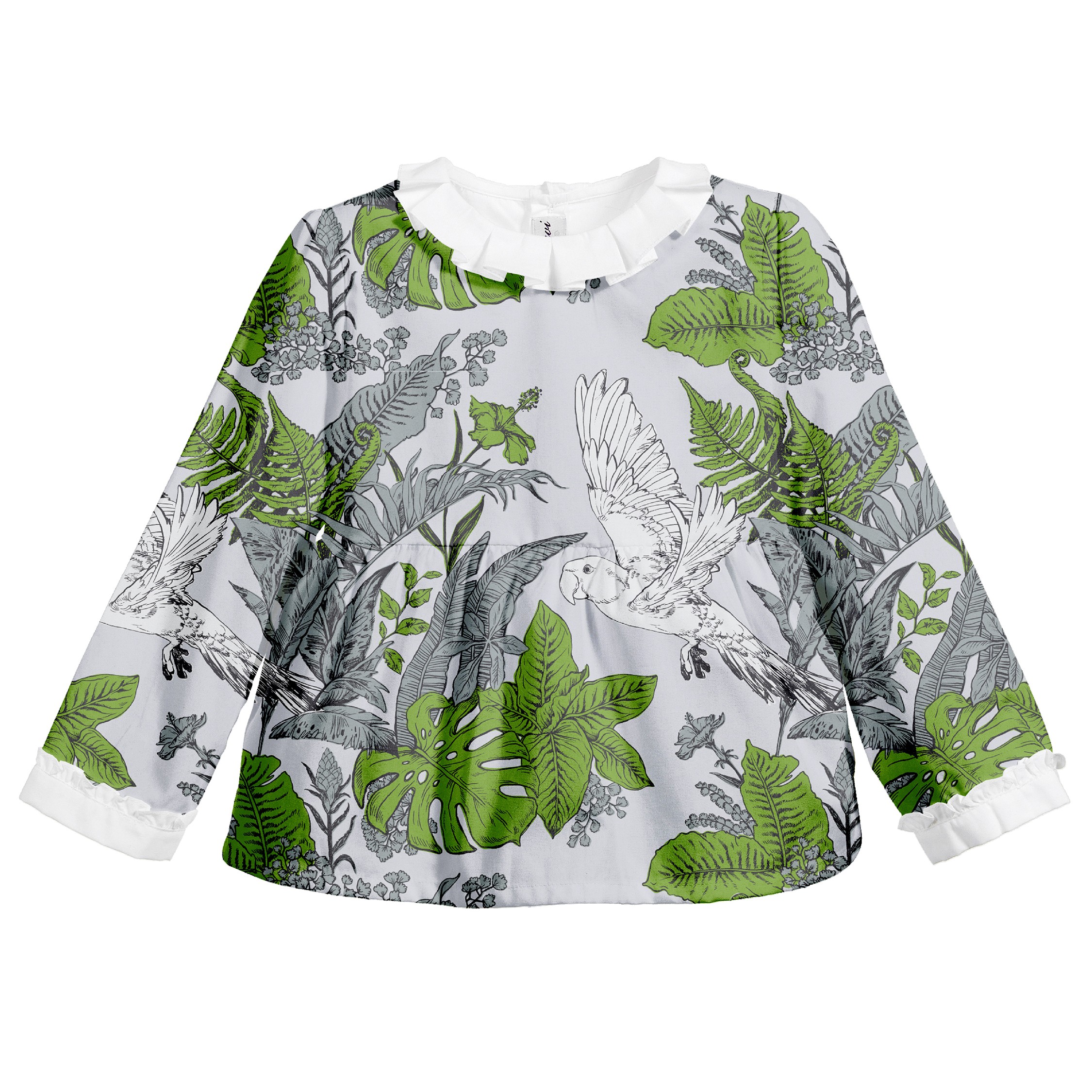
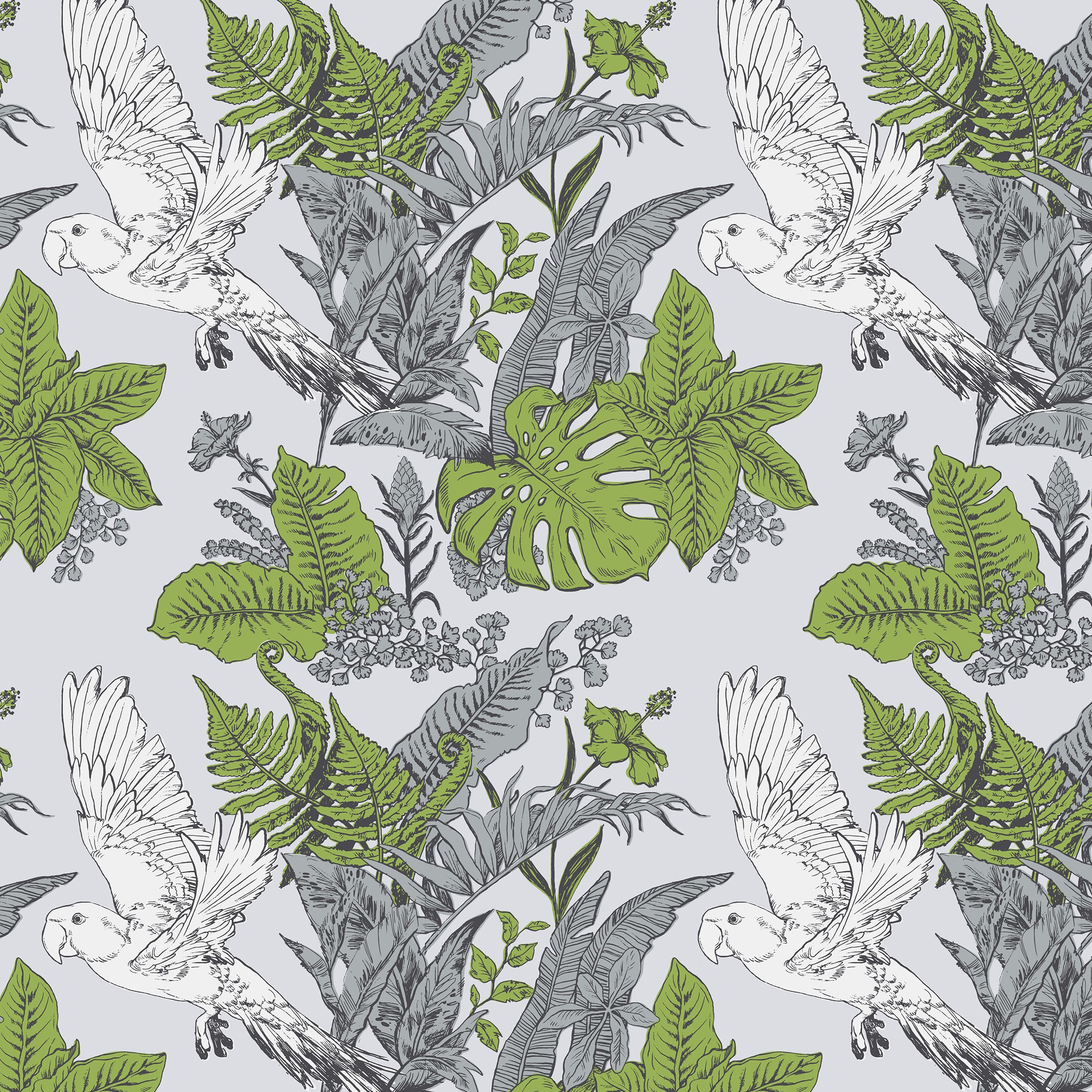
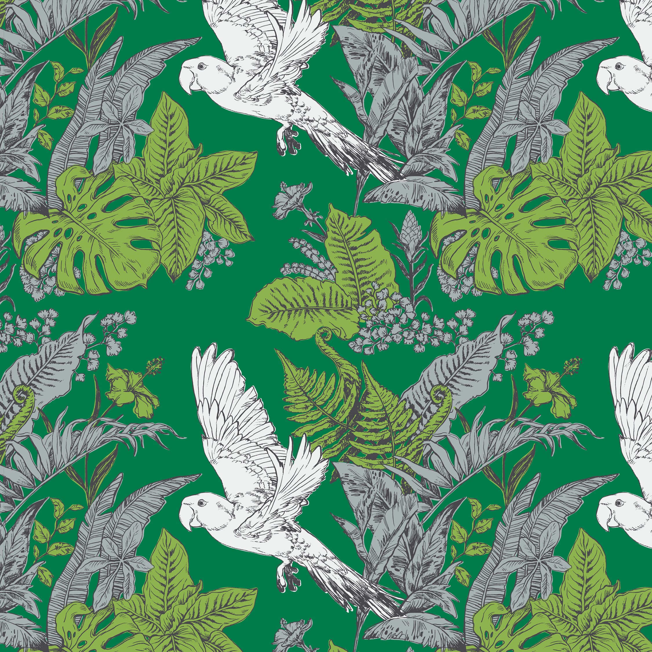
The fill for the colour in the hand-drawn elements was flattened and smoothed here, making the design appear more clean-cut, modern and sleek. This fill also balanced better with the energy of the quivering ‘leaky-ink’ line being used.
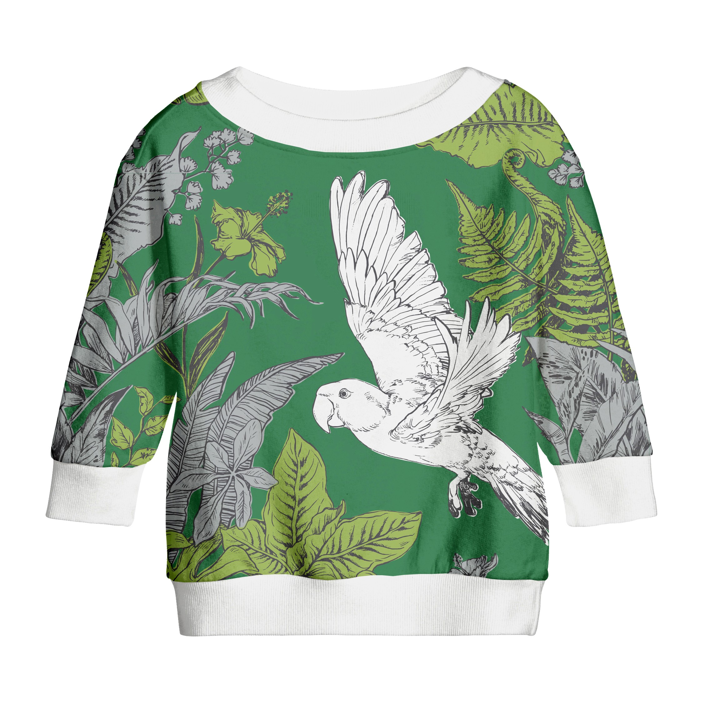
The greens of the colour palette are yet more prevalent here too. Placing the pattern design on a dark-green background has added more weight and depth to it, whilst the white parrot is a more eye-catching element that really stands out.
The surface pattern is visualised here, on a jumper, in an oversized manner that has the parrot in the middle and the botanicals spreading along the sleeves. This more colour-saturated portrayal really accentuates the opulent and mysterious notes within the Jungle motif.
Girls: Version 3
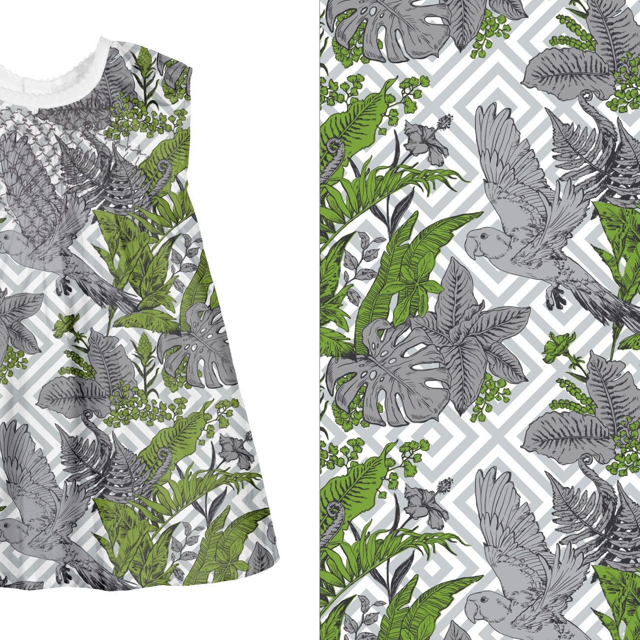
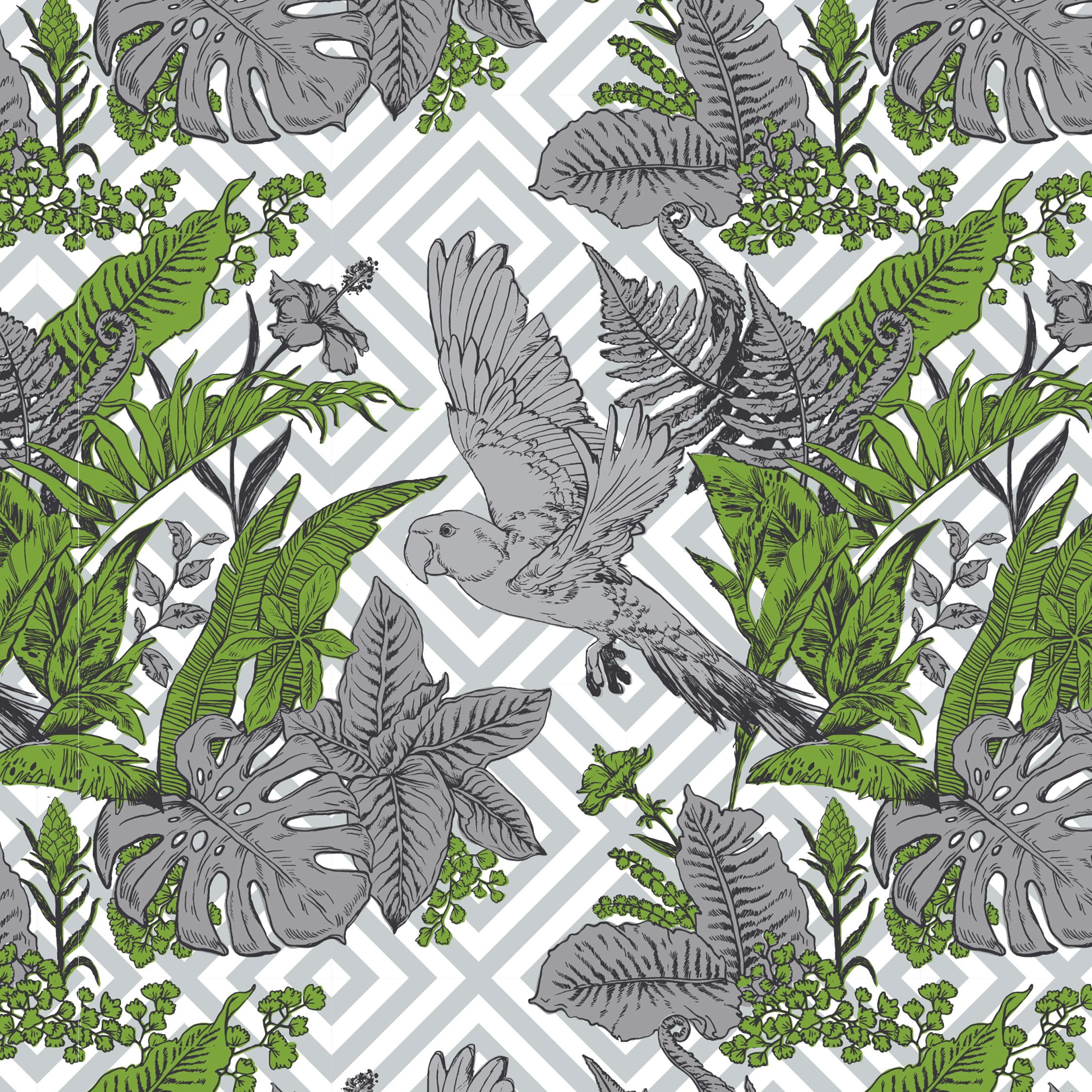
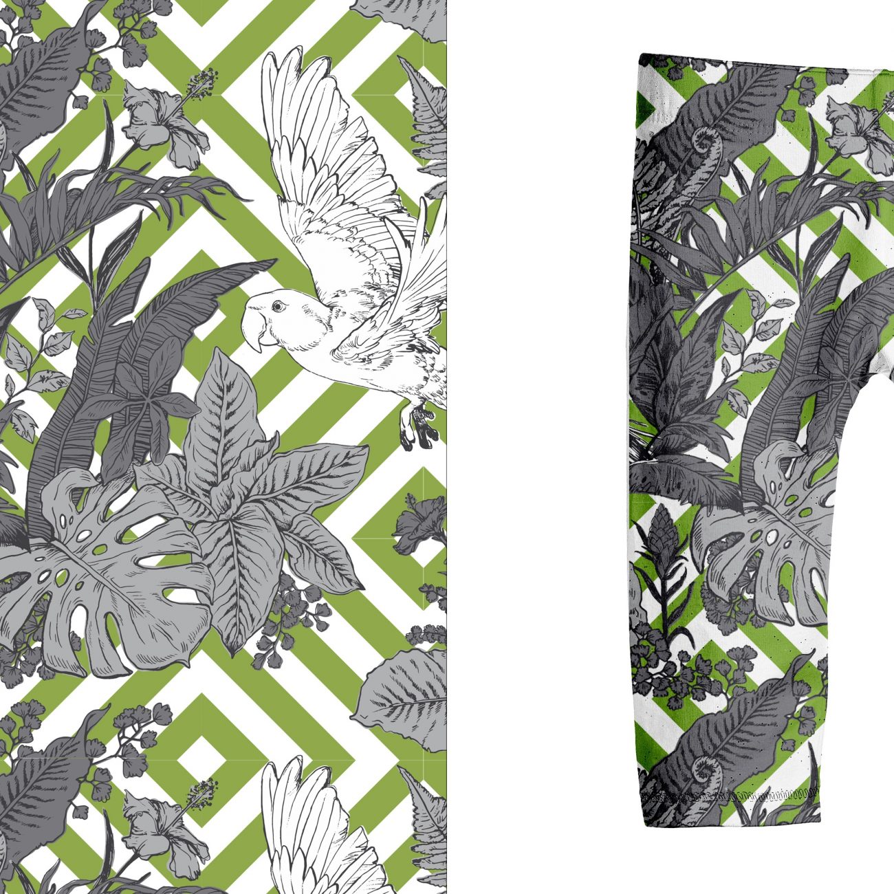
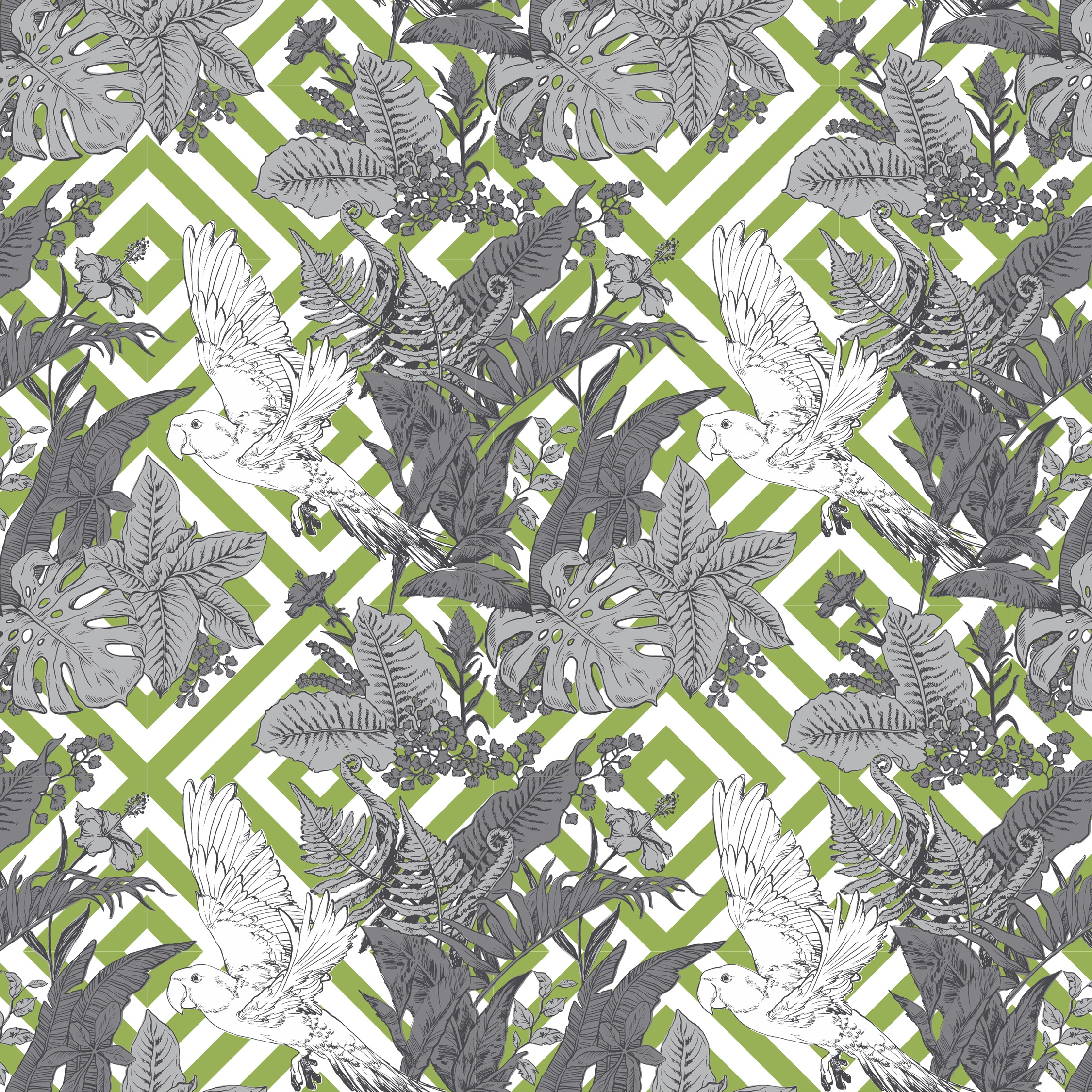
Lastly, in one further update to the design I juxtaposed it against a background containing a bold, geometric pattern. This clash between the organic and the orthogonal lines in the overlaid surface patterns sets up a contrast that, by comparison, highlights the wild unruliness of the jungle elements.
Using a predominantly grey palette, with a touch of juicy, vibrant, green the design is now much more modern looking and possibly more suited to an older age-group as well.
Pattern in Print
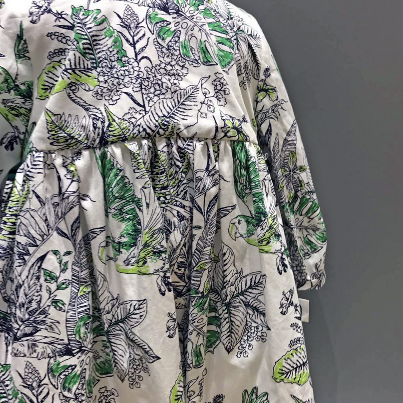
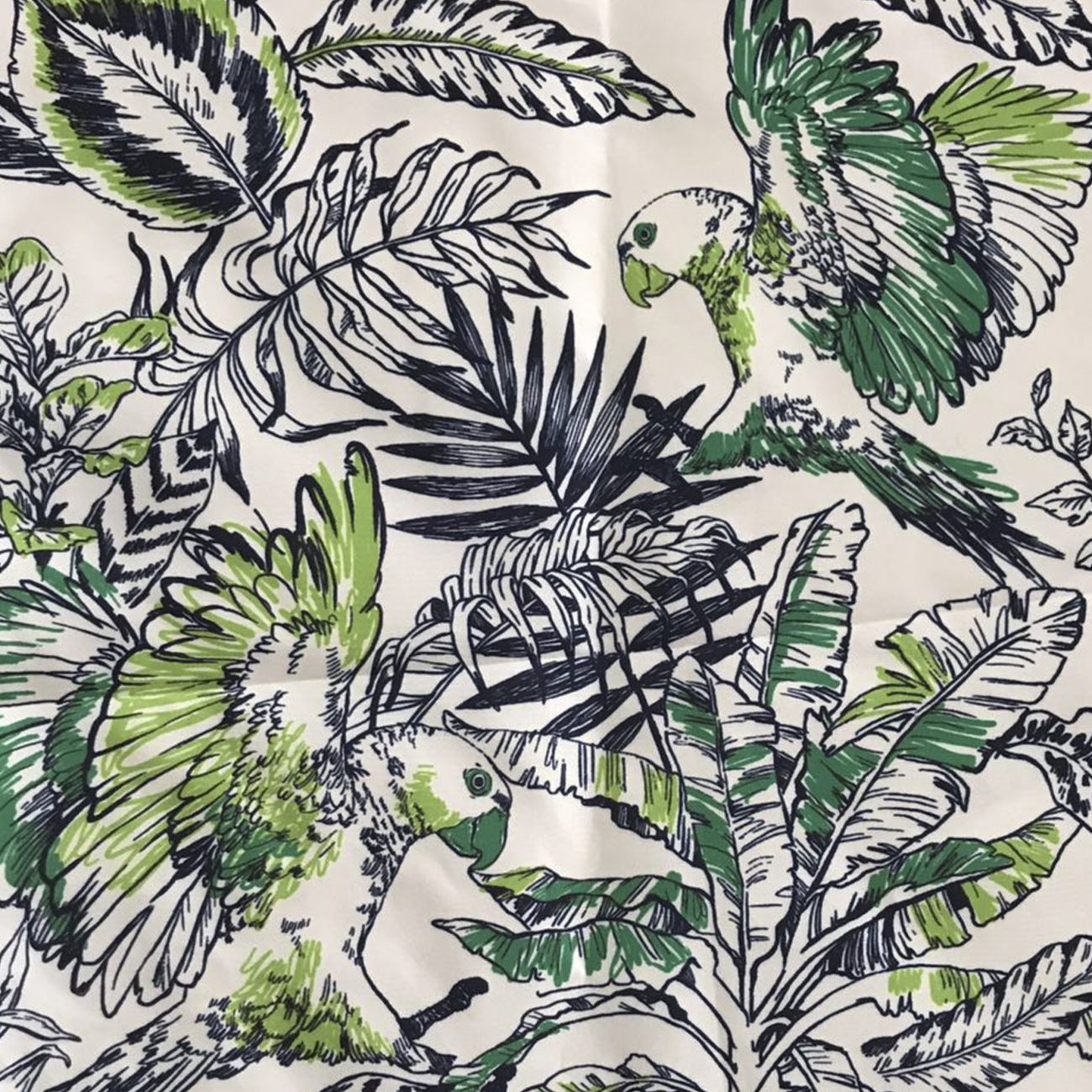
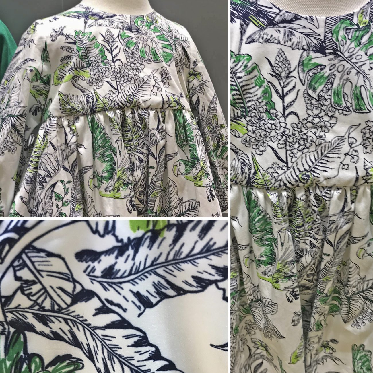
Below you can view a few quick snaps of the first clothing samples using these surface pattern designs. These were the final designs purchased by the client for incorporation into their Spring-Summer Collections.
Disclaimer: These images are provided courtesy of the client and Kidspattern and are used for portfolio purposes only.
“A brave heart and a courteous tongue. They shall carry thee far through the jungle, manling.”


