Leaf Venation
Welcome to a surface pattern design case study called “Leaf Venation”. It was inspired by the fine design the smallest of nature’s creations. Through magnifying leaves, the translucent structure offers an opportunity to marvel at its intricacies.
The highlighted venation system reminds us of the life pulsating in their veins, as well as our own connection to all living things.
This pattern design project was a part of my ongoing collaboration with Kidspattern. If you’d like to learn more about them please visit their website HERE. Alternatively, view the archive of our previous projects HERE, in which I discuss in detail the history and nature of our work.
All clothing-mockups presented here are provided courtesy of Kidspattern and are used for visualisation purposes only.
Overview
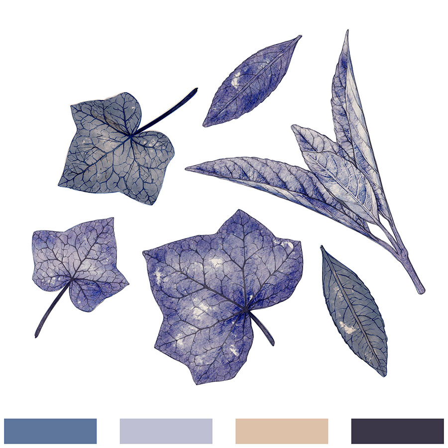
This pattern design series is a briefed commission for a Spring — Summer Collection for boys aged up to 36 months old. It was directed by Kidspattern, whom also composed the colour palette, which you can view below. It is an elegant selection of a duo of blues, matched with a camel shade and contrasted with an indigo which is so dark, it’s almost black. This design shares this base of a duo of blues with another pattern set from the same group. To view “Graphic Botanicals” please click HERE.
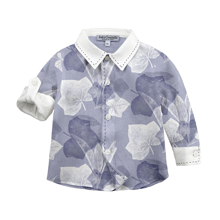
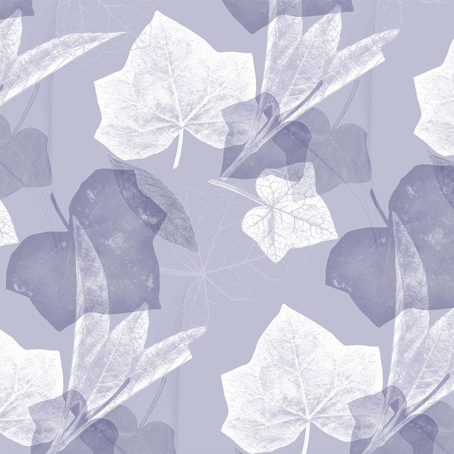
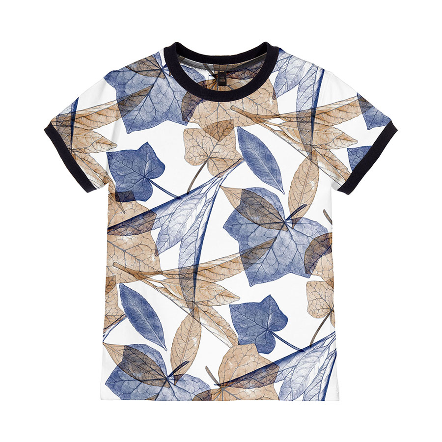
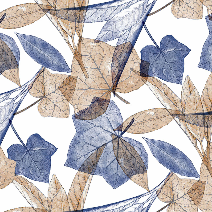
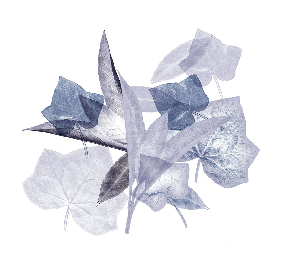
The main concept for this design involved the botanical elements being substantially enlarged, scattered and layered on top of each other. The resulting overlaying effect makes this series not only very dimensional, but also full of interesting textures, which emerged from the elements blending together.
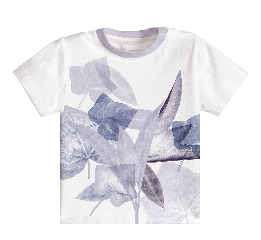
In this series, the pattern is also often supporting a complimentary standalone, placement illustration.
Pattern Elements
With digital print techniques in mind, a mixed media technique was used throughout the process.
These were based on high detail photographs taken by Kidspattern of ivy leaves and a snippet of an elegant greenery. This formed the base reference material, which was then altered and topped with an additional layer of complementary digital drawing.
Smooth Transitions
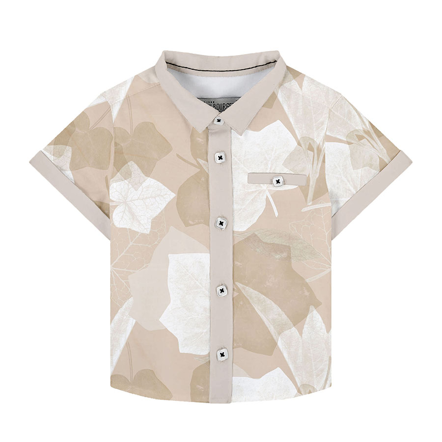
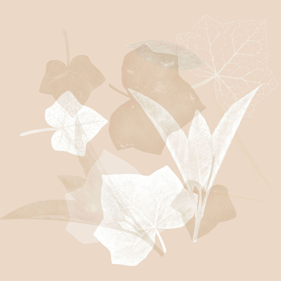
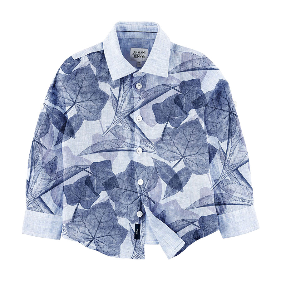
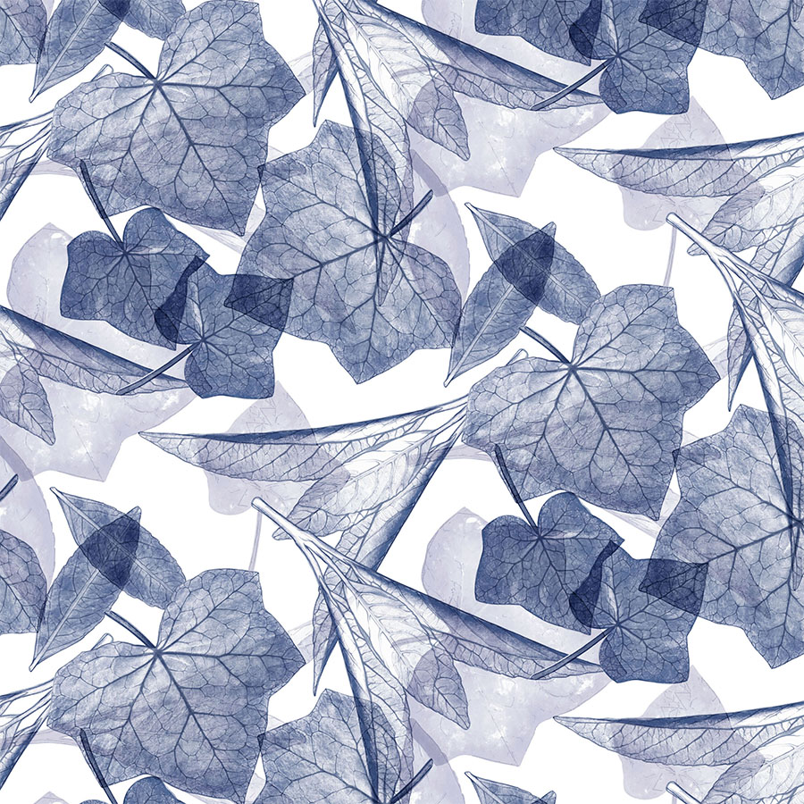
In this version, in order to place more focus on the interactions between the textures and colours within the leaves, the linear drawing was removed. Furthermore, this focus is emphasised by having both concepts visualised in a large size. This allows the pattern to soak up the soothing blending between the elegant shapes and soft, warm colours.
These were also recoloured in a delicate monochromatic palette and placed atop matching light brown, as well as light blue coloured backgrounds. A layer of depth was added by changing the leaves to a darker shade. This makes them sink gently into the background, as the white ones rise to the surface.
Lastly, the single white ivy skeleton, though understated and almost imperceptible, adds a lovely finishing touch.
Venation Drawing
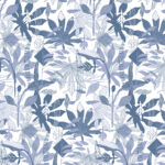
Both patterns incorporate the use of the hand drawn vein network in the majority of the leaves. These were then recoloured in darker blue, which serves to draw the eye in by creating a meshed structure.
Using this enhanced detailed imagery offers a much fuller print. Furthermore, placing it on a crisp, white background supports the desired contrast; bringing the opacity down gives the leaves a transparent quality to them which provided a light and airy design.
Lastly, both of these pattern designs focus predominantly on the dark blue aspect of the palette; each one matching it with either light blue or camel brown. Additionally, they are both visualised in a large size on tops aimed at boys.
“The leaves and the light are one.”


