Lilac Dream
Lilac is considered a feminine and graceful colour. Its direct connection to the sweet-scented, charming flowers means it’s often associated with innocence, youth and memories of the arrival of spring.
This project was a part of my ongoing collaboration with Kidspattern. If you’d like to learn more about them please visit their website HERE. Alternatively, view the archive of our previous projects HERE, in which I discuss in detail the history and nature of our work.
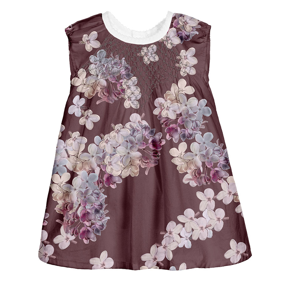
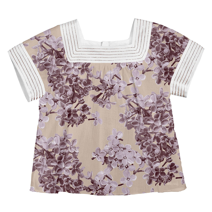
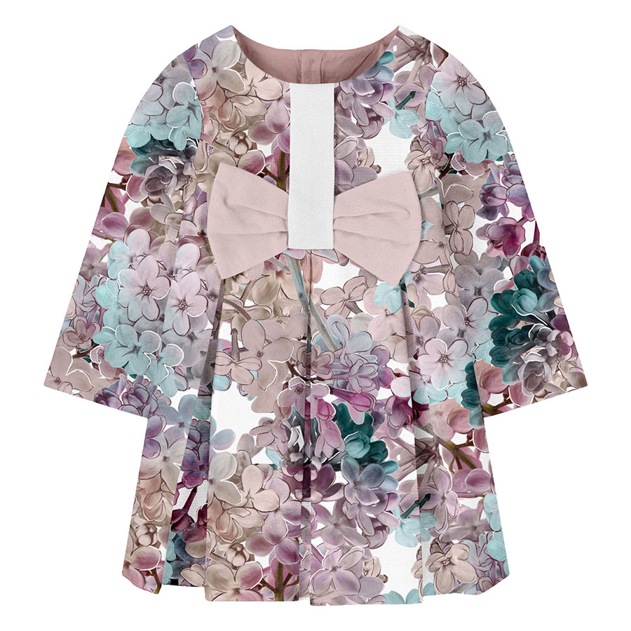
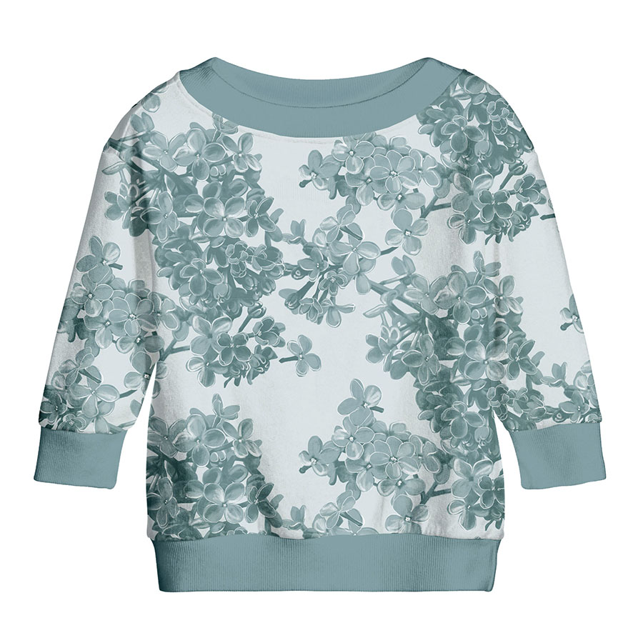
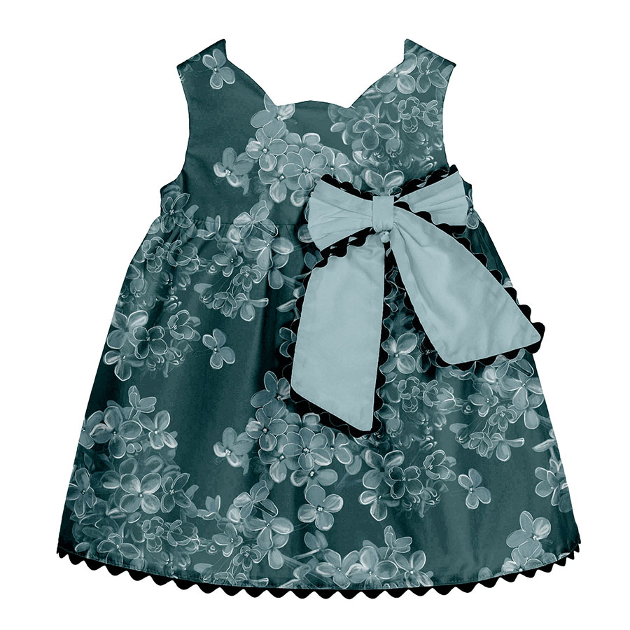
All clothing-mockups presented here are provided courtesy of Kidspattern and are used for visualisation purposes only.
Overview
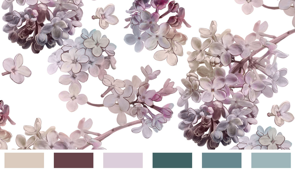
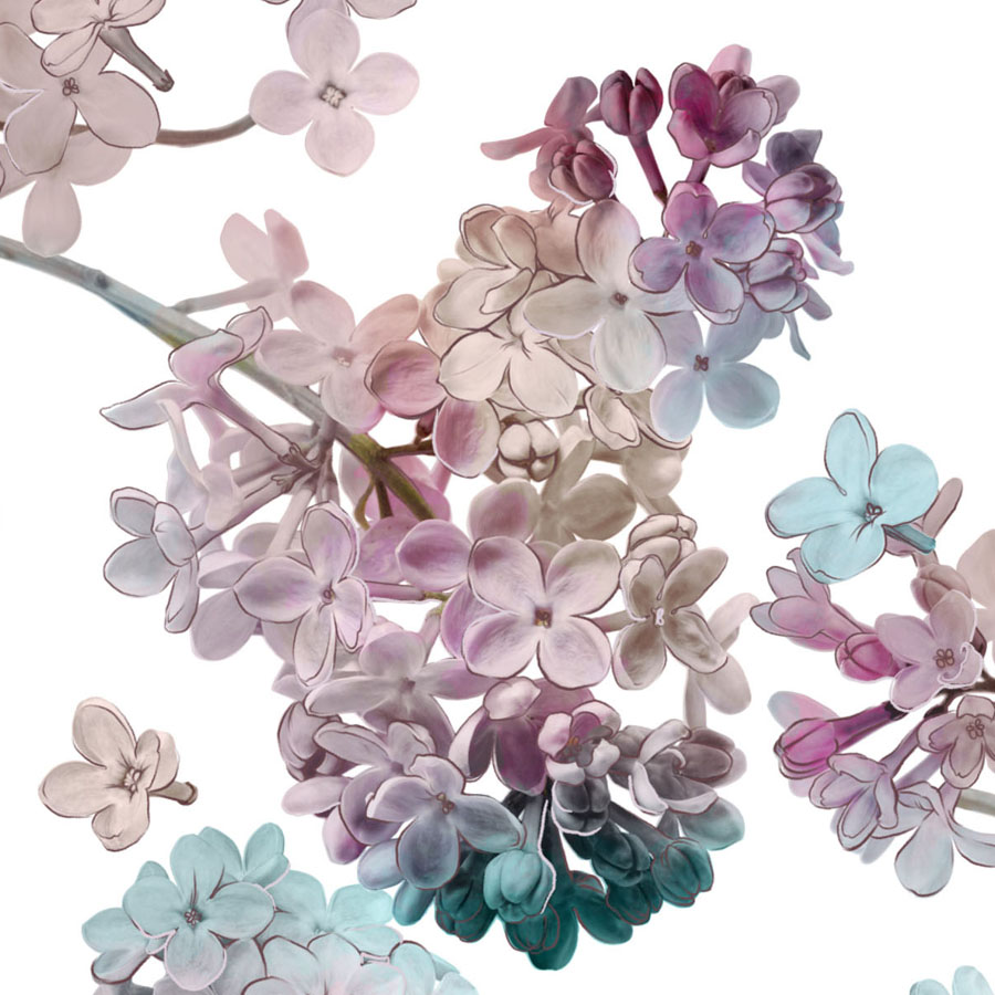
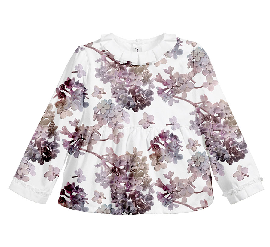
Lilac Dream, forms part of a pattern development series commissioned for a client’s Autumn-Winter Collection. The colour palette was composed by Kidspattern, from a selection of tinted sage greens, matched with a butterscotch cream, purple puce and fresh lilac.
The selection of this theme for this series is a response to ‘LILAC’ Colour Trend. Since Ultra Violet became Pantone Colour of the Year 2018, Lilac, especially in its pastel shades, is enjoying a persistent resurgence in fashion and design.
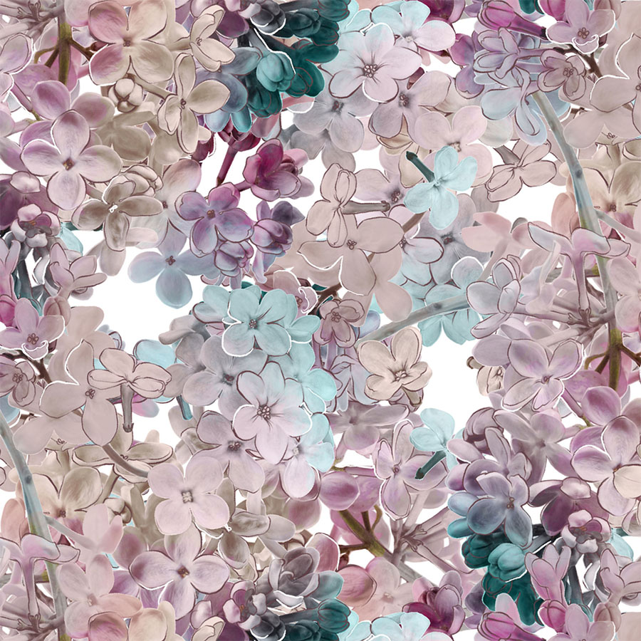
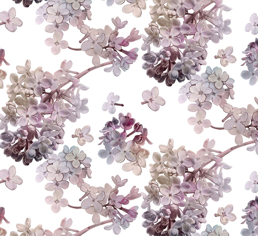
This floral, signature print series was proposed as an oversize, full digital print design, so that the details of the blooms, as well as the colour transitions could be represented well in a print form.
The elements of the design, were based on manipulated photographic material, recoloured in a transitional manner, with colours from the full spectrum of the colour palette softly blending into one another.
Furthermore, in each colour option a layer of a hand drawing was added on top in order to define the details of the small flowers and balance out the overall contrast.
The main version of the pattern (shown above) has the lilac branch placed in a diagonal and regular repeat on top of a white background.
Below you can view a selection of stages from the development process, with the pattern recoloured to fit multiple colour sets, various arrangement and size options.
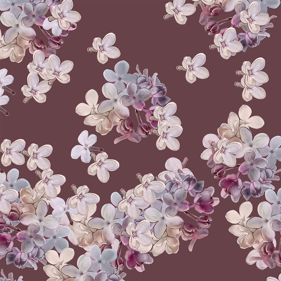
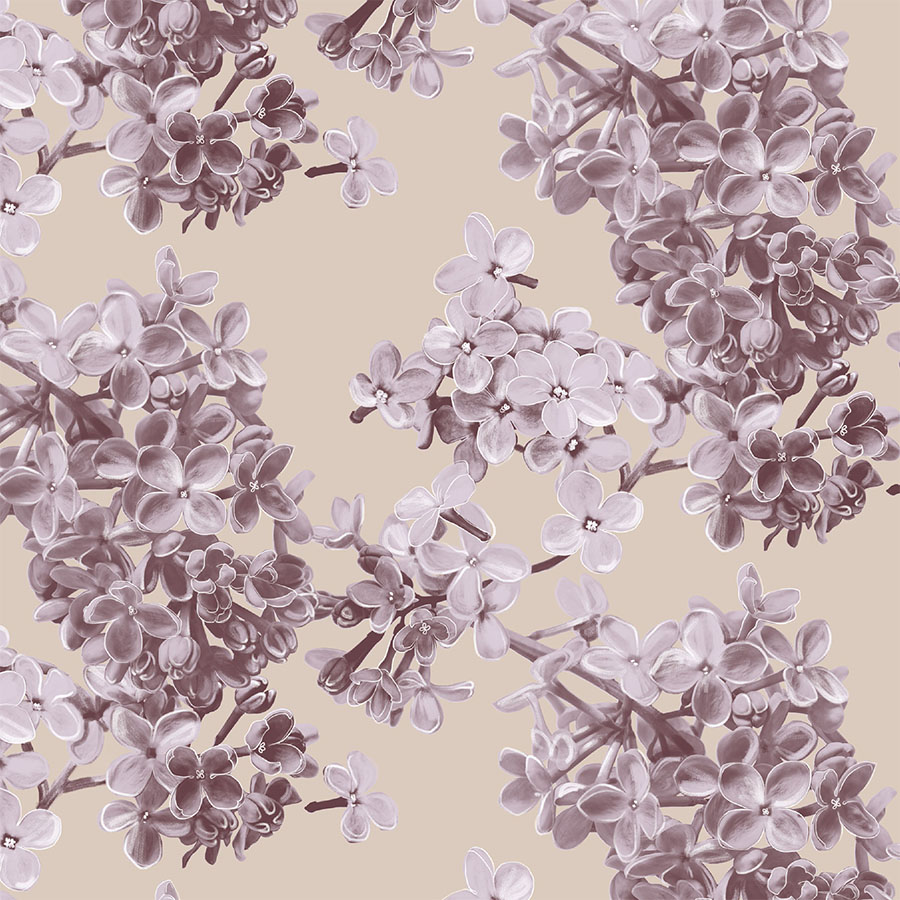
Purple Puce
Both versions focus on the ivory and maroon colour combinations by setting each one as the background. Moreover, both present a large size of the pattern to assist with printing and to bring out the details of the design.
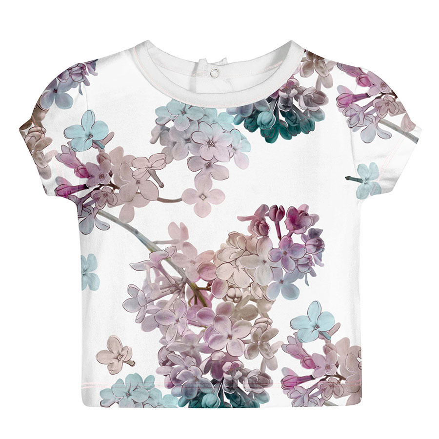
Firstly, the smaller floral elements, infused with tints from the colour palette, are scattered around in a free flowing manner.
Next follows a monochrome recolouring which is more in keeping with the natural lilac shade of the flower sprig, which is arranged diagonally in a simple repeat.
Magical Garden
By introducing a hint of an iridescent character, the luminosity of the pastel colour palette was amplified in order to offer a more contemporary design.
This striking version was proposed on a white background in a large zoom with two different spacing arrangements.
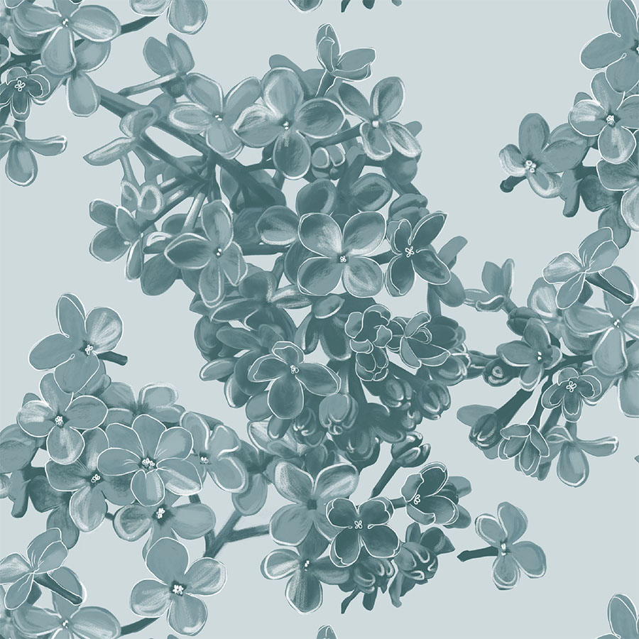
Dark Green
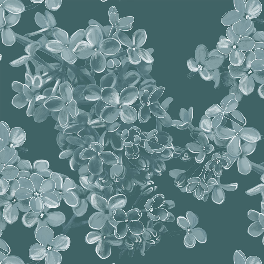
Focusing on the green side of the palette the elements were reworked in monochrome with layer of white pastel drawing on top.
The darker central floral element is also repeated regularly amongst the loosely scattered smaller flowers.
Pattern in Print
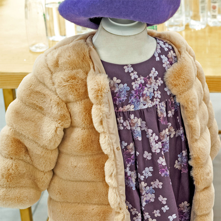
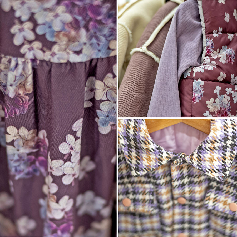
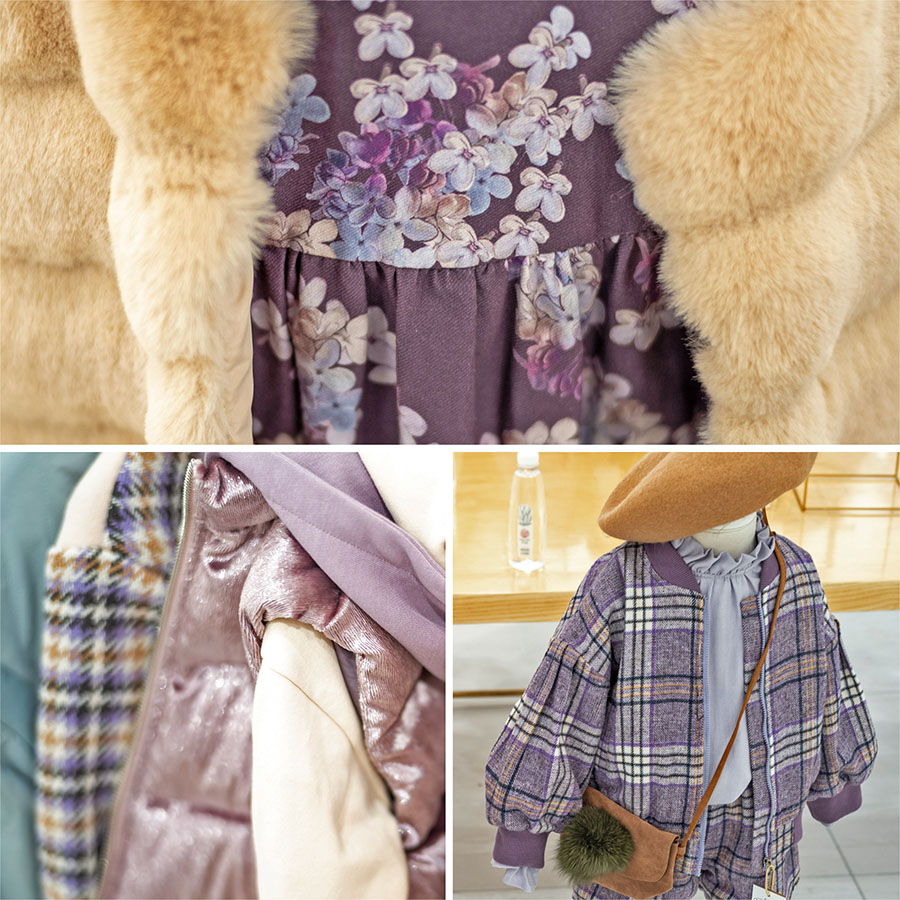
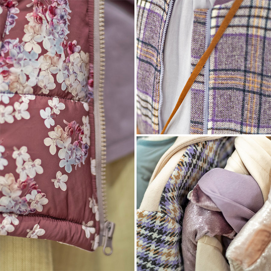
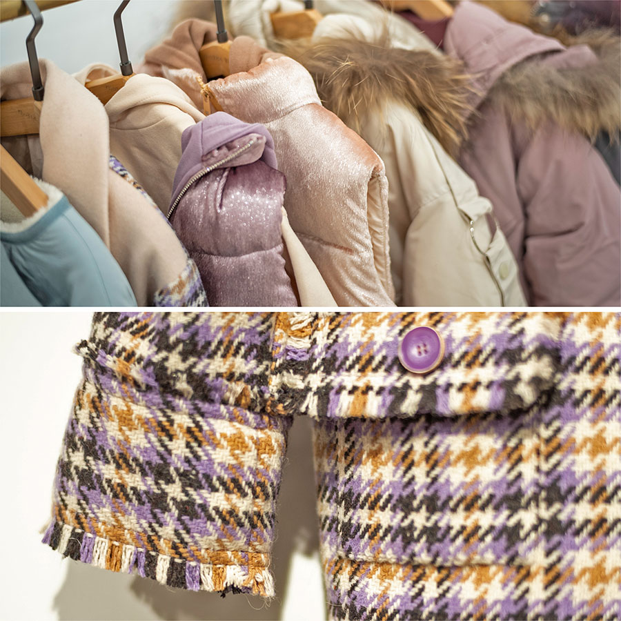
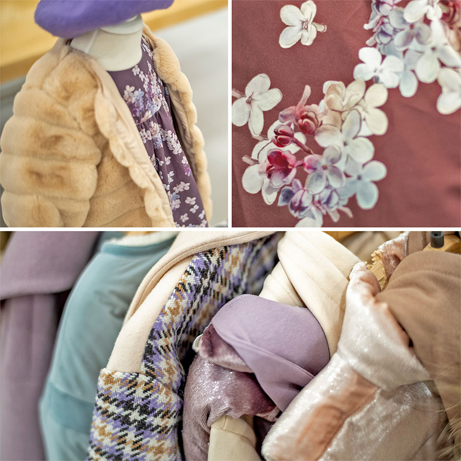
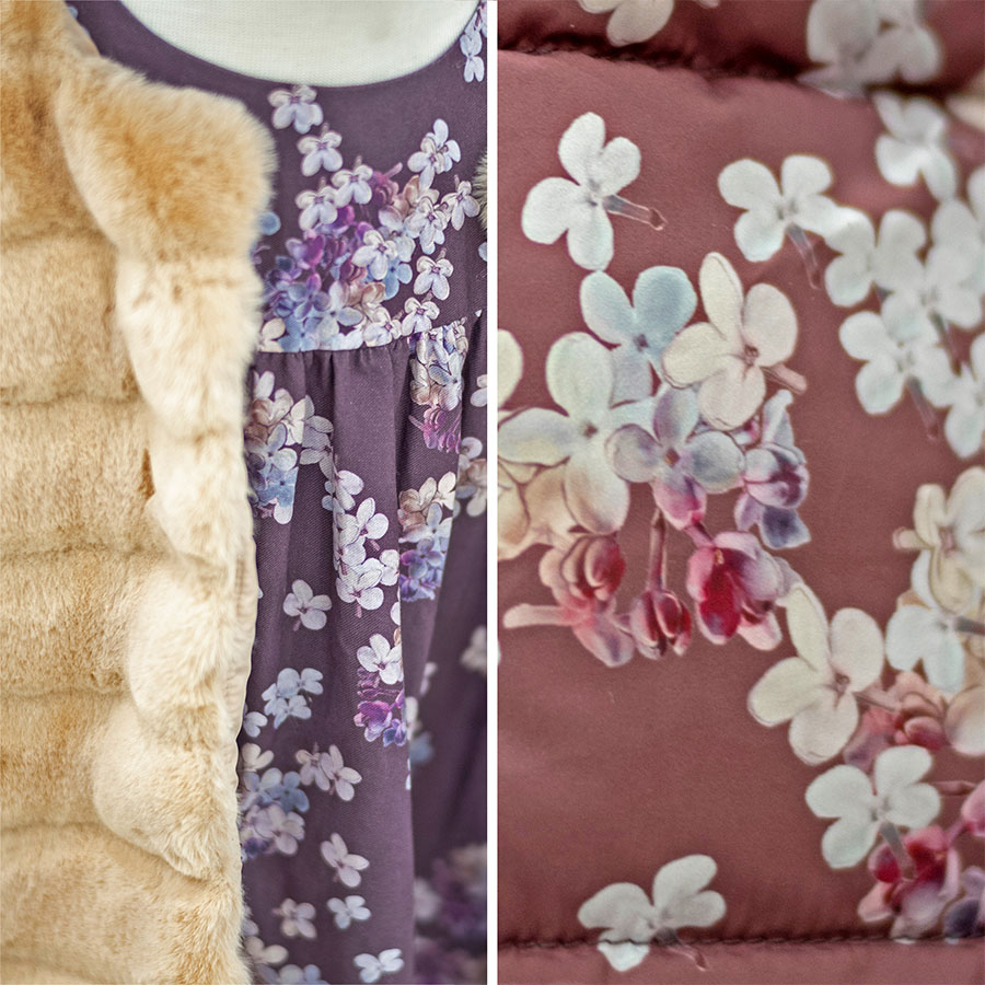
These are photographs of the client’s first clothing samples produced to display at a trading fair as a part of the launch of their overall Autumn-Winter Collection. Here you may observe how the pattern was used and printed across multiple items and how it fits within the wider context of the collection.
Please note that these images are provided courtesy of the client and Kidspattern and are used for portfolio purposes only.
“Winter is on my head, but eternal spring is in my heart; I breathe at this hour the fragrance of the lilacs, the violets, and the roses, as at twenty years ago.”


