Living Coral Pattern
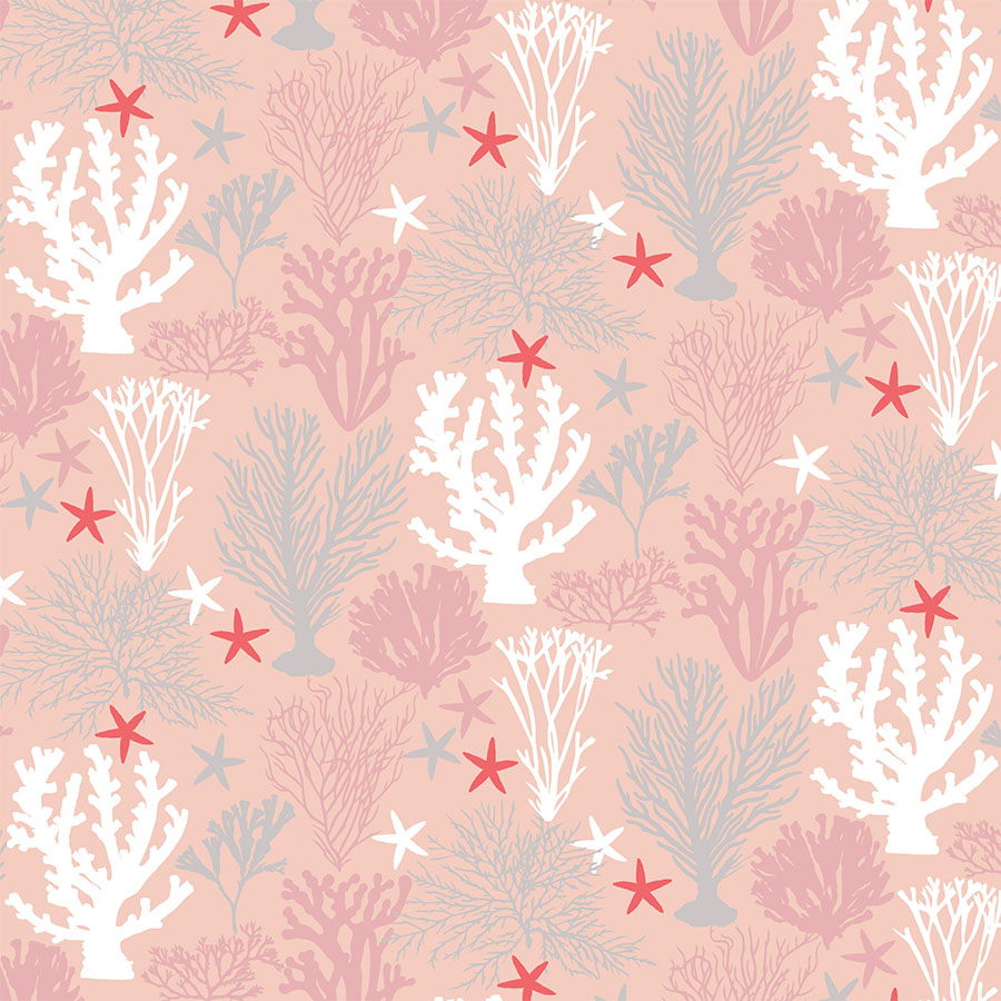
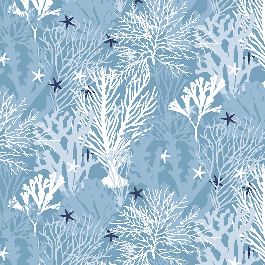
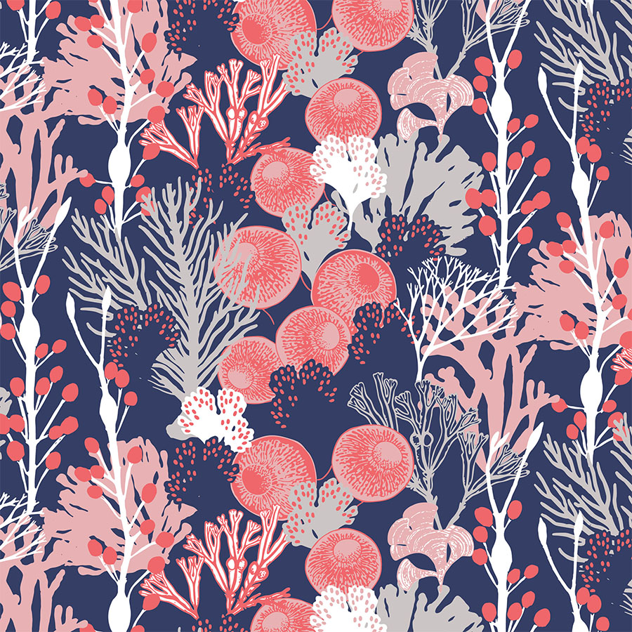
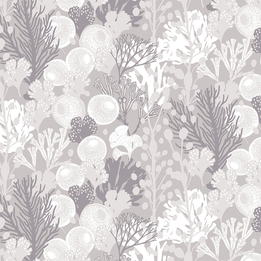
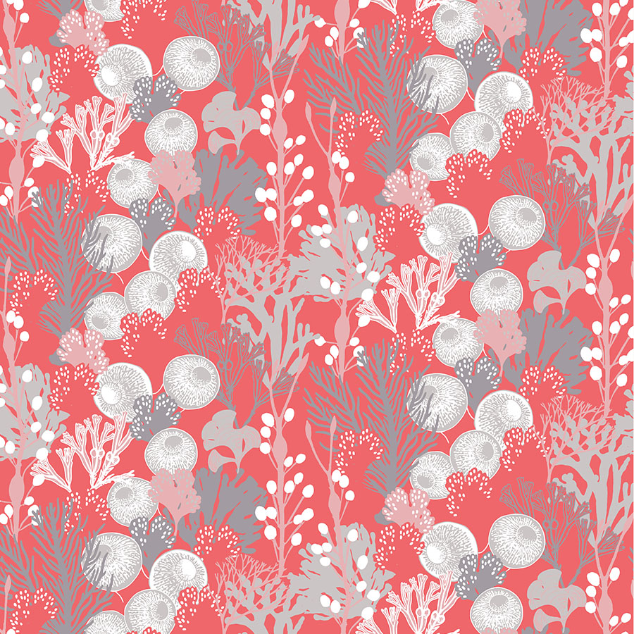
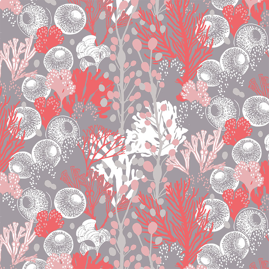
As a response to the prevalent “Living Coral” trend, this pattern series explores not only the ‘Pantone of 2019’ colour palette, but also the theme behind its name.
Drawing inspiration from marine elements revolving around a variety of corals, kelp and algae, it aims to depict an underwater scene full of alluring seaweed swaying softly with the flow of the deep waters.
This pattern design was a part of my ongoing collaboration with Kidspattern. If you’d like to learn more about them please visit their website HERE. Alternatively, view the archive of our previous projects HERE, in which I discuss in detail the history and nature of our work.
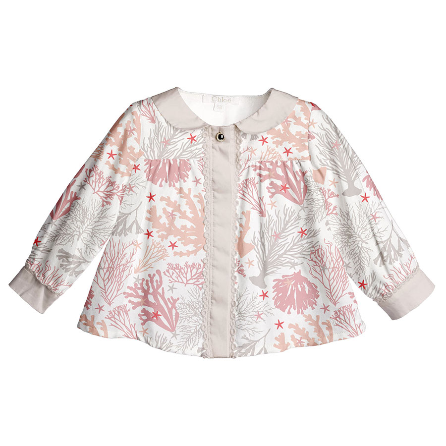
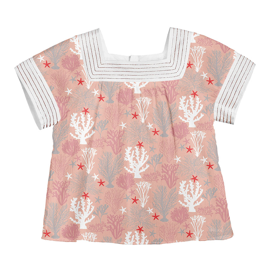
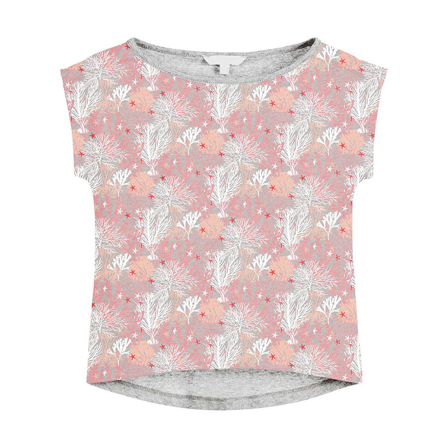
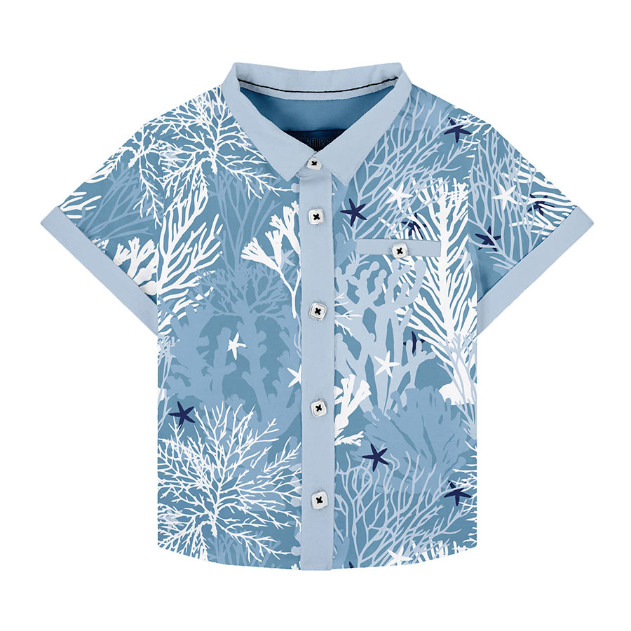
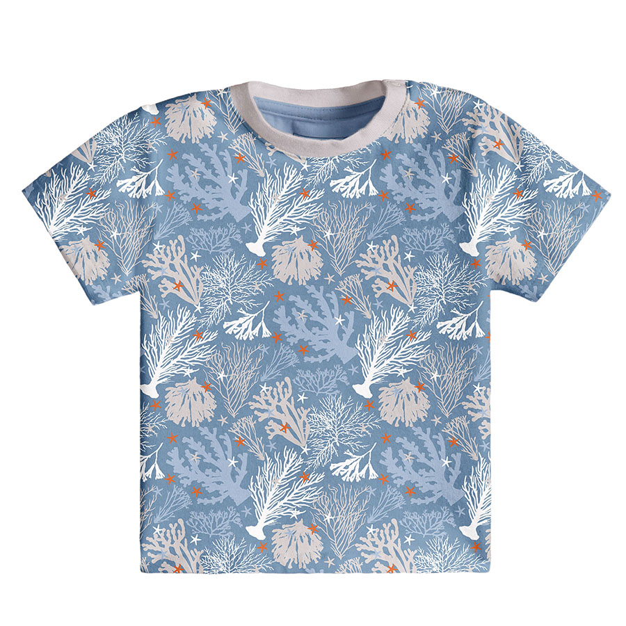
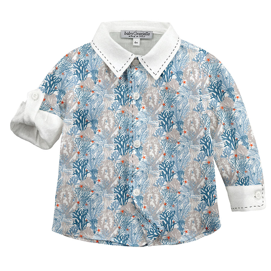
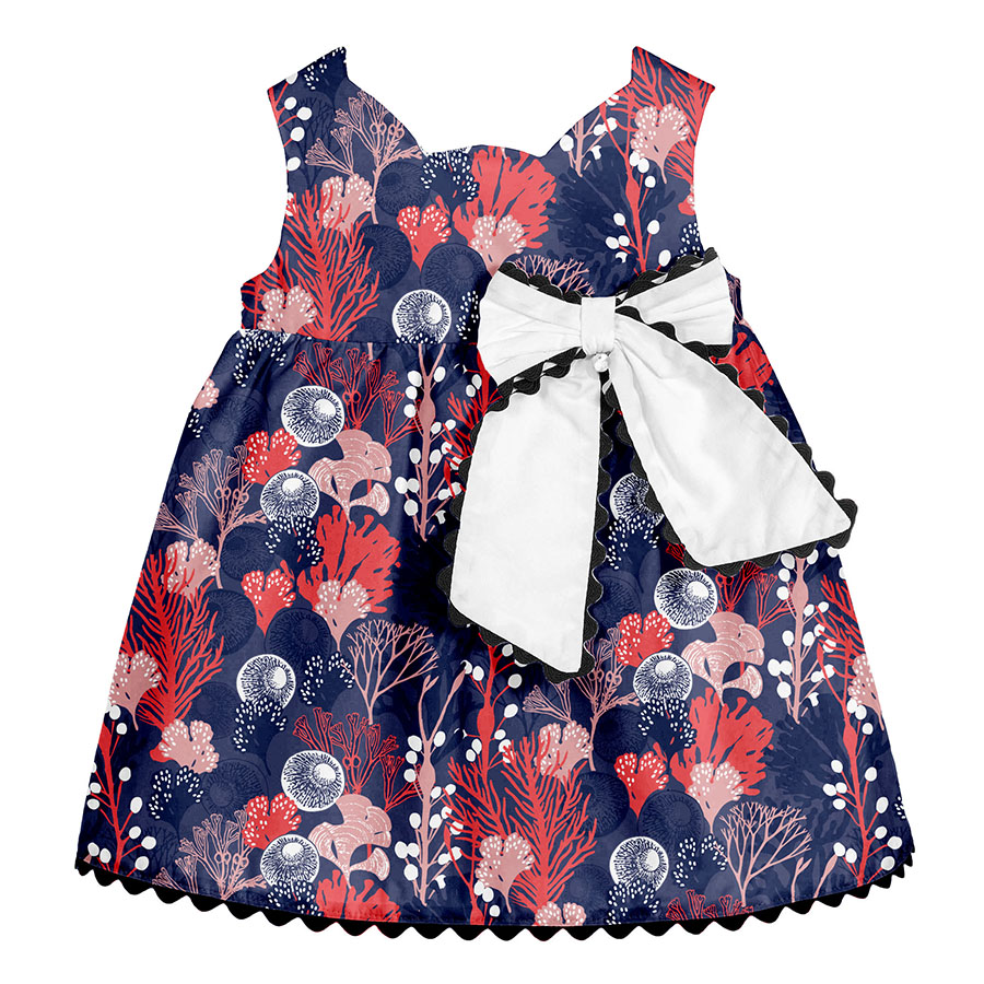
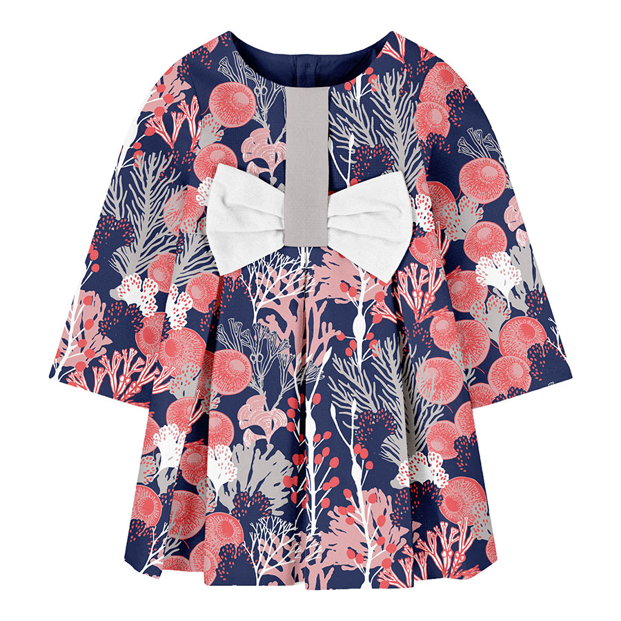
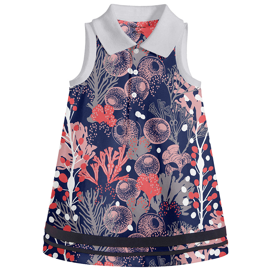
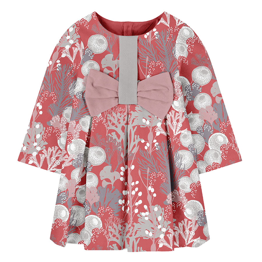
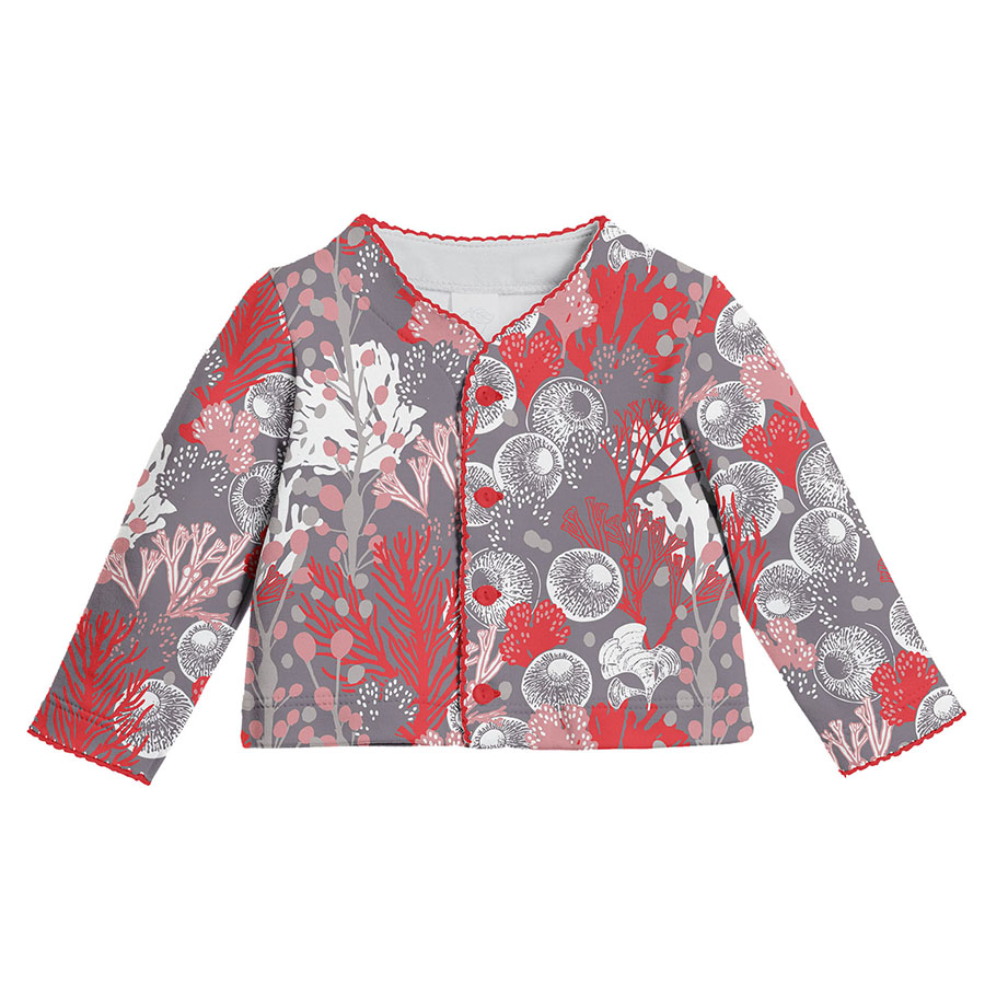
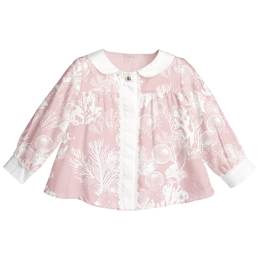
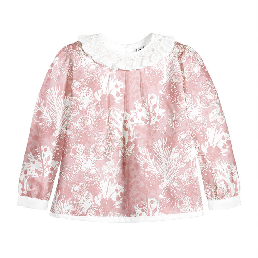
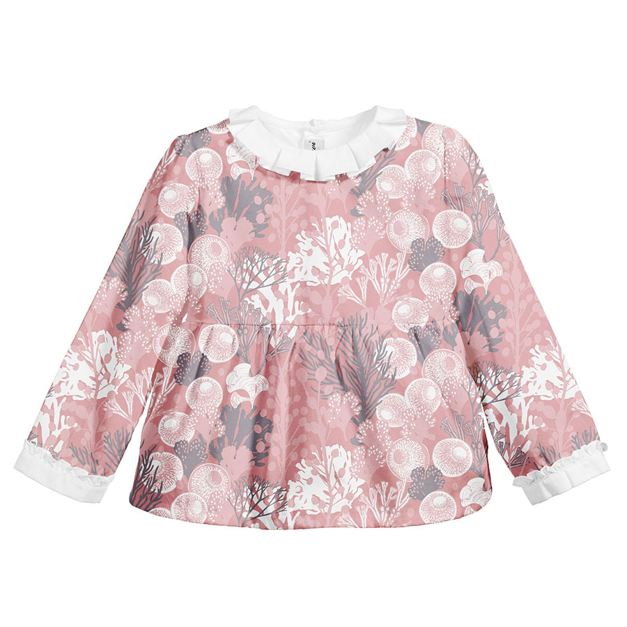
All clothing-mockups presented here are provided courtesy of Kidspattern and are used for visualisation purposes only.
Overview
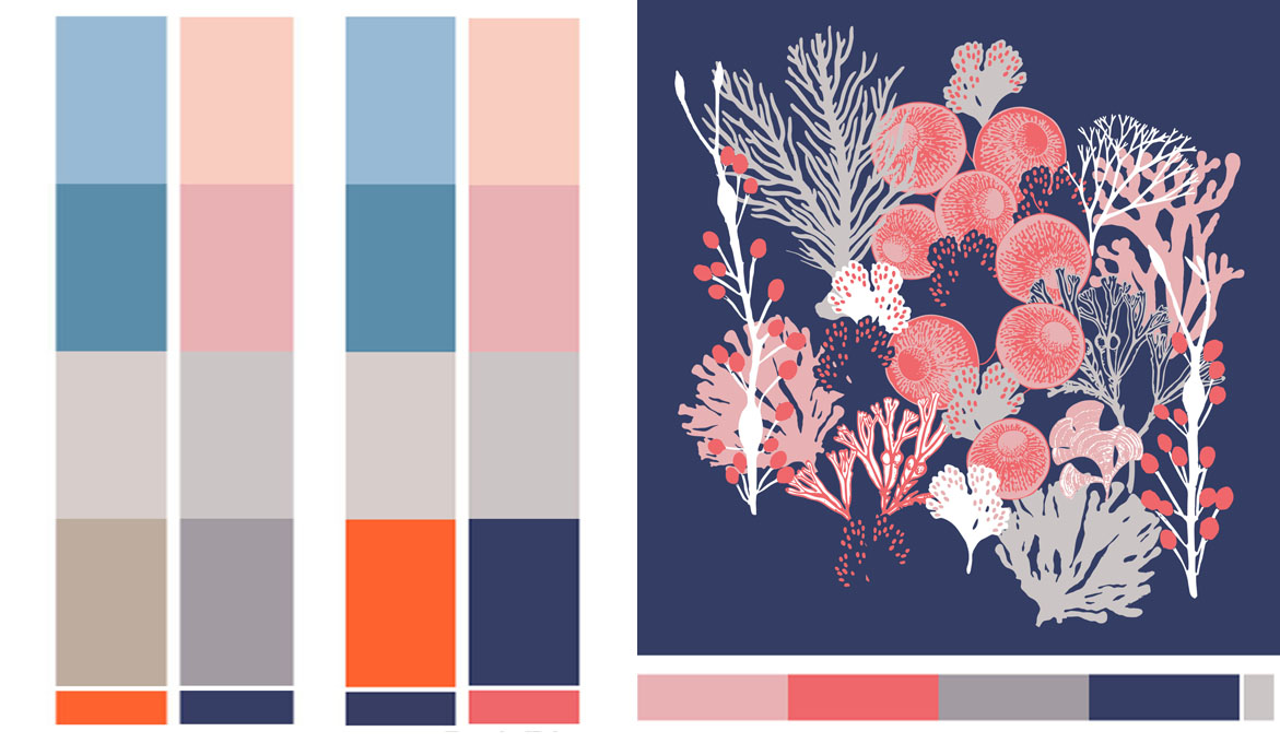
This is a pattern development series commissioned for a client’s Spring — Summer Collection for children aged up to 36 months old. Below you can view its structure directed by Kidspattern along with the respective colour palettes with shades transitioning along with the age and gender they’re indicative of.
The overall collection was broken up into three age groups: Newborn (0−9 months), Baby (6−18 months) and Kids (18−36 months). Starting from the left-hand side, you can view the corresponding duo of colour palettes that were developed for each group.
Each column also shows an additional strip of colours addressed for boys and a matching one for girls. These colour schemes are then reflected in the designs prepared for each of these groups.
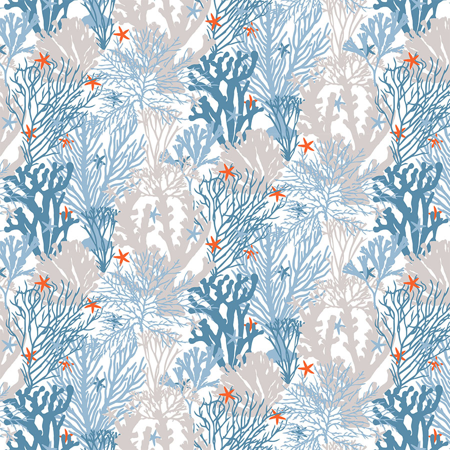
For boys, the palette is a selection of classic blues matched with warm, brown greys contrasted by a spot of orange red. The older age group additionally features an addition of deep navy blue.
For girls, the palette is composed from a base of coral shades (starting with a pastel peach, then rose and all the way to rich salmon). These are initially matched with a duo of cold greys and was contrasted with a spot of dark navy blue.
Additionally, the line for girls included a design for the oldest age group (to the right). This typically means that the elements used are slightly more complex in detail and the palette has more vivid and often darker, contrasting colours.
Newborn Collection
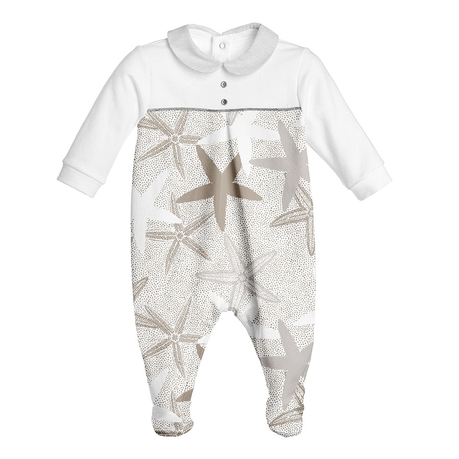
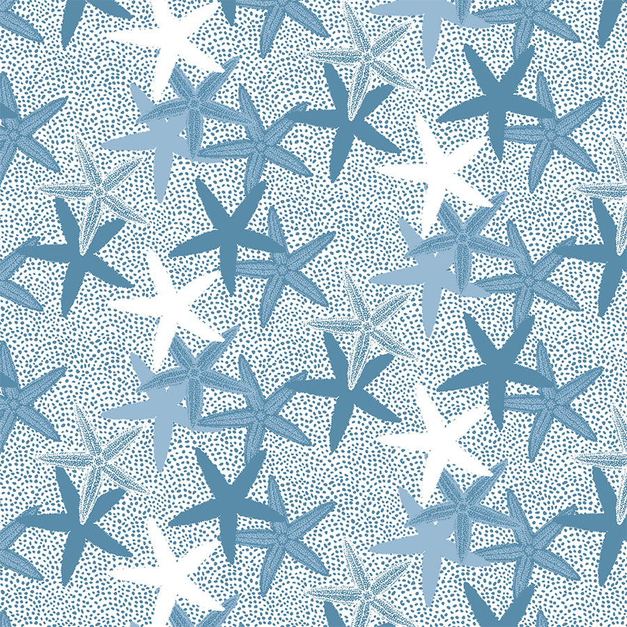
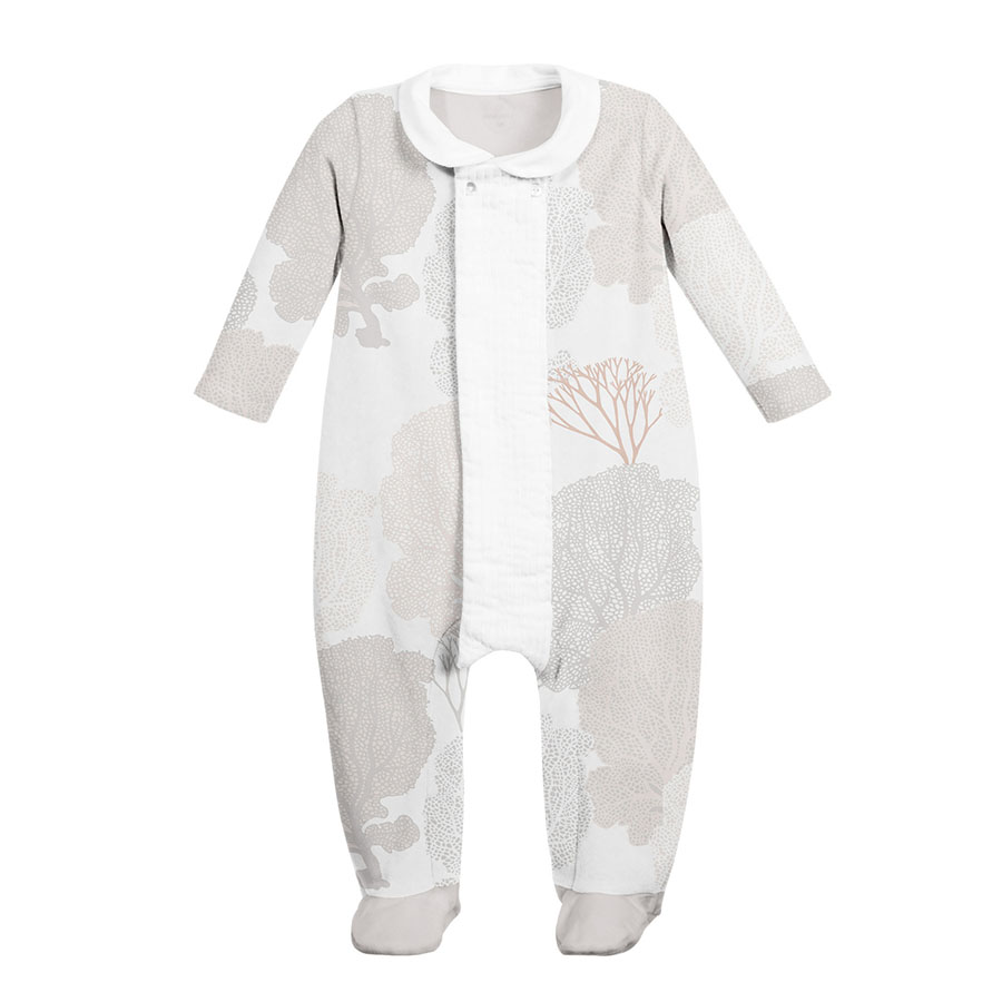
These patterns tend to be more simplified and pared back, and coloured in a neutral scheme.
In this case, for boys, we developed an idea based on a simple graphic illustration of a starfish. It was repeated in a diagonal manner and presented in monochrome palettes, placed on top of a hand drawn textured background.
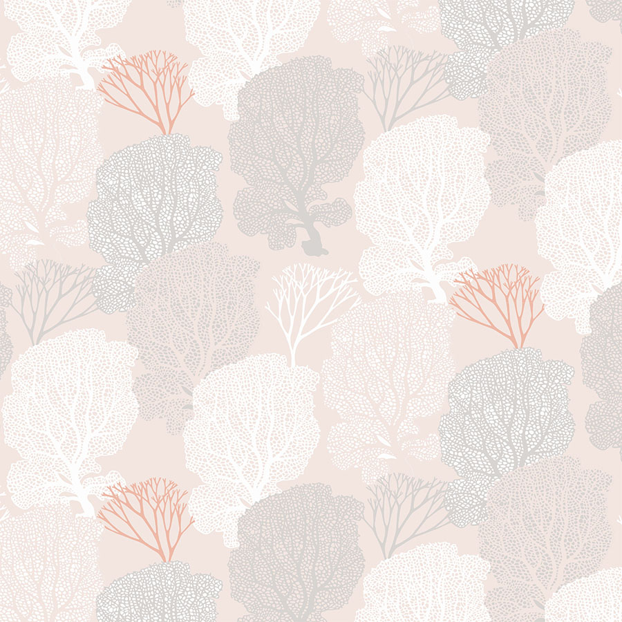
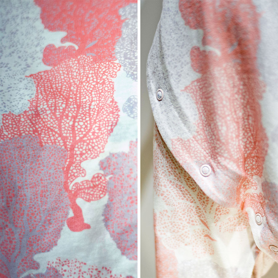
For girls, the inspiration came from an exquisite, soft coral formation called ‘Sea Fan’. Once repeated these gave the impression of an underwater forest, giving this pattern not only a texturised, but also an organic quality.
Baby Line
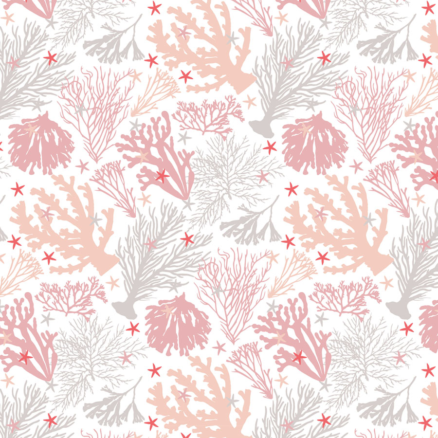
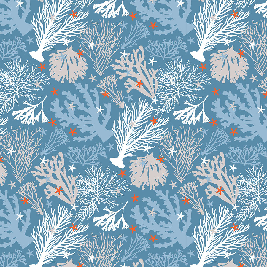
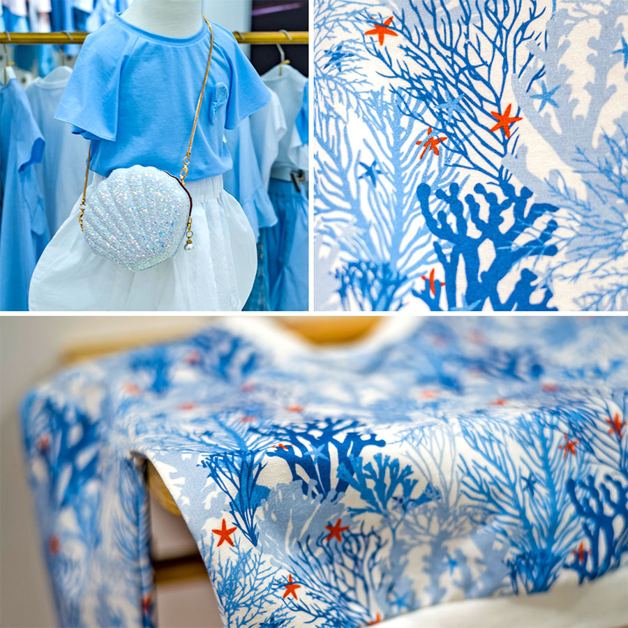
These are pattern versions proposed for a medium age group (up to 18 months). The separation between lines for boys and girls is discernible by the affixed colour palette. However, both versions now make use of the same elements. The coral silhouettes are filled in with flat colour, which make these designs not only age appropriate, but also easy to adjust and cheap to print.
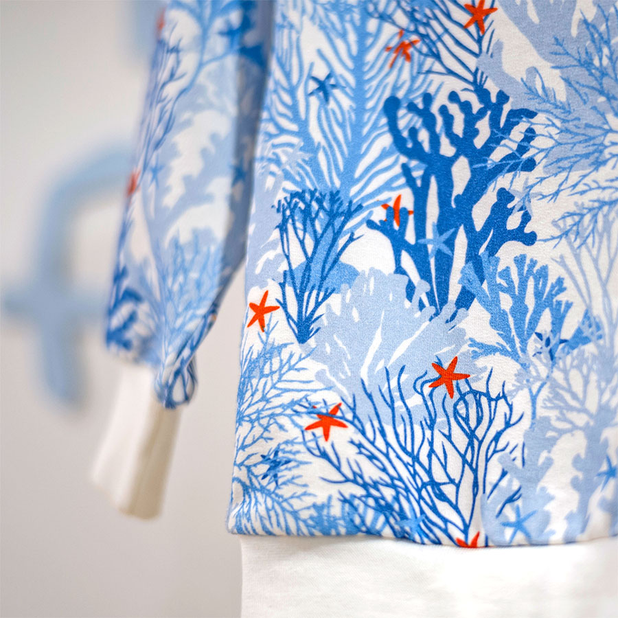
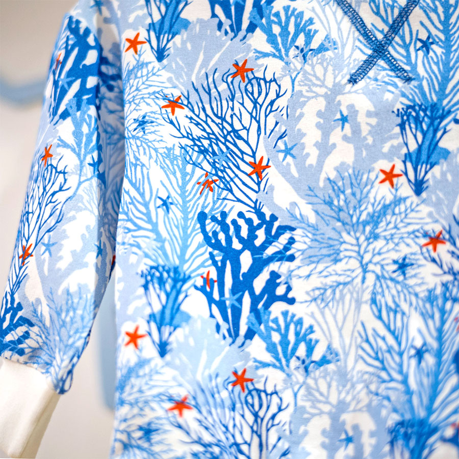
The pattern arrangement of the elements was threefold. Firstly, with even spacing and in an upright manner, spots of deep orange red starfish were peppered amongst the shapes to draw the eye in.
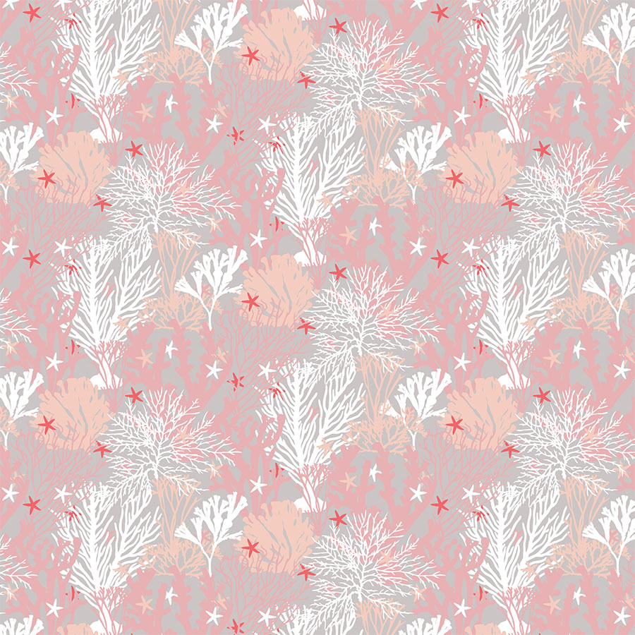
Secondly, the elements remain upright, but were clustered closer together. With the elements almost on top of each other, this created a layered, slightly abstract visual network. In addition, the starfish were weaved in behind some of the corals whilst the others remained in front, which also added to the design’s dimensionality. All this was to convey a sensation of a bustling, underwater scene.
Lastly, the corals were staggered in a diagonal manner, however the spacing between them remains even and orderly. The scattered orange red starfish on top brings in the accent of colour in a regular repeat.
Above, please browse through a selection of these patterns in three different colour ways (white, light and medium coloured backgrounds) and three different print sizes — small, medium and oversize. For the smaller size, simplified detail was used for more of a texturised finish.
Kids Line
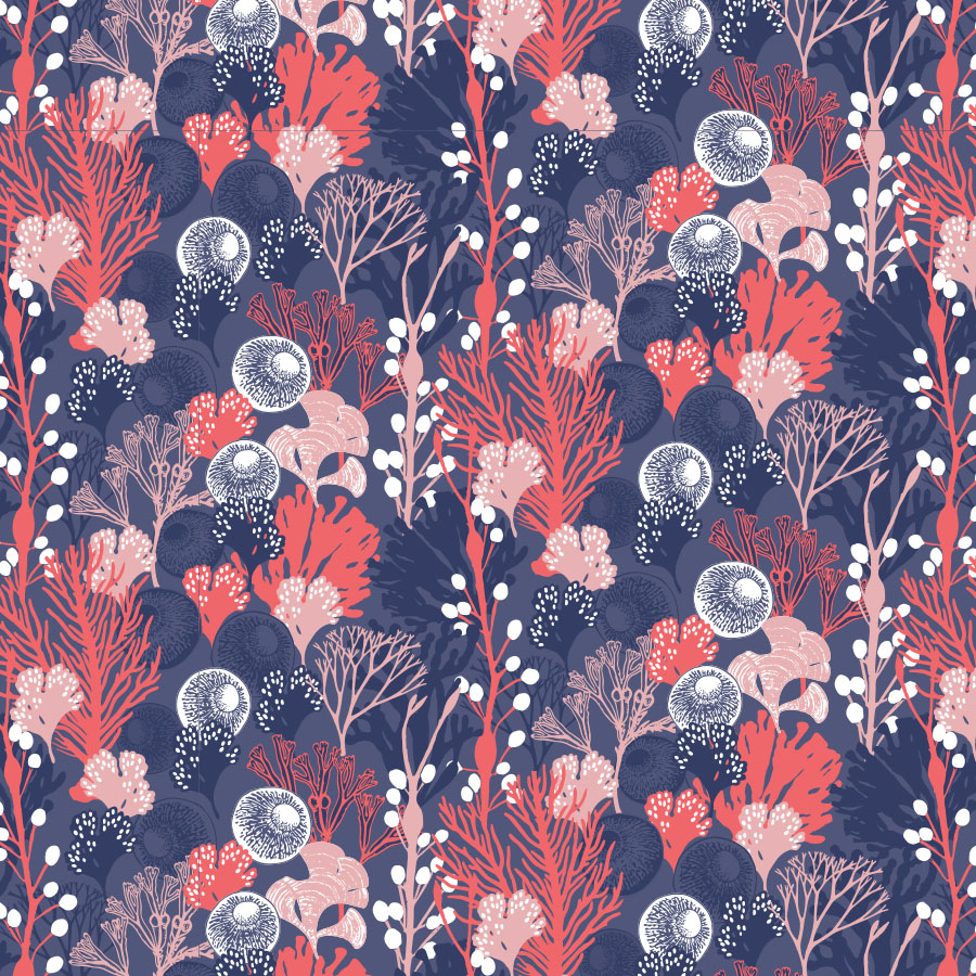
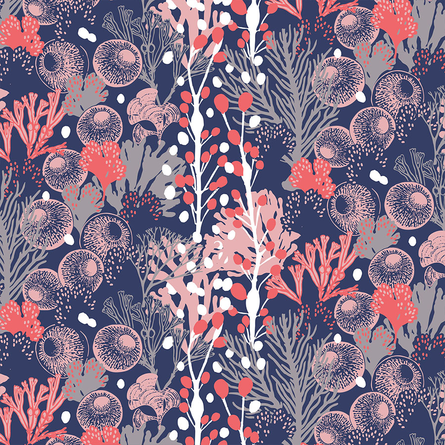
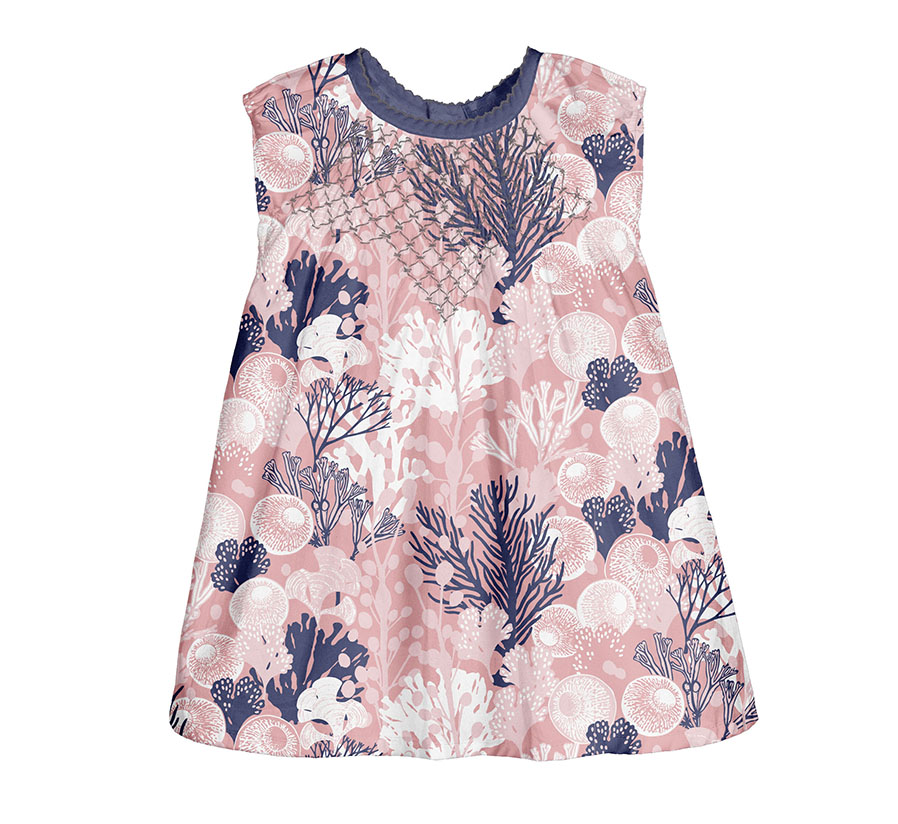
In the pattern development for the oldest age girl group (up to 36 months) the previously featured underwater formations were enriched with new additions: bubble seaweeds and a fascinating bubble tip anemone coral with its curious looking tentacles. These now formed a new main module used to complete the full themed set.
Dark Background
The colour combination of navy blue background matched with greys, corals and a touch of white, sets the mood for a murky and mysterious low sea-level scene.
Here you can browse through few colour variations, in which some or all the bubbles have been filled in with colour, and hence are more vibrant. This, in turn, affects the dynamics of the visual hierarchy within the elements.
In the first version, I experimented with the shades of blue, using the darker tone to colour elements set deeper in the background. These shadow silhouettes were contrasted with white dots, which like underwater lanterns illuminate the way up, back to the safety of the surface.
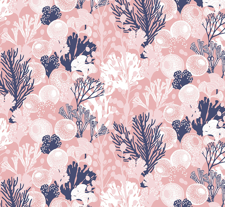
Pink and Grey
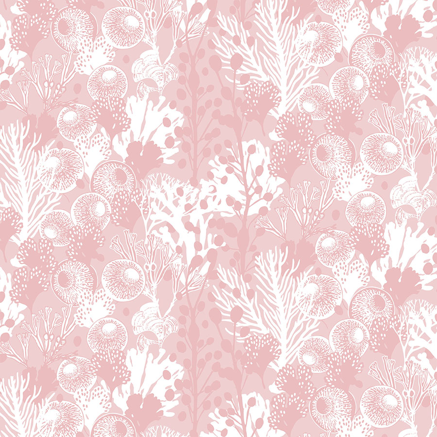
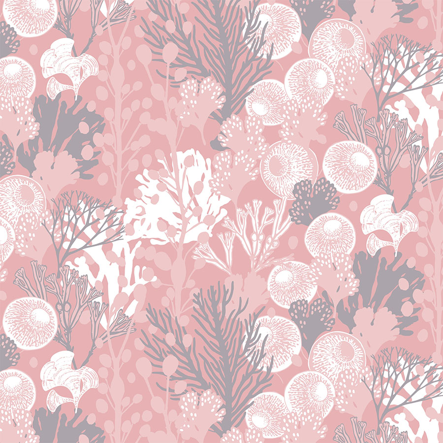
As the colour palettes moves towards the lighter shades, the total number of colours used was reduced in order to offer a secondary, simplified solution.
Here, the seaweed cavities are filled with white and resemble bubbles of air in water, fizzing up along the garment in a vertical arrangement. The small white dots of the smaller kelp that pepper the background with details emphasise the design’s sense of effervescence.
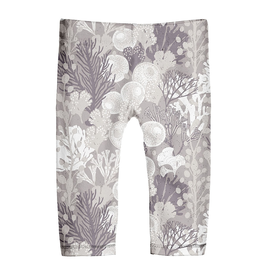
To complete this set you can view a full monochrome greyscale version offered as a pared back option that could be easily matched with just about any other colour.
Simplified Pink
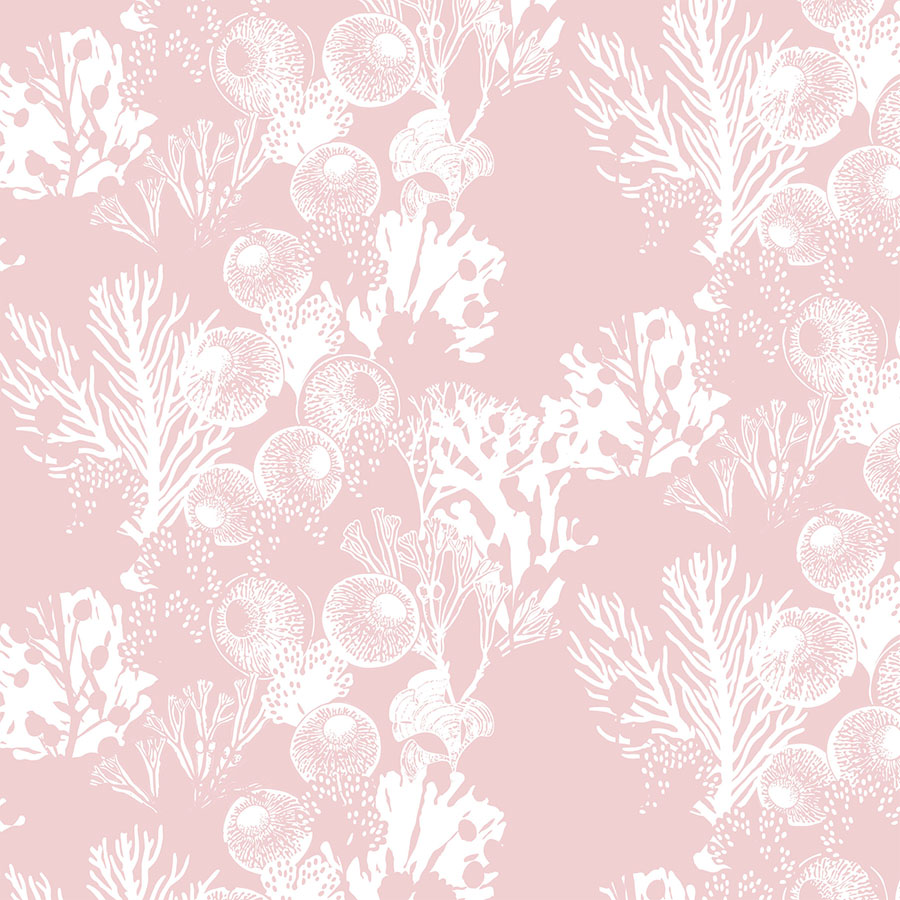
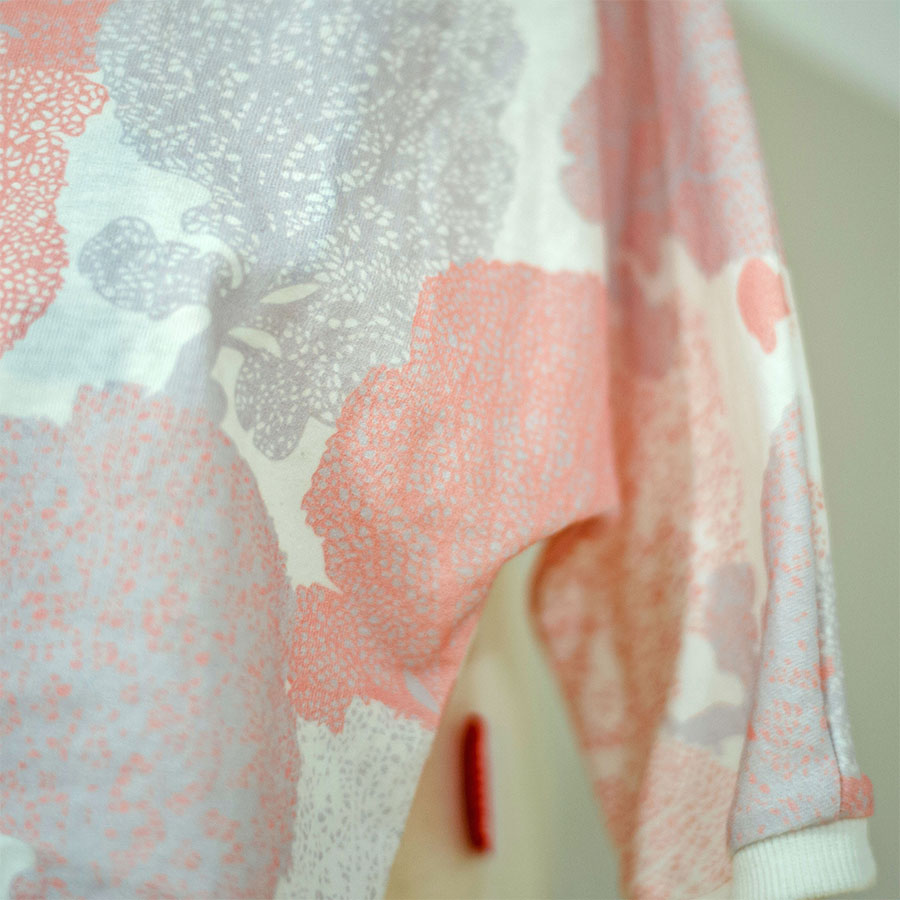
Within this development, the patterns were simplified and lighter, thus offering delicate and subtle alternatives. Options dominated by shades of light coral pink with an addition of medium grey champion more of a monochromatic approach to the “Living Coral” trend.
Thanks to the power of colour we are being transported from the deep waters of the dark navy background to the mesmerising spectacle of this cotton candy, magical underwater garden.
Notice a particularly interesting pattern reduced to a mere one colour, which in this case was white. Thanks to also being visualised in a relatively large size, this offers ideas for quite a modern, slightly abstract design. Moreover, it holds great potential for a second complimentary print.
Pattern in Print
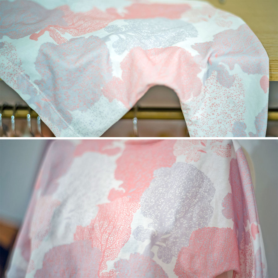
Below, please browse through a slideshow selection of a few examples of this pattern in print. These are photographs of the Client’s first clothing samples produced to display at a trading fair as a part of the launch of their overall Spring-Summer Collection. Here you may observe how the selected patterns were used and printed across multiple items and how these fits within the wider context of the collection.
Please note that these images are provided courtesy of the client and Kidspattern and are used for portfolio purposes only.
“Blue, green, grey, white, or black; smooth, ruffled, or mountainous; that ocean is not silent.”


