Nocturnal Dwellers
An ongoing fascination with the motif of moths may have its root in their deep, symbolic meaning, which generally seems to be two-fold.
On one hand, these curious looking creatures are admired for their determination; even when their efforts prove dangerous and futile, they are still madly driven toward light.
For the same reason, this trait is also considered a warning, as their often detrimental ending acts as a caution against the self-destructive tendencies of blind faith.
This pattern design project was a part of my ongoing collaboration with Kidspattern. If you’d like to learn more about them please visit their website HERE. Alternatively, view the archive of our previous projects HERE, in which I discuss in detail the history and nature of our work.
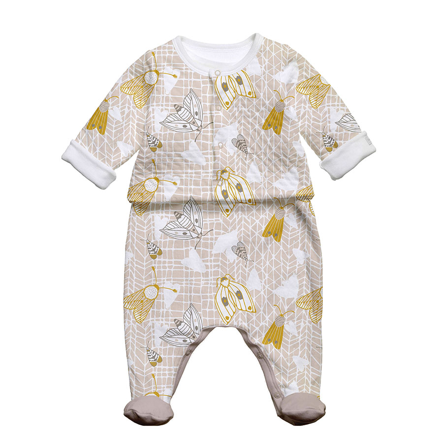
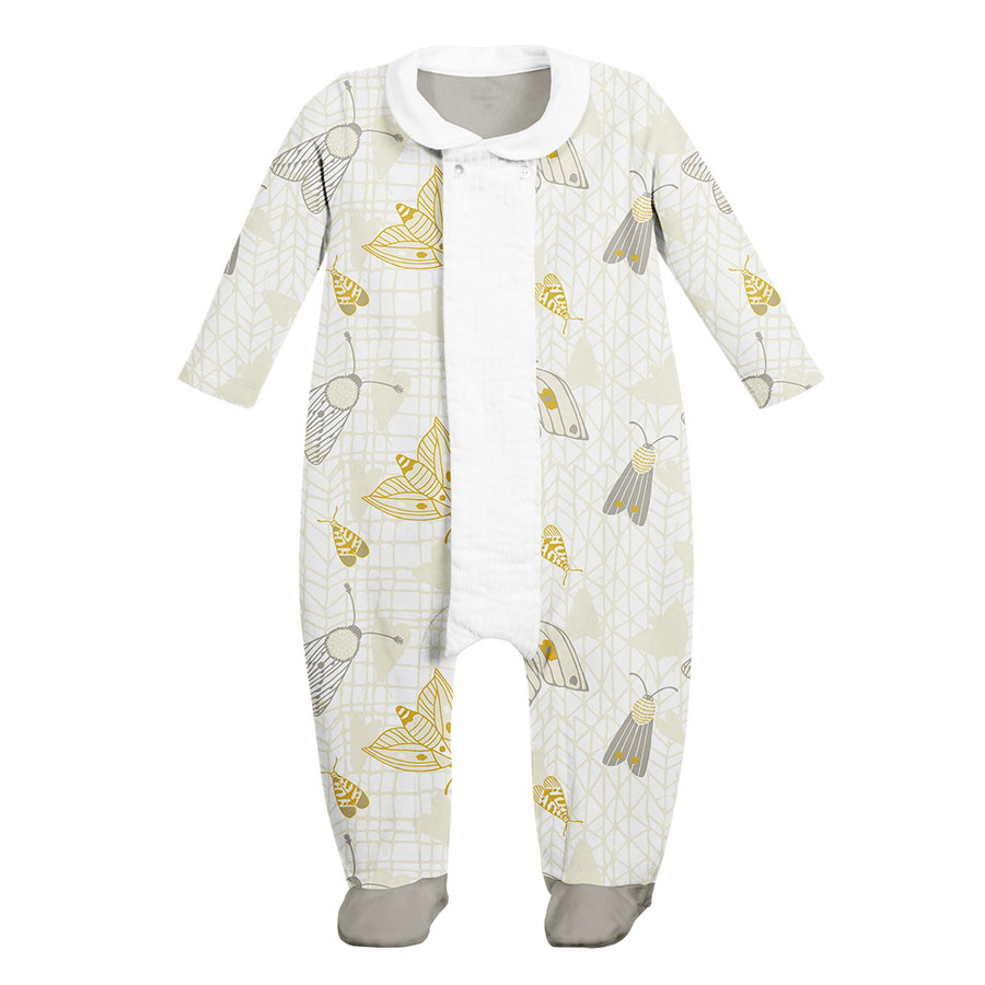
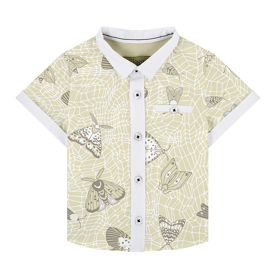
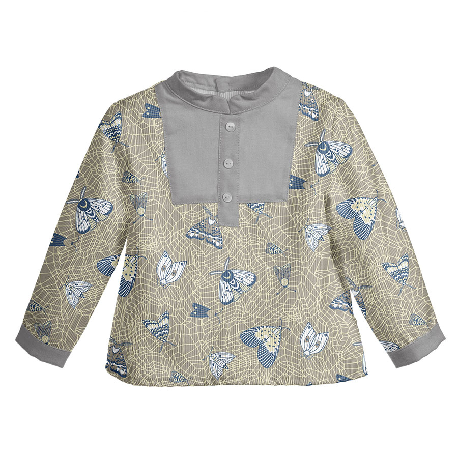
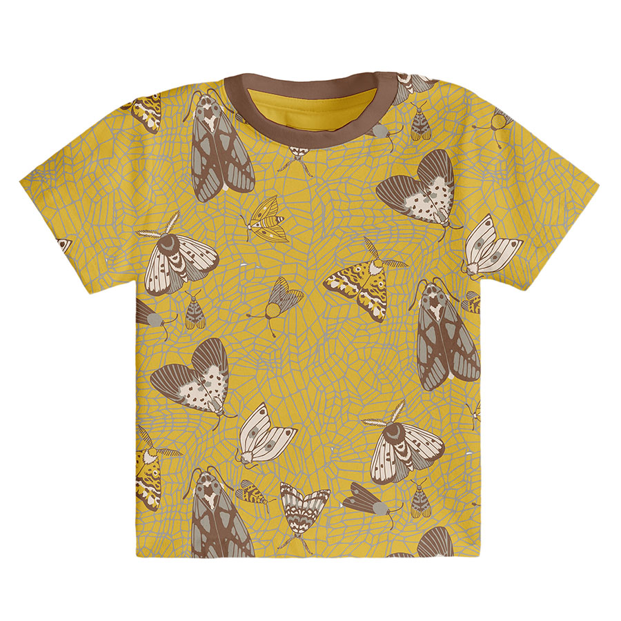
All clothing-mockups presented here are provided courtesy of Kidspattern and are used for visualisation purposes only.
Overview
This pattern development series was commissioned for a client’s Spring — Summer Collection for boys, divided into three age groups: Newborn (0 – 9 months), Baby (0 – 18 months) and Kids (18 – 36 months).
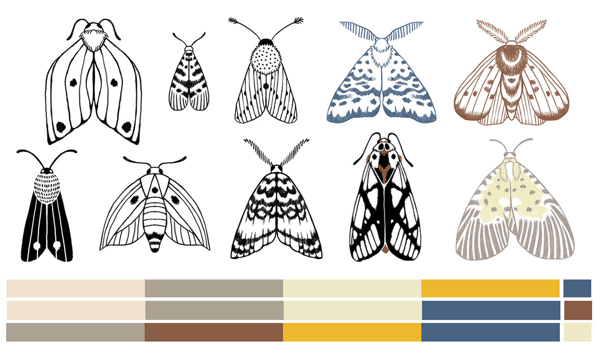
Below you can view this structure, reflected in three respective colour palettes — with shades transitioning along with the age group they are indicative of. This framework was directed and composed by Kidspattern. The colour scheme starts with light and neutral shades for the youngest and continues to adjust with each age group, turning a little darker and more vivid. Overall, these shades are an interesting selection of pale lemon, English mustard yellow, taupe, dark navy and hazelnut brown.
This pattern series is a response to a current trend fuelled by the magnetising appeal of the butterfly’s “ugly cousin”. In order to avoid scary connotations, these depictions were simplified to keep them baby-friendly. All the elements were hand drawn with a few slightly more complex ones for the older age group, which are placed on the right hand-side of the image below.
Newborn Line
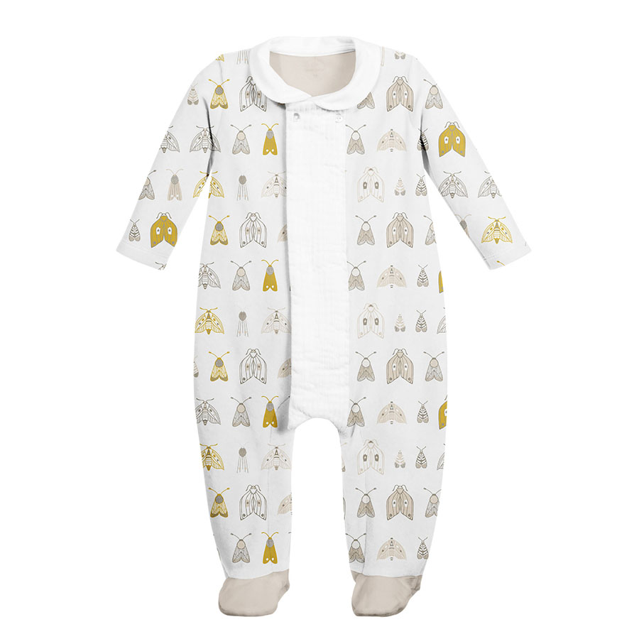
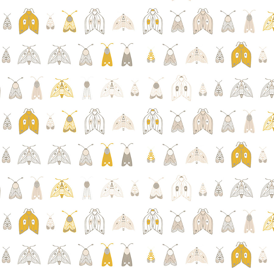
The first option has the moths in small size neatly arranged in a row. As a default these were placed on top of a white background and recoloured with spots of accent yellow to introduce a little pop of colour and break up the order.
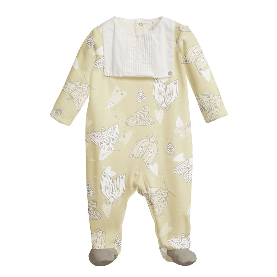
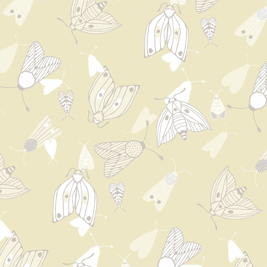
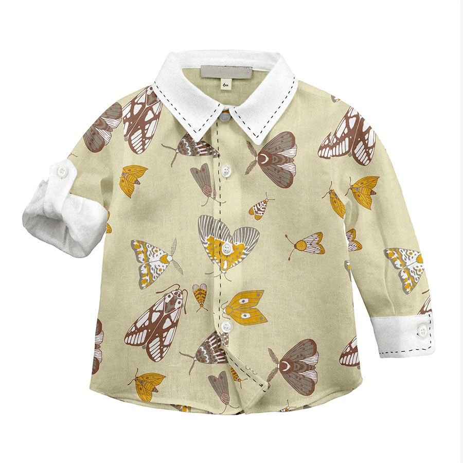
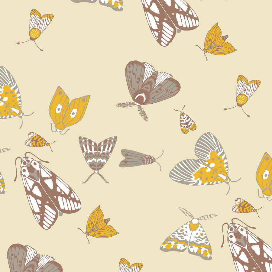
The second pattern is visualised in a larger size and placed against a coloured background in a shade of a pale lemon. The elements are now scattered and rotated. In addition, small flat silhouettes were introduced for a touch of depth.
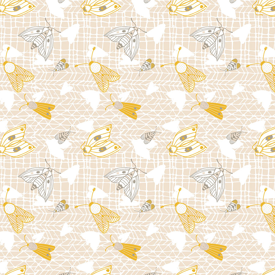
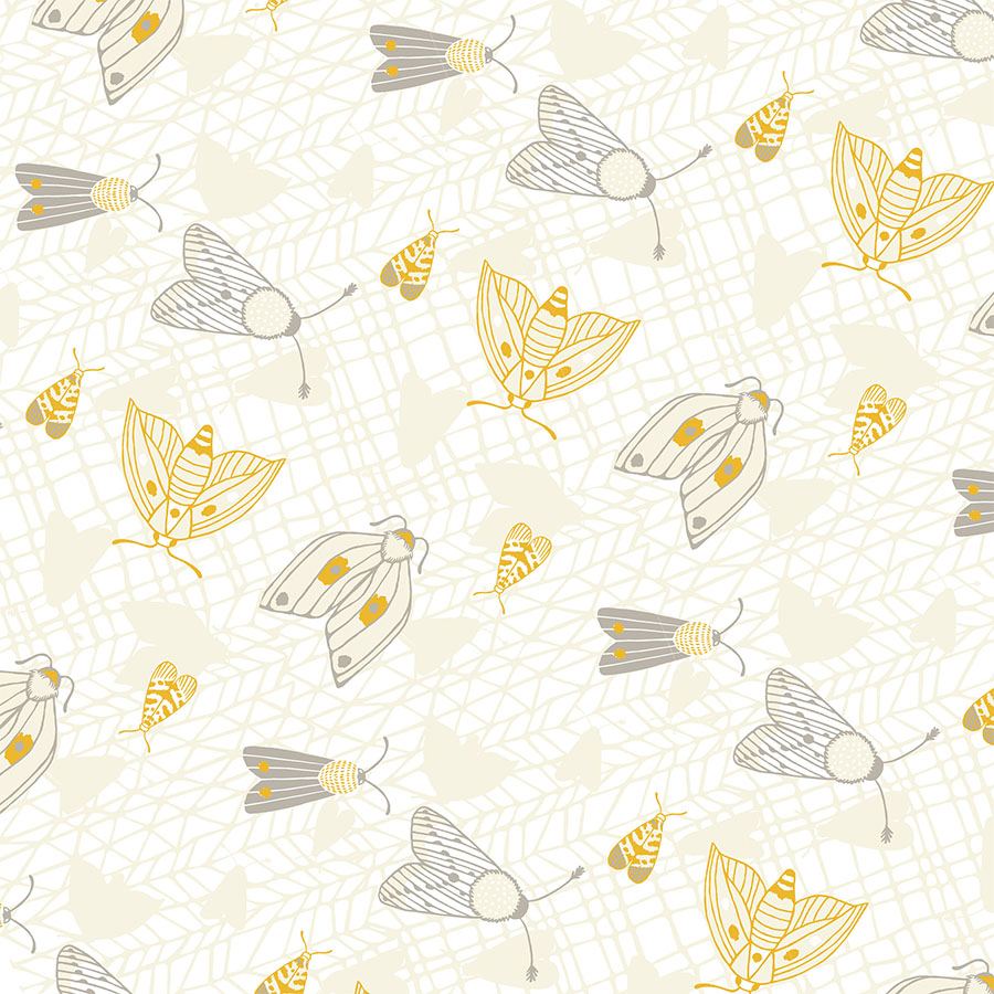
In this last pattern option, an extra background texture was added in the shape of a graphic mesh. It was created from two columns: one with diagonal and the other with straight lines. The moths are layered on top in a regular repeat in order to balance out the visual busyness of the grid. Here it is presented in two colour ways with white and coloured backgrounds.
Baby Line
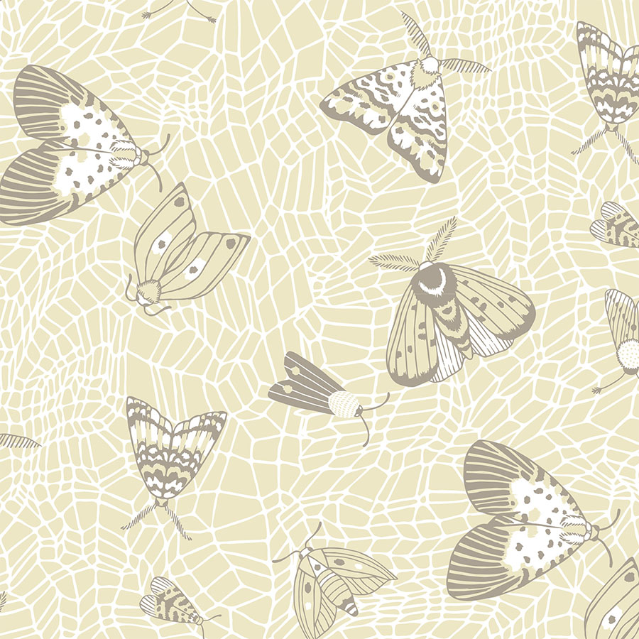
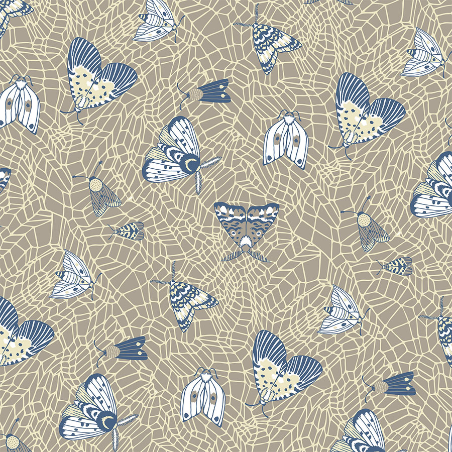
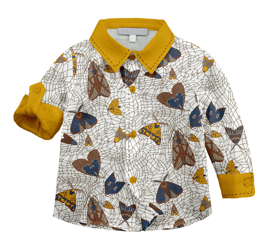
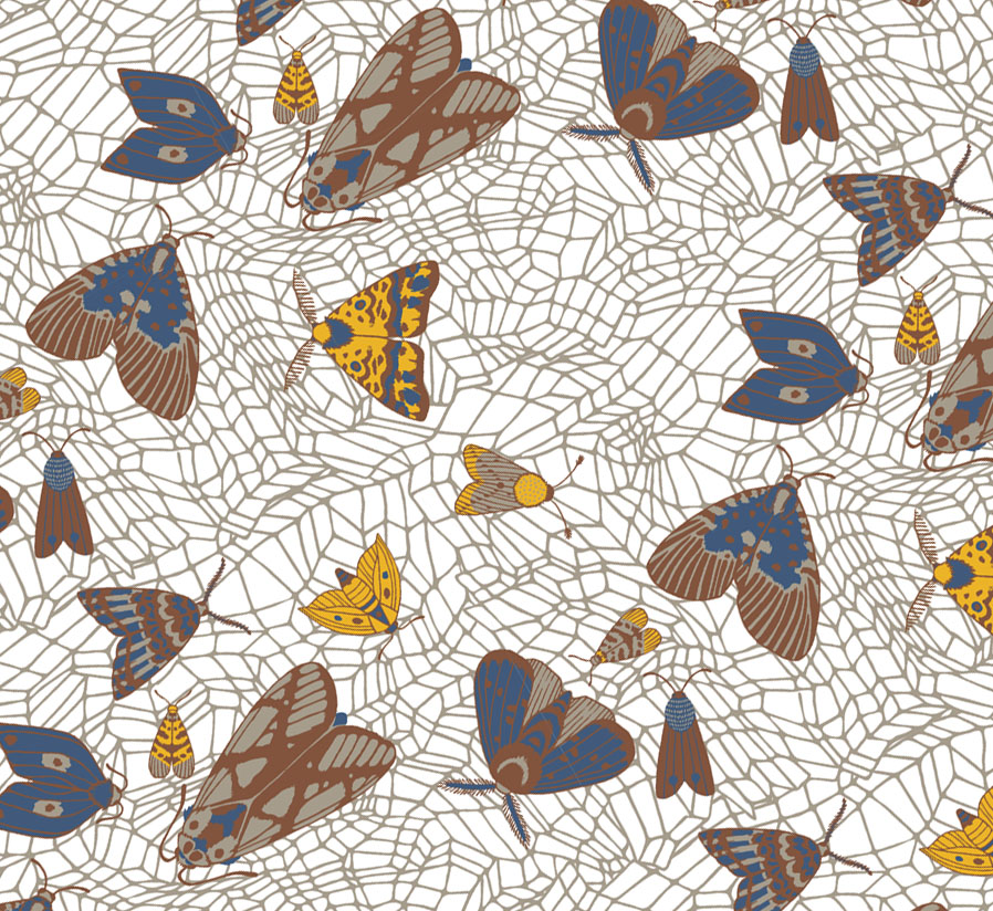
The patterns for the slightly older age group were advanced with the use of another type of complex grid system in the background. Moths, which are layered on top are of various sizes, rotated and scattered irregularly.
Here, you can view the first colour-way presented in a light, pared back pattern with the mesh in white against a coloured background. Whilst, for a darker option, thanks to tinting of the colour palette, a variety of additional interesting shades were expressed in this pattern.
These designs are also distinguished by the size they are visualised at.
Kids Line
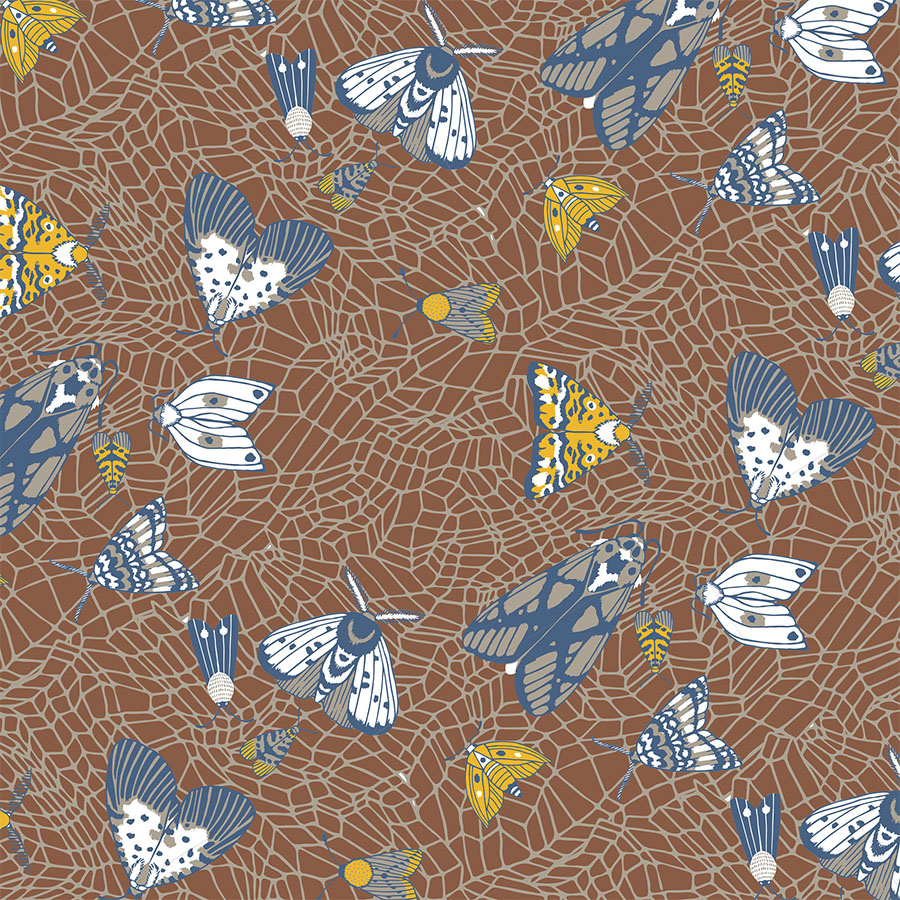
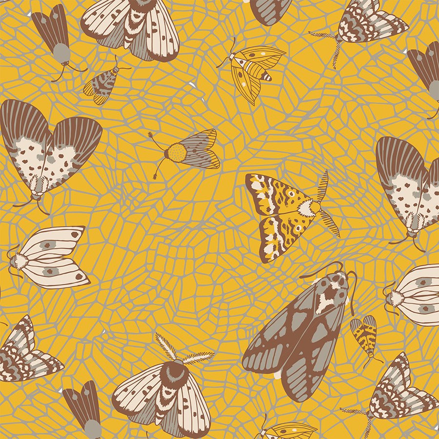
The similar arrangement continues in the oldest age group. The moths now vary in size and shape, roaming around in different directions placed atop a network of a hand drawn graphic grid. Here these are recoloured to match the dark and vivid backgrounds from the colour palette.
The first pattern focuses on the brown background by using the full spectrum of the colour palette and offers an idea for a bold statement print. Following this, is a complementary, slightly lighter option with the mustard yellow set as the background. The emphasis is placed on the matching beige and mushroom colour aspects.
Monochrome Blue
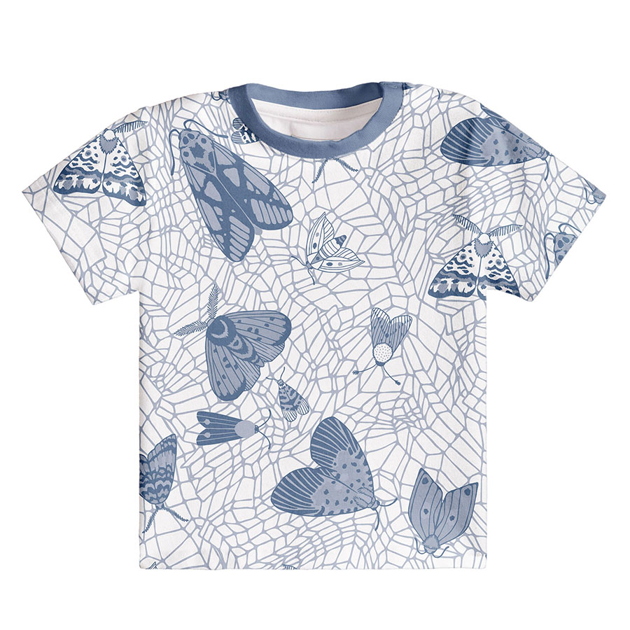
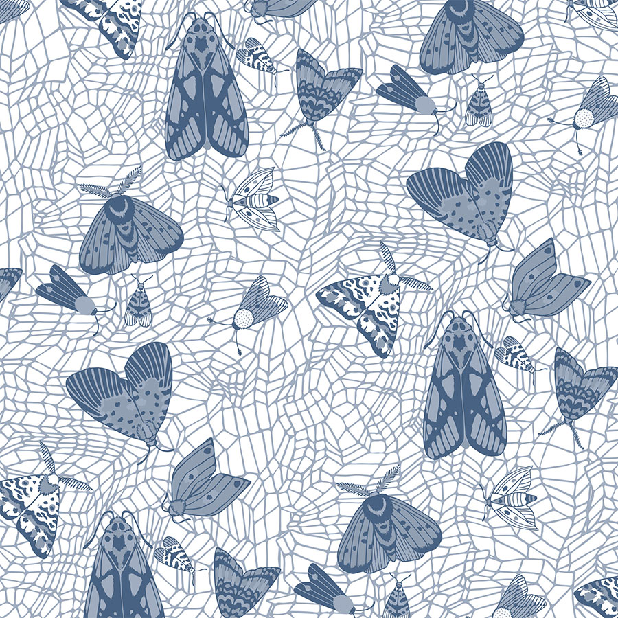
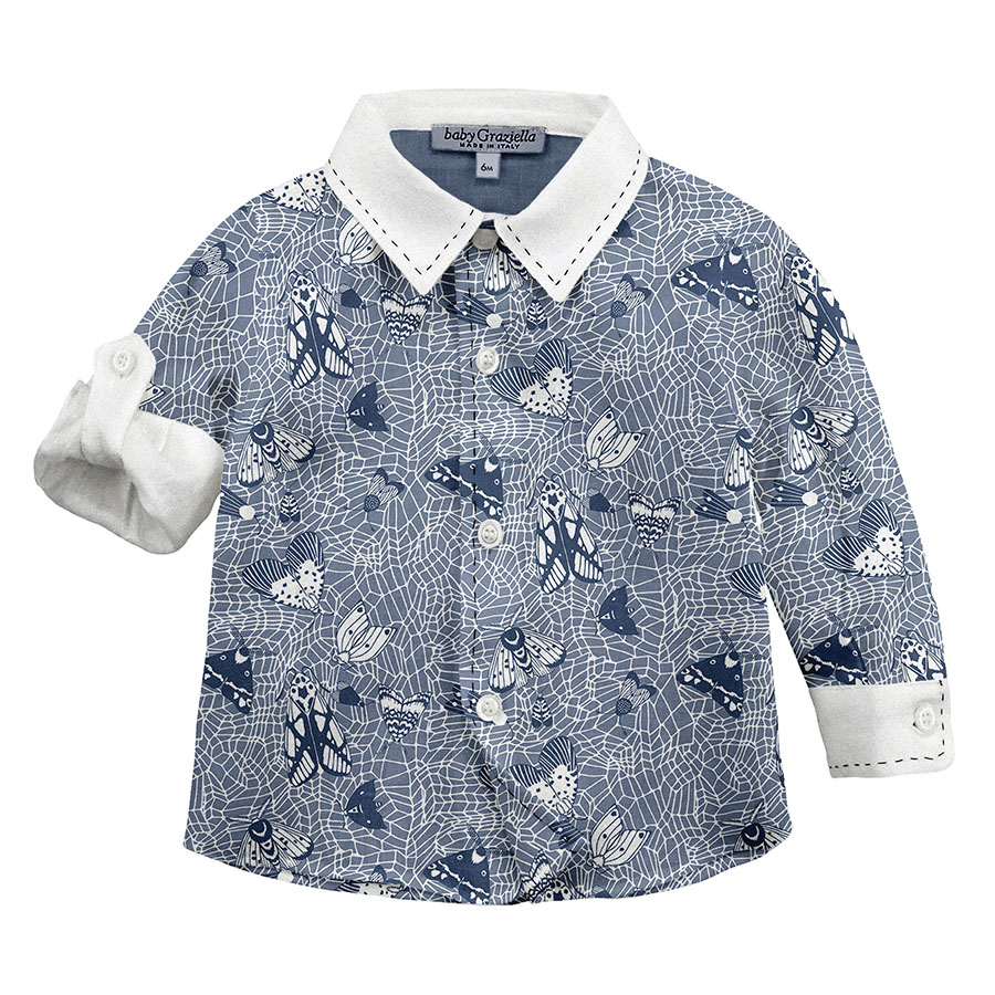
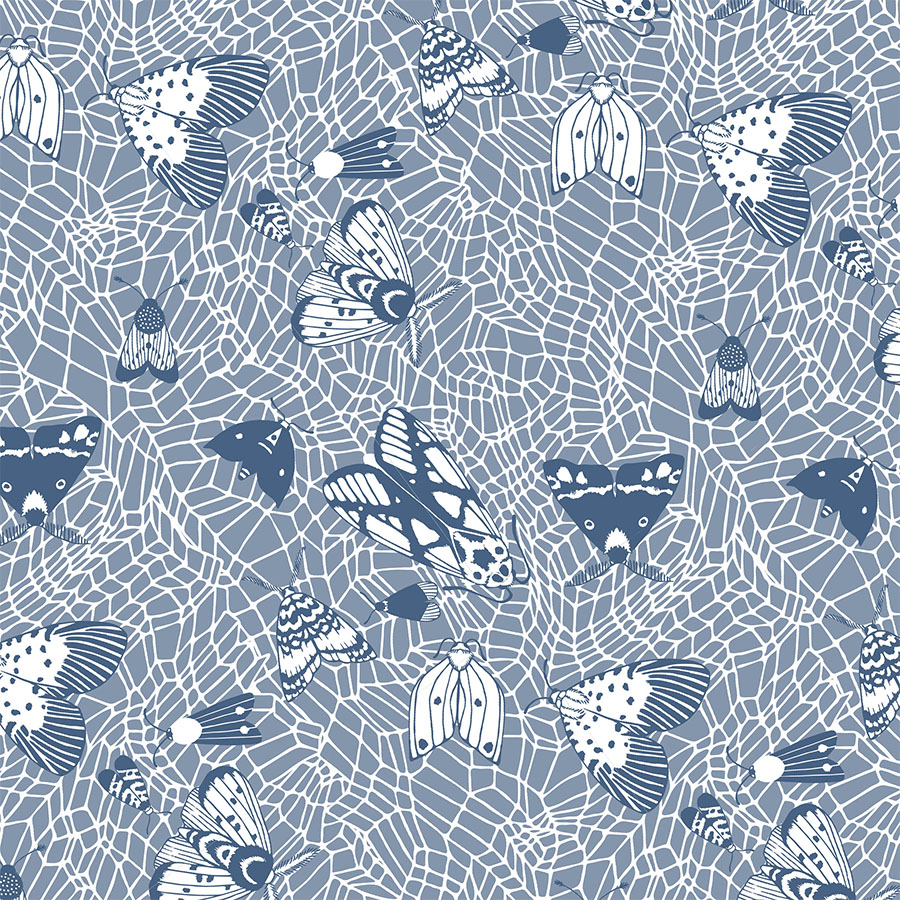
The attention in these patterns is placed solely on the blue aspect of the colour palette. These monochrome and simplified options use only two printing colours — complementary tints of the dark navy.
As such, they provide a cheaper to print, secondary colour-way to potentially add to a matching pattern set. Here they are visualised in two different sizes, however, it is in the smaller one that the web particularly stands out in as an eye-catching textural feature.
Plain Background
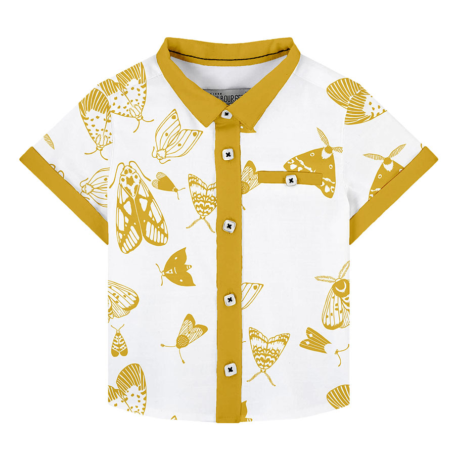
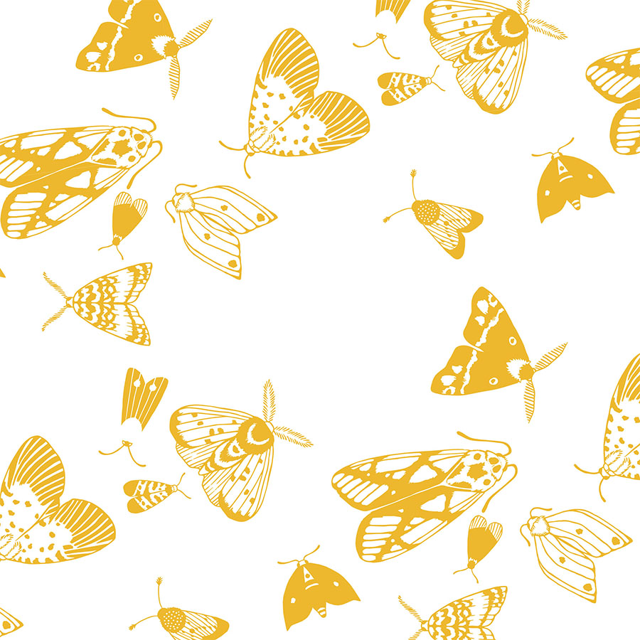
To complete the set, a pattern option was developed, which was stripped of the background texture. This refocuses back onto the illustrations of the moths, which are full of interesting patterns on their wings, which already draws the eye in.
Particularly interesting is a design limited to the use of merely one colour. The elements were simplified to graphic symbols and visualised in an oversized manner. Recolouring these in a bright yellow colour makes for a contemporary and striking design.
“Judge the moth by the beauty of the candle.”


