Night Forest
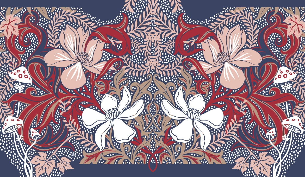
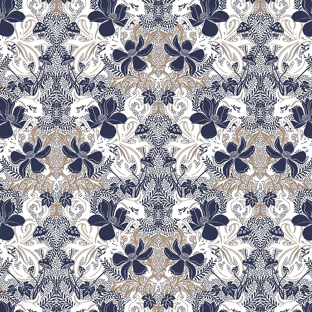
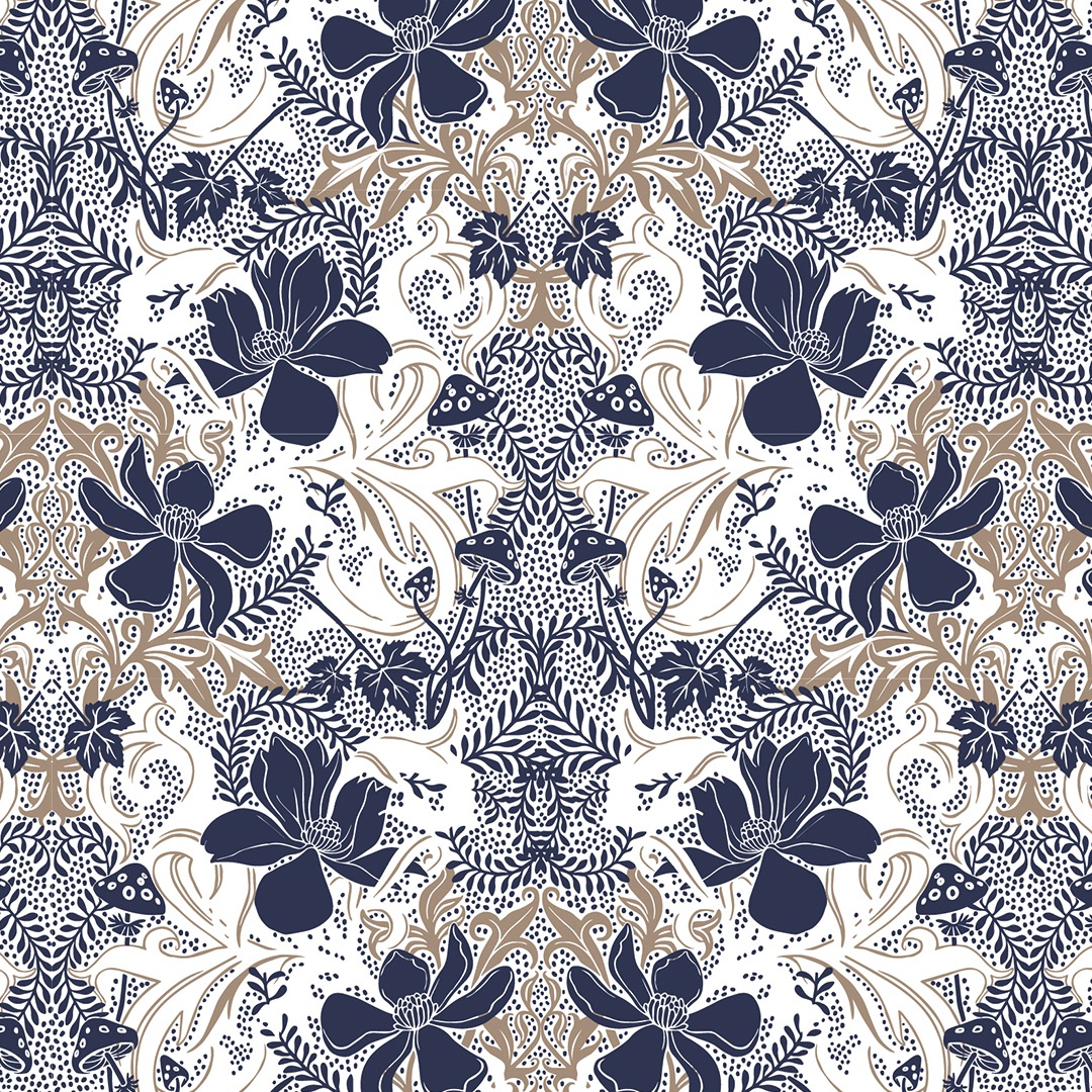
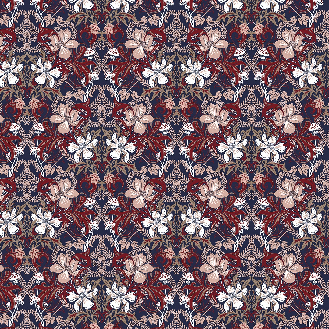
The pattern’s concept comes from imagining a forest at night that is full of blooming flowers, enveloped in billowing foliage, and spotted with small button mushrooms and climbing vines. The colour palette was composed by Kidspattern and comprises dark navy, warm brown, vibrant red, with notes of blush pink and off-white for balance. The composition and aesthetics are inspired by the work of William Morris and the Arts & Crafts Movement.
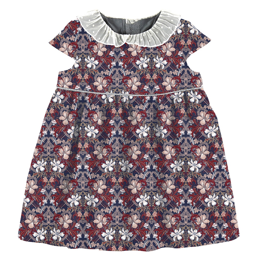
Below is the main version of the “Night Forest“ pattern. It was selected by the client to go into production as part of their Girl’s Autumn-Winter Collection, which I helped develop with @kidspattern. The carefully designed module was intended for a dark background, made full use of the colour palette and, once repeated, it created a rich and ornate full-print pattern.
This project was a part of my ongoing collaboration with Kidspattern. If you’d like to learn more about them please visit their website HERE. Alternatively, view the archive of our previous projects HERE, in which I discuss in detail the history and nature of our work.
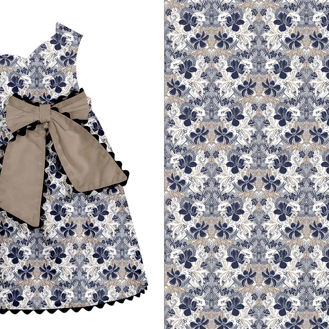
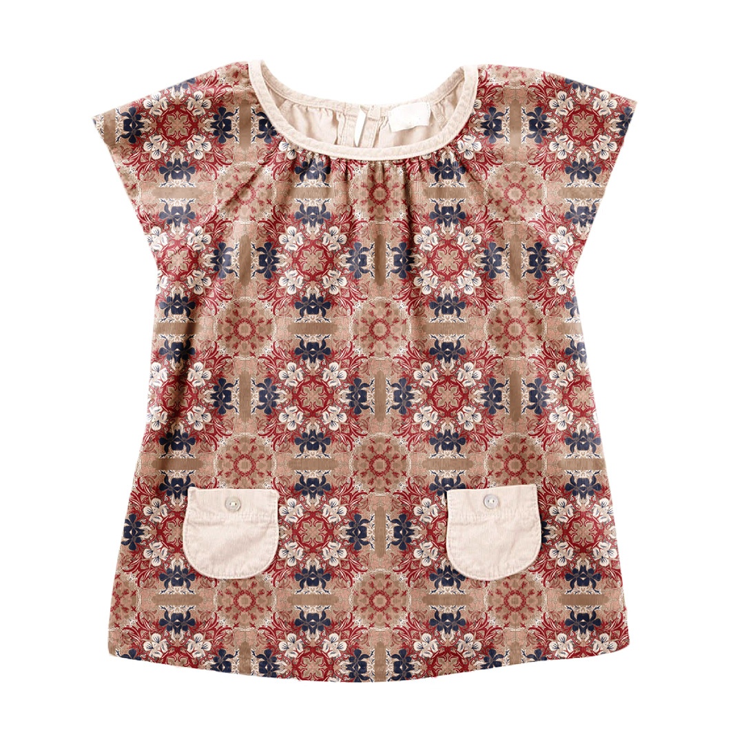
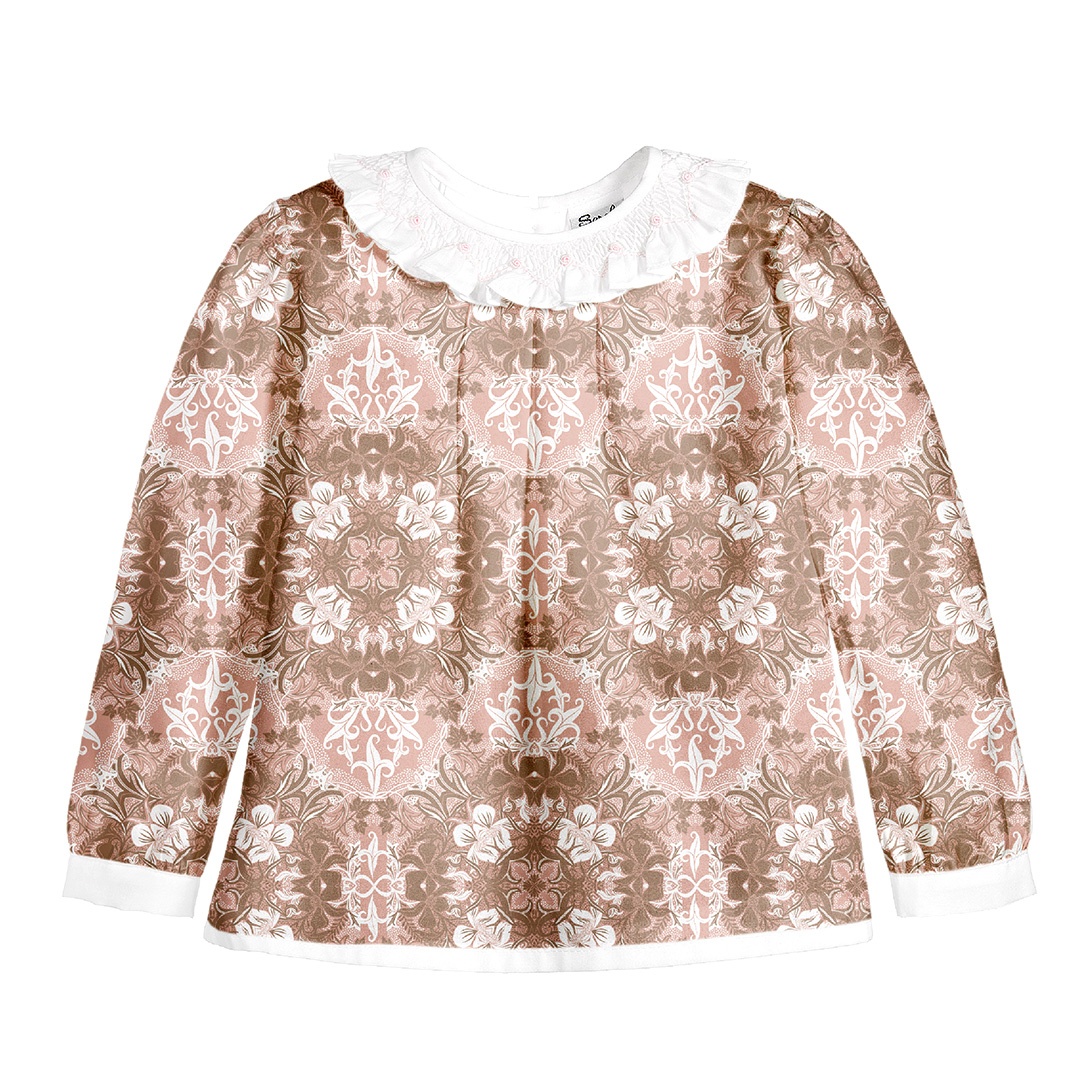
All clothing-mockups presented here are provided courtesy of Kidspattern and are used for visualisation purposes only.
Break it Down
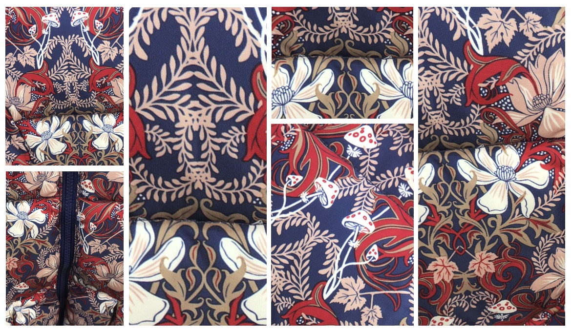
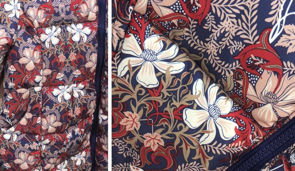
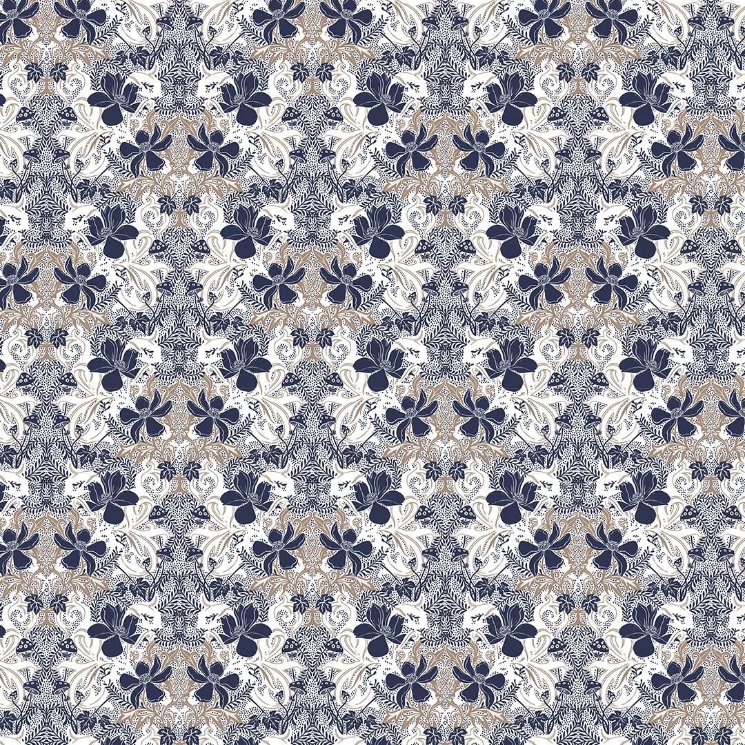
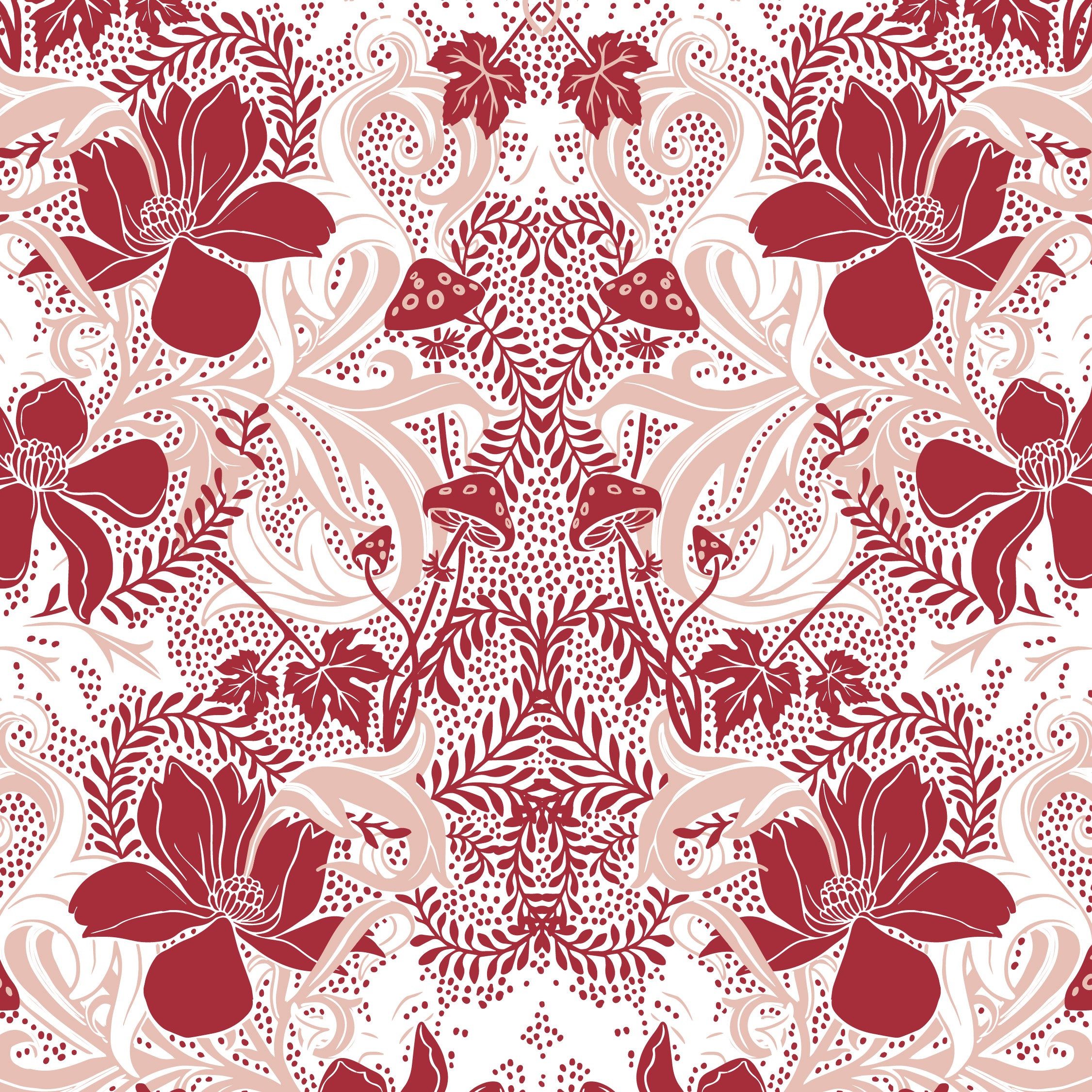
To create a base for the repeat pattern module I digitally hand drew all the composing elements, layered the colours by using each for a specific element and then interwove them together. To be evocative of a setting fit for a mysterious fairytale I also peppered the dark-blue background with white, star-like, dots. Lastly I symmetrically reflected the design to create the complete module. Below you can swipe right to view examples of this pattern in print.

Creative Exploration
Please feel free to browse through the alternative arrangements and colour solutions below. This selection depicts some of the explorative steps that went into developing this pattern, and which I go through in every design process. For each pattern I’ve attached a description, various sizings and close-ups.
Version 1
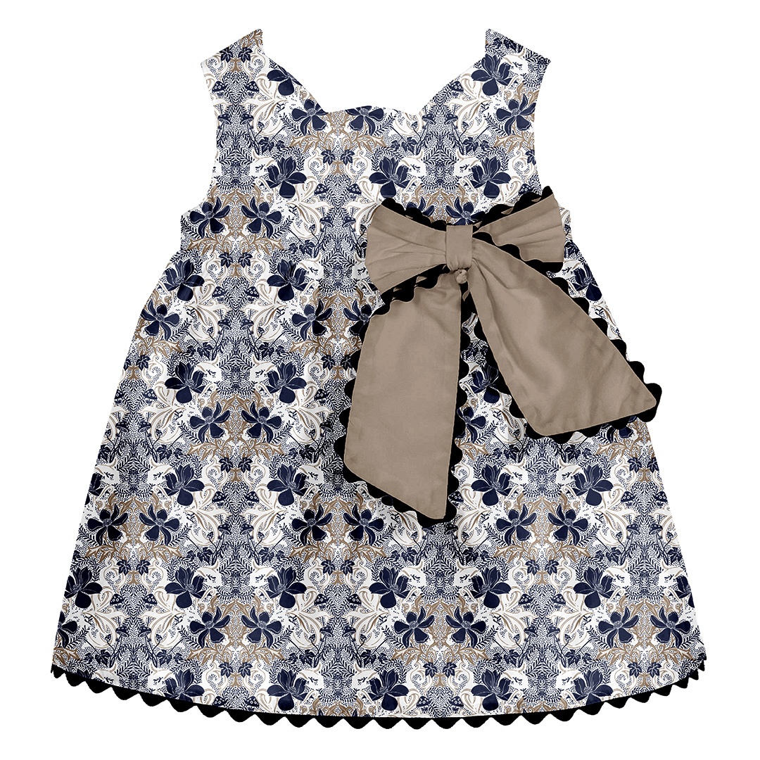
Compared to the final version of the Night Garden pattern this version uses a more limited and wintery colour palette. It reduces the total amount of colours used to just two, which makes it more cost-effective. For this highly detailed version I’ve inverted the colour of the star-like veil of dots (from white to blue), which I think livens up the white background.
Version 2
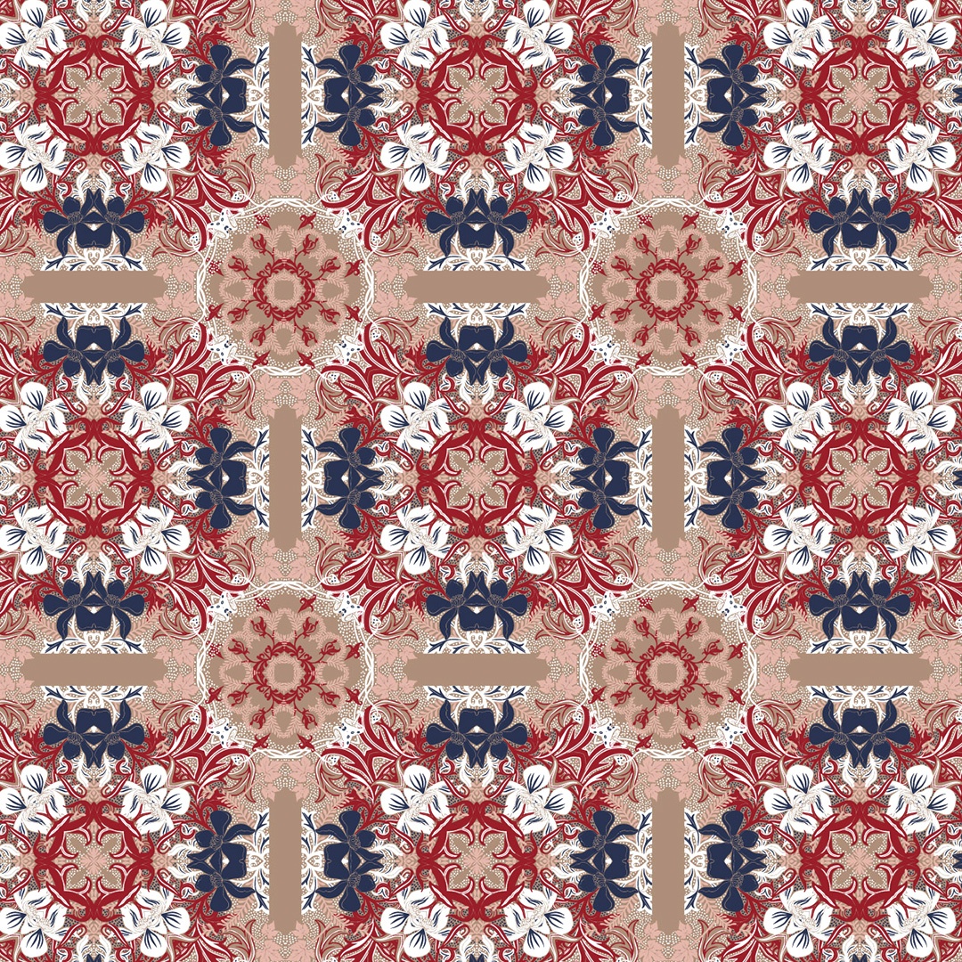
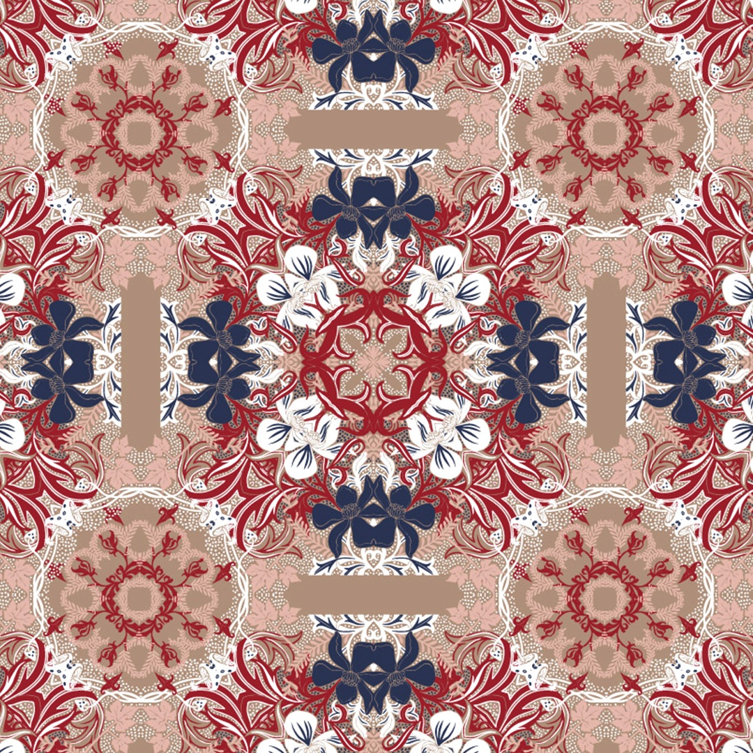
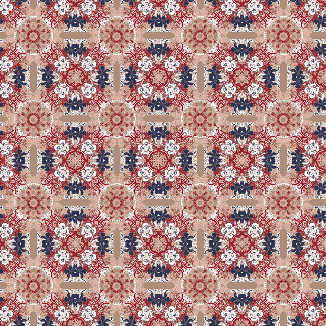
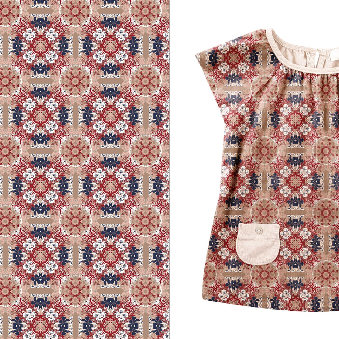
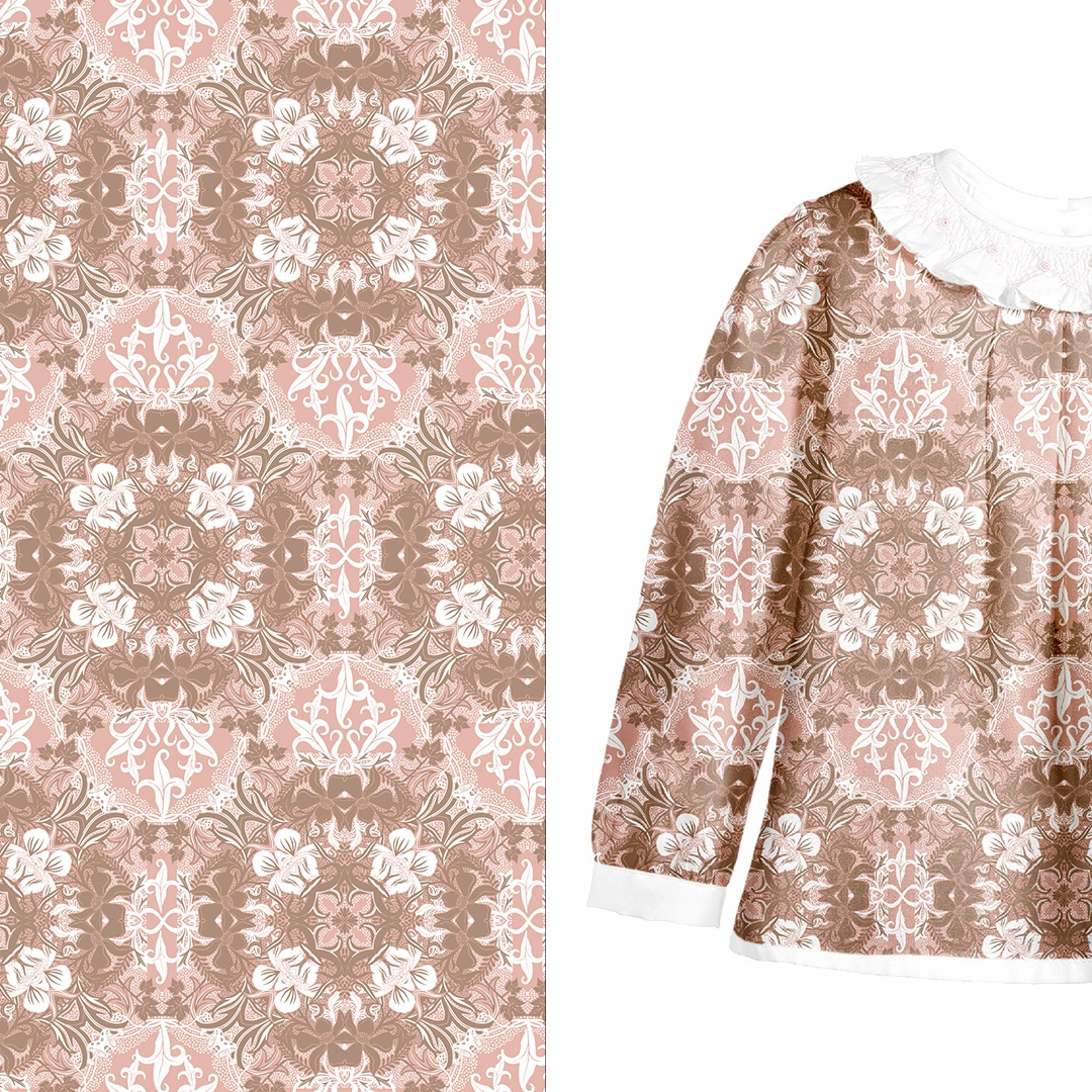
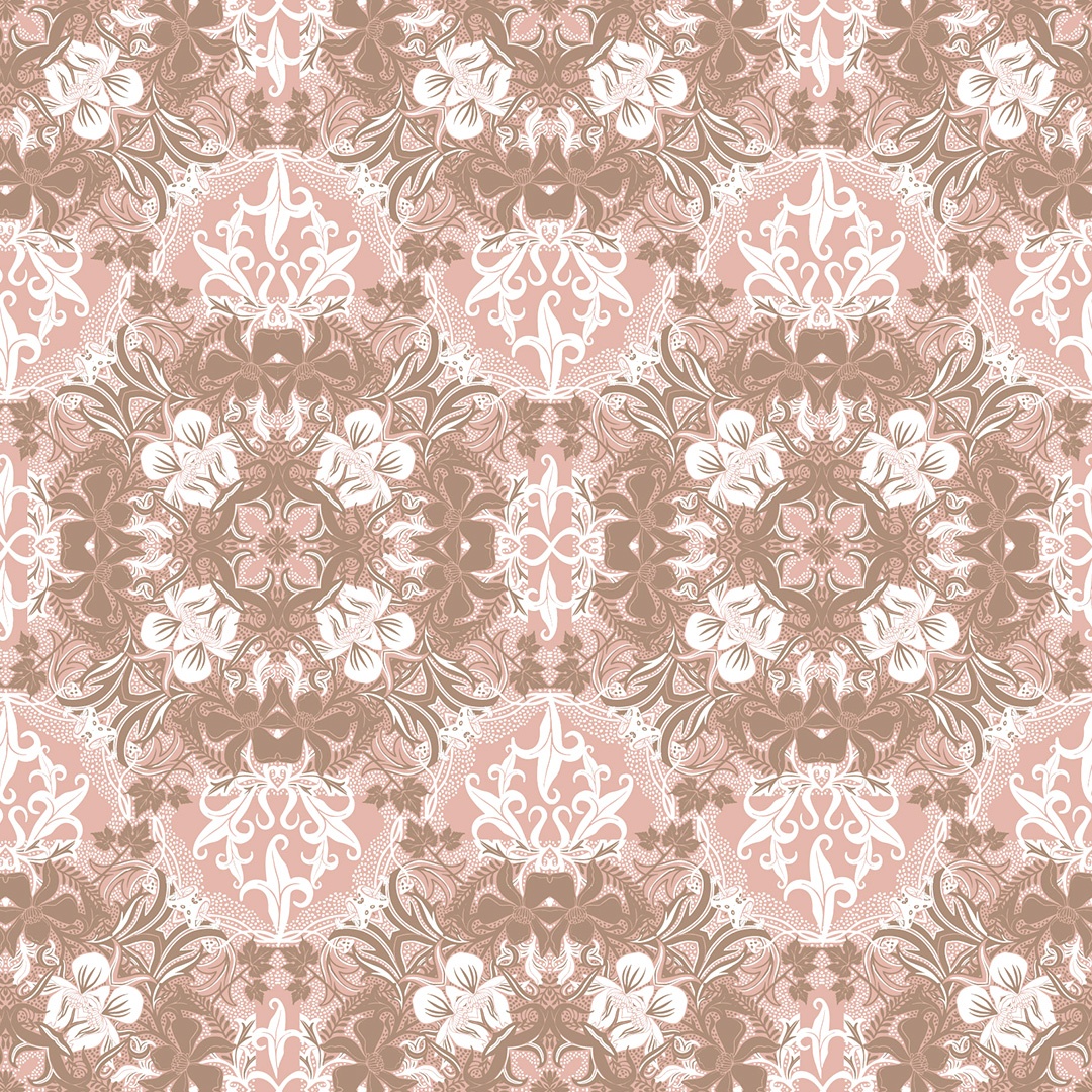
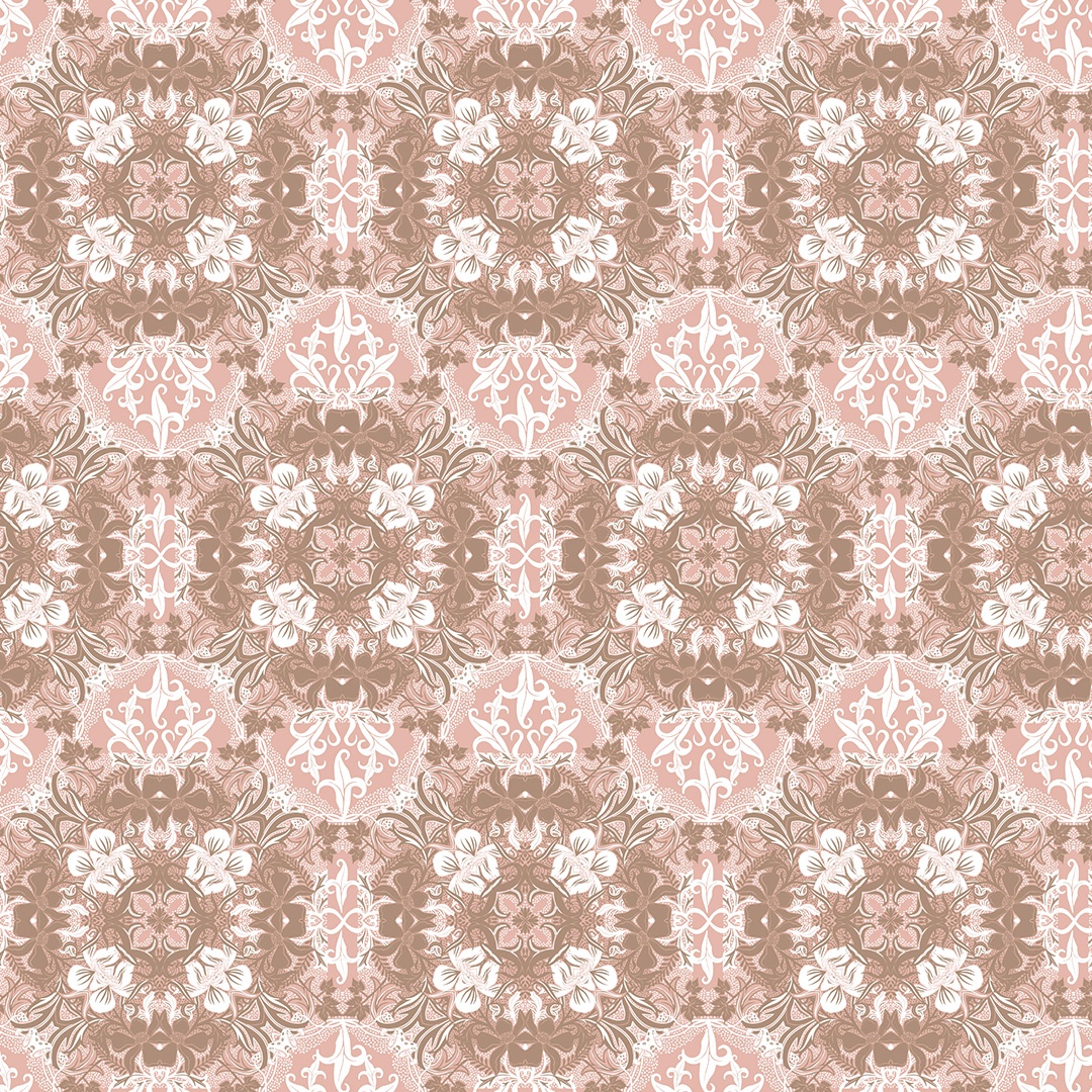
This experimental version is more complex and intricate and was created by using the base elements to create mirrored reflections. The result is this tiled pattern, which moves away from the initially very organic imagery and instead is more deliberately ornamental in its structure. With the background colour set to brown it still uses the full array of the colour palette but with different tones now dominating.
Version 3
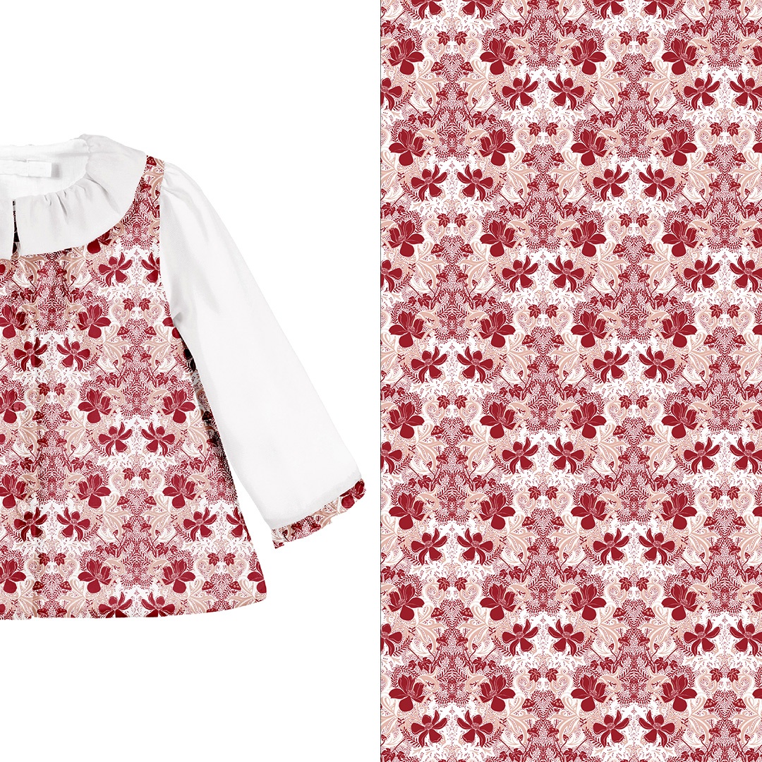
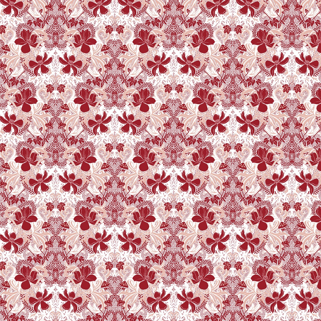
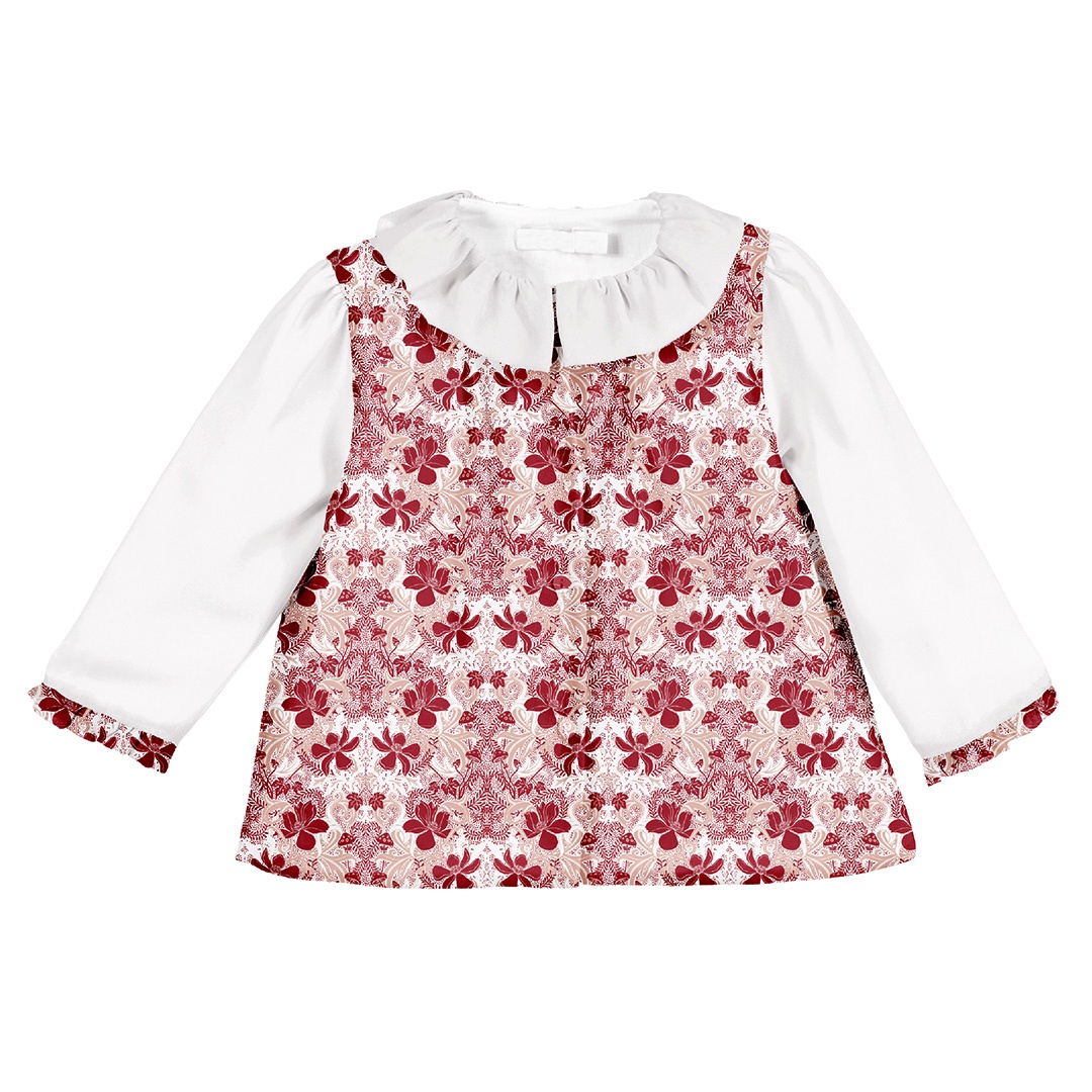
This variation makes use of the original pattern arrangement but presents it in a simplified, monochrome colour palette. Here I simply juxtapose a vibrant red with a complimenting blush. This colouring made it a good option for some of the specifically festive clothing in the client’s Winter Collection.
Version 4
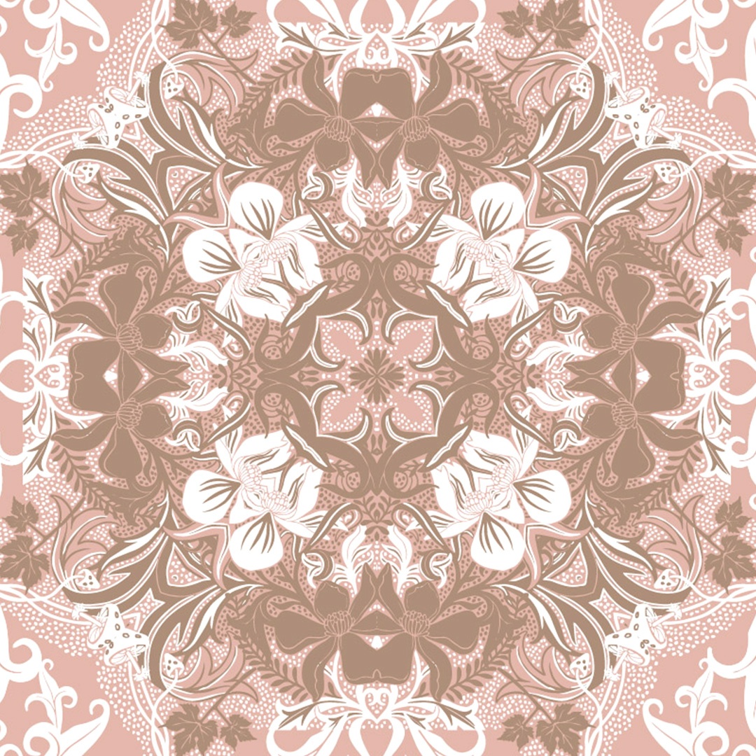
I kept experimenting with the ‘mosaic tile’ variant of the Night Garden pattern and ended up creating this rather flamboyant and elaborate option. To counterbalance the growing level of detailing here I’ve presented it in a more muted version of the colour palette. I’ve also enlarged the overall size of each tile. The kaleidoscopic quality is mesmerising and I’m very pleased with this addition to the set. This is not how I originally intended the module to look but it is very satisfying when the creative process takes on a life of its’ own like this and leads you to something novel — particularly when the outcome is so unexpected and intriguing!


