Ornamental Lacework
Ornament has been evident in the human civilisation since the beginning of recorded history. Drawing inspiration from the heritage of Decorative Arts, as well as the craft of lacework, both traditions were juxtaposed together within this series in search of modern and eclectic design solutions. Furthermore, it explores creative ways to revisit and reinterpret some of the encountered themes and motifs and introduce them to a contemporary audience.
This project was a part of my ongoing collaboration with Kidspattern. If you’d like to learn more about them please visit their website HERE. Alternatively, view the archive of our previous projects HERE, in which I discuss in detail the history and nature of our work.
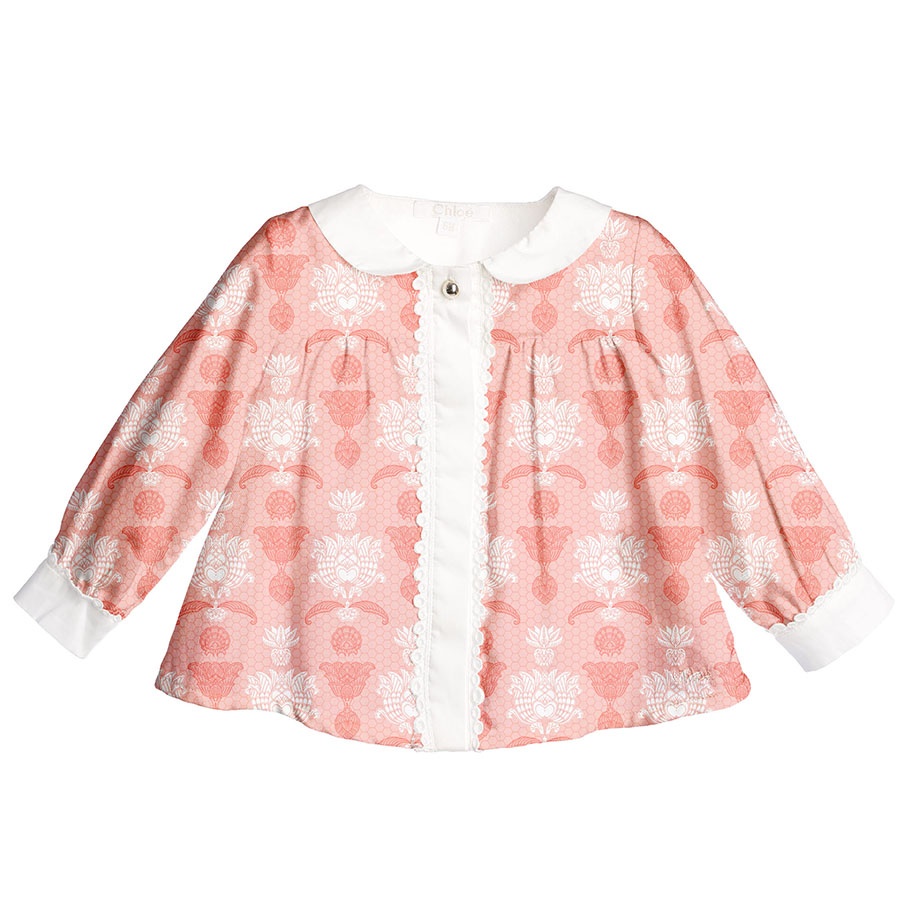
All clothing-mockups presented here are provided courtesy of Kidspattern and are used for visualisation purposes only.
Overview
This pattern case study is formed from a commission for a client’s Spring- Summer Collection inspired by Decorative Arts. This theme, as well as the colour palette, was commissioned for a total of two designs (view the other here — Eclectic Folk)
The brief recommended following one of the current fashion trends, of printing a pattern that resembles a certain type of fabric, as opposed to using that exact fabric in order to make an item of clothing out of it.
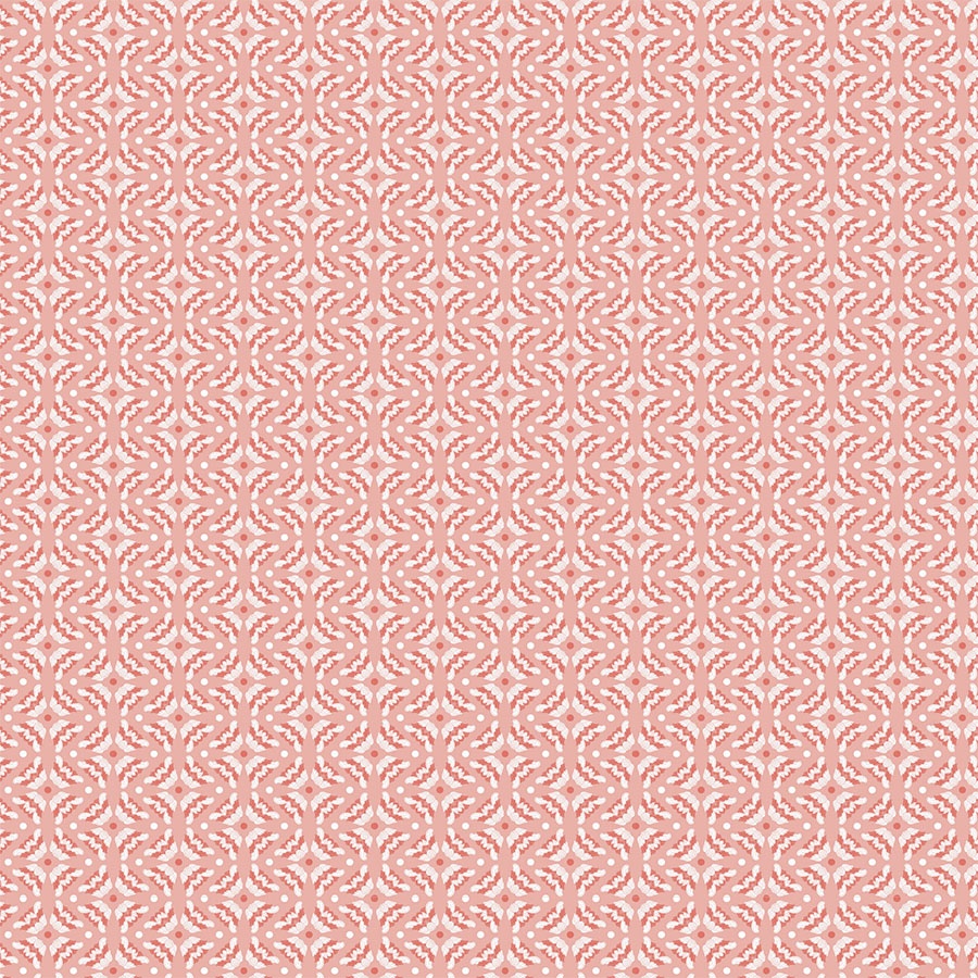
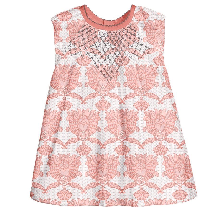
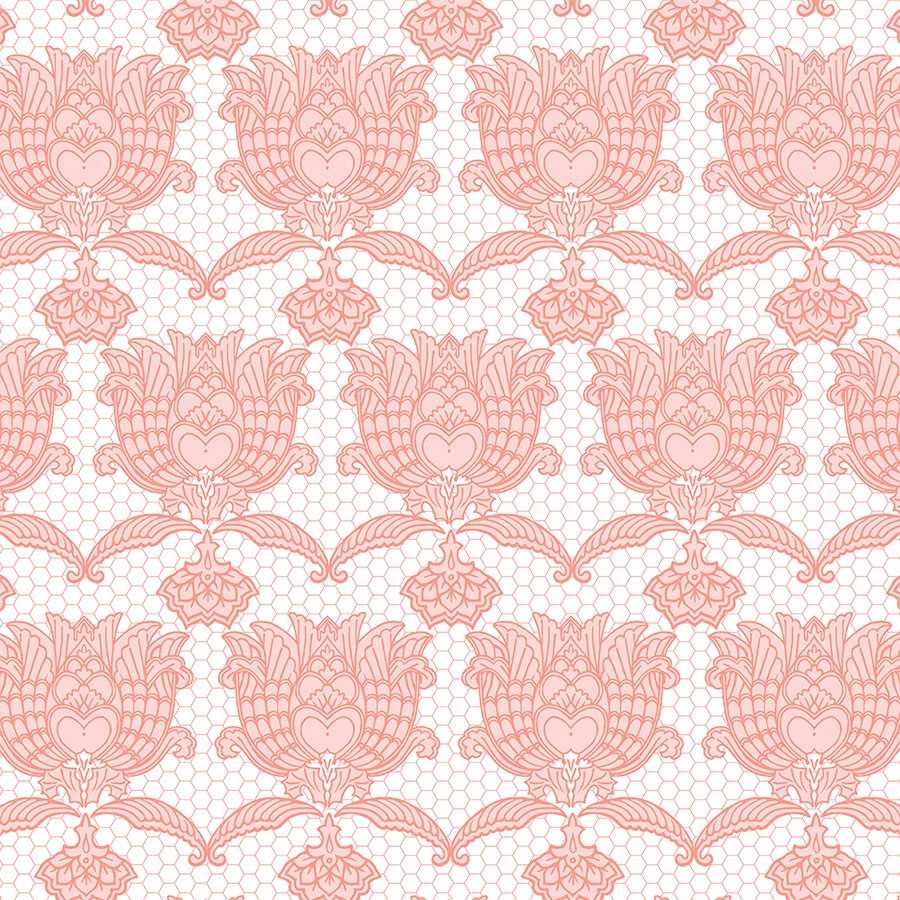
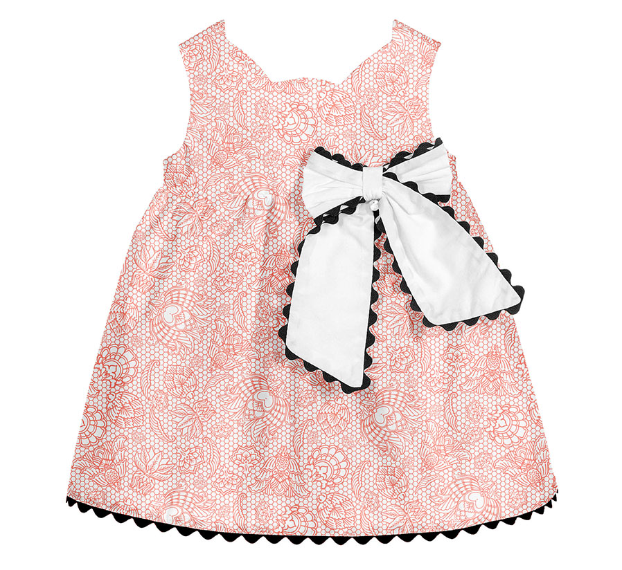
Above, you can view an outcome of this reinterpretation of lace in a version of the pattern, which was purchased by the client. A simple hexagonal texture was added on top of the white background to imitate lace and to create a base for the placement of the other ornaments. These were then scattered and rotated around, blending in for more of a textured look. This print appears full and decorative even though it uses just one colour to achieve that effect.
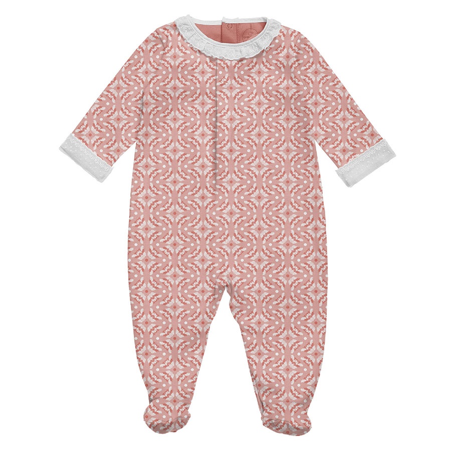
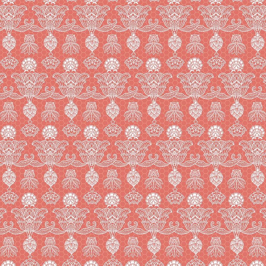
In an alternative colourway, the background colour was set to medium coral, which then turns the hexagonal line of the lacework to white. This not only reinforces the association to classic lace, but makes the white embellishments really stand out. This is brought up to date by a use of a modern ‘Living Coral’ palette, eclectic juxtapositions and bold, oversize print solutions.
Starting Point
Here you can view the full colour palette composed by Kidspattern for this series, ranging from tinted corals and then matched with accents of pinks.
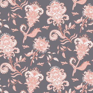
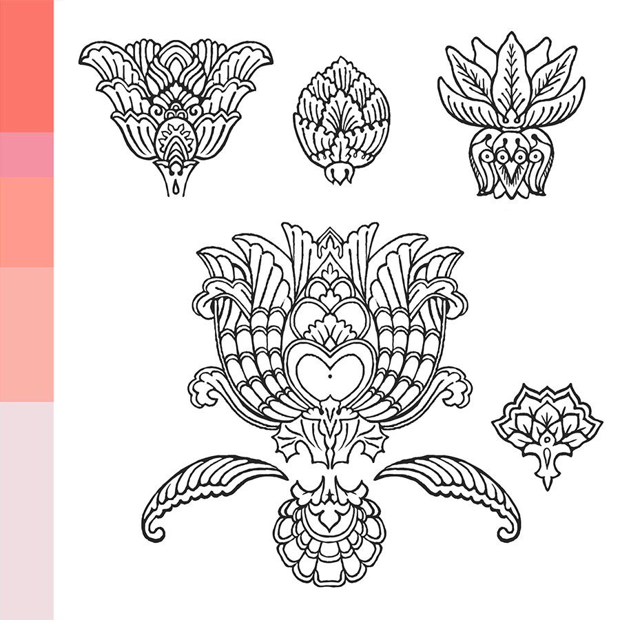
Across Eurasia and the Mediterranean world there has been a rich and interconnected tradition of plant based ornament for over three thousand years. Thus, these elements are influenced by classic motifs, based on stylised florals and leaves.
Newborn Collection
In our work with Kidspattern we make sure that our designs are universal and can be applied across multiple age groups and backgrounds within our client’s collections.
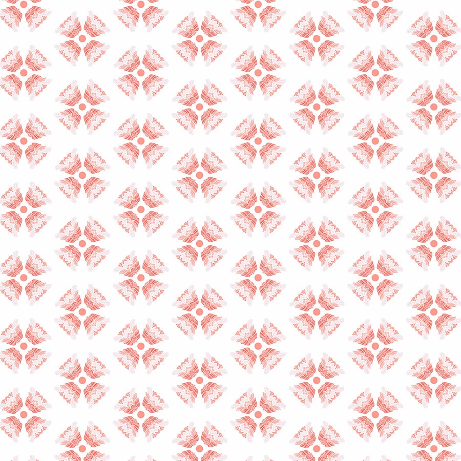
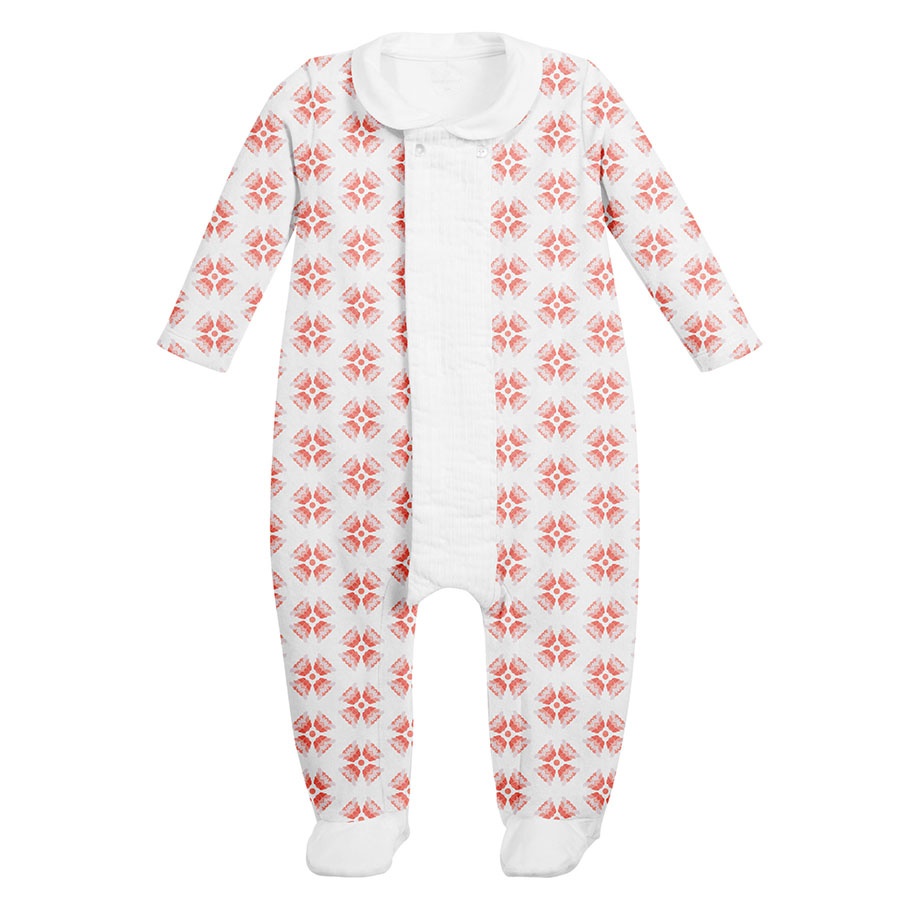
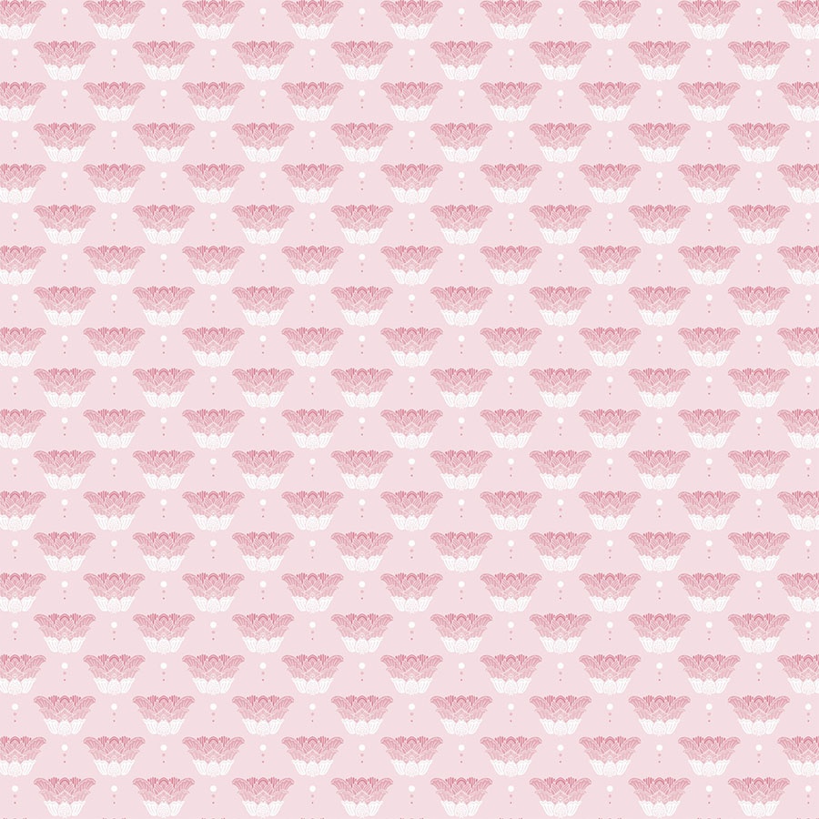
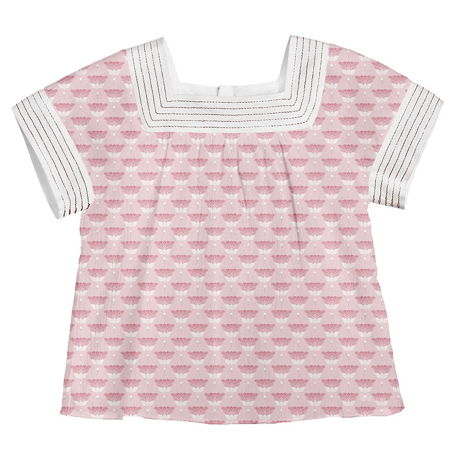
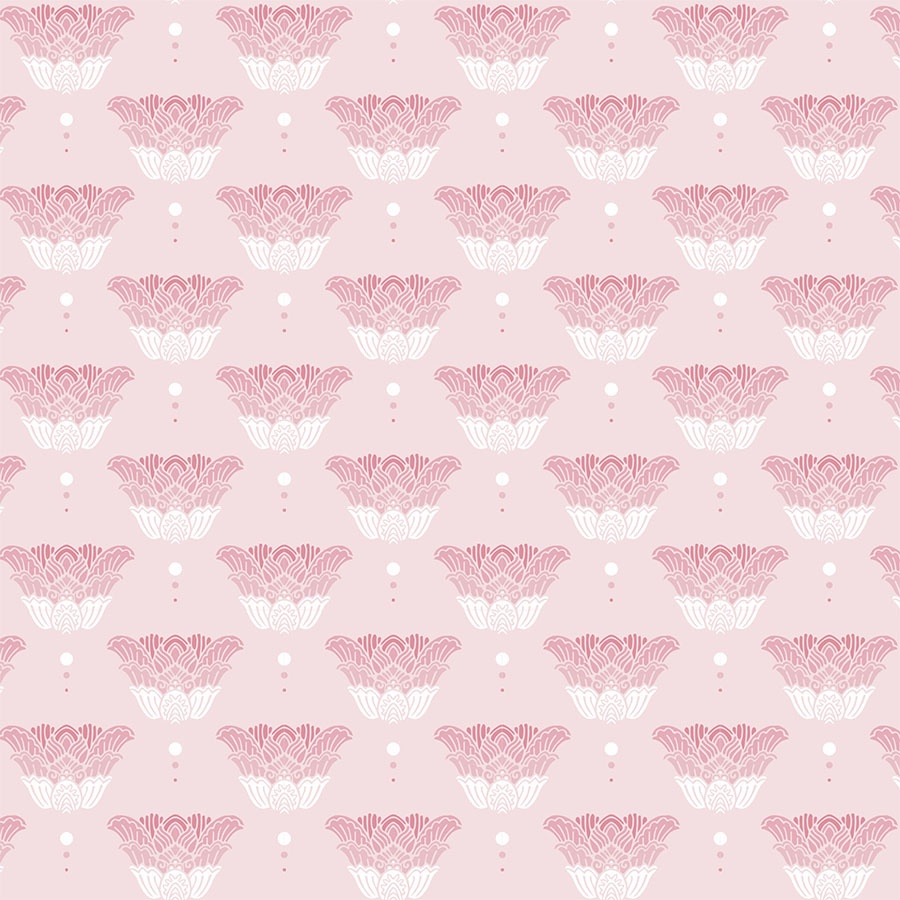
In this version, the ornaments were filled and recoloured in a transitional manner (from light to dark), then arranged in a rosette and spaced out regularly on a white background.
Browse Through Alternative Solutions
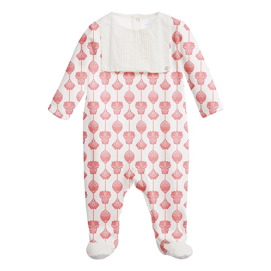
Below I’ve presented a selection of designs all aimed at the Newborn group. Apart from bodysuits this would typically also include a Homeware Collection of items like baby blankets and other accessories.
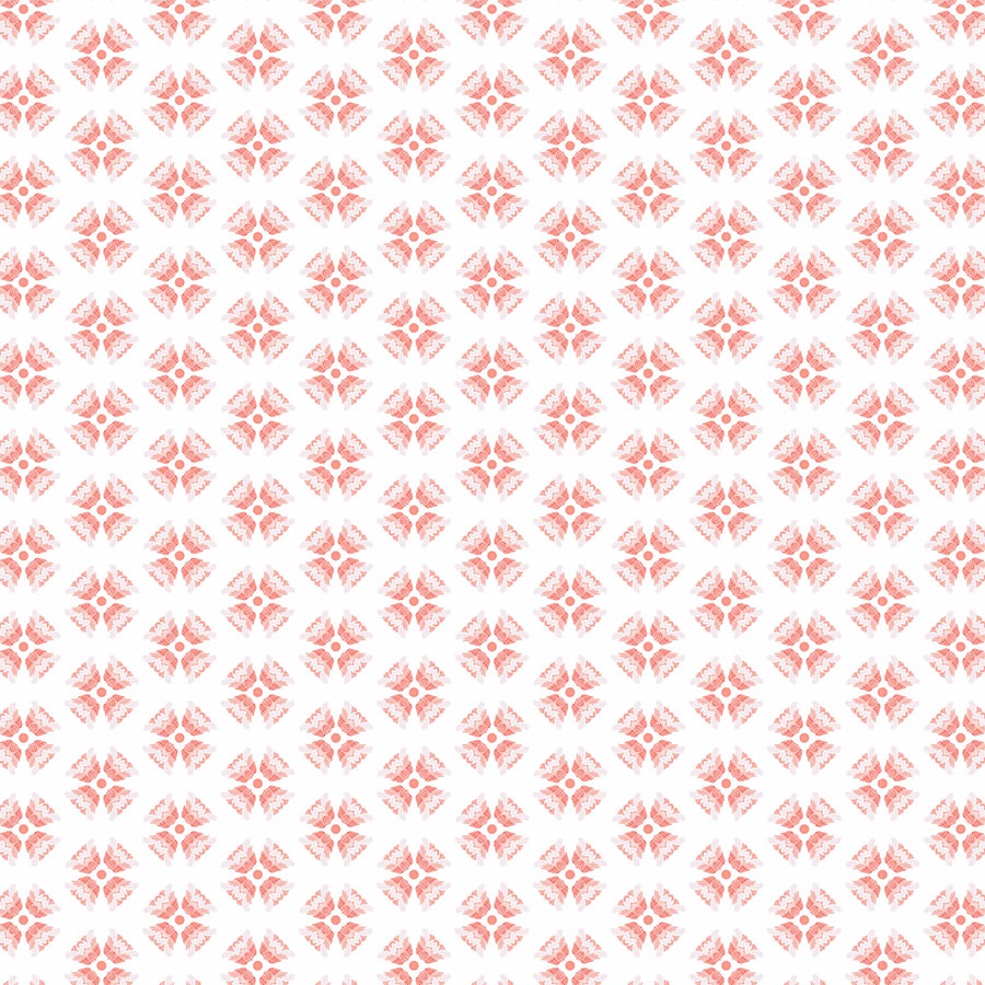
1)The initial, simple pattern was recoloured to fit a medium coral background. The elements were clustered closer together and now appear to have a mosaic effect. To keep the cost of print low, the number of colours used was reduced to only two.
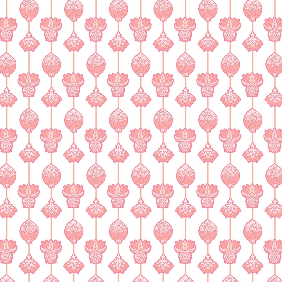
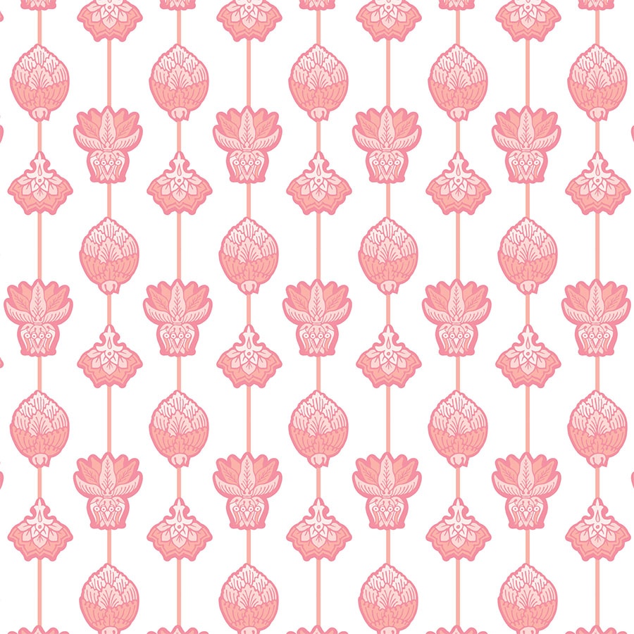
2) In this stripy version of the pattern, all the ornaments were arranged along thin, coral lines. The embellishments were recoloured in a transitional manner, in sync with the pinks of the palette.
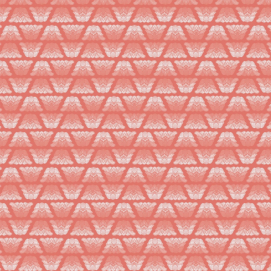
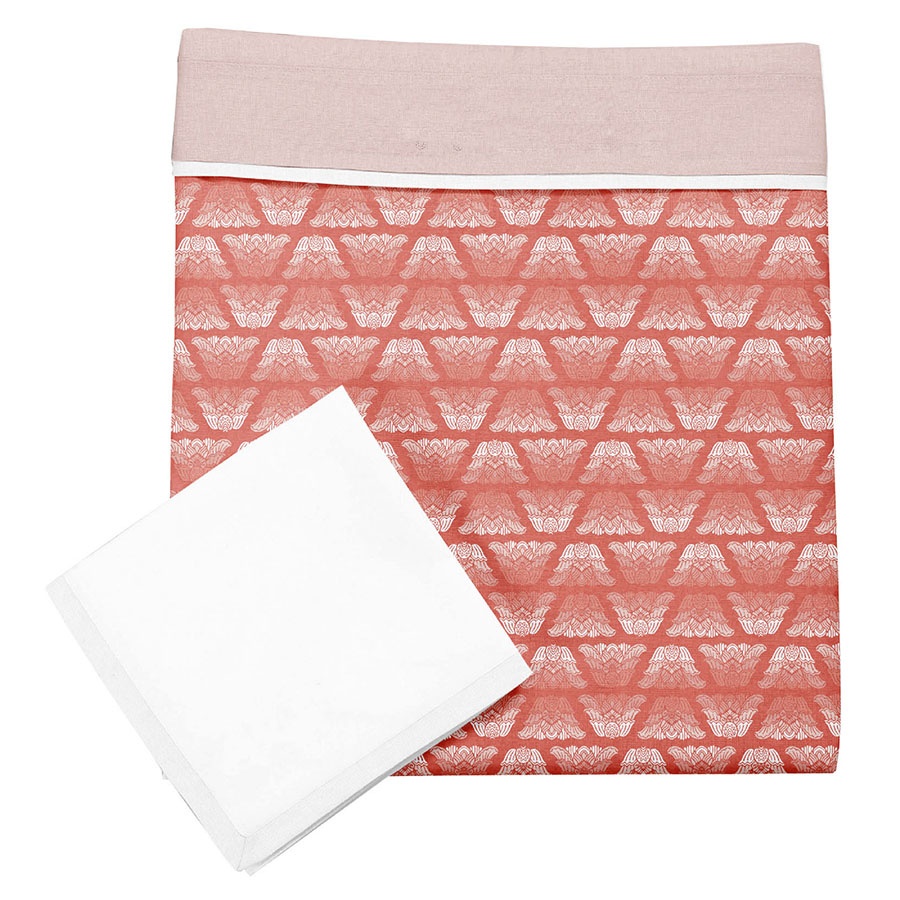
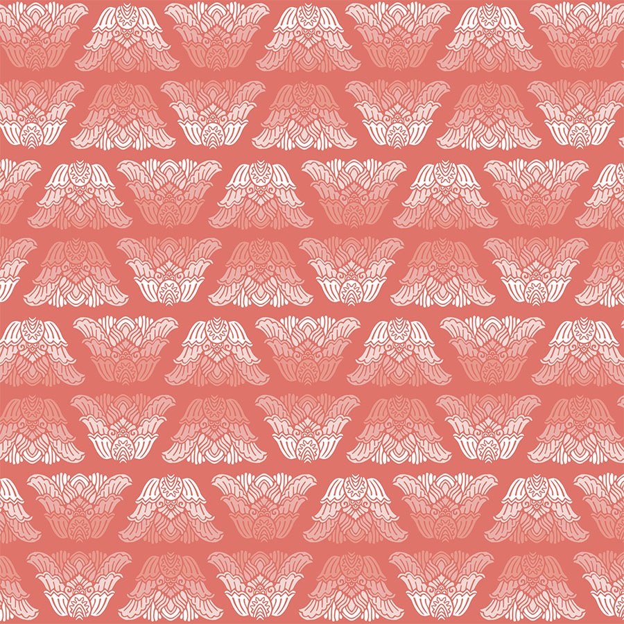
3) Next, the tulip shaped ornament was arranged methodically into lines. Combined with its transitional ombré-like colouring this creates a vibrant, optical rhythm. The design is placed against the darkest of the corals and visualised on a baby blanket as part of design package aimed at homeware baby products.
4) This time, the tulip-shaped element was reduced in size and repeated regularly to suggest an idea for this petite, secondary print. Aiming to offer an alternative that matches the rest of the set, it was recoloured to fit in with the pinks of the palette. The result is this delicate, subtle pattern with a range of uses in multiple age groups.
Lacework
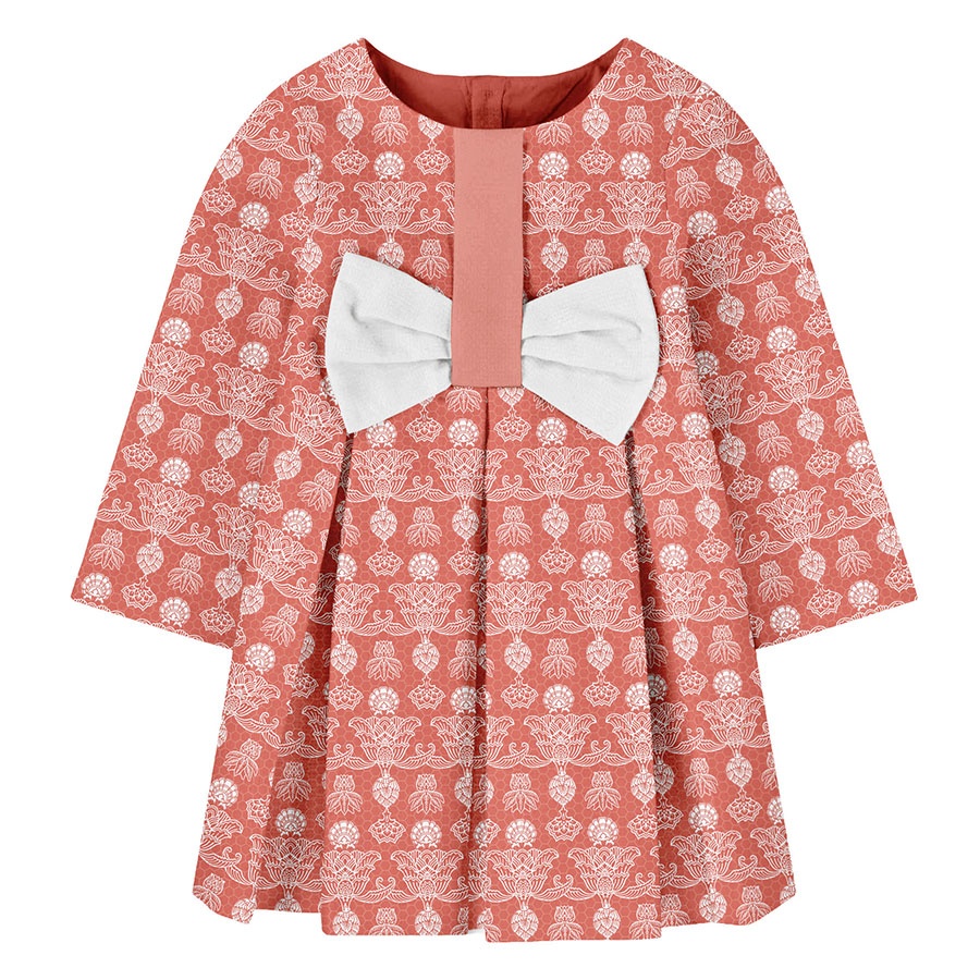
The main decorative ornament was arranged in a linear manner to emulate a sense of an elaborate lace. Here it is visualised in a large size on a summer dress.
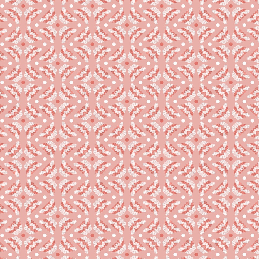
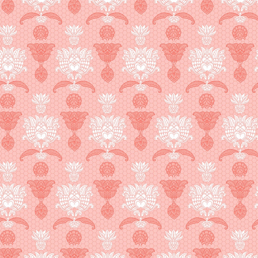
Next, the background colour switches to the medium coral and the arrangement of the ornaments becomes more vertical and intermittent. Also, the overall pattern was reduced in size and now has a certain polka-dot rhythm to it. In this close up, you can observe a nice detail at play where some of the elements are filled with darker coral whilst others blend into the background and are filled with white. This treatment of the ornaments resembles a display of fancy jewel pieces such as lavish brooches or big bedazzling earrings.
Dark Background
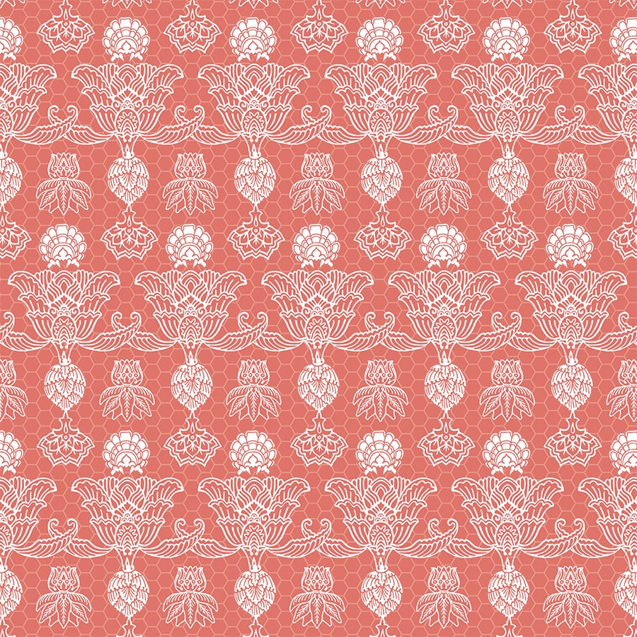
This final arrangement is inspired by border lace designs. Some of the elements are filled in with white to add to the rhythm and weight of this design. Placing it on a dark background also makes the lines sharp and clean. Lastly, the arrangement in horizontal lines helps to read it as if these were strips of lace.
Pattern in Print
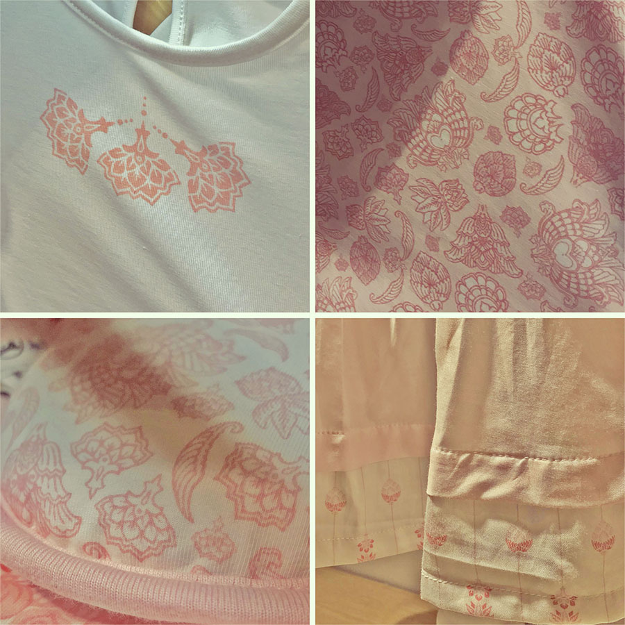
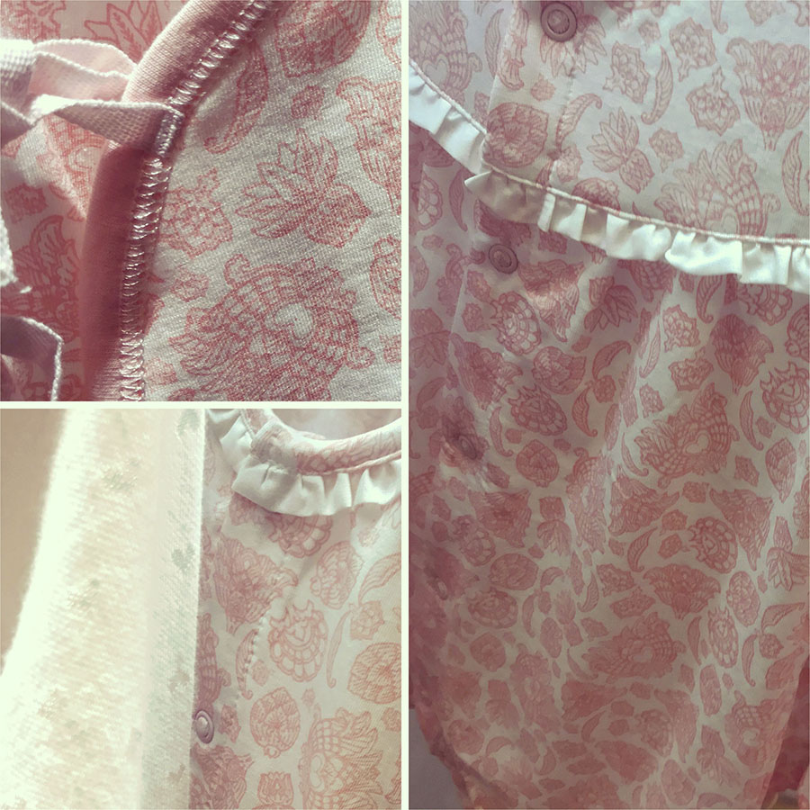
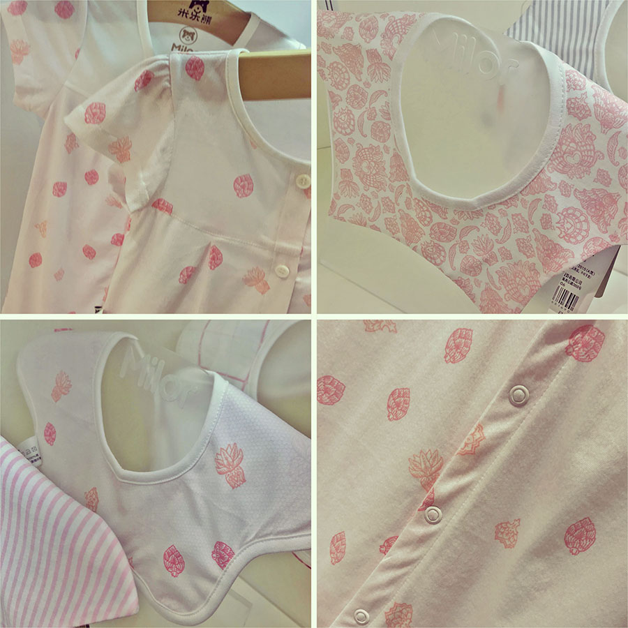
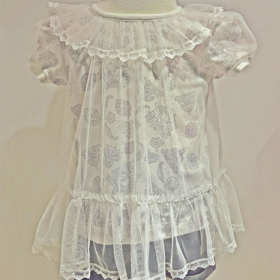
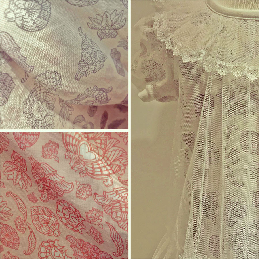
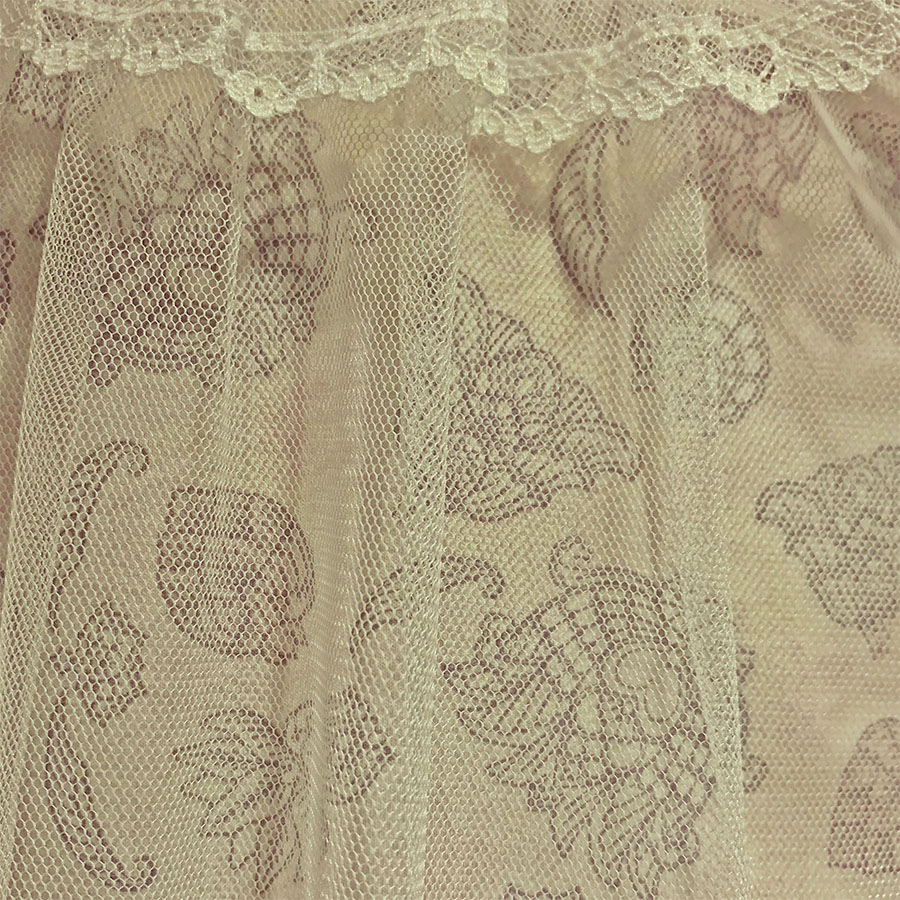
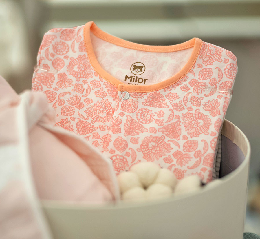
Please browse through a selection of examples of the Ornamental Lace pattern in print. These were produced to launch the client’s overall Spring-Summer collection and to promote it at trading fairs. Apart from clothes aimed at kids 18 – 36 months old (on the right), I’ve also added a few samples from their Newborn group, which include bodysuits and bibs (on the left).
What I found particularly interesting about the last image, was how the overall theme of lace was carried through by an additional layering of a patterned top with a transparent lace dress. As throughout the collection, the same set of decorative elements was used across all the pattern variations; hence this whole series has a consistent look, regardless of the designated age groups.
Please note that these images are provided courtesy of the client and Kidspattern and are used for portfolio purposes only.
“Let us have no machine-made ornament at all; it is all bad and worthless and ugly.“


