Pegasus of the Forest
Deep in the forest, mythical creatures make their home in the realm inhabited by other beings that shy away from the human gaze and prefer to remain undiscovered. Take a walk through a late autumn, moody woodland with majestic trees so tall that the sunlight fails to reach through to the ground level, leaving it shrouded in mysterious shadow.
This project was a part of my ongoing collaboration with Kidspattern. If you’d like to learn more about them please visit their website HERE. Alternatively, view the archive of our previous projects HERE, in which I discuss in detail the history and nature of our work.
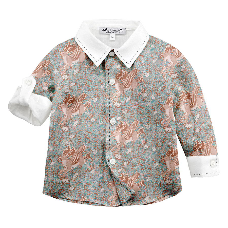
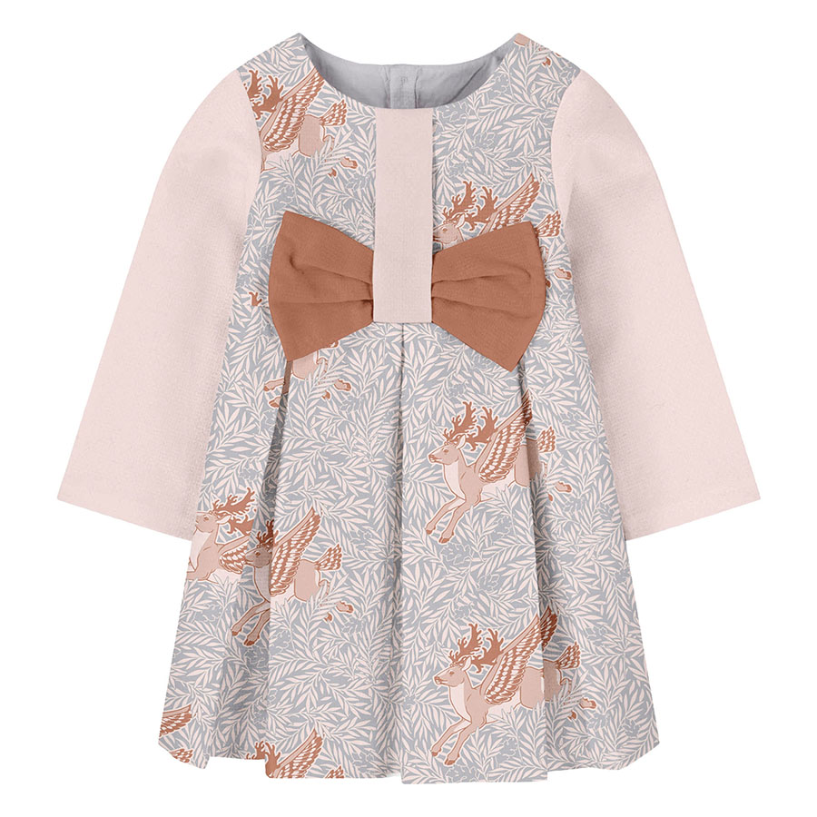
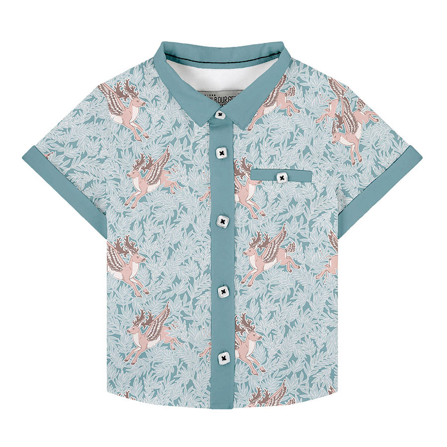
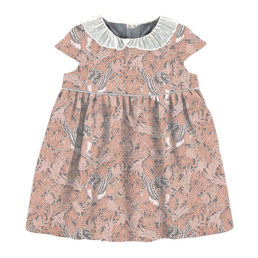
All clothing-mockups presented here are provided courtesy of Kidspattern and are used for visualisation purposes only.
Overview
This series is a briefed commission for an Autumn-Winter Collection for children aged up to 36 months old. The separation between boys and girls is discernible by the affixed colour palette composed by Kidspattern. These share a base of neutral colours — a selection of browns and greys. However, the palette for boys is matched with a shade of sage, whereas the one for girls is finished with the ever popular, lilac.
Anchored in the theme of Autumnal Woodland, this design seems to echo the aesthetics of medieval tapestries, filled with legendary hunting scenes full of mythical animals. Further inspiration comes from a longstanding tradition of flying equines like Pegasus, who because of their flying ability, have always been considered a universal symbol of latitude and free spirit.
Elements Development
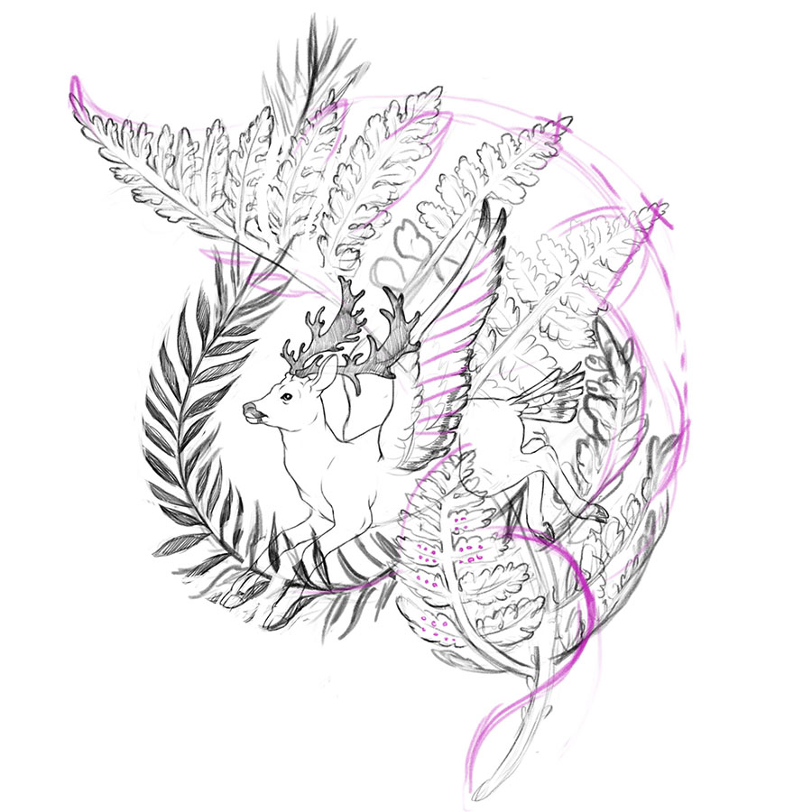
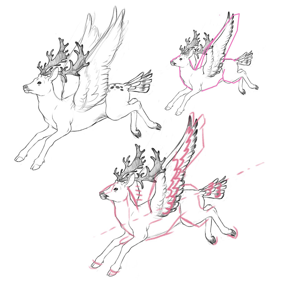
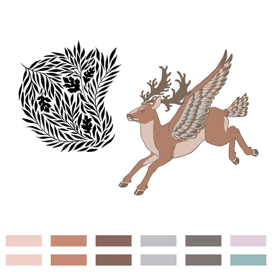
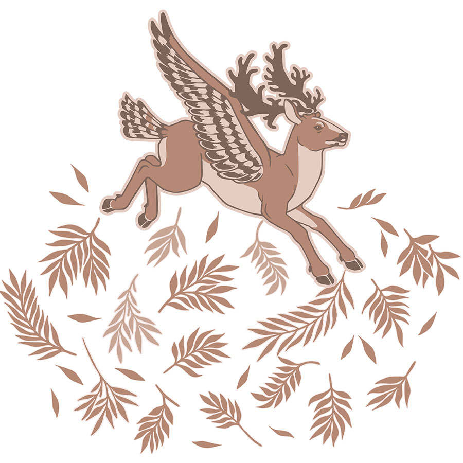
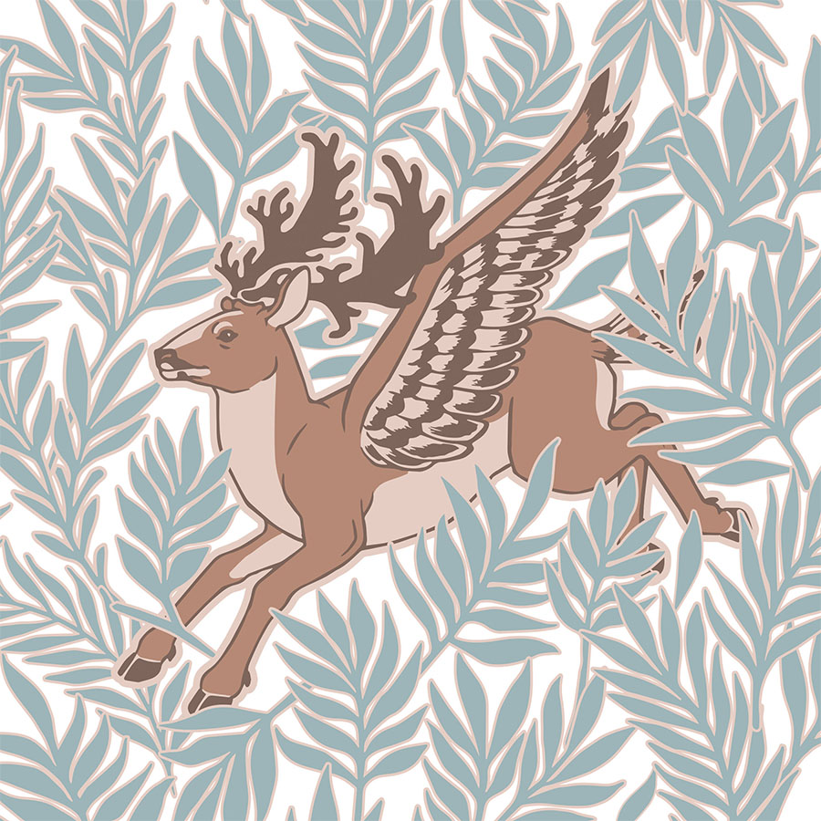
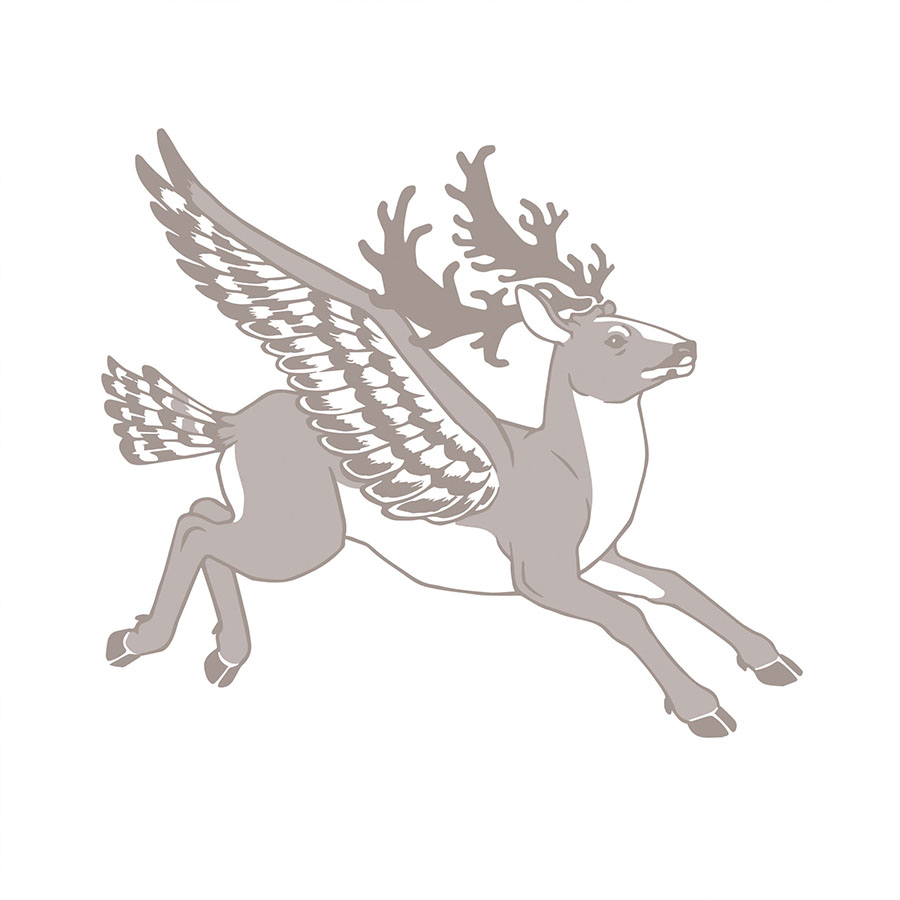
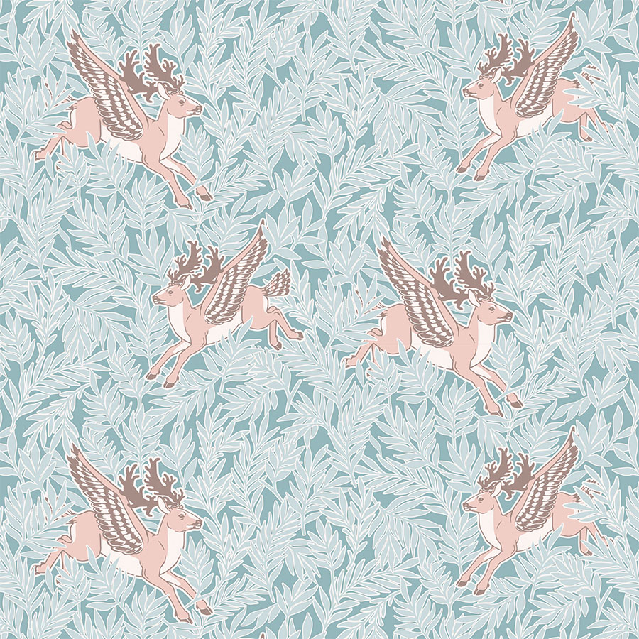
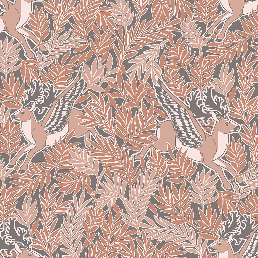
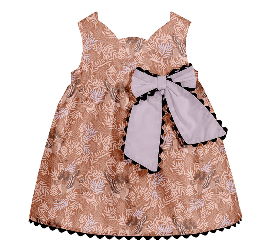
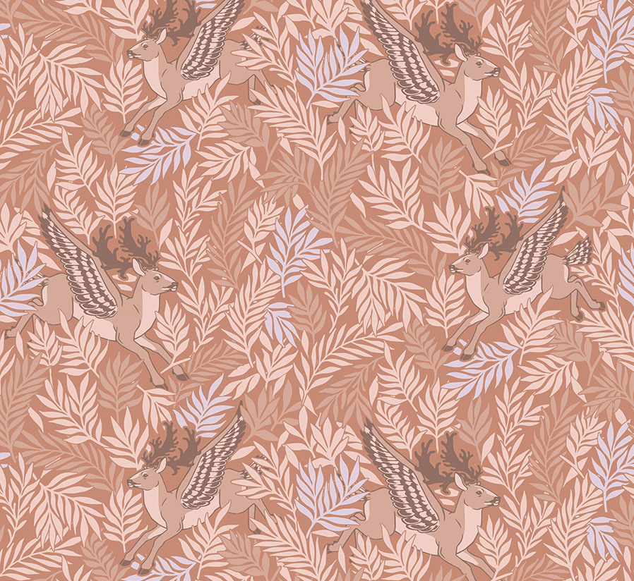
Drawing upon the sentiment of mythical hybrid animals, we chose to develop our own creature based on a young buck. I equipped him with the wings and tail of a bird and prominent, fanciful antlers. To the right, you can browse through the stages of the character development, from the initial hand drawing, which was later filled in with flat colour and turned into vector, to the finished final module.
A selection of flowing, leafy botanicals was developed alongside the module to compliment it and provide a secondary background pattern. All the elements were kept separate to allow for flexible pattern arrangement at a later stage. Lastly, these had to be universal and unisex enough to work for both boys and girls.
Newborn Collection
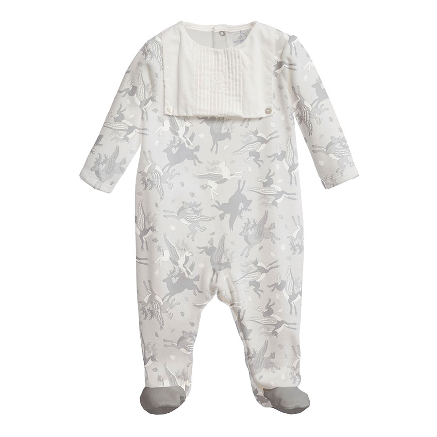
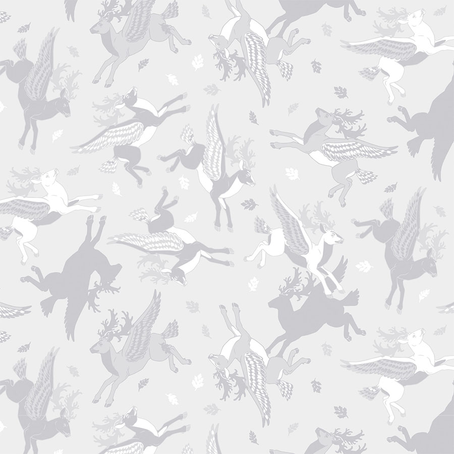
Below you’ll find ideas for a small line of complimentary pattern series developed for the younger age group. These are simplified and recoloured in monochrome shades, yet the focus remains on the animal character. Firstly, imbued in light greyscale, it is rotated and scattered among the intertwining autumnal leaves.
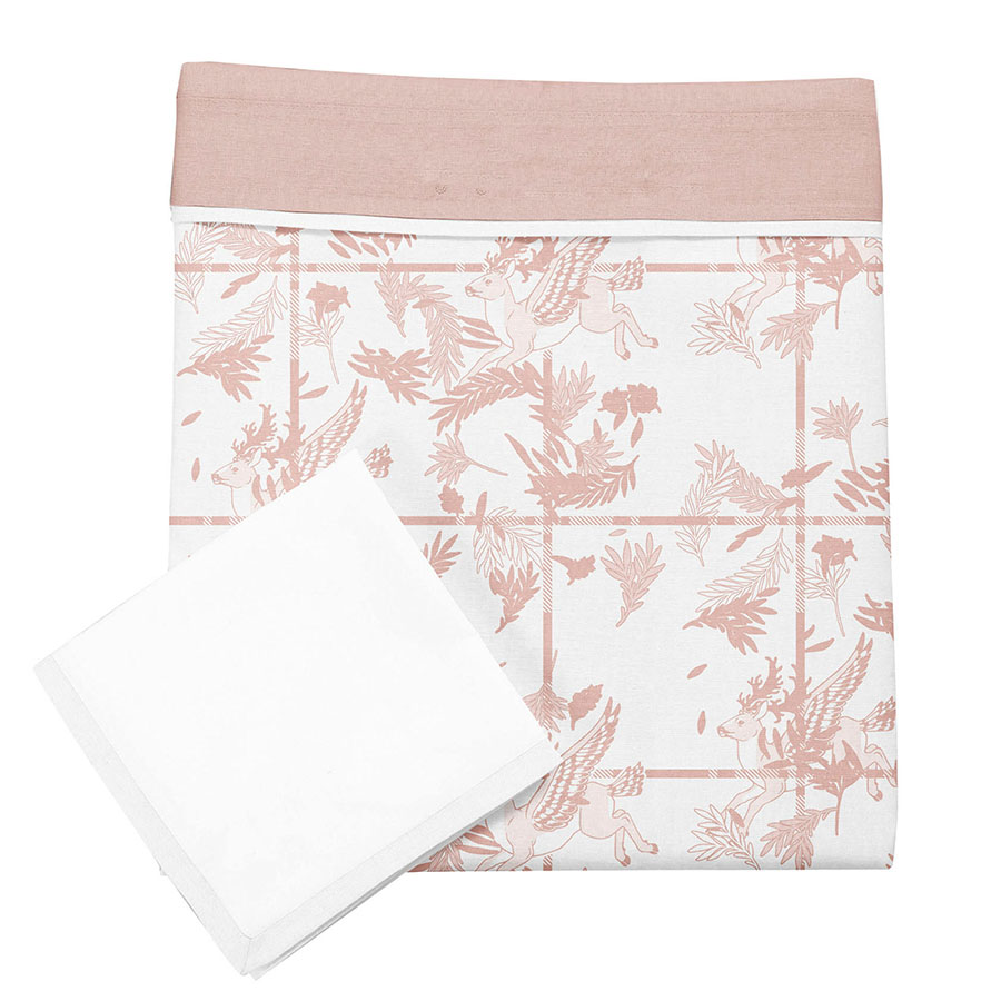
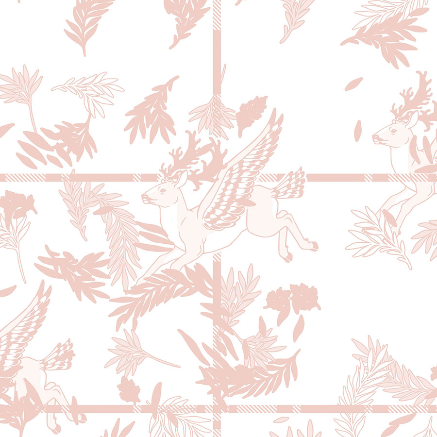
Additionally, the winged buck was also juxtaposed with a checked pattern. The leaves are scattered in a more dynamic manner to break up the grid of the regular repeat. The whole design was recoloured in monochrome nude colours and placed atop a white background.
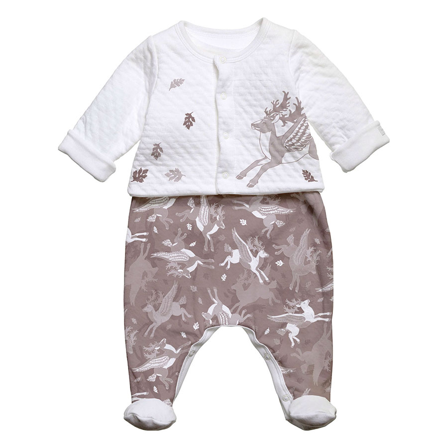
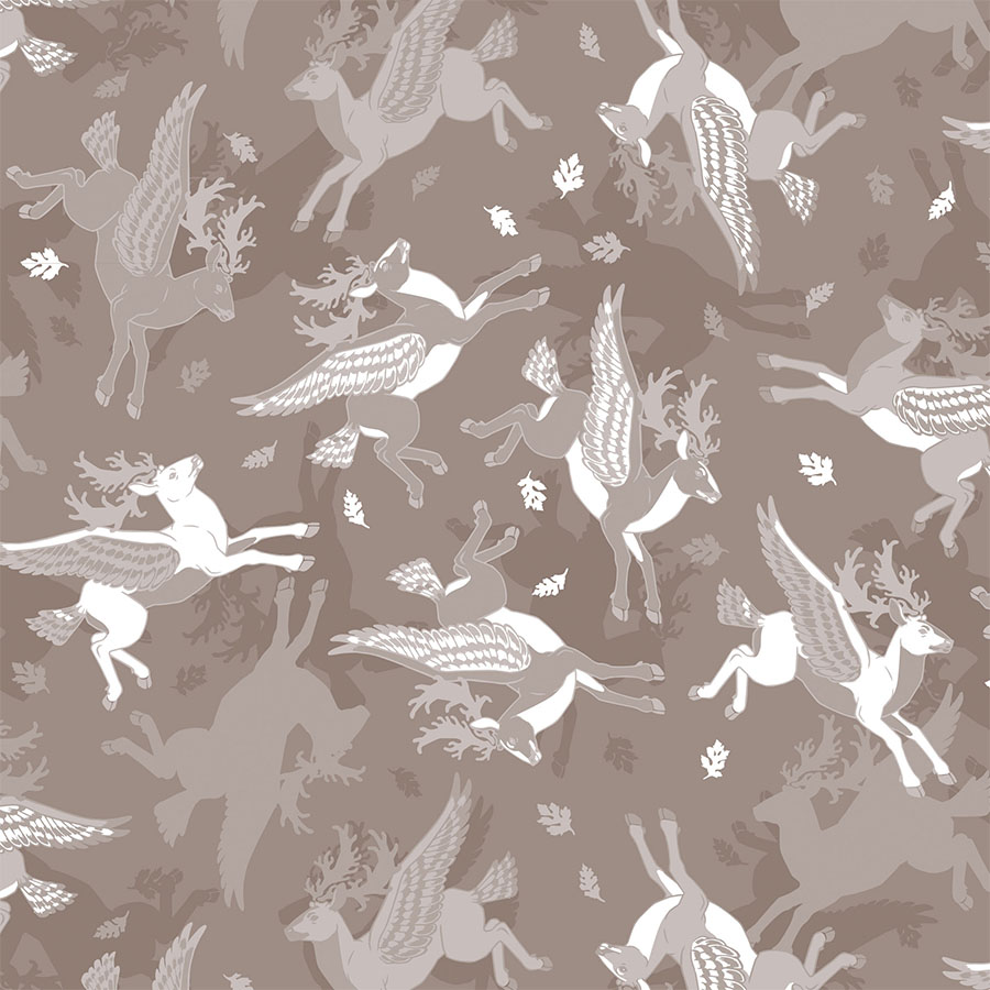
Finally, the pattern is recoloured in tune with the hazelnut shades. The buck was extracted and used as a standalone illustration in order to create a matching set. The pattern is layered on top of darker silhouette in the background, which adds to this design’s dimensionality.
Version 1
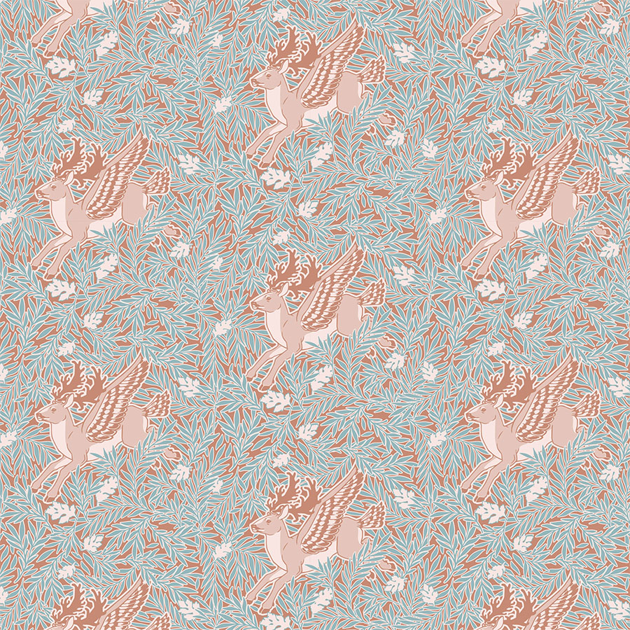
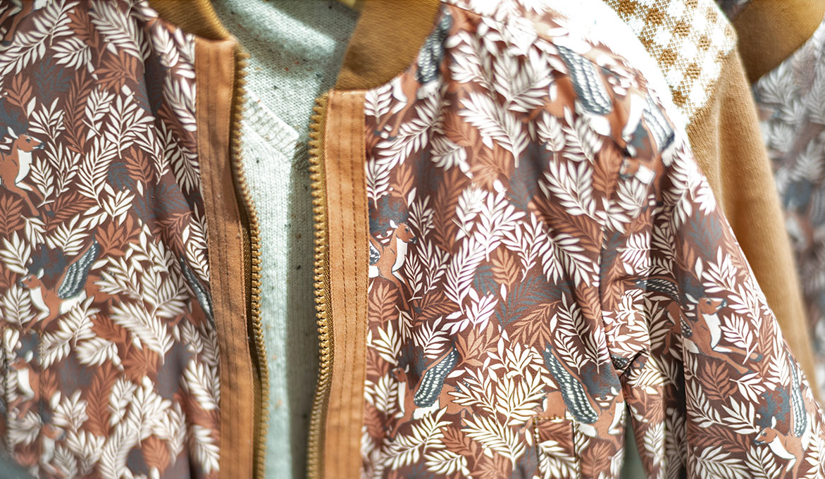
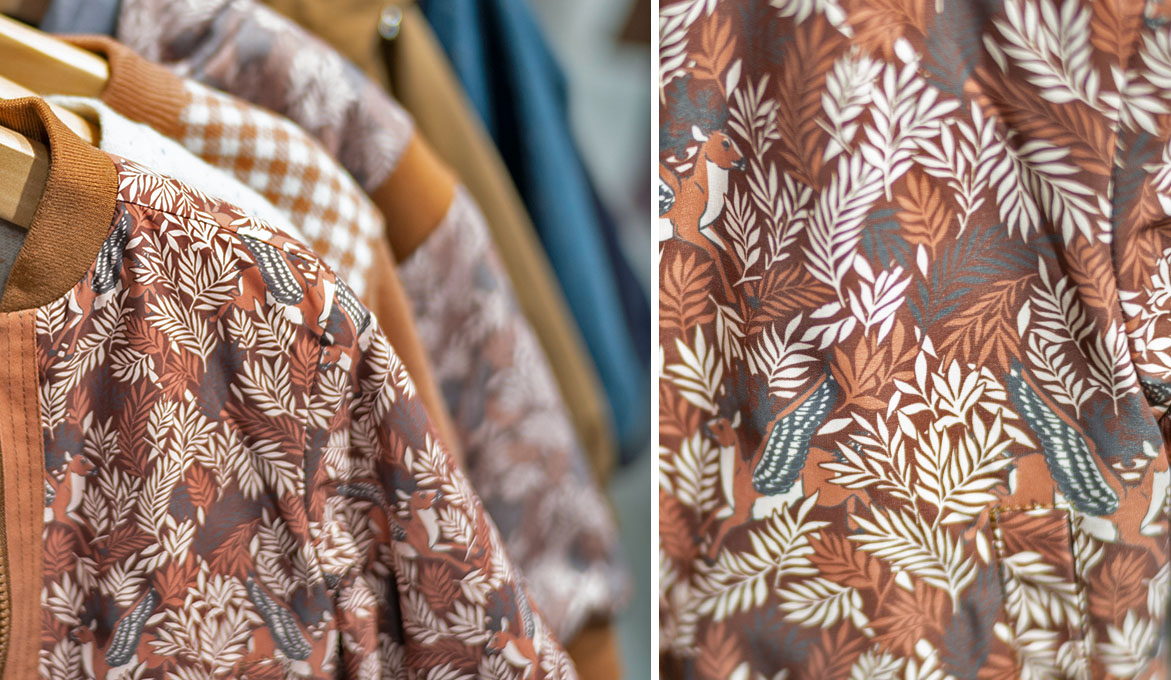
The character is arranged in a regular, even manner on top of a leaf pattern. Portrayed as if jumping out from a bush, some of the foliage partially covers its legs, adding to the design’s dimensionality. The leafy botanicals are very dynamic, but the regularity of the buck’s repeat keeps the overall composition balanced. This pattern makes a full use of the colour palette, whilst keeping the total number of Pantones used at only four.
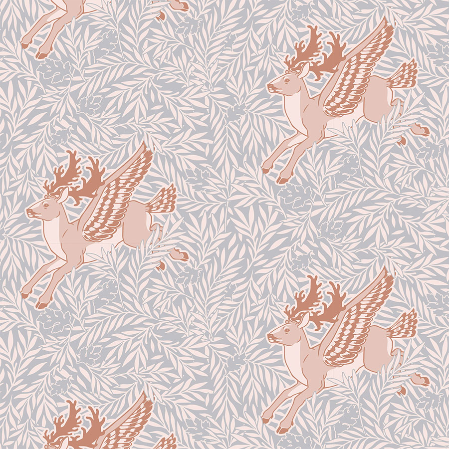
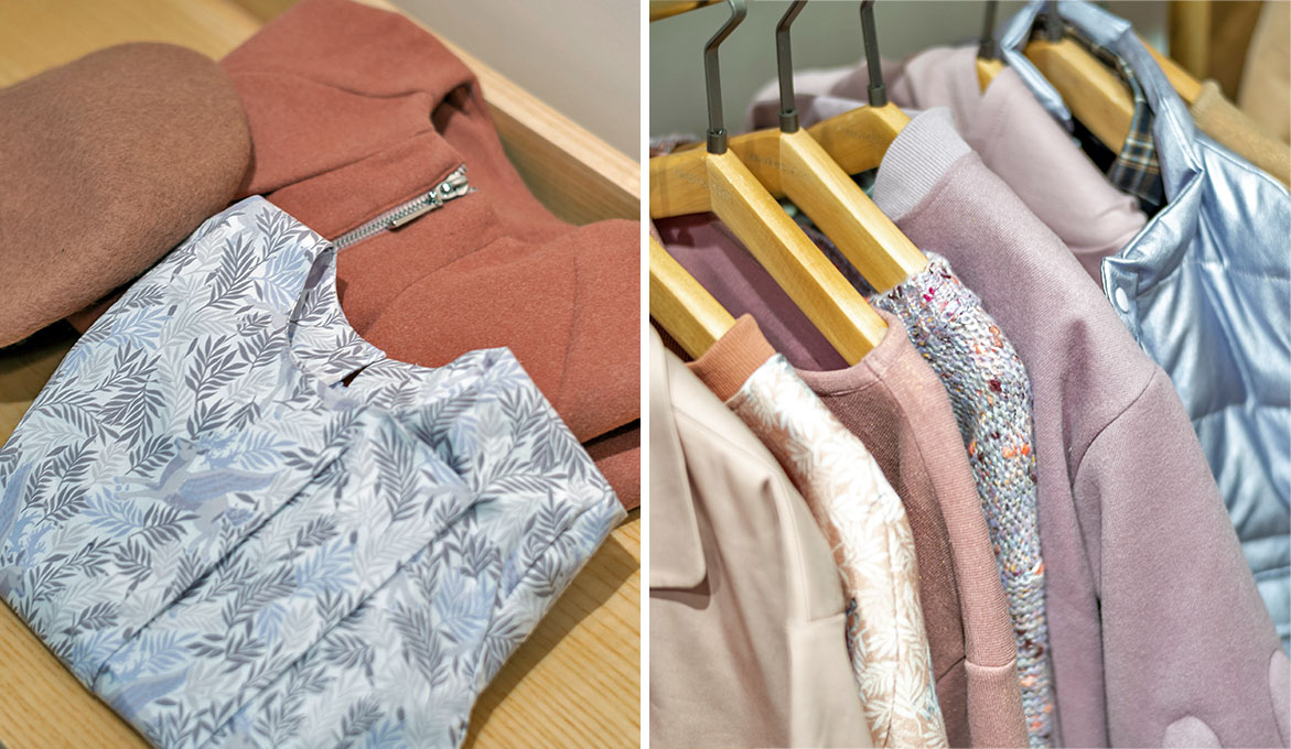
Additionally, a colour way adapted for girls was recoloured in a combination of light grey and fawn shades. The outline of the botanical pattern has been removed, so it blends in with the now slightly muted background. This helps the buck pop out more and as the focal point, it sets a visual rhythm and hierarchy to the overall composition.
Version 2
This colour version focuses on the verdant palette, which was intended specifically for boys. The winged buck is recoloured in light tanned shades and it is flipped around to now jump in both directions, which makes this a more irregular arrangement.
Next, was a version recoloured to fit the darker shades of the colour palette where the browns are set against the space grey background. All the elements share a unifying outline that sets them apart from the background.
Pattern in Print
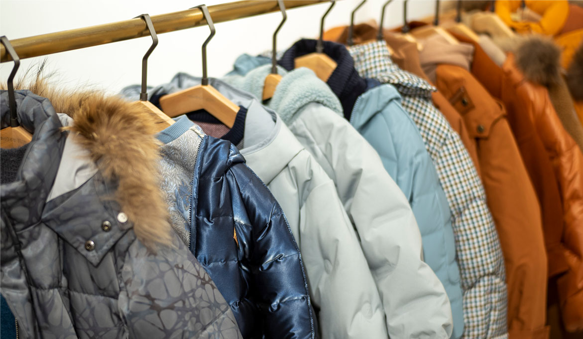
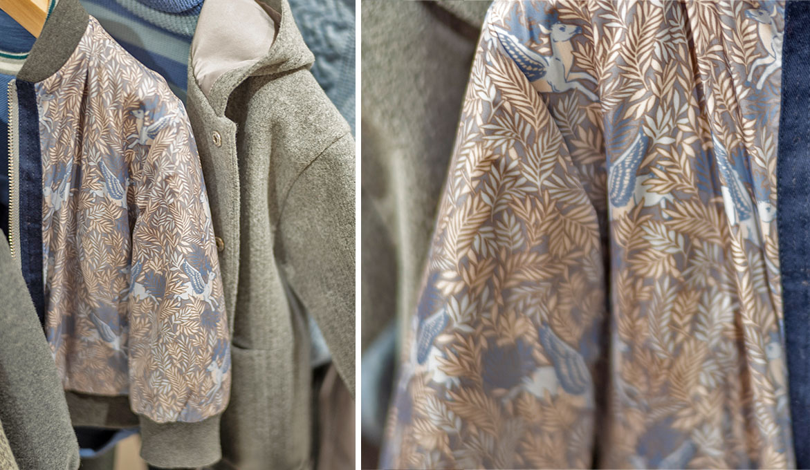
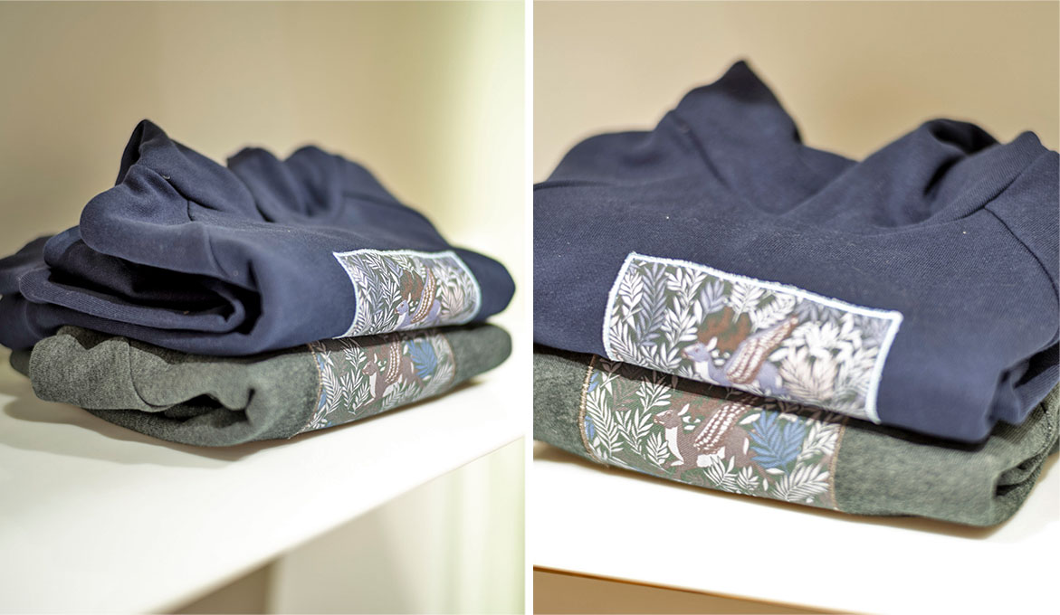
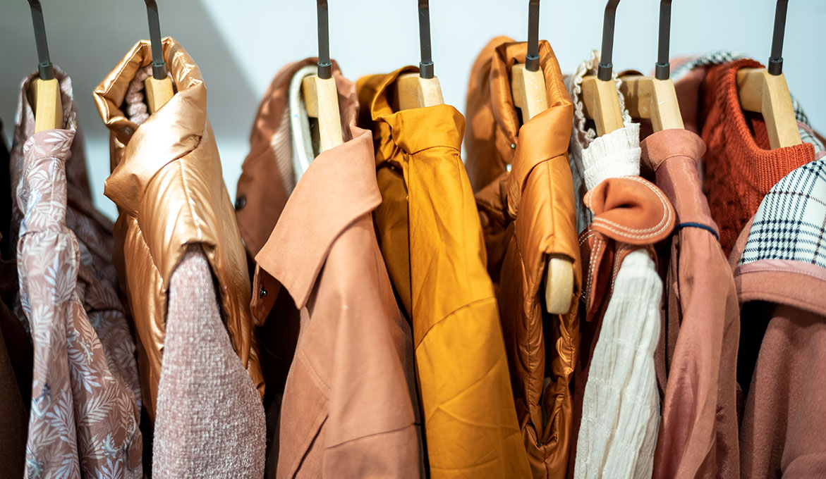
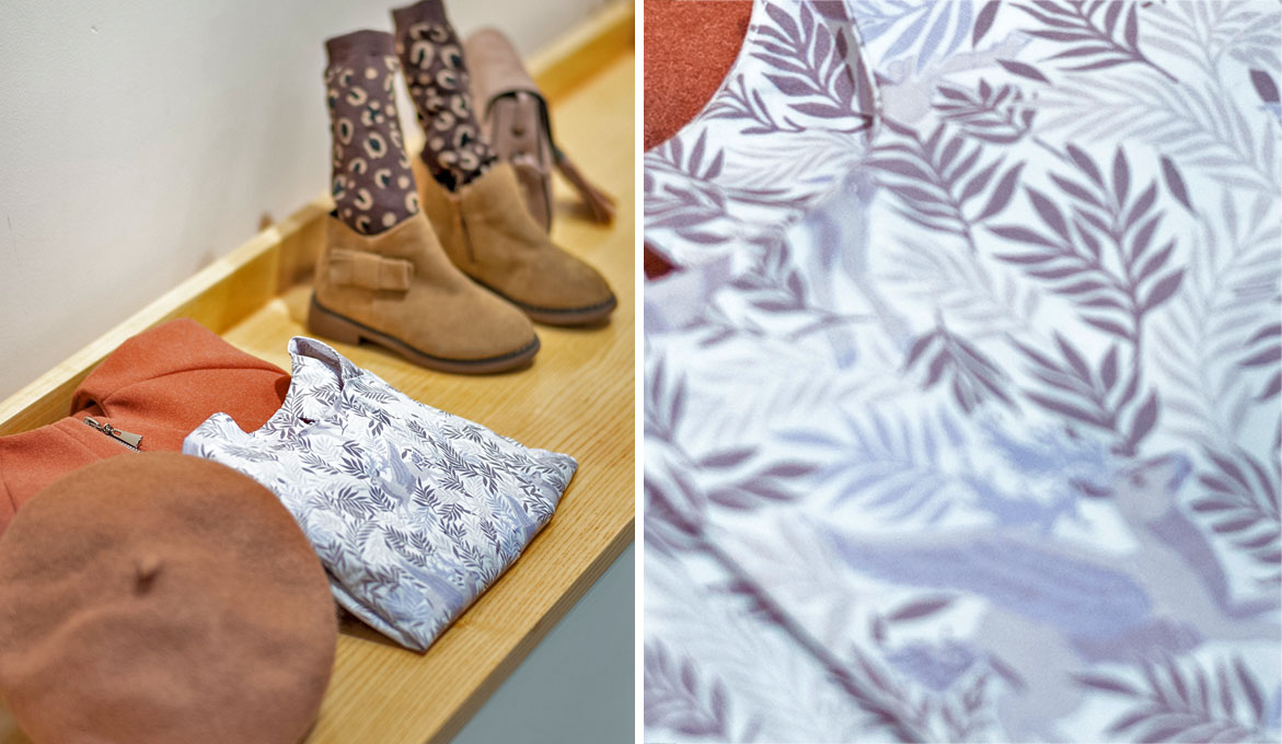
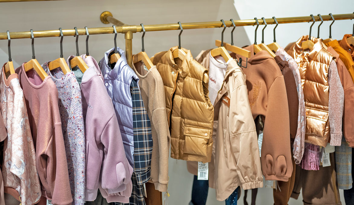
Below, please browse through a slideshow selection of a few examples of this pattern in print. These are photographs of the client’s first clothing samples produced to display at a trading fair as a part of the launch of their overall Autumn-Winter Collection. Here you may observe how the pattern was used and printed across multiple items and how it fits within the wider context of the collection. I have also attached few close ups of the material and different colour versions.
Please note that these images are provided courtesy of the client and Kidspattern and are used for portfolio purposes only.
“And into the forest I go, to lose my mind and find my soul.”


