Romantic Meadow
To walk through a wild meadow, during a warm summer evening as the sun is slowly setting, is truly an uplifting experience. Buzzing with life and bursting with growth it provides a never ending source of inspiration and true awe. This artwork is meant to evoke a memory of such an experience, whilst also being an ongoing celebration of nature’s abundance and the versatility of shapes of its creation.
This project was a part of my ongoing collaboration with Kidspattern. If you’d like to learn more about them please visit their website HERE. Alternatively, view the archive of our previous projects HERE, in which I discuss in detail the history and nature of our work.
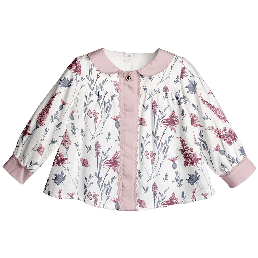
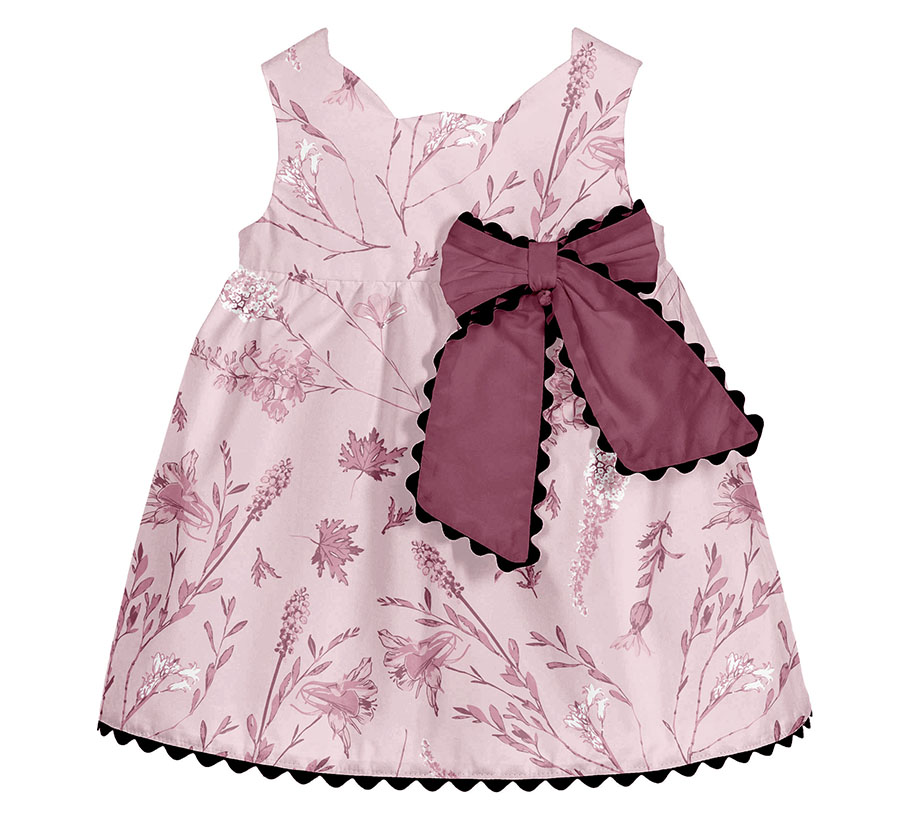
All clothing-mockups presented here are provided courtesy of Kidspattern and are used for visualisation purposes only.
Overview of the Brief
This pattern series was commissioned for a client’s Spring Summer Collection aimed at girls aged 18 to 36 months old. The overall order included two designs which would cover both parts of their Summer release. These were separated by two corresponding colour palettes, both designed by Kidspattern. The first one comprised of a range of pale pinks contrasted with a deep burgundy and a navy blue, meanwhile the second one replaced the burgundy and navy with a selection of two warm browns.
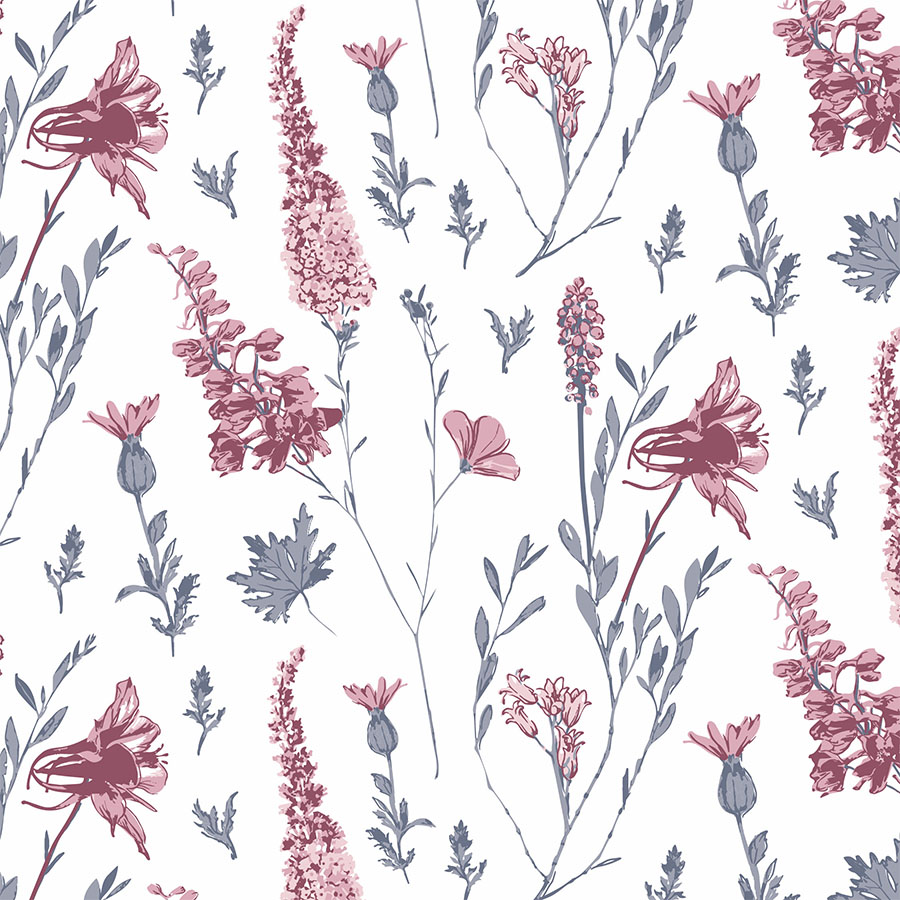
Drawing from time honoured traditions of floral patterns, this series portrays a collection of a whimsical, hybrid flowers which blend diverse blossoms by having them grow out from a singular stem. This design was intended to be screen print ready, therefore the hand drawn elements were live trace and vectorised. An additional layer of flat drawing was added on top to define the details. During the development of this series these botanical elements were consequently recoloured and rearranged into various compositions including regular, scattered and diagonal.
Starting Point
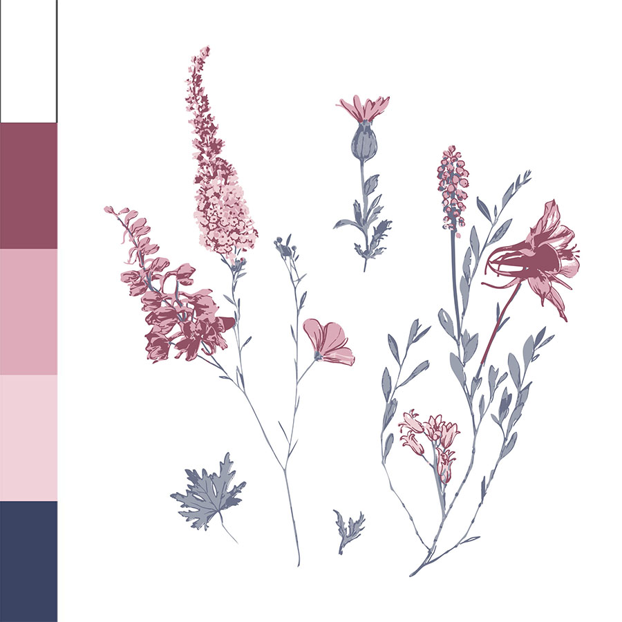
Here are the elements selected for the first part of the Summer Collection alongside the intended palette. This initial, base version of the pattern makes a use of the palette’s full spectrum.
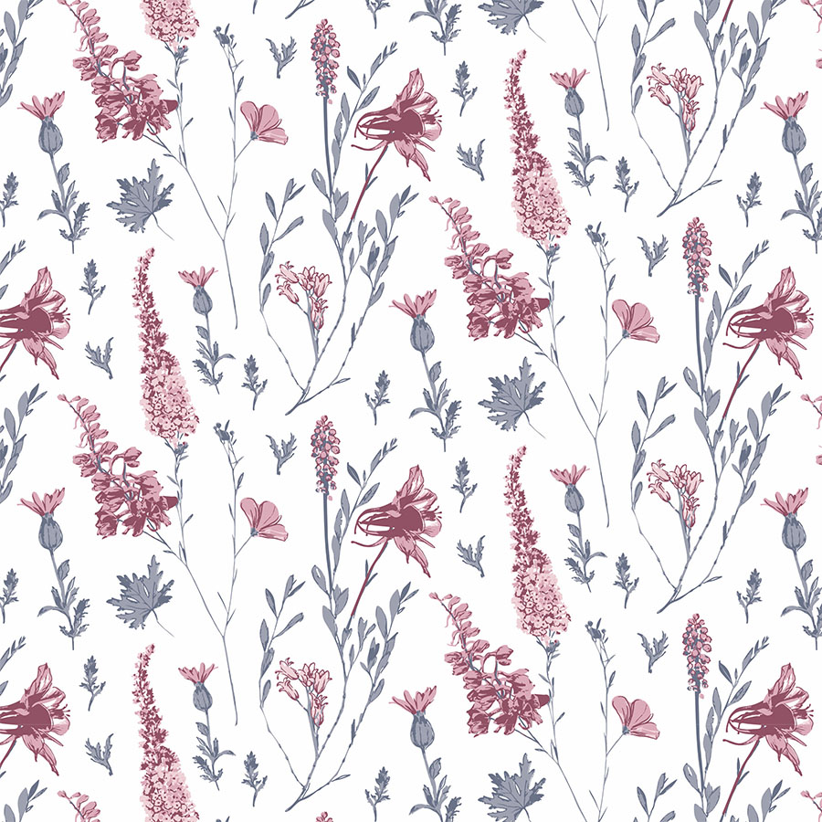
Placed on a standard, white background with the pinks applied in the blossoms and the stems recoloured in tinted navy. The arrangement is balanced, regular and veritical and visualised in a medium size.
Silhouette in Blue
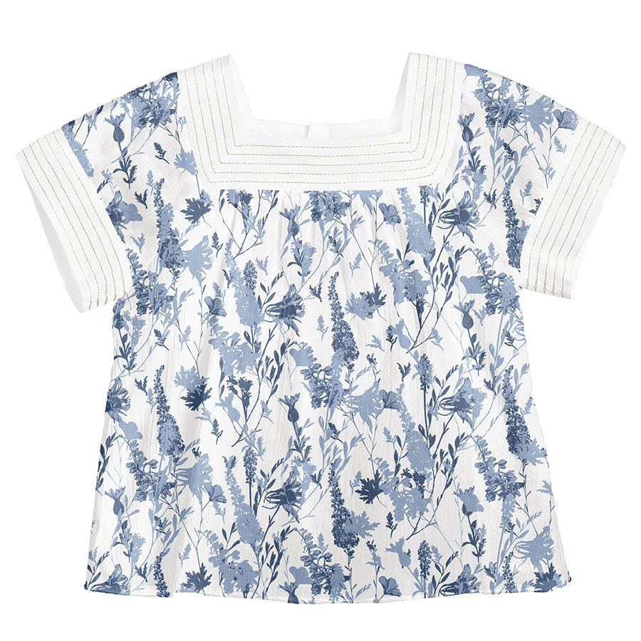
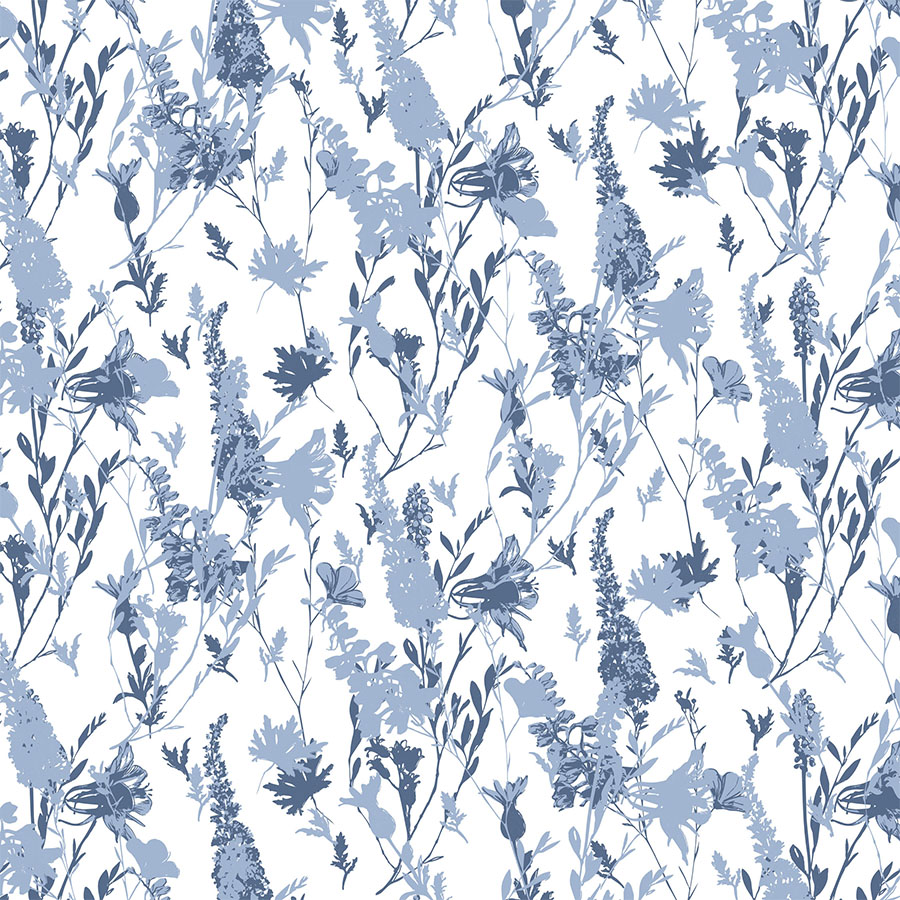
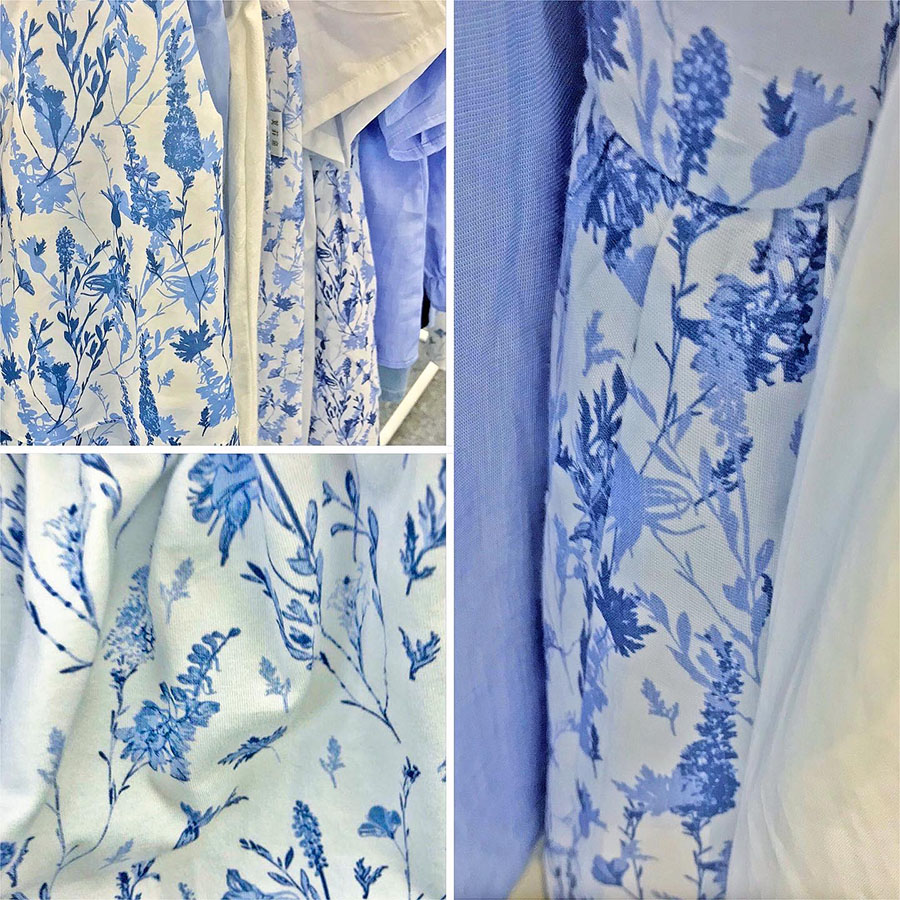
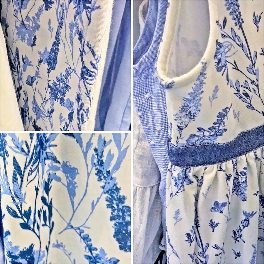
This version of the pattern proved very popular as it focuses solely on the blue aspect of the palette. As a result, it ended up being a signature print for a whole blue range of clothing items. It is a combination of the floral elements, matched with a further layer of silhouettes.
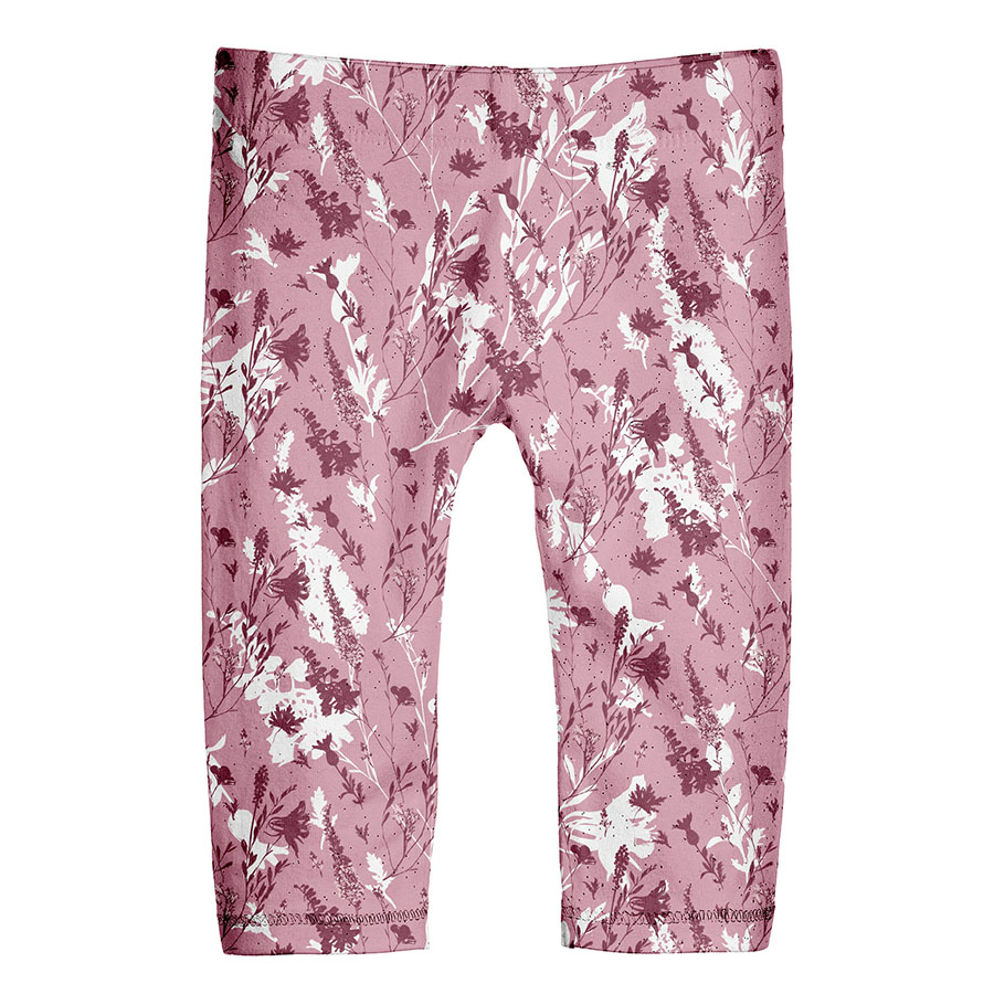
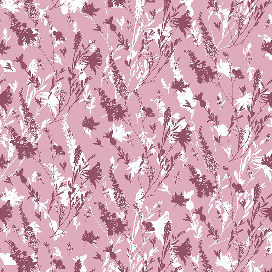
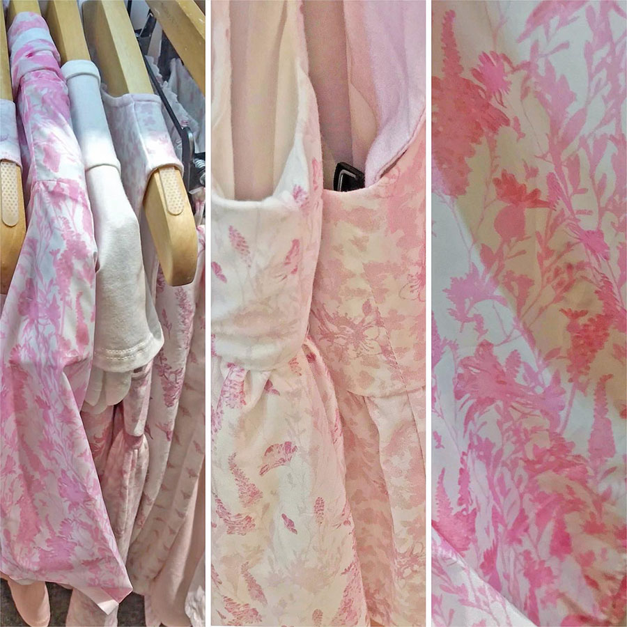
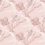
Click right to view the accompanying, further simplified and thus secondary print in pink, composed purely out of the silhouettes layered in two contrasting sizes.
Dark Background
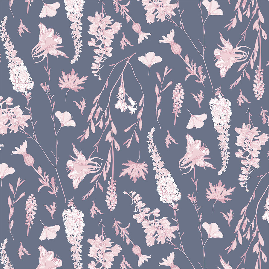
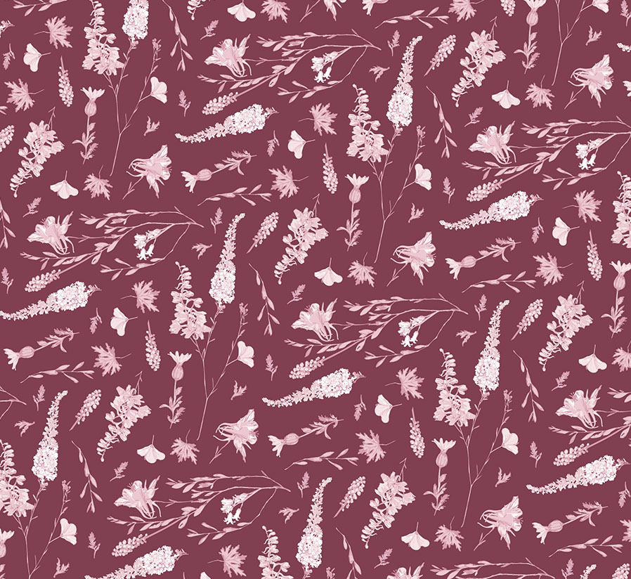
This version of the pattern was placed against a tinted blue background with the florals recoloured in shades of light pink. The elements are arranged closely together with some of them flipped upside down. Overall composition remains regular and vertical, however now the pattern is visualised in a larger size.
Placement Print
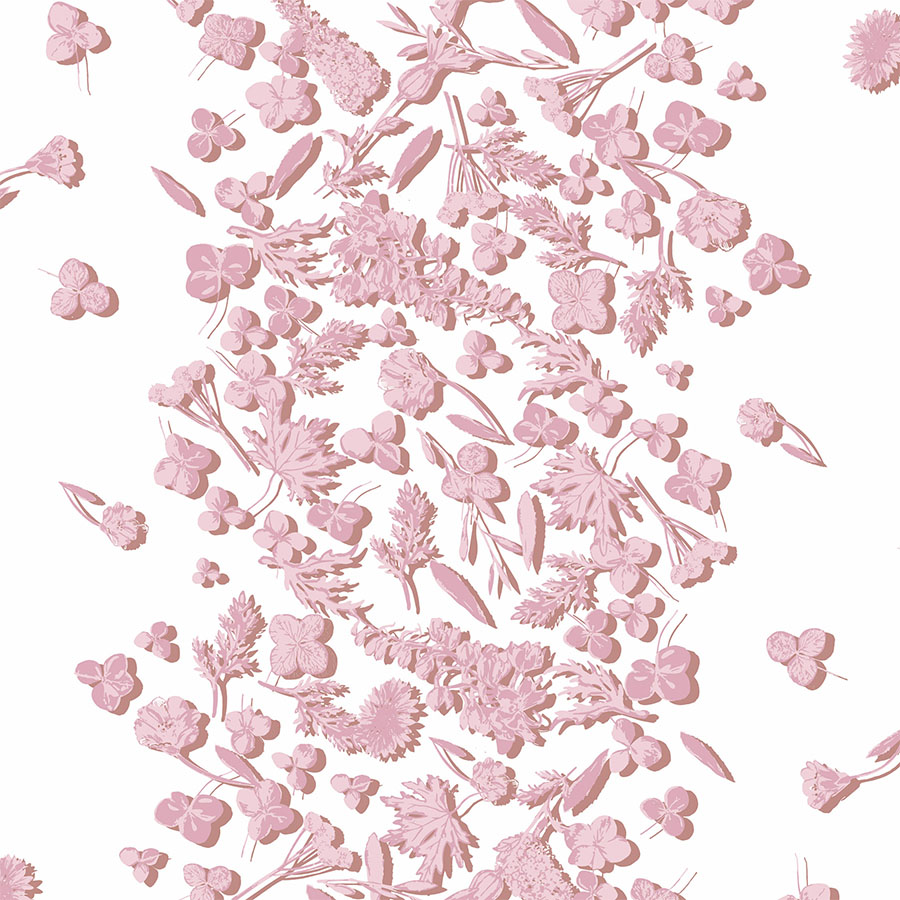
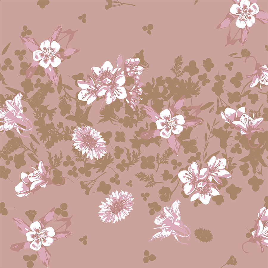
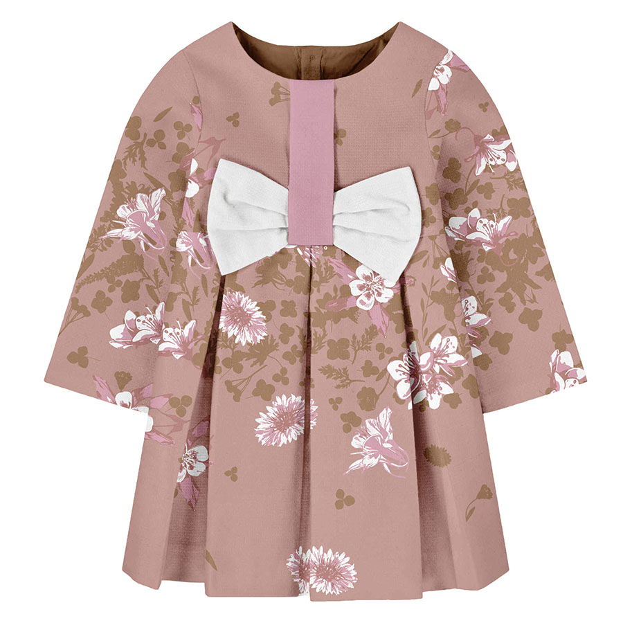
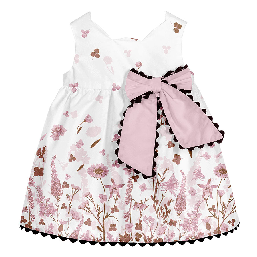
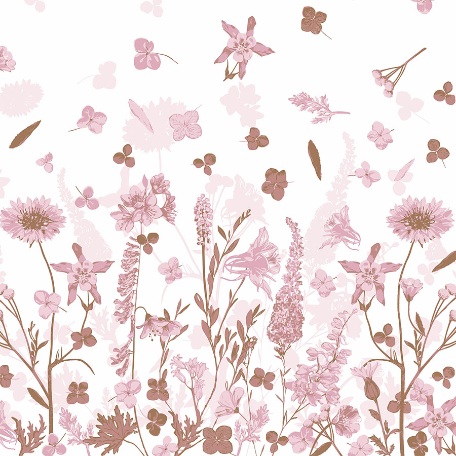
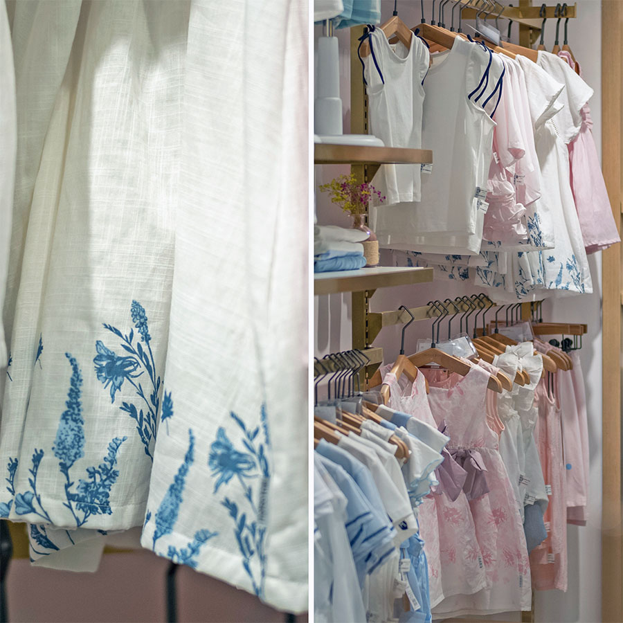
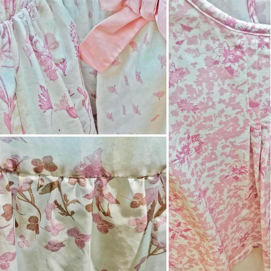
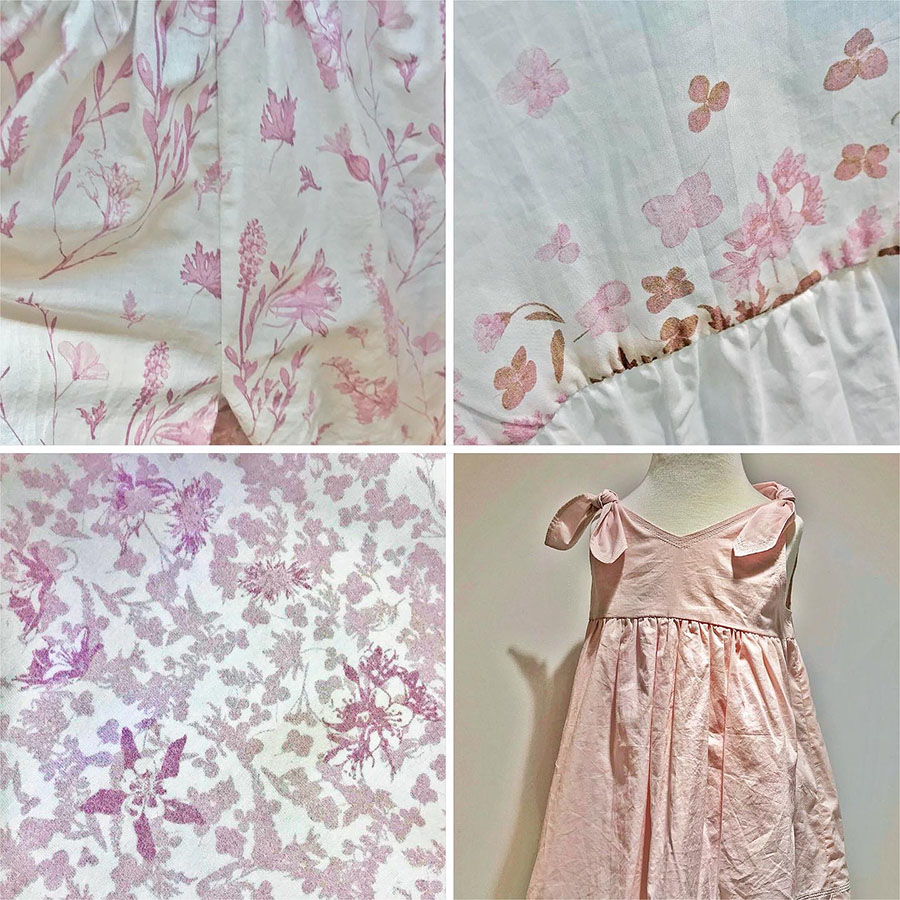
The second part of the Summer release was built around an altered colour palette that matched the pinks with warm browns. Additionally, the floral elements differ from those used in the first part. Here the brief required a design prepared for a placement print, hence, we explored a variety of positioning for the artwork. View some of our ideas below.
In the first idea, the small scattered details radiate sideways from the middle of the garment or alternatively up its sleeves.
The second arrangement was a transitional composition made from dark floral silhouettes topped and dotted with large sized flower heads.
Lastly, all the floral elements were placed along the rim of the dress in a regular, vertical, and linear manner.
Design in Print
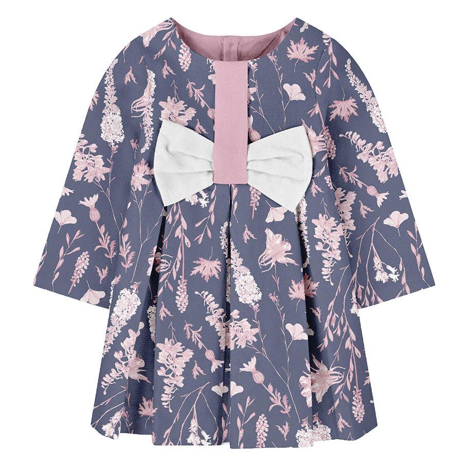
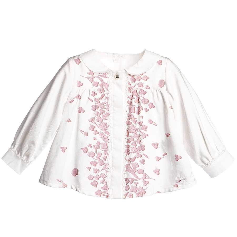
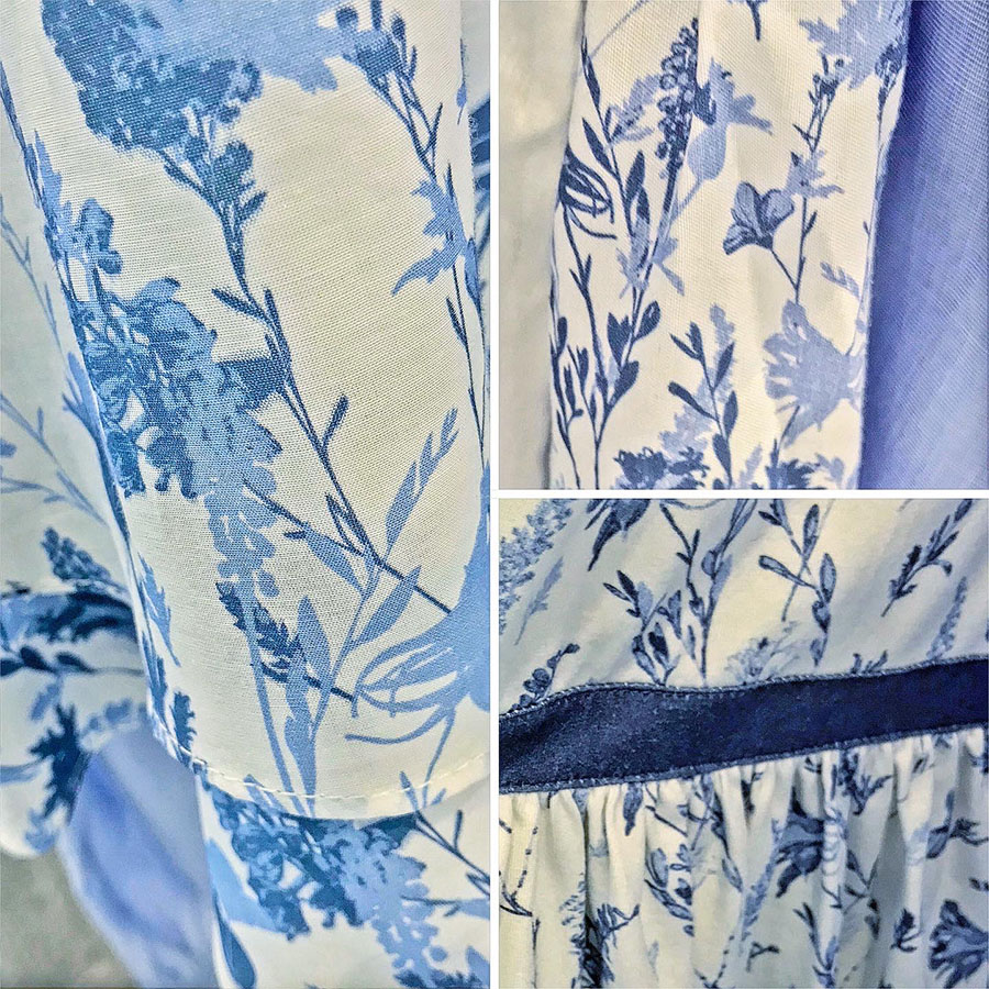
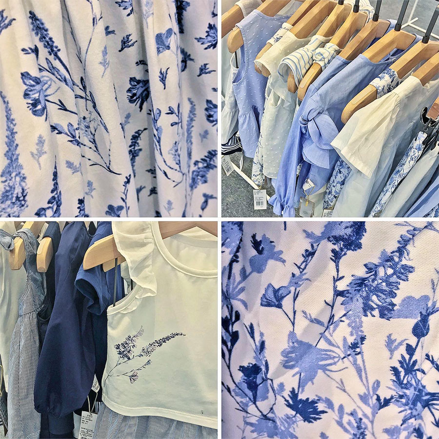
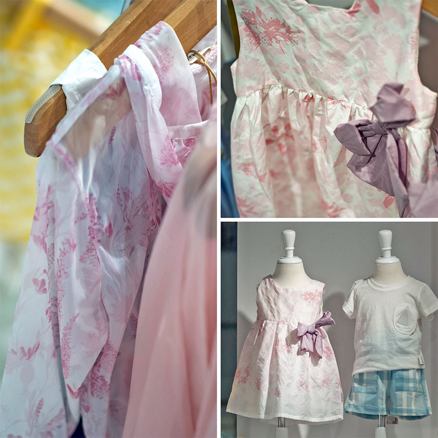
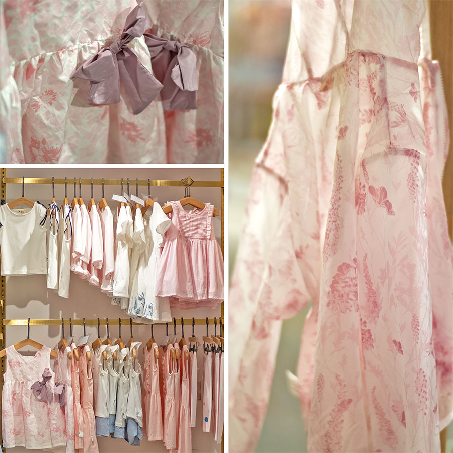
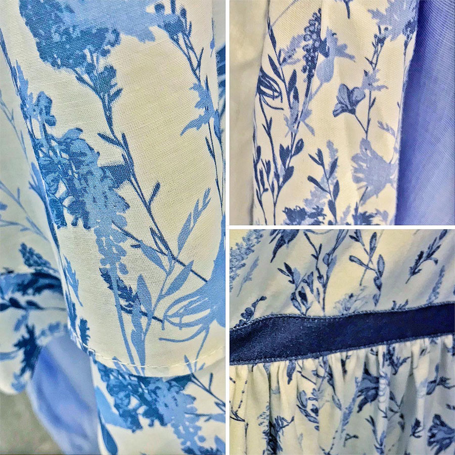
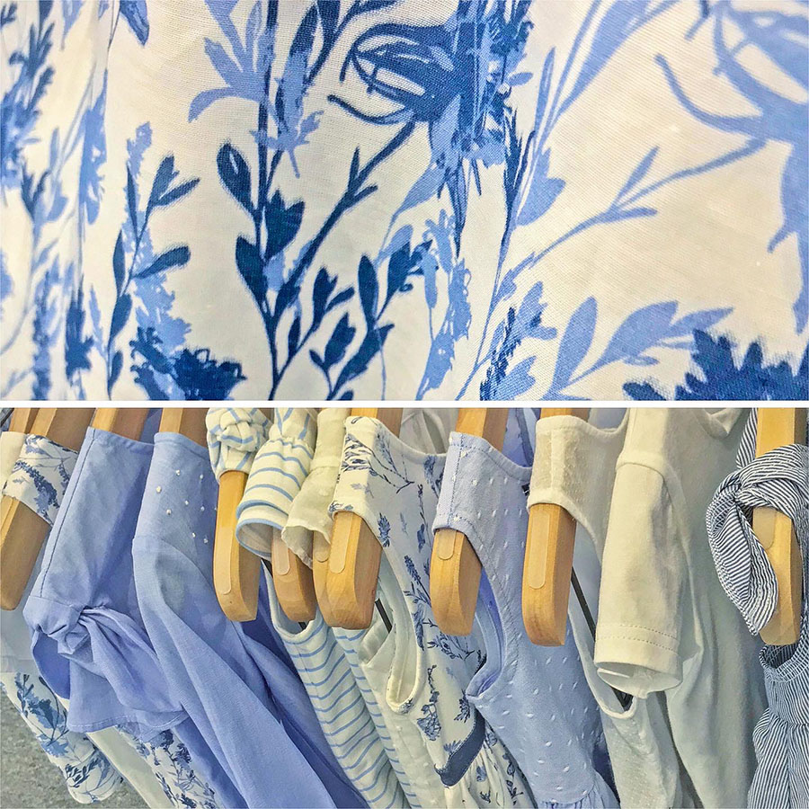
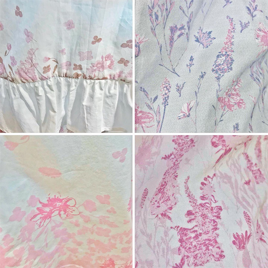
Please browse through a slideshow selection of various examples of this pattern in print below. These photographs are of the client’s first clothing samples which were produced to display at a trading fair for the launch of their overall Spring-Summer collection.
Please note that these images are provided courtesy of the client and Kidspattern and are used for portfolio purposes only.
Here you may observe how the Meadow Pattern was used and printed across multiple items in both parts of their summer release. Hopefully these quick snaps should give you an idea of how this design fits within the wider aspect of the clothing range it belongs to.
I’ve also attached close ups of the material and displays of different versions, placements and arrangements, which demonstrate this design’s versatile use.
“How does the Meadow flower its bloom unfold? Because the lovely little flower is free down to its root, and in that freedom bold.“


