Sparrow
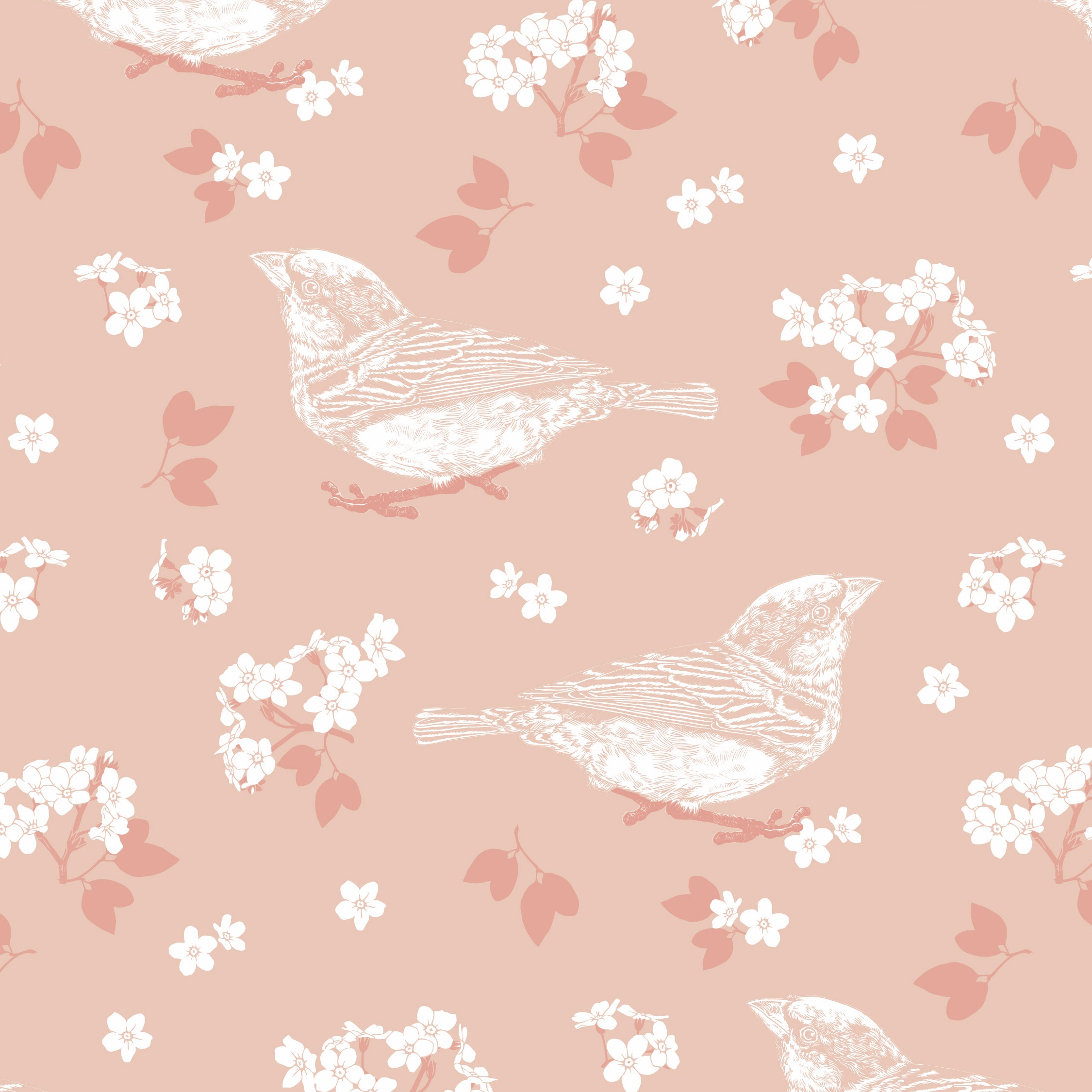
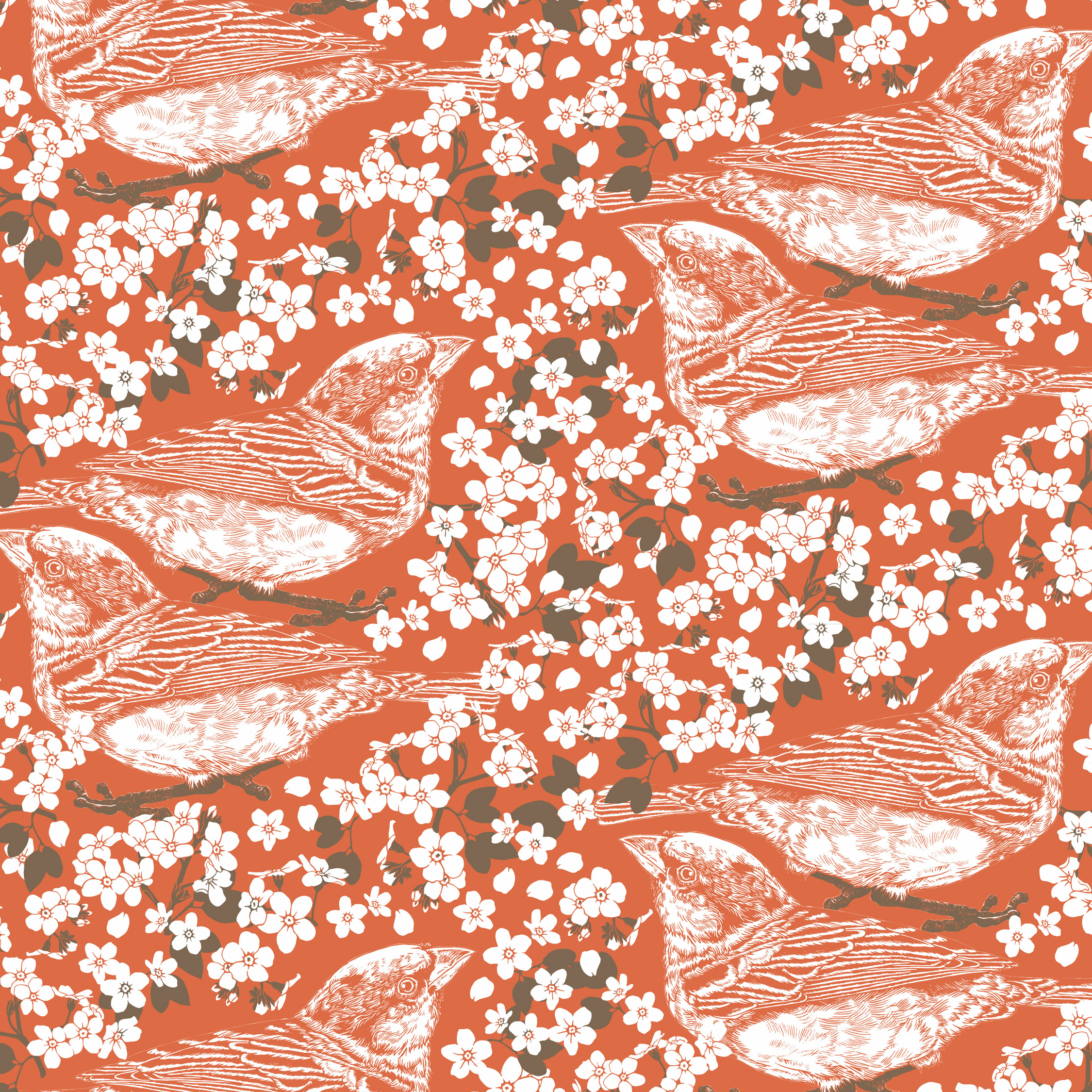
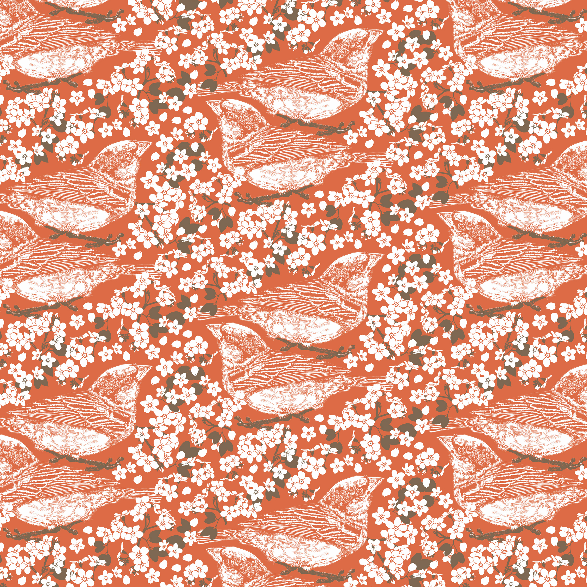
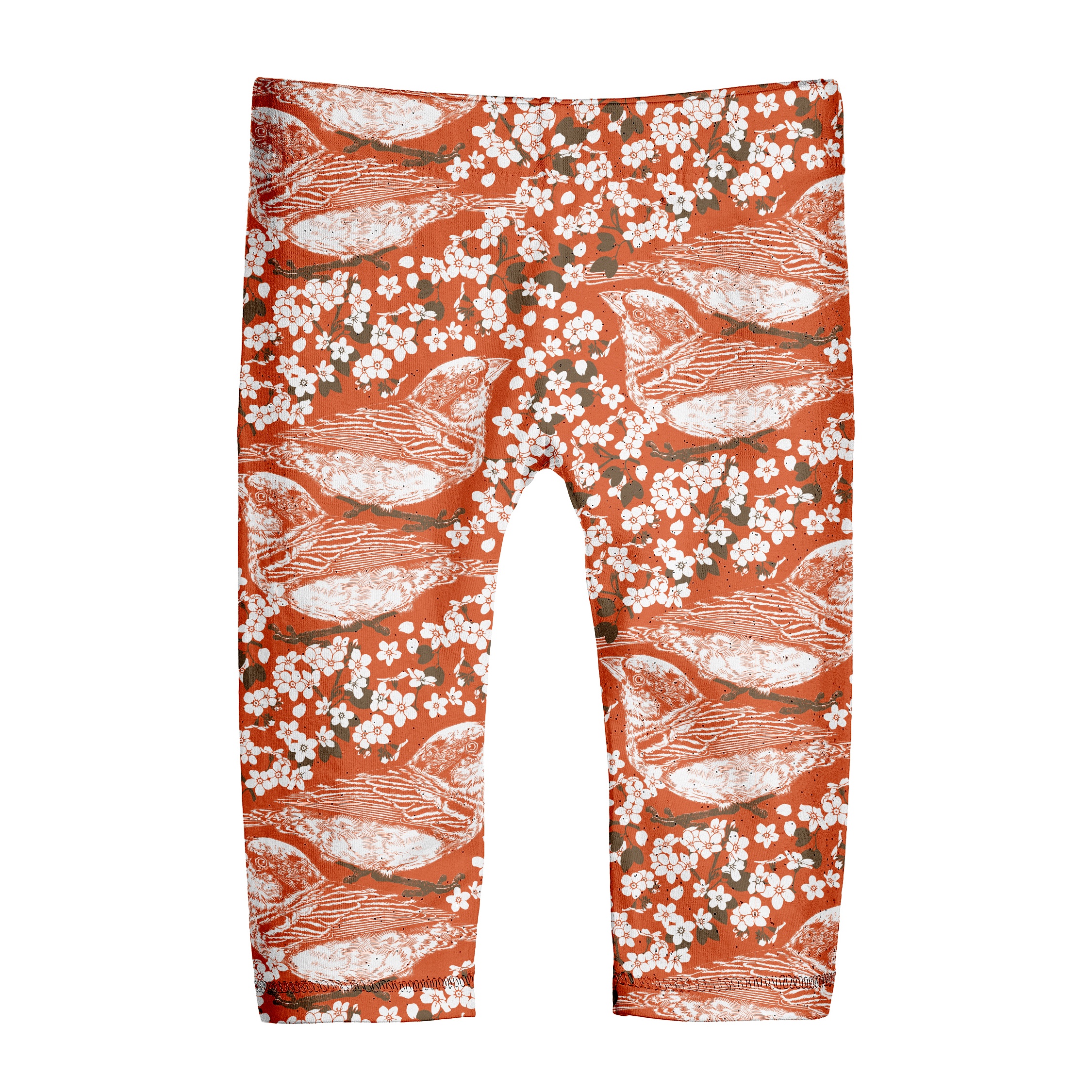
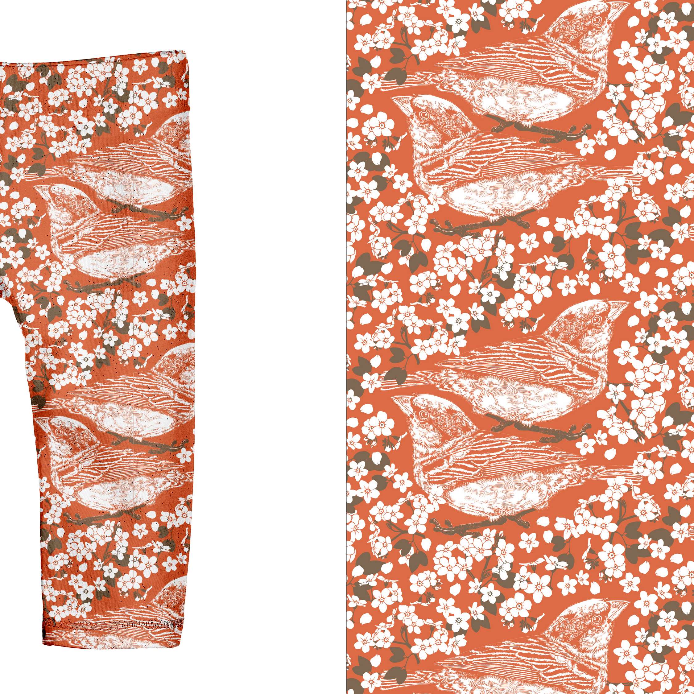
Sparrows could be thought of as a common and plain species of bird. However, paired with forget-me-not flowers they offer a tender portrayal of the understated beauty found in the ordinary. We tend to associate these little birds with simplicity and community and thus this avian design is intended as a subtle reminder not to disregard the small gems that unfold in our everyday lives. The design acts is a gentle encouragement to mindfully observe our surroundings and savour the pockets of joy within it.
This project was a part of my ongoing collaboration with Kidspattern. If you’d like to learn more about them please visit their website HERE. Alternatively, view the archive of our previous projects HERE, in which I discuss in detail the history and nature of our work.
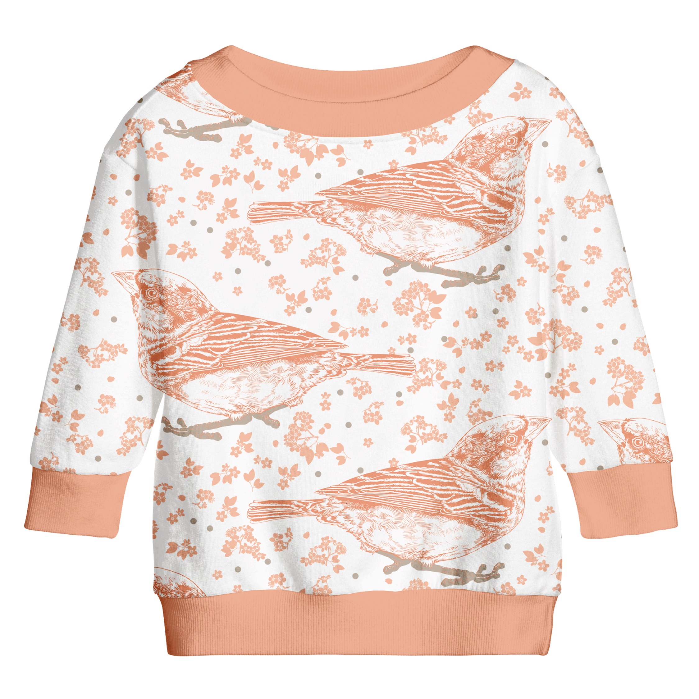
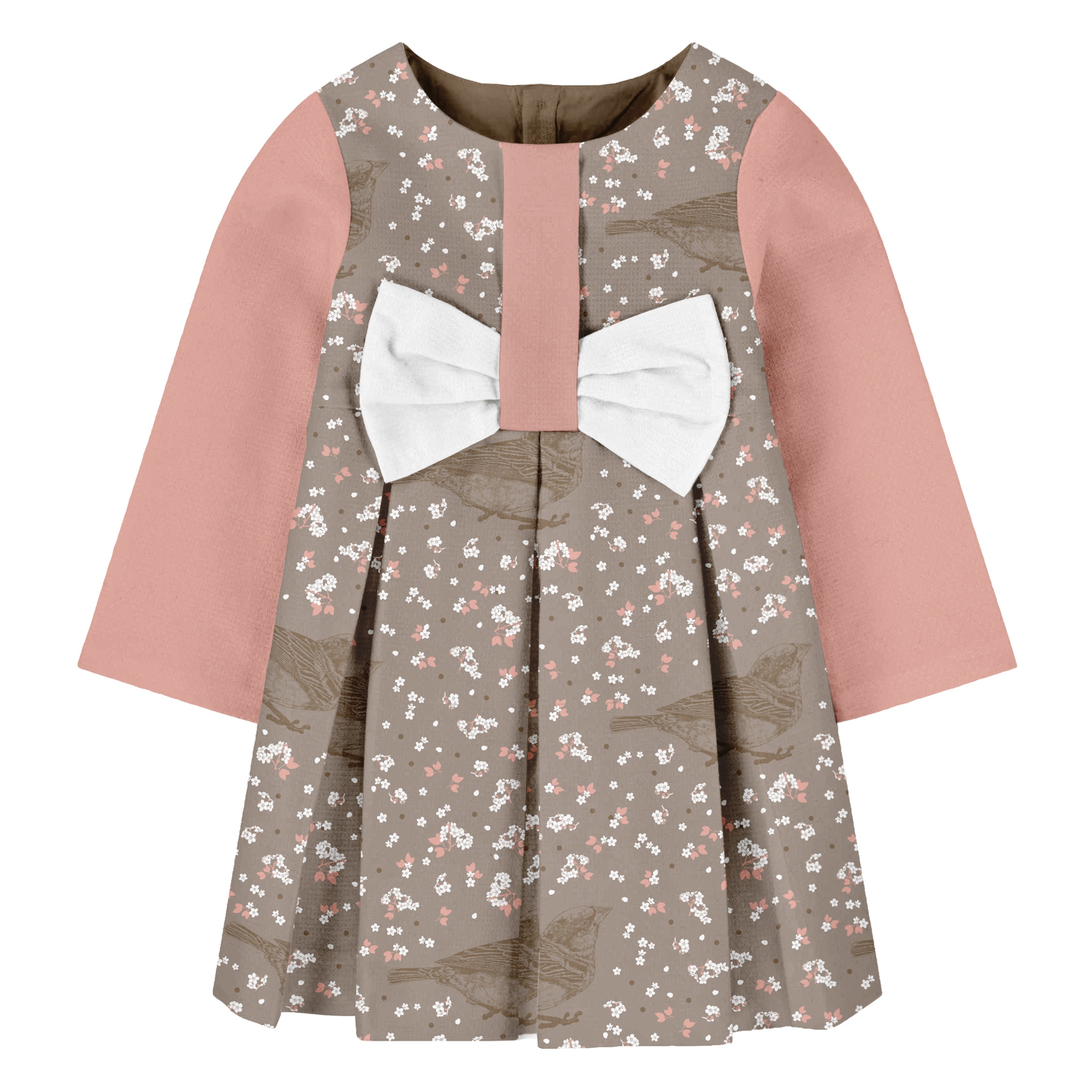
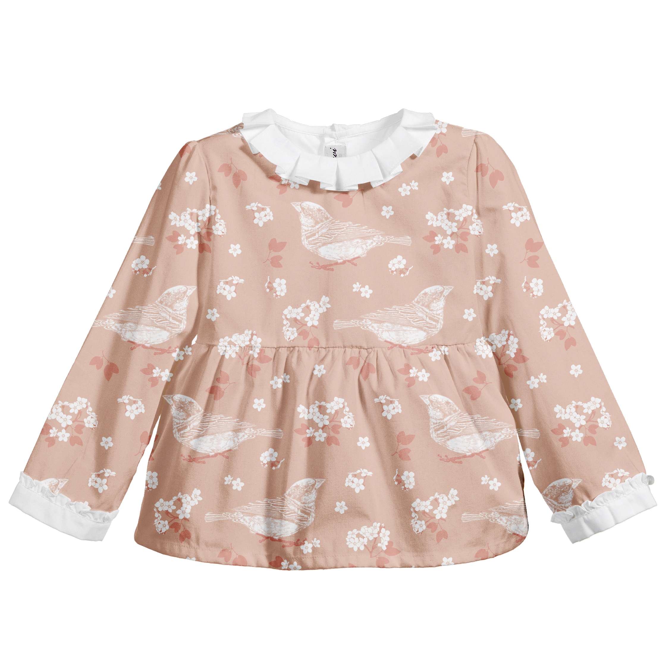
All clothing-mockups presented here are provided courtesy of Kidspattern and are used for visualisation purposes only.
Oversize Drawing
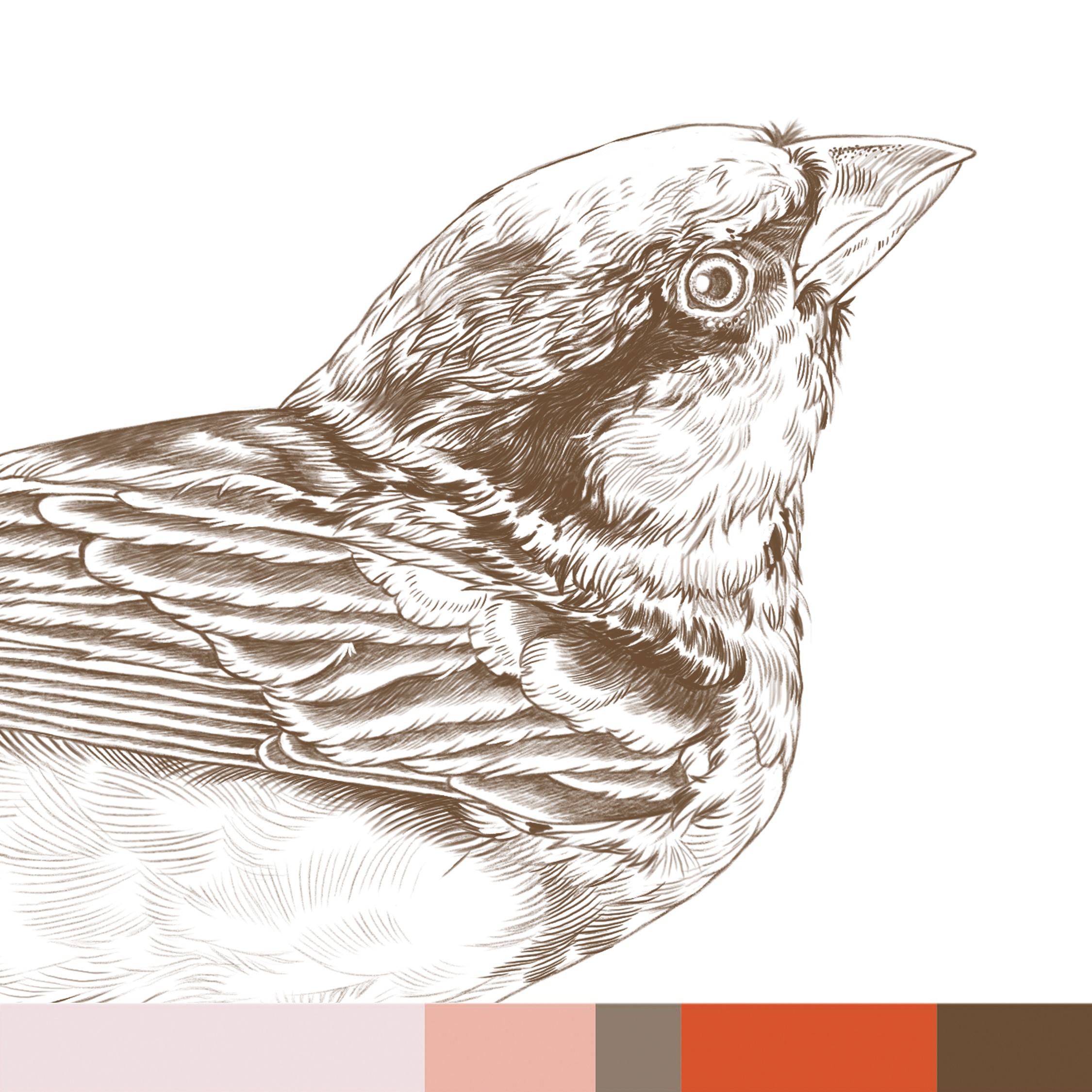
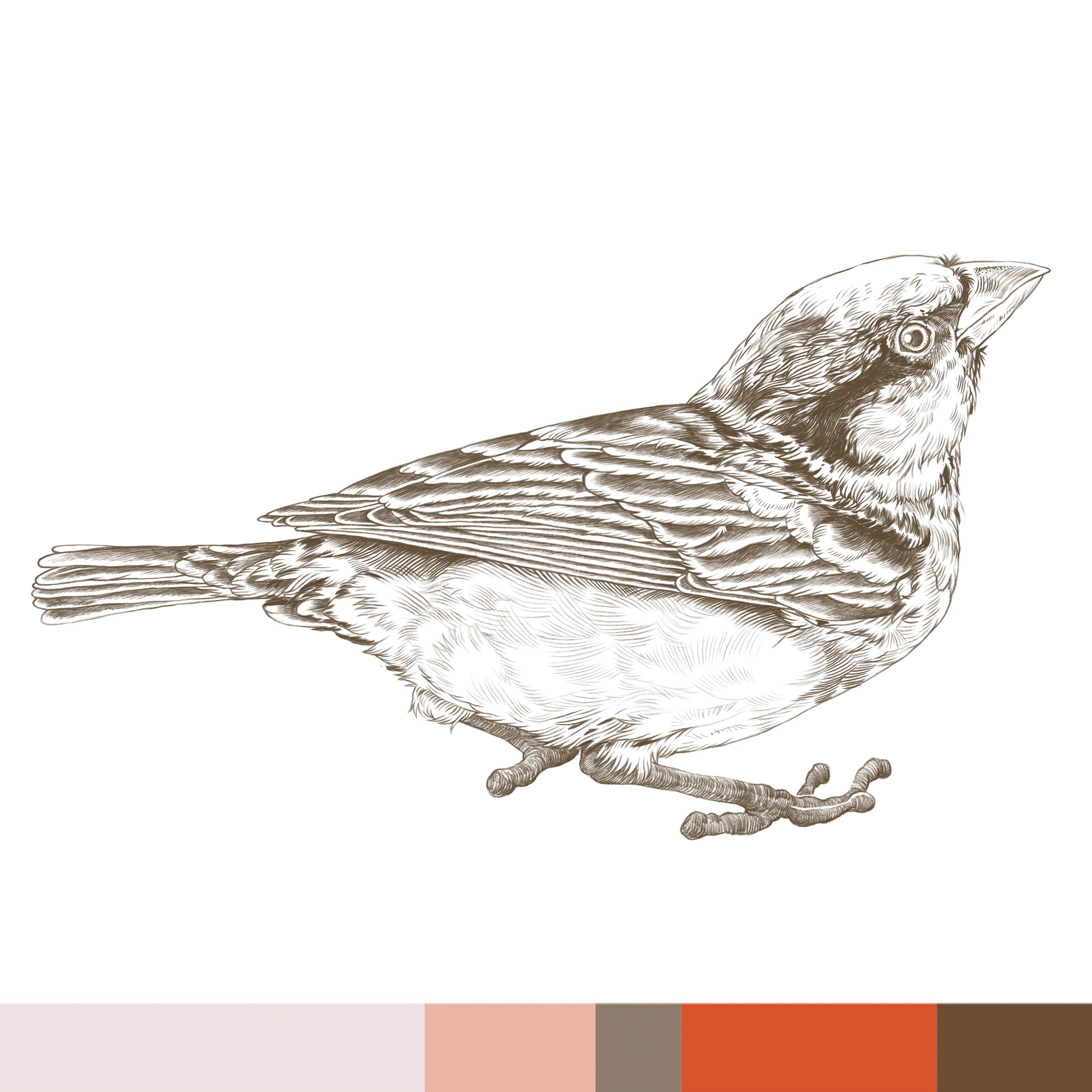
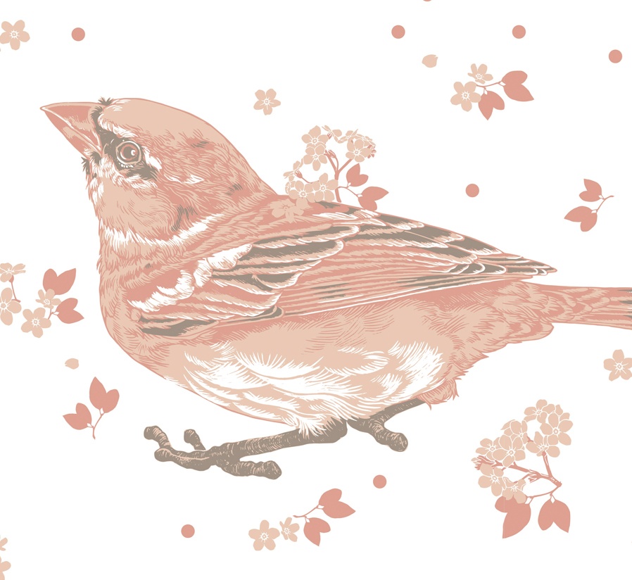
Having a background as an illustrator I often like to build my pattern designs around a hand-drawn element. The plan for this pattern was to centre it around an oversized image of a little bird and therefore I had the opportunity to take my time and create this very detailed, naturalistic depiction. I’ve also attached here a zoom-in on the drawing’s details and a colour palette strip, from the grouping within the early Autumn-Winter collection that this pattern was intended for.
Sparrow Pattern
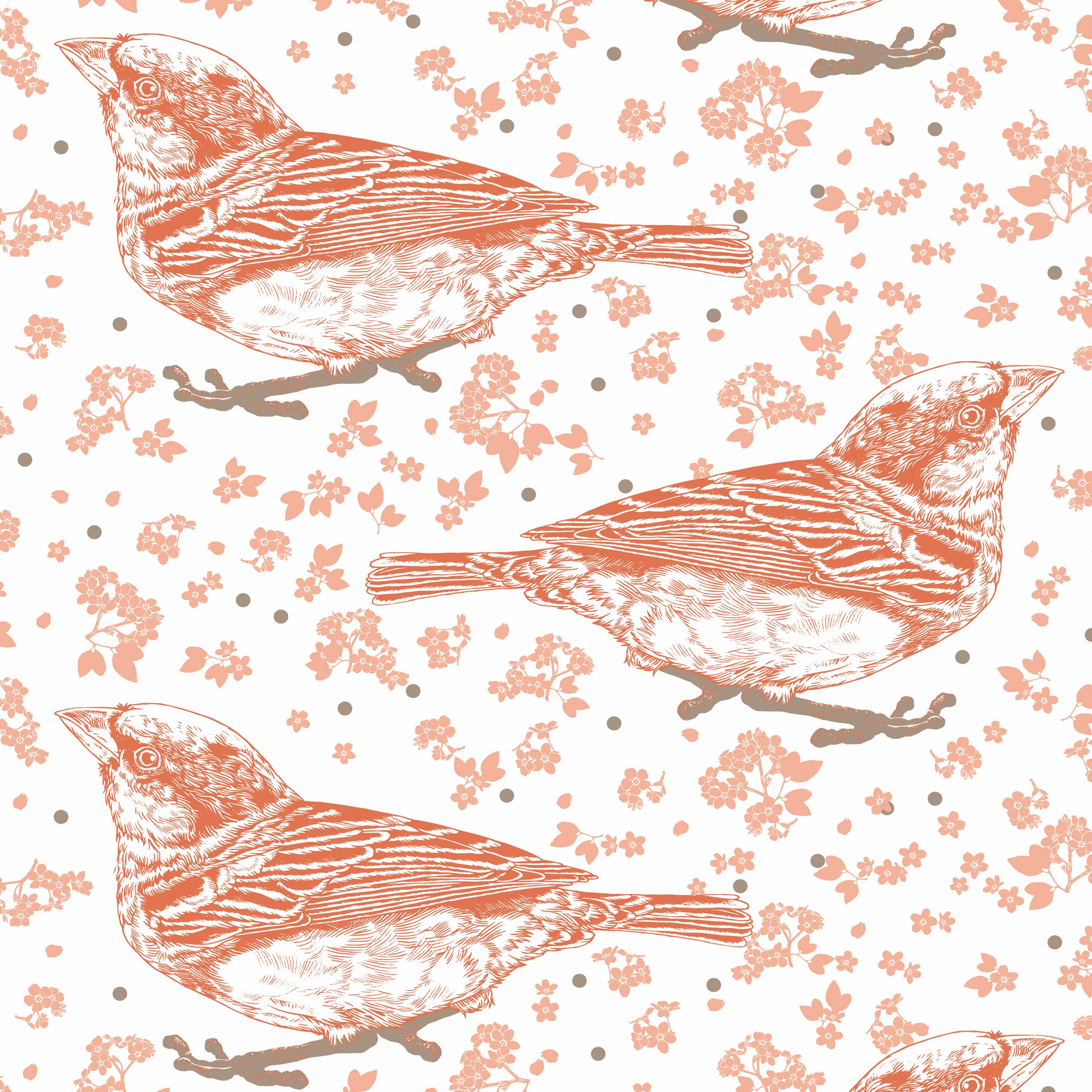
This version of the pattern followed through on the original plan of having the main element be an oversized, placement-print of the sparrow — with small florals and dots scattered around it. The bird is set on a white background, in a regular arrangement, with plenty of space around it. The detailed, multicoloured drawing of it is the hero element here, and what makes it a signature print. I broke down the original drawing into a few separate colour-layers, making it really stand out against the white material. This was the final design, which got selected into production.
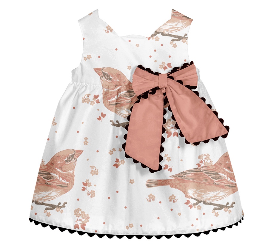
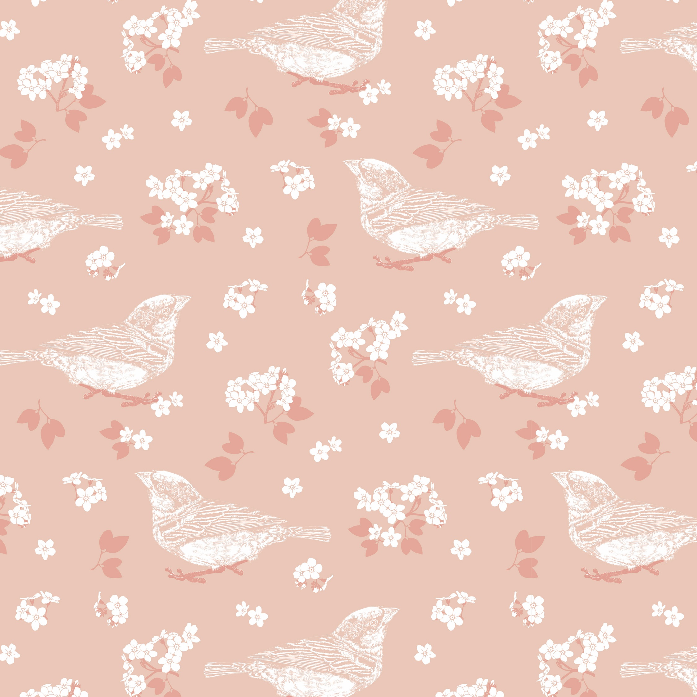
Feel free to browse the selection of alternative versions presented below. These versions differ in the arrangement of the elements, their colour and the spacing between them. They also vary in terms of the relative size of the elements within the pattern and the overall size at which the pattern is presented on the mock-up. Some interesting contrasts are created by drastically changing the scale of the bird in contrast to the petite florals and by having it printed in oversize.
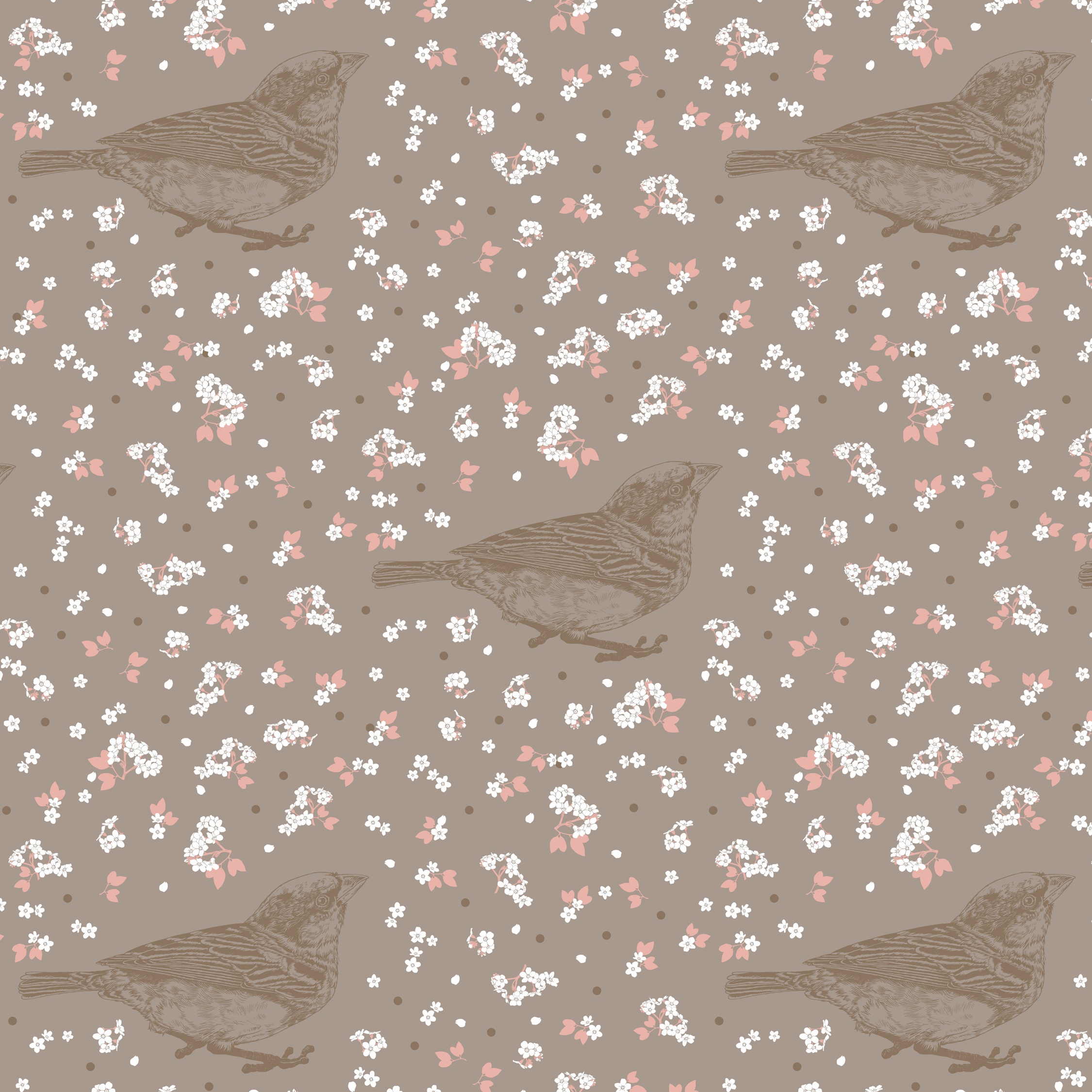
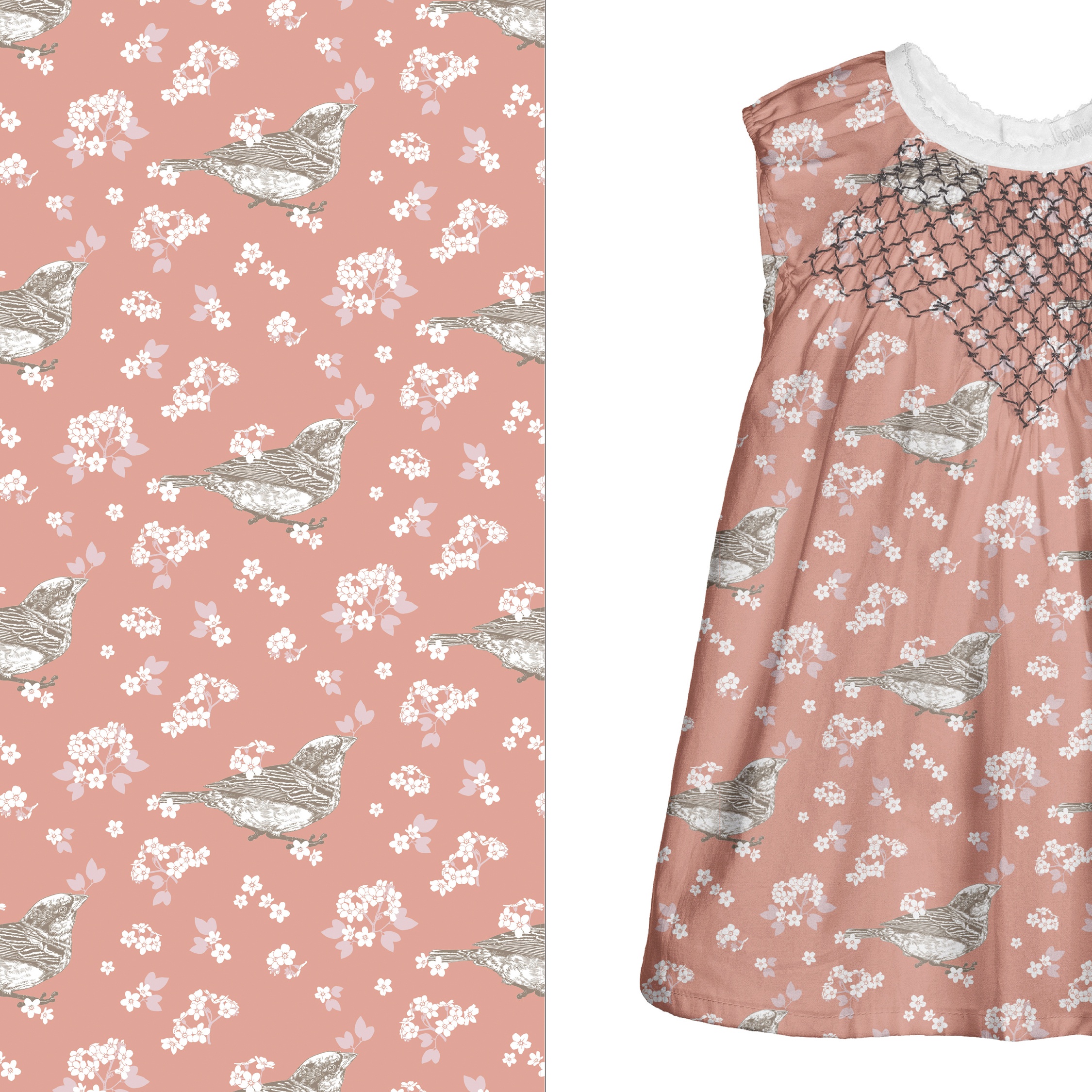
Here I wanted to fully explore the breadth of the coral colour palette and to bring in some of the browns into it. Reducing the number of colours makes the design very cost effective. Additionally, this simplified arrangement is also more appropriate for a younger age group (under 3 years old). It is always intriguing how simple changes to attributes such as size, arrangement and colour alter, fundamentally, the mood of a pattern.
Pattern 1
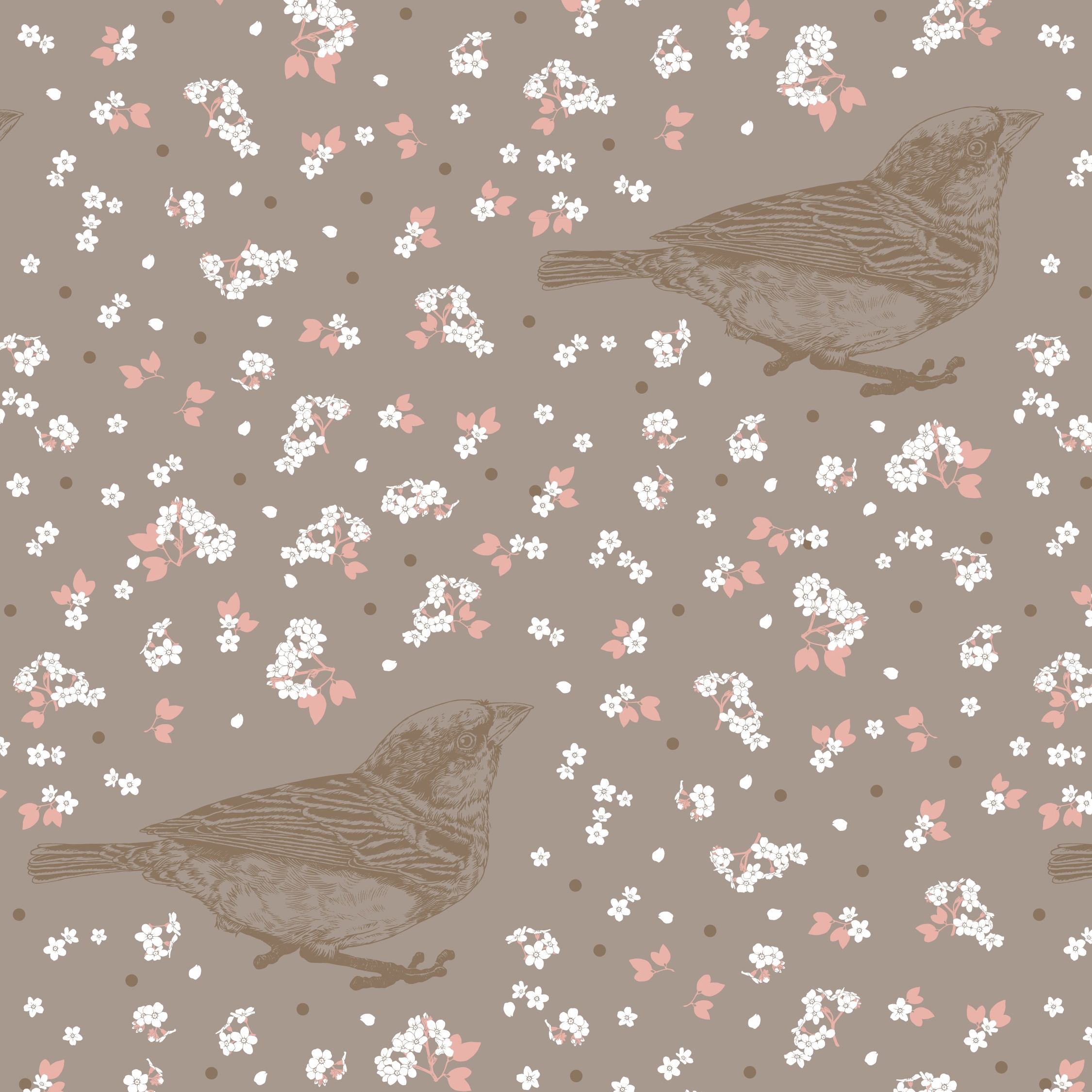
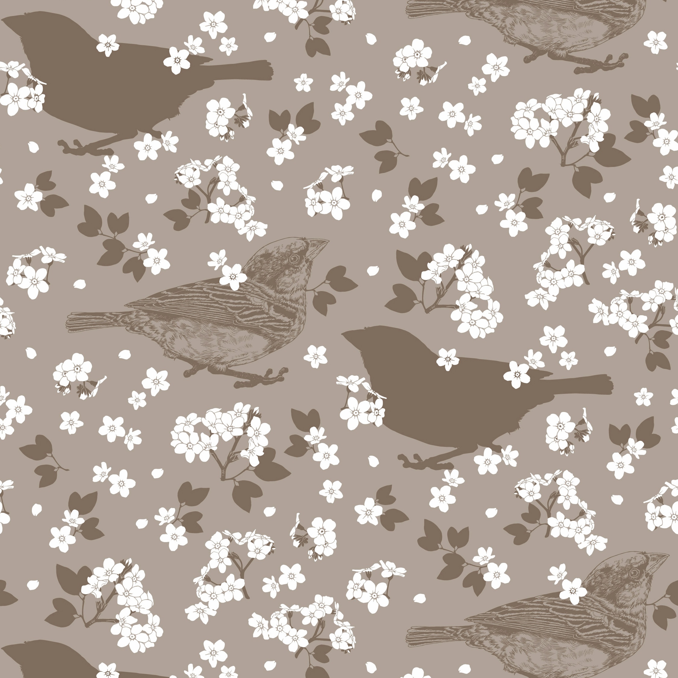
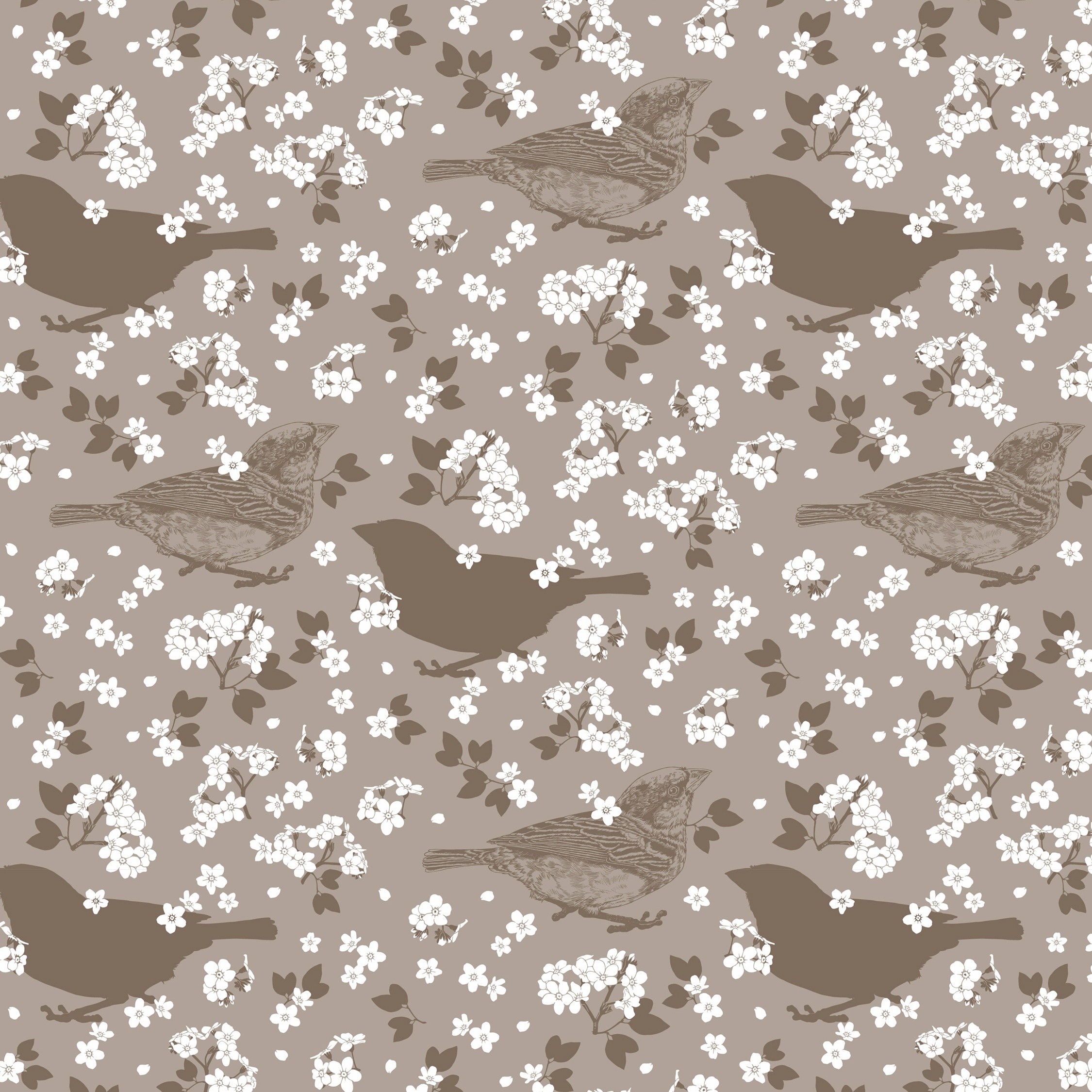
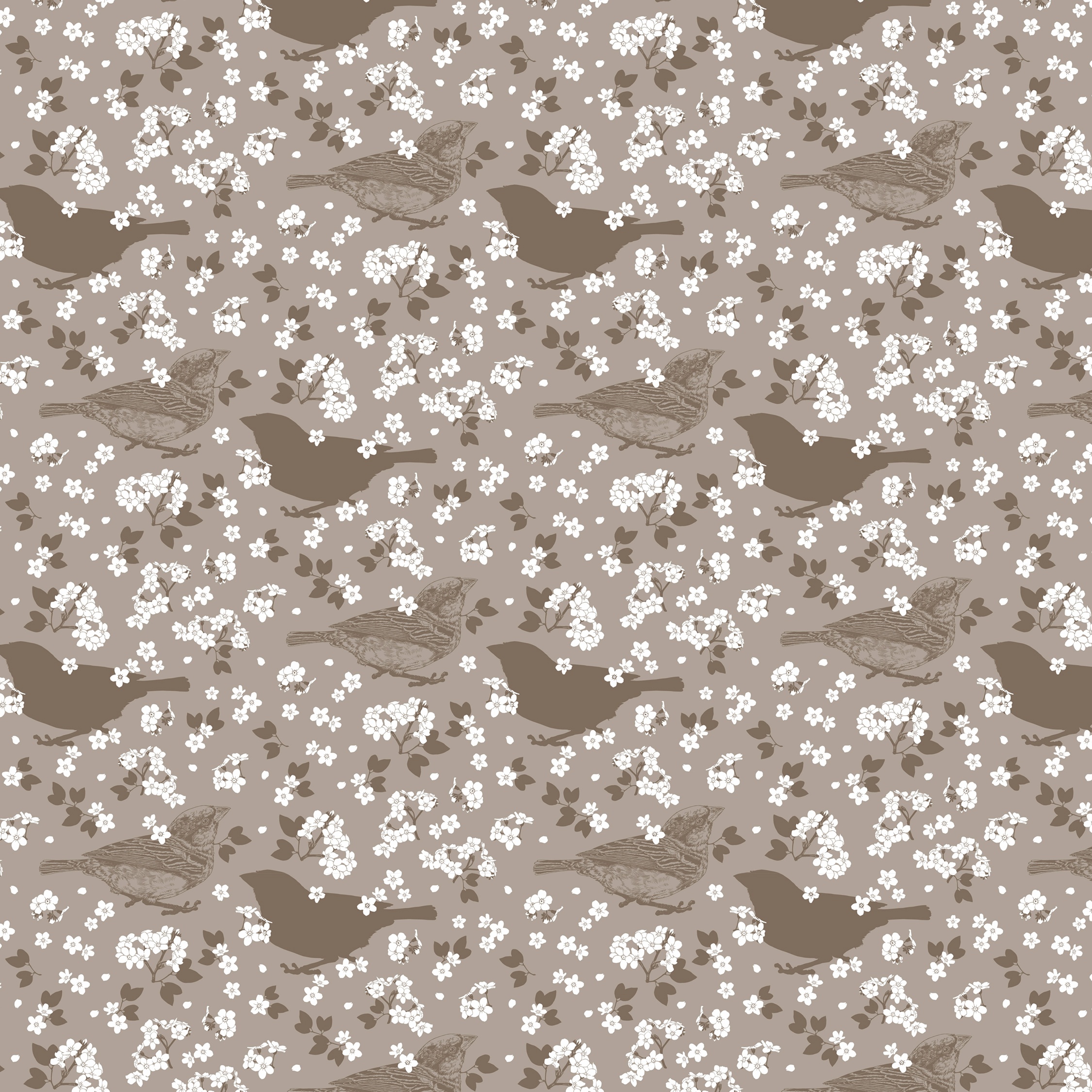
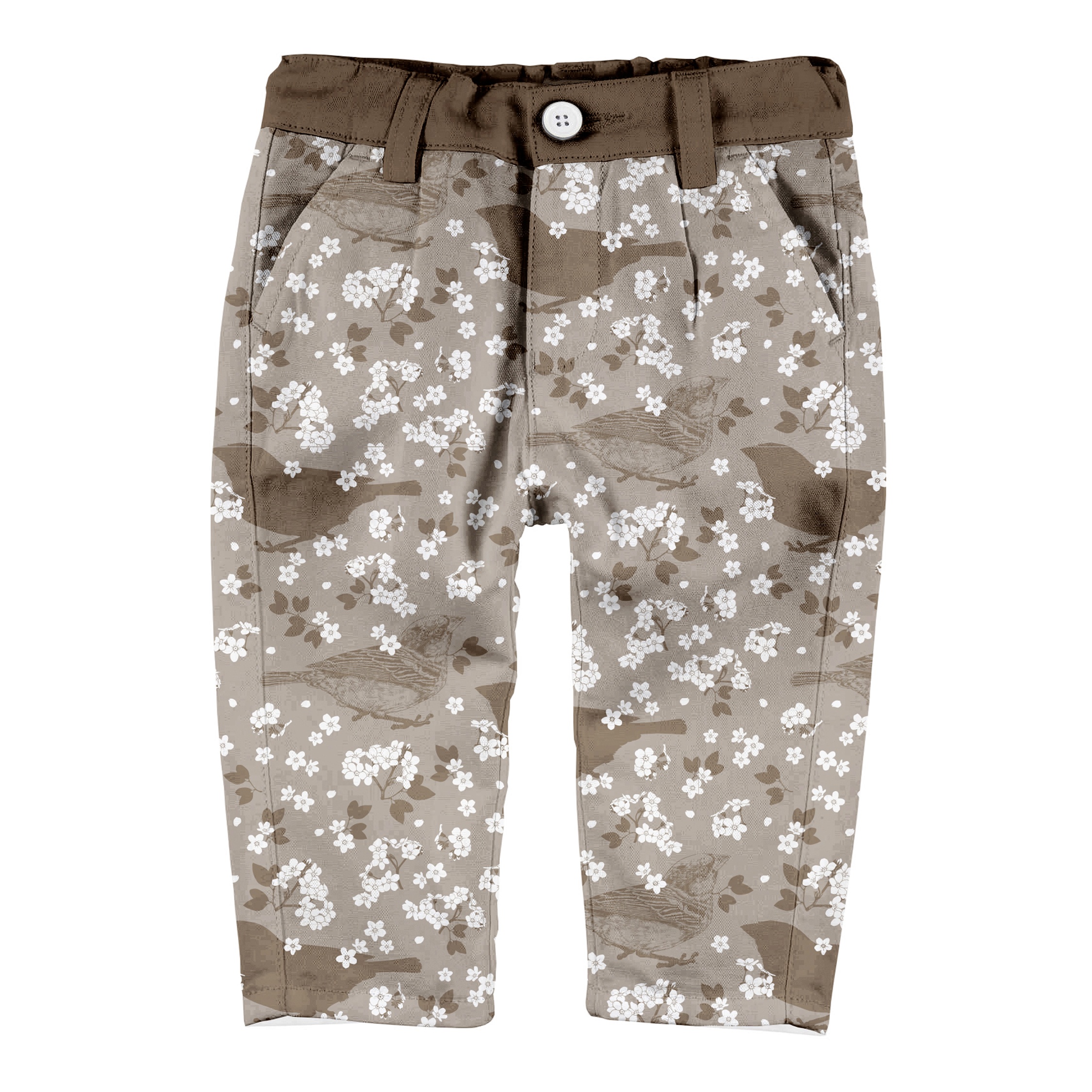
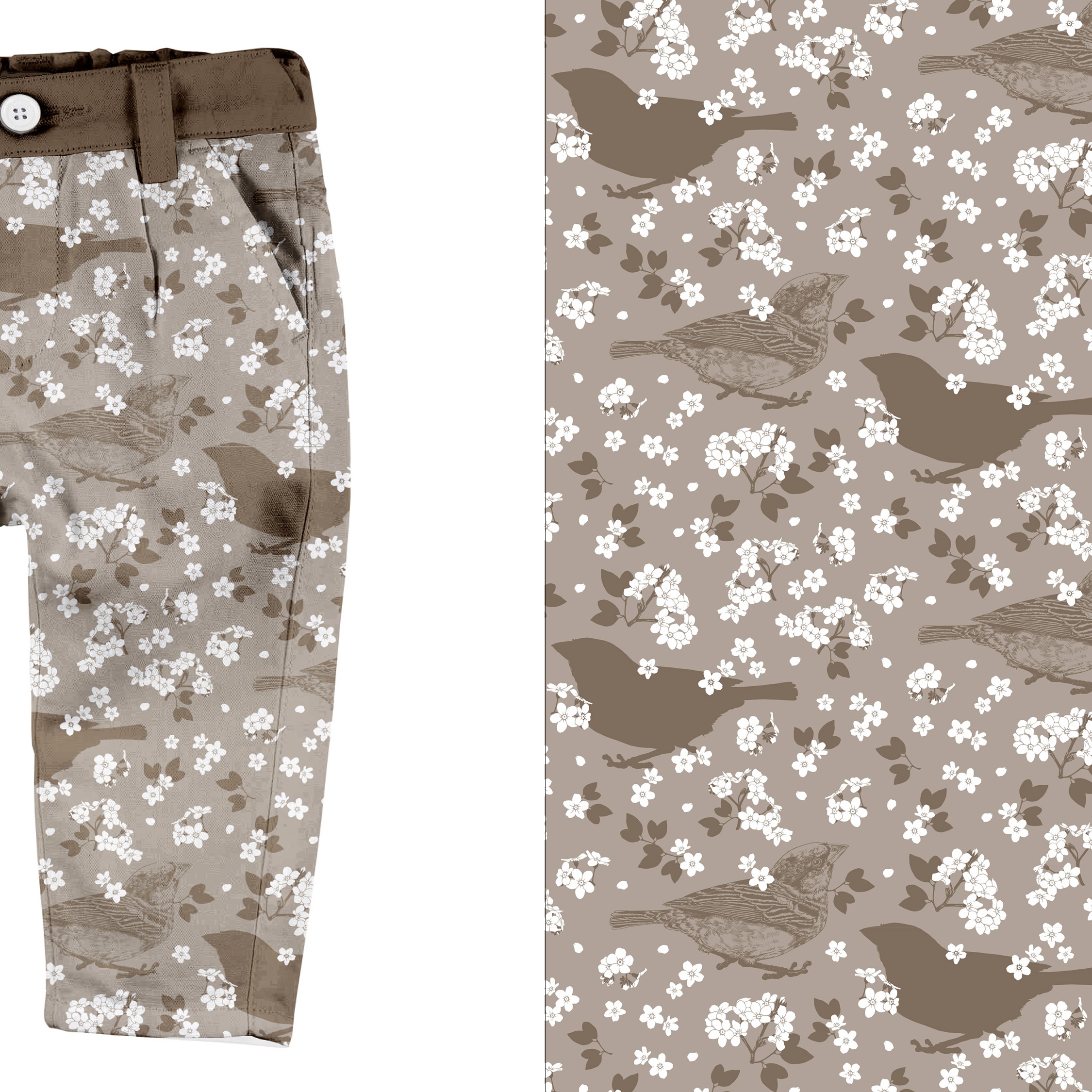
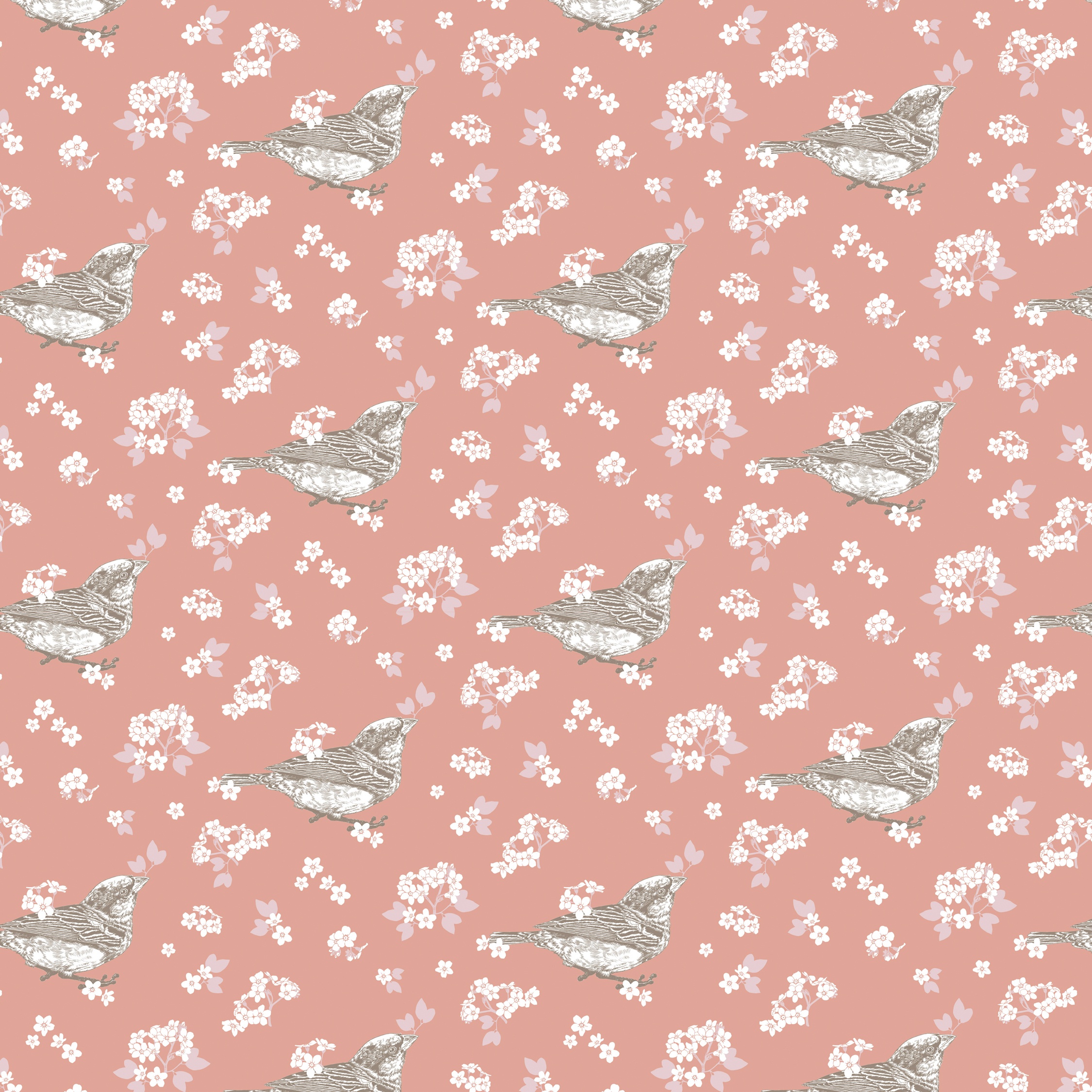
Having experimented with the dark-brown side of the palette I then created this monochromatic solution, which uses only two flat colours. This version also appears much fuller because the spacing between the elements has been reduced, the flowers are slightly enlarged and I’ve scattered small, dot-like petals in-between them. As for the bird, I’ve juxtaposed it against an outline silhouette of itself. This blends in with the colour of the background and in doing so gives the pattern more depth.
.
Pattern 2
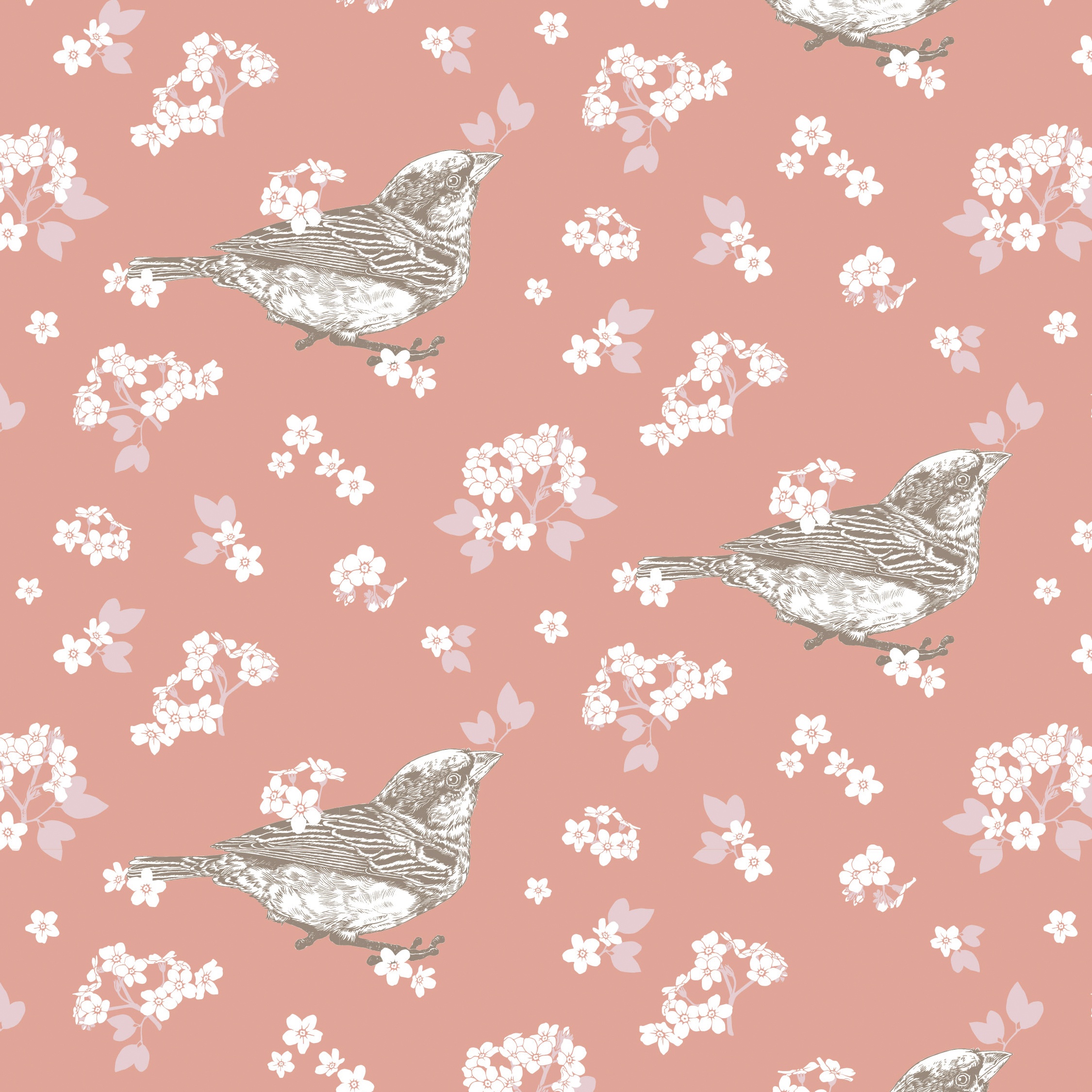
This version of the “Sparrow Patten” continues to explore the range of options within the colour palette. Though the sparrow illustration is reduced in size it still remains the focal point of the pattern. To keep emphasis on it the bird’s outline was recoloured into a coffee brown, whilst its body was filled-in in white. This makes it a fuller shape, that stands out clearly against the darker-coral background. I arranged it in a very regular, one-way manner and surrounded the bird with a slightly enlarged array of Forget-Me-Nots. Lastly, I put one of the sprigs in the bird’s beak, tying it in more with the rest of the overall design.
Pattern 3
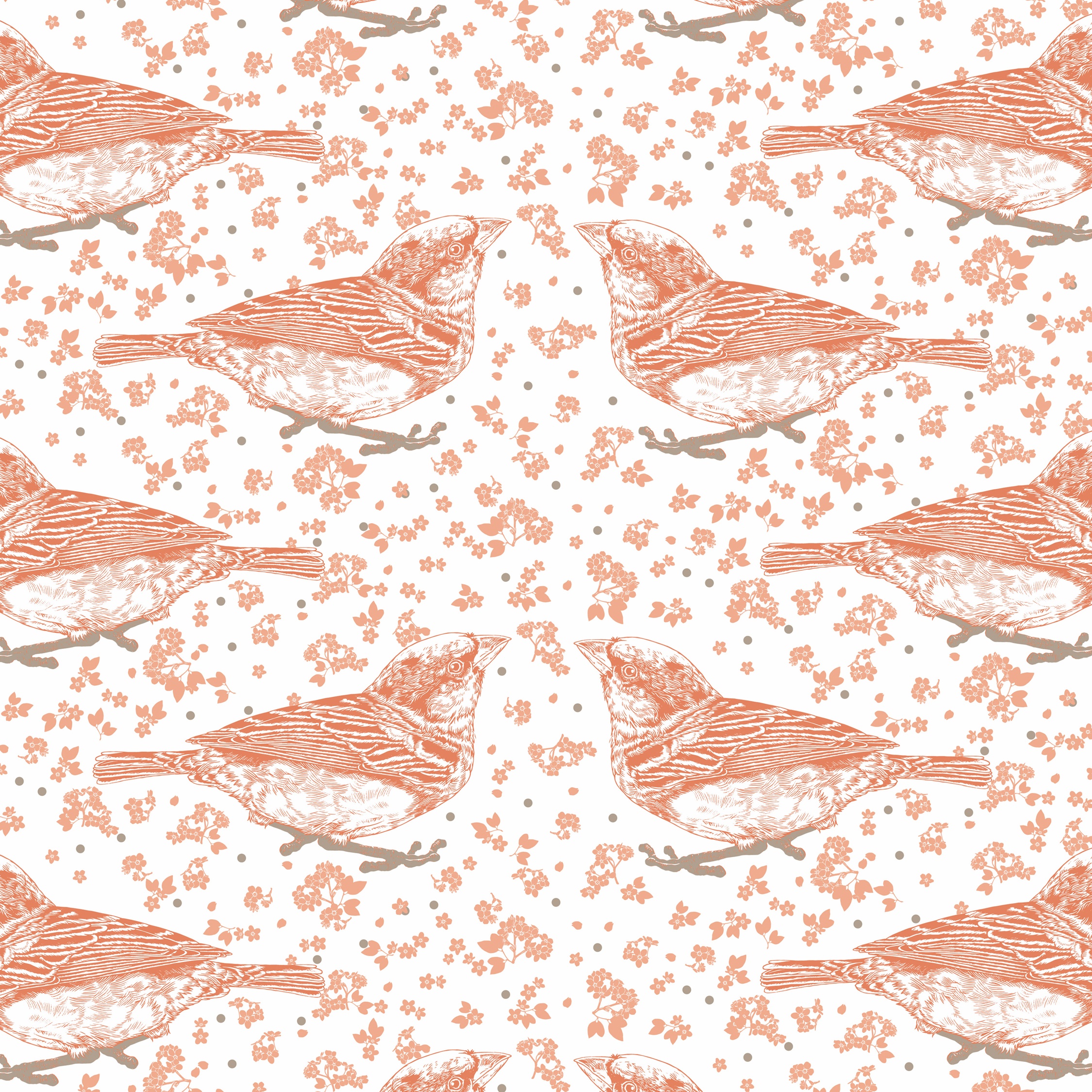
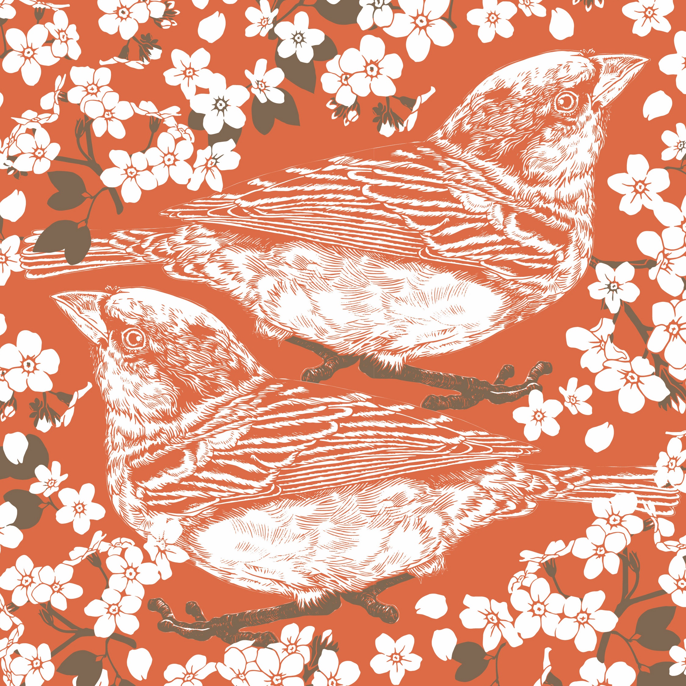
In this last version I wanted to experiment with bold and striking colouring and arrangements. I’ve juxtaposed two birds here, positioning them to face in opposite directions, and surrounded them closely with a myriad of Forget-Me-Nots. This turns the print into a busy and fulsome Floral. For good measure I also used a vibrant blood-orange from the palette and chose a contrasting colour match. This was all in an effort to create a very modern feeling, statement print.
“I once had a sparrow alight upon my shoulder for a moment, while I was hoeing in a village garden, and I felt that I was more distinguished by that circumstance than I should have been by any epaulet I could have worn.”


