Sub Rosa Carolina
The sentiment of a single stemmed, fragile wild rose, which grows with an abundance of fresh, unfurling leaves is pure everyday poetry. The sweet scented, deep pink roses blossom all summer and are loved by bees and butterflies alike. As a powerful symbol of love and adoration, roses provide inspiration to artists as a spectacle of fleeting beauty.
This project was a part of my ongoing collaboration with Kidspattern. If you’d like to learn more about them please visit their website HERE. Alternatively, view the archive of our previous projects HERE, in which I discuss in detail the history and nature of our work.
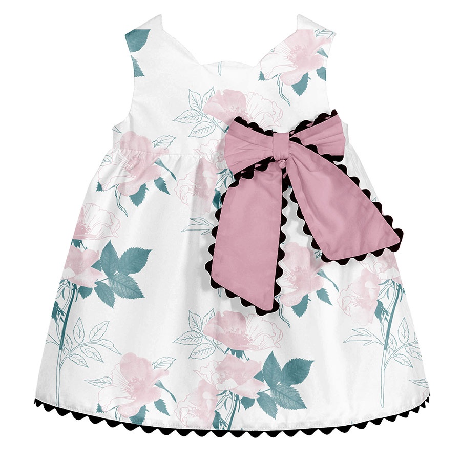
All clothing-mockups presented here are provided courtesy of Kidspattern and are used for visualisation purposes only.
Incomplete Works
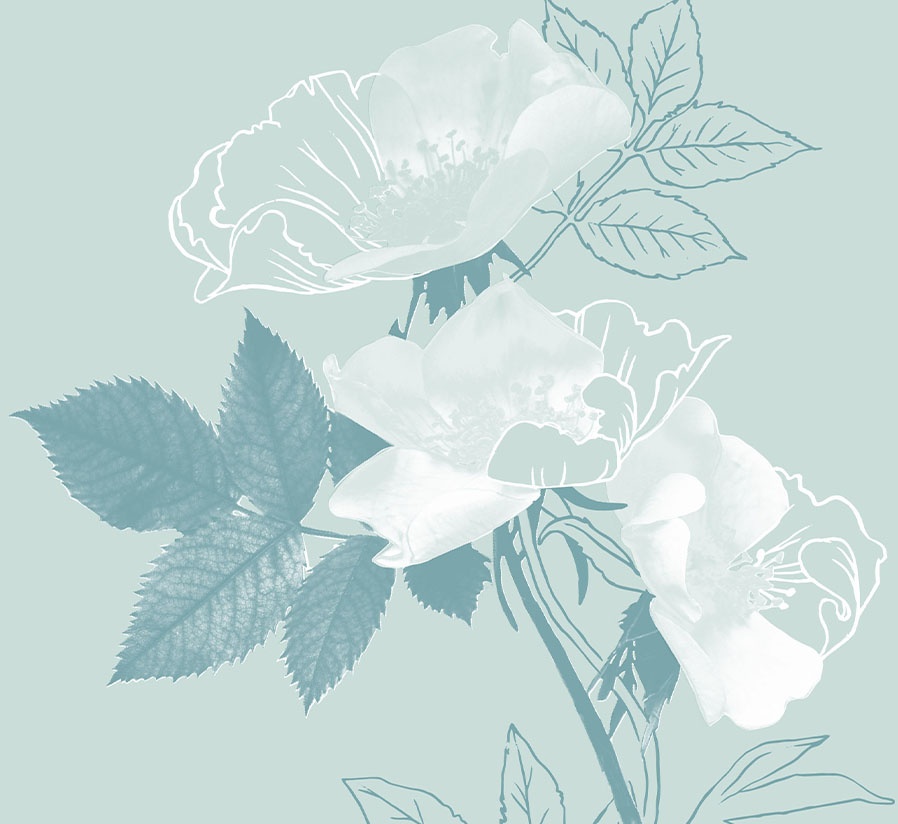
The brief for this commission was based around its main floral element being rendered in a mixed media technique. The mood board and accompanying keywords called for an unfinished look, collage effect and understated finish.
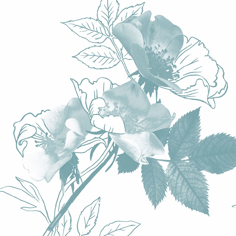
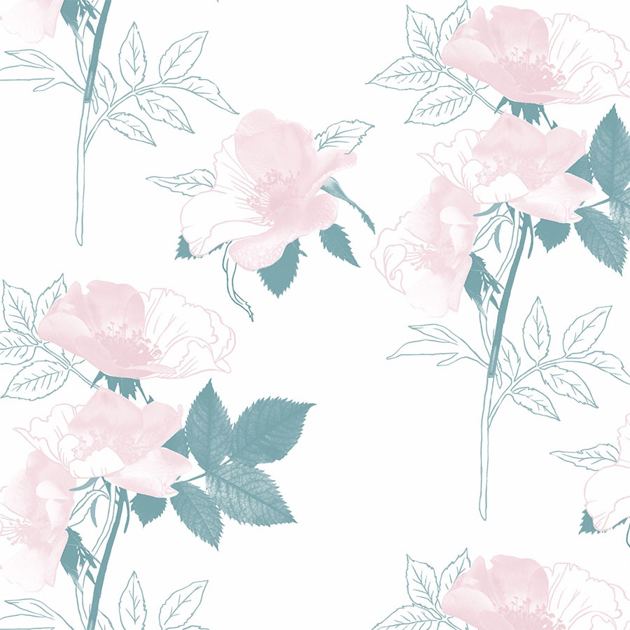
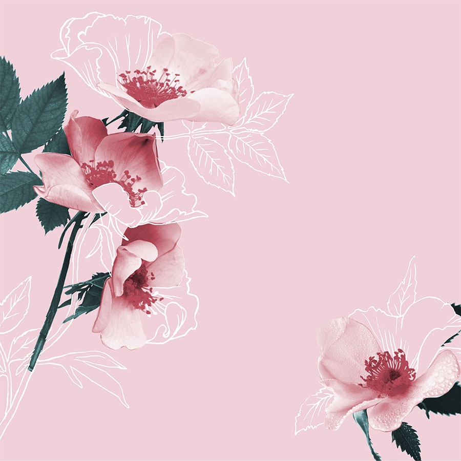
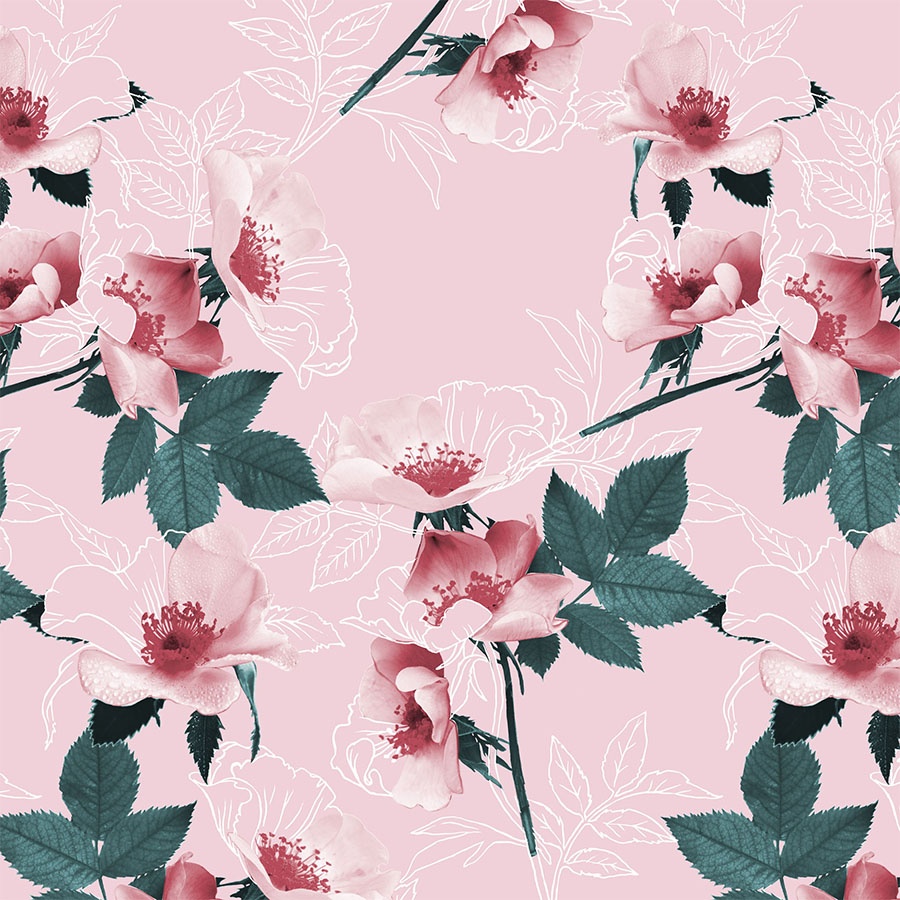
We, therefore, juxtaposed a detailed, close-up photograph of a full rose on a stem with the simplicity of a linear outline of a pencil drawing. The concept for this design was always to have it as an oversize placement digital print.
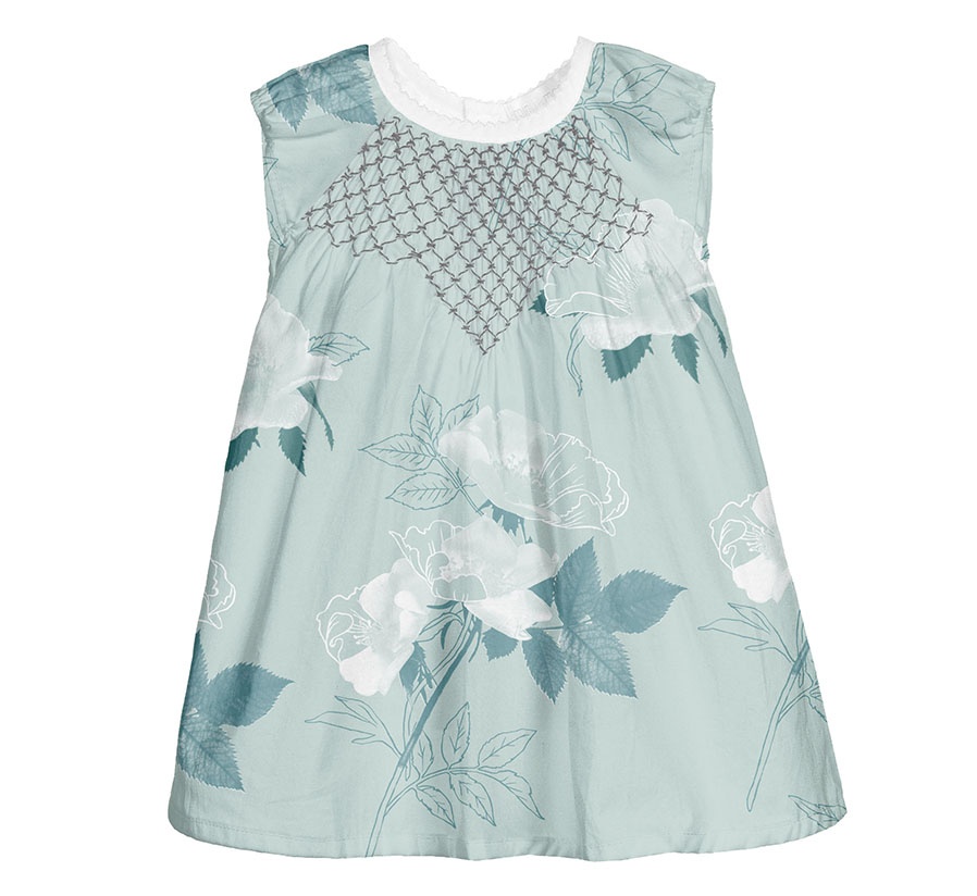
Moving the focus to the pastel green side of the colour palette and portraying a rose without any suggestion of a rose-tint seems almost a defiant act. However, I feel the monochrome adds to the design’s sophistication and unifies the connection between the photo and the linear details of the botanical drawing.
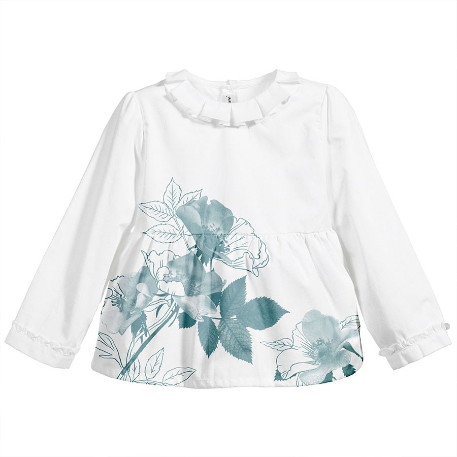
Each pattern was complimented by an oversize placement print to be used as an illustration. The version placed against a brilliant white background looks particularly crisp and elegant.
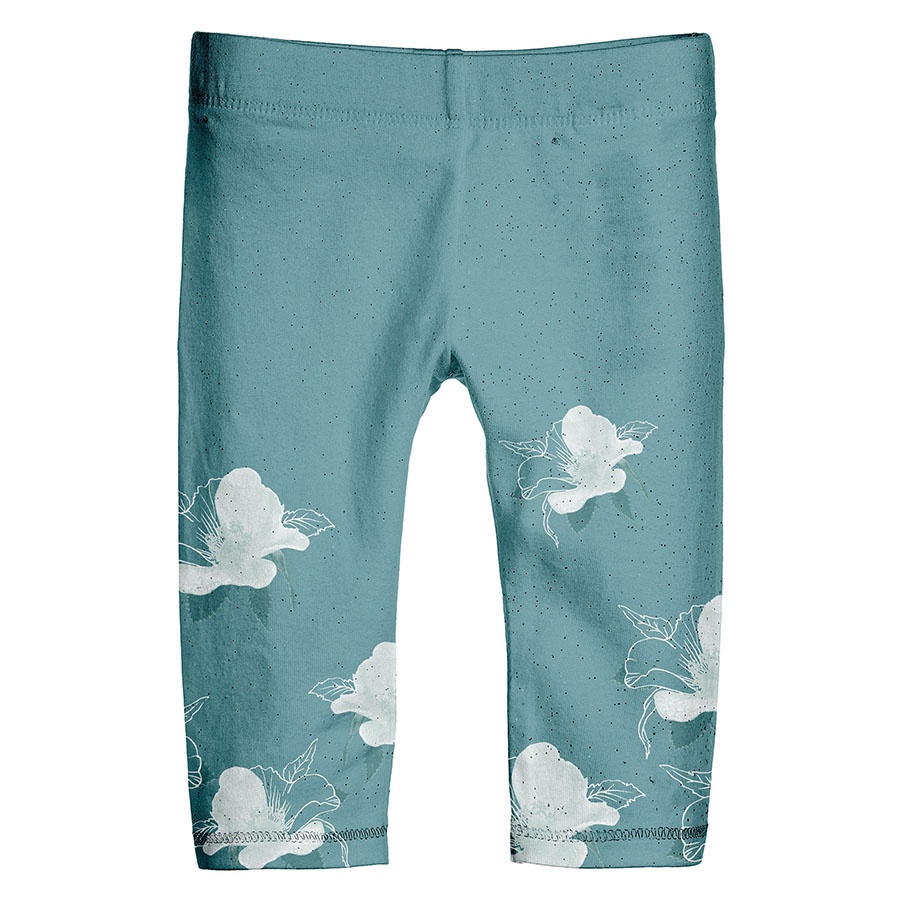
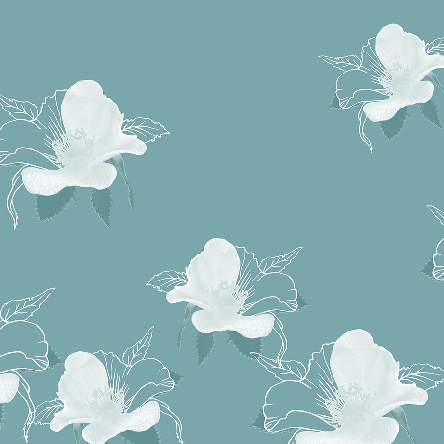
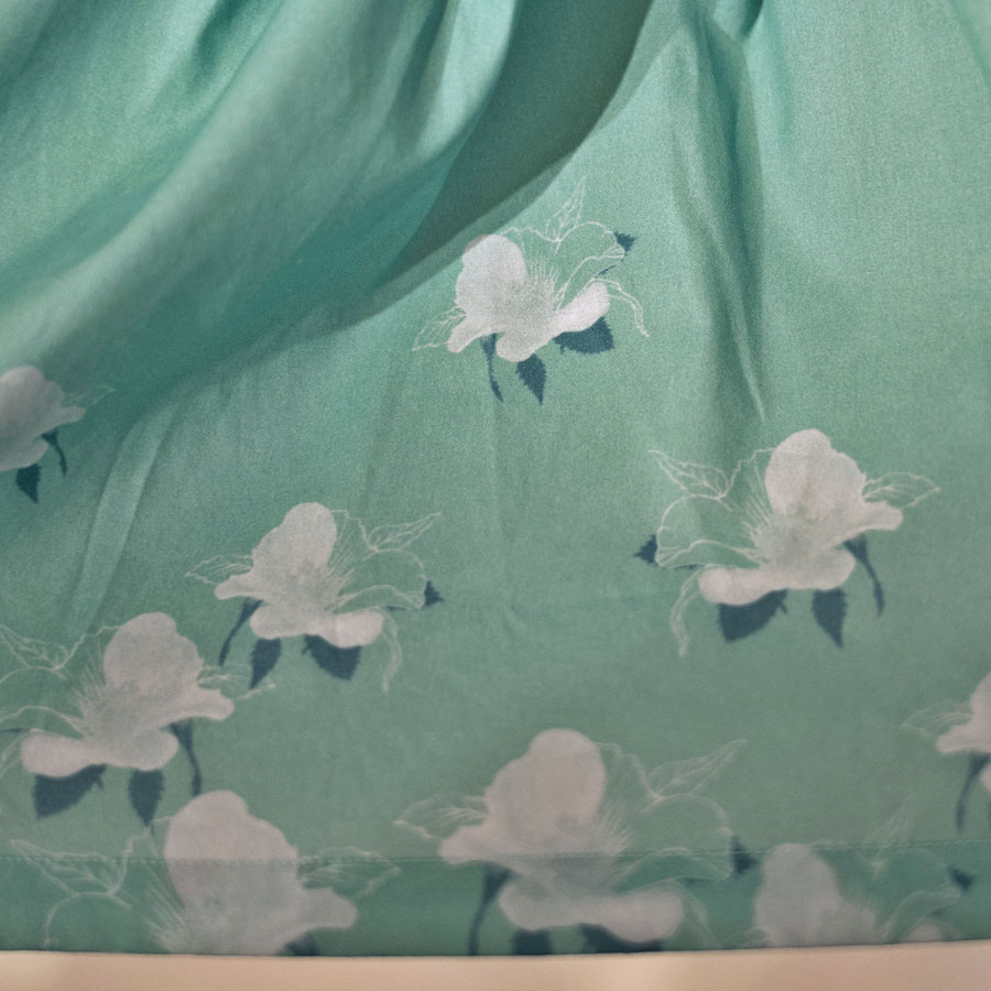
To complete this colour set, a version of the pattern fit for a dark green background was prepared. It was pared down to feature only one of the flower heads, which was then arranged in a transitional and scattered manner. The white florals and the details of its outline contrasts nicely against the melancholic shade of green.
Printed Product
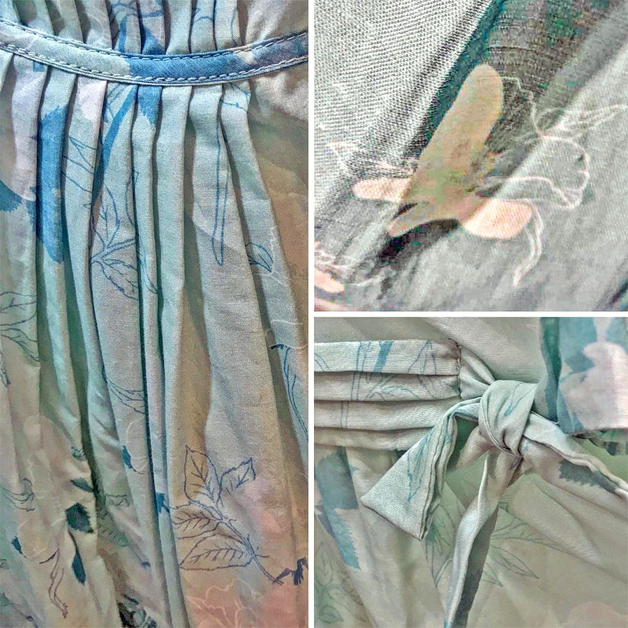
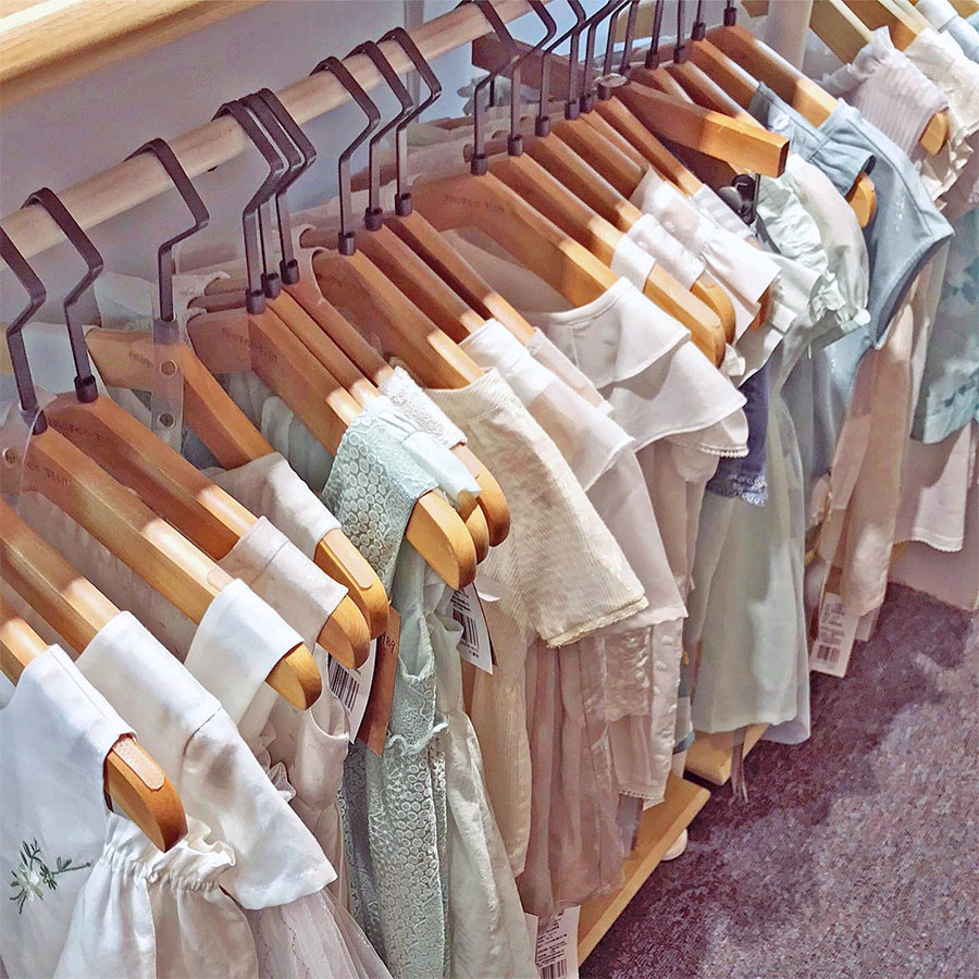
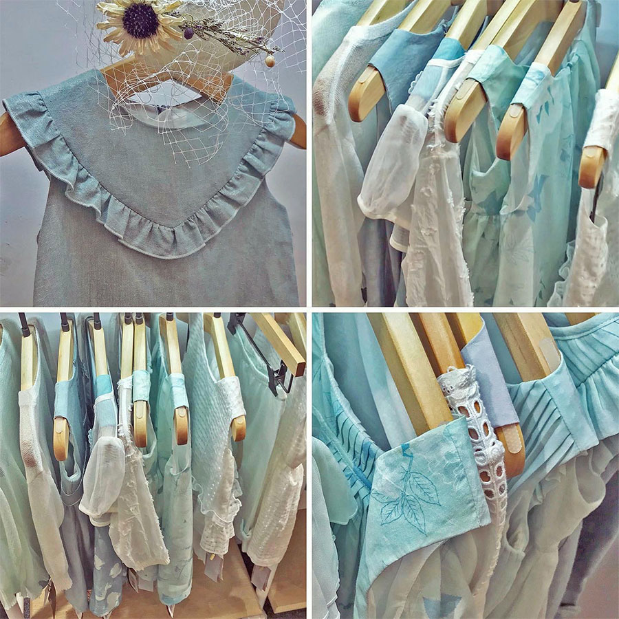
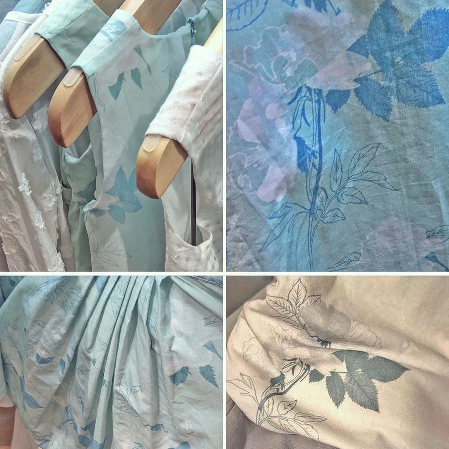
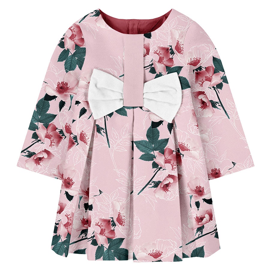
Since this was childrenswear specific and a bespoke commission, here are few examples of our client’s first clothing samples. These were made to launch their Spring-Summer collection and display at various trading and selling fairs. This hopefully should give an idea of the final use of this signature pattern in print within the context of its colour and age group (up to 36 months old).
Please not that these images are provided courtesy of the client and Kidspattern and are used for portfolio purposes only.
Pastel Version
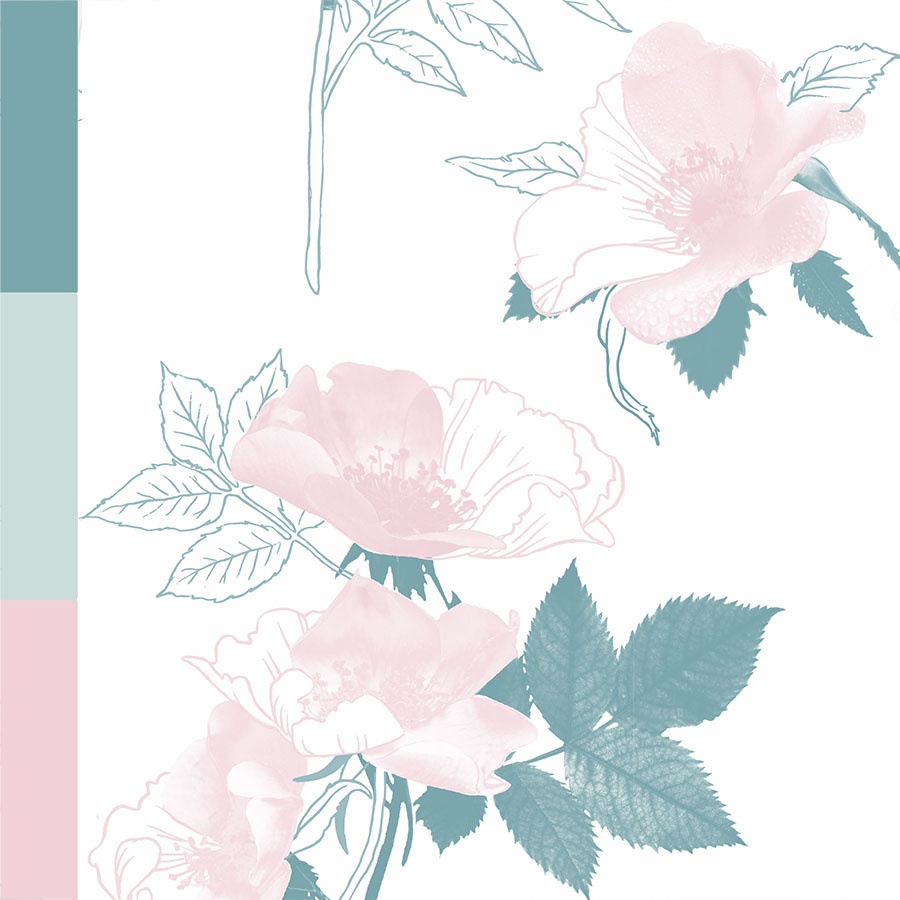
On the left side bar, you can view the original colour palette prepared for the colour group by trend and colour specialist Kidspattern. Here’s a version of the pattern recoloured to match it and make full use of its spectrum. Together with placing it on a white background the overall result is soft and dreamy. Since visualised on a lovely summer dress with the bow balancing out the use of pale pink the pattern makes an elegant, pastel and feminine design.
Pink Version
The main module was recoloured to compliment a darker background and with the pink part of the palette. This version of the pattern is composed out of rose stems scattered in an irregular arrangement and was visualised as a full print on a dress in a relatively small size.
The rose blends in almost seamlessly with the background but is defined by only a subtle, almost ghostly white outline. It completes the image by acting almost as a reminder of its fleeting nature and a phantom memory of the petals lost with the passing of time.
“It is the time you have spent on your rose that makes her so important.“


