Underwater Landscape
Most of Earth’s surface, more than 70 percent, is covered by oceans. This design is a celebration of the fascinating underwater landscapes, as well as a reminder of the importance of preserving these fragile aquatic habitats.
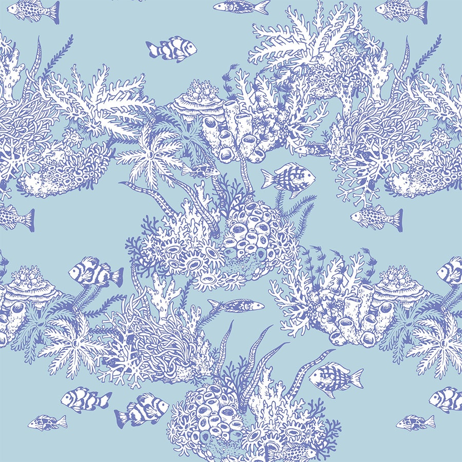
This pattern invites us to imagine the awe-inspiring views beheld during experiences such as scuba diving amongst coral reefs. Infused in a colour palette inspired by sunrays slicing through the surface of the water, Underwater Landscape is illuminated in a shimmering spectrum of aquamarines.
This project was a part of my ongoing collaboration with Kidspattern. If you’d like to learn more about them please visit their website HERE. Alternatively, view the archive of our previous projects HERE, in which I discuss in detail the history and nature of our work.
All clothing-mockups presented here are provided courtesy of Kidspattern and are used for visualisation purposes only.
Pattern Development
This design is a part of a marine series inspired by the wonderful abundance of sea life. It covers a total of three patterns commissioned for a client’s Spring-Summer colour group aimed at boys. Here you may view the other two accompanying designs : Shoal of Jellyfish and Seaside Shore. Apart from the marine theme that runs across them, they’re also unified by the same water inspired palette, which was composed by the trend and colour expert Kidspattern, and consists of a set of soft greens and blues, contrasted by a touch of rich, deep ultramarine.
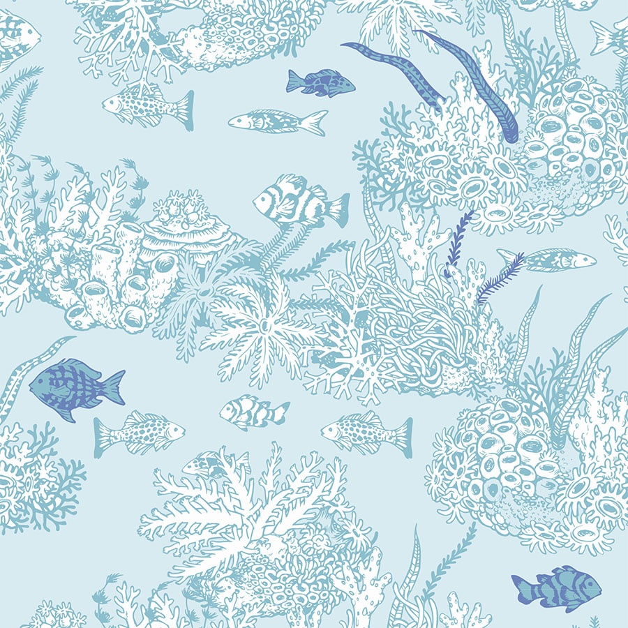
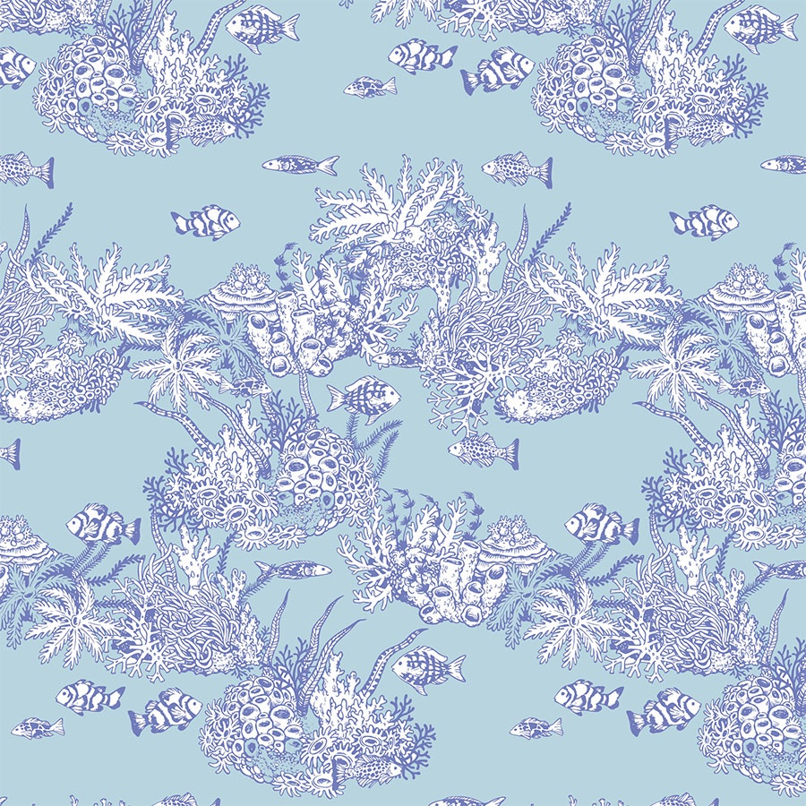
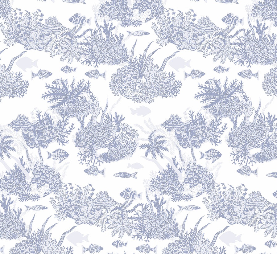
Above you can view the final version of the pattern which was purchased and printed by the client. The design combines two recoloured outlines, both filled with colour. This brings in an interesting dynamic, whilst keeping the total amount of colours used to just two. The elements remain balanced in a regular, linear arrangement. This version works equally well across various backgrounds: standard white, medium blue and dark ultramarine. This allows for versatile uses across multiple clothing and accessory items.
Drawing
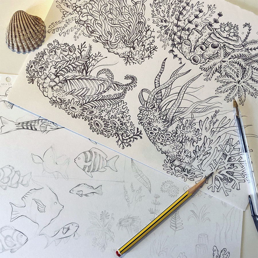
Please view the preliminary pencil sketches offering you a peek into my creative process. Loosely inspired by imaginary coral reef habitats, they are filled with unusual, and fascinating alien shapes anchored to the seabed.
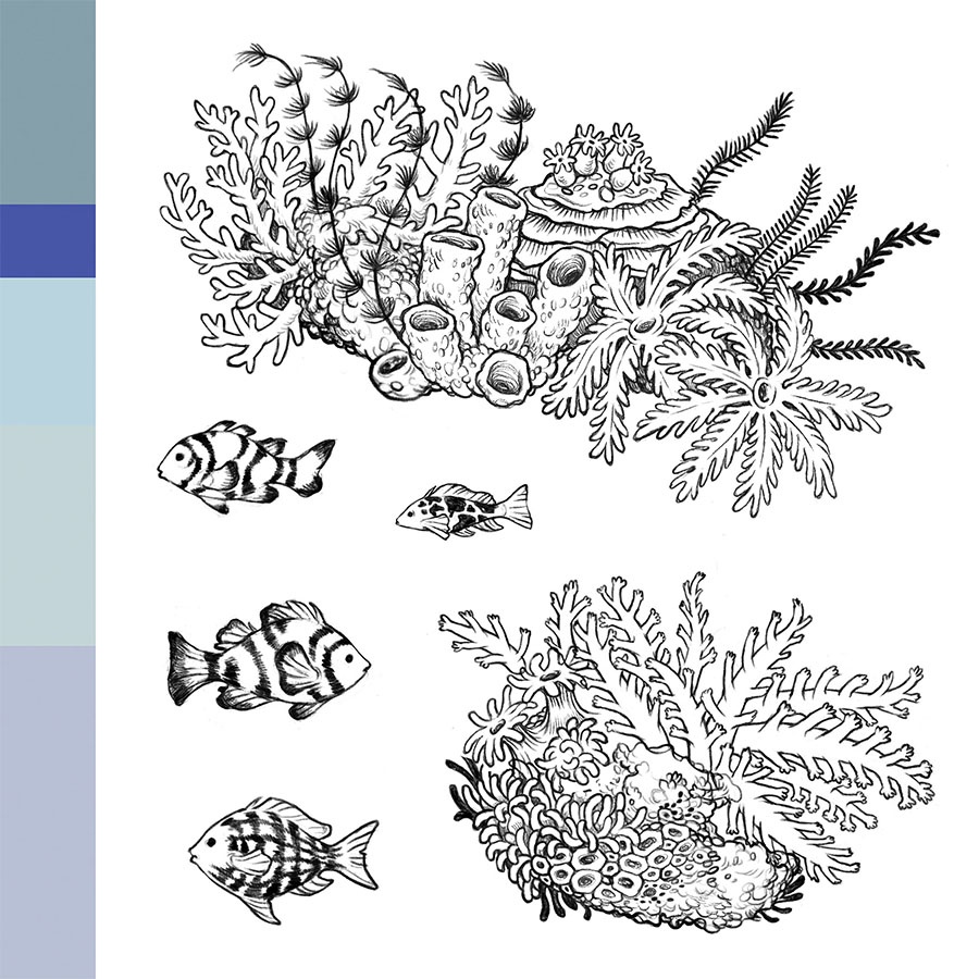
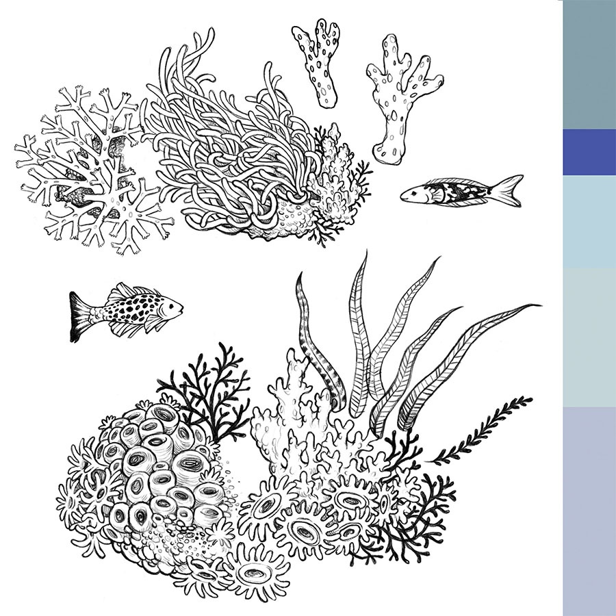
Using biro pen I simplified and stylised these to arrive at this kid-friendly design. Next, these were scanned in and cleaned up digitally to get them vector — ready for pattern design.
Newborn Collection
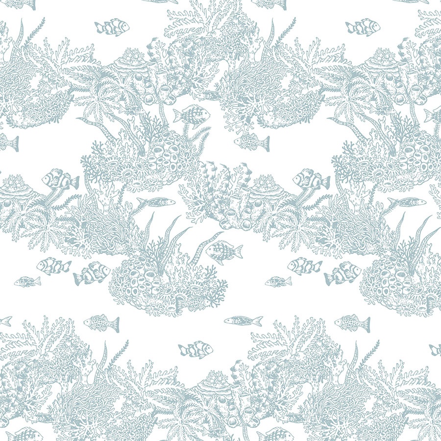
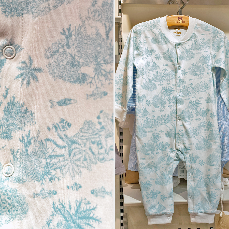
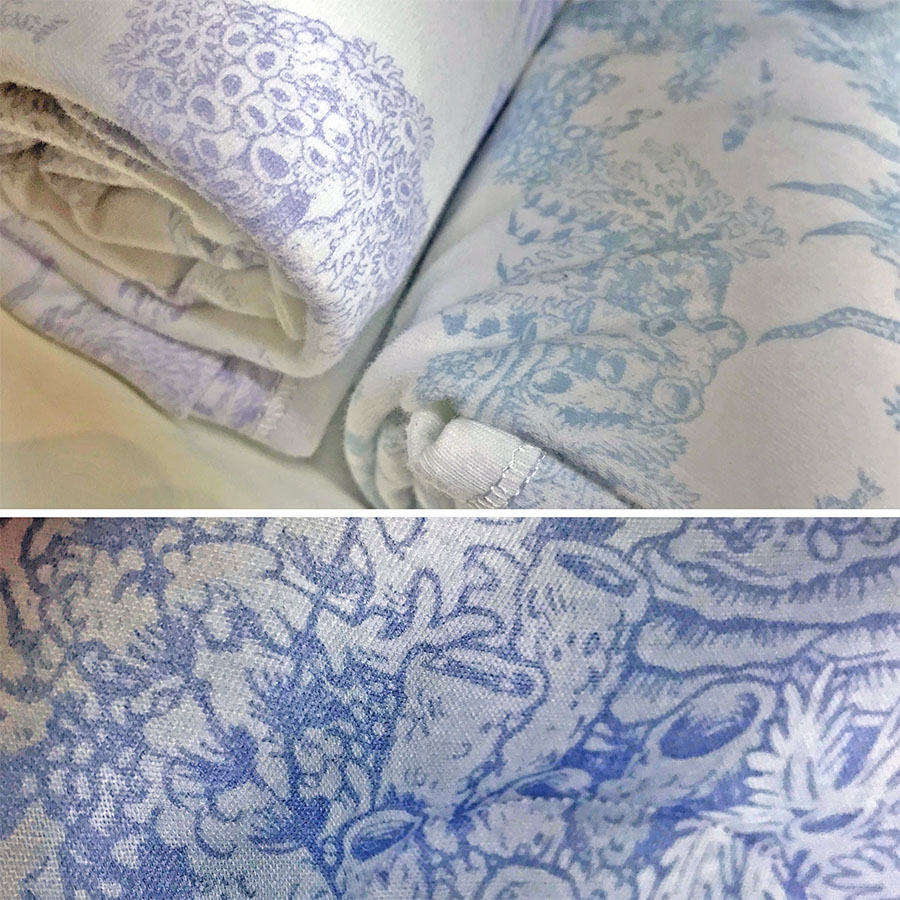
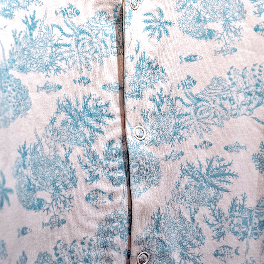
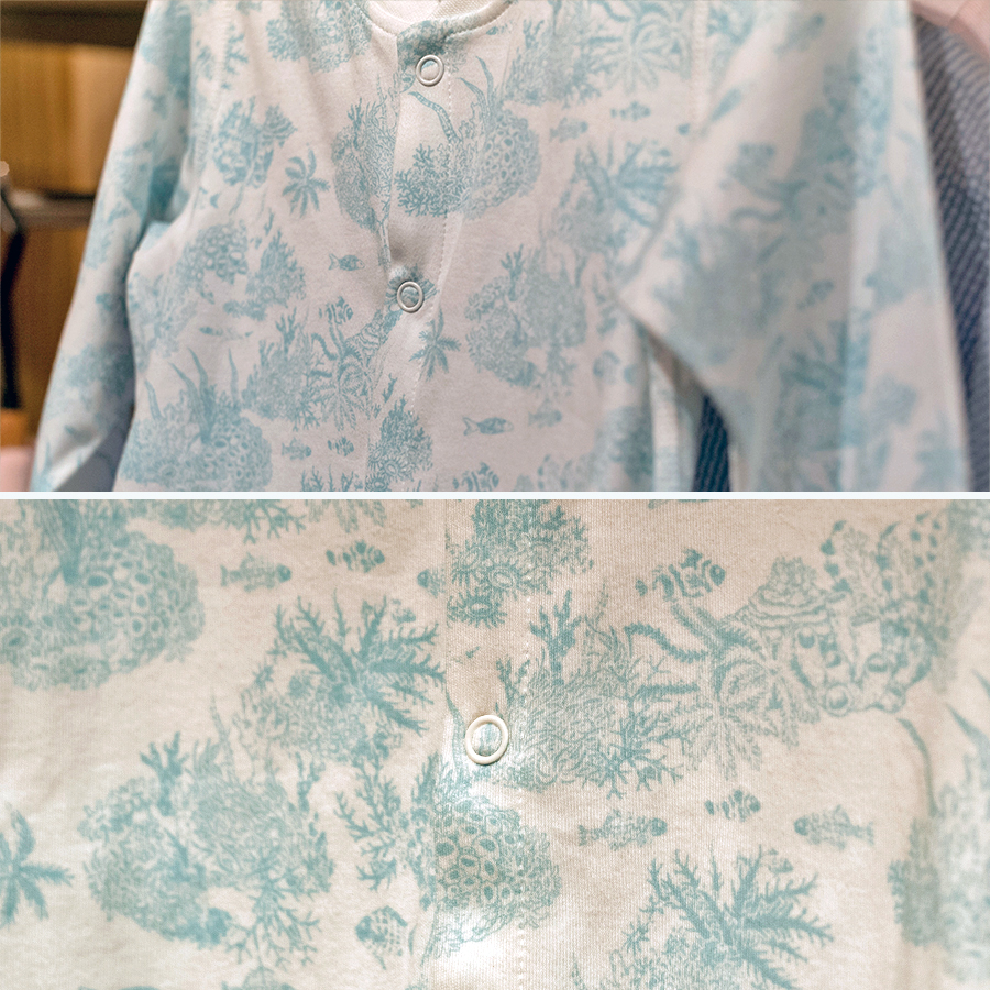
Part of the collection addressed to Newborns involved prints for baby grows and other accessories like hats or blankets. On the left side, you may view an idea for a base, single-colour version of this pattern, which has the coral reef islands arranged in a linear, regular manner. This version allows us to fully appreciate the hand drawn aspect of all the elements by visualising it in a relatively large size and the choice of a white background provides contrast to the dark green artwork.
On the right hand side, please view a slightly more adventurous version, which was recoloured to fit a fresh, light turquoise background. The elements were filled in with white colour and an additional darker blue was injected as a fun pop of accent colour in the details of some the fish and few reeds of seaweed. The islands are now also clustered closer together and visualised in a large size, which adds to the design’s modern feel.
Clothing Samples
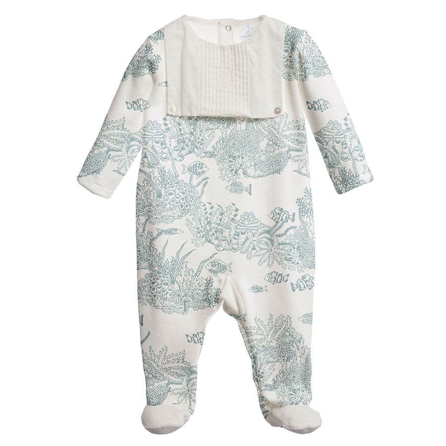
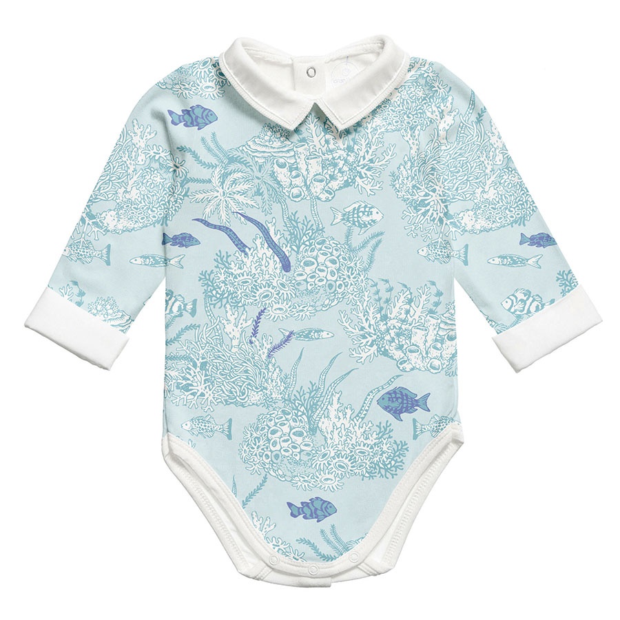
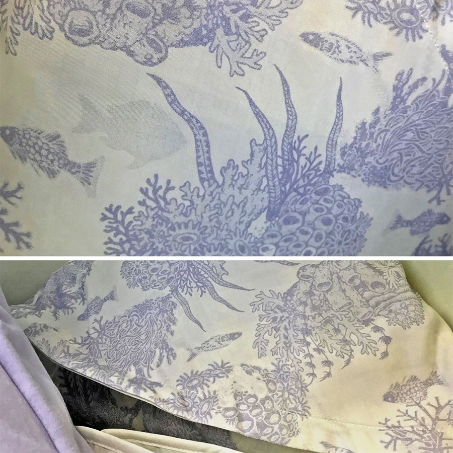
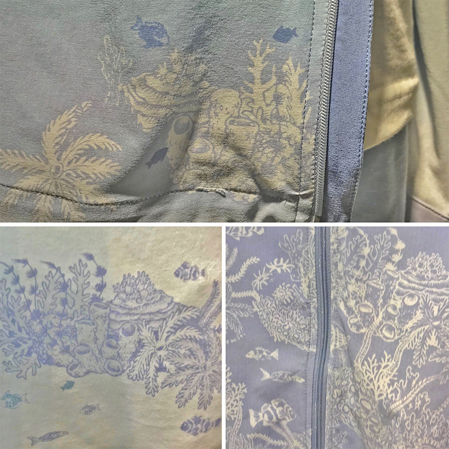
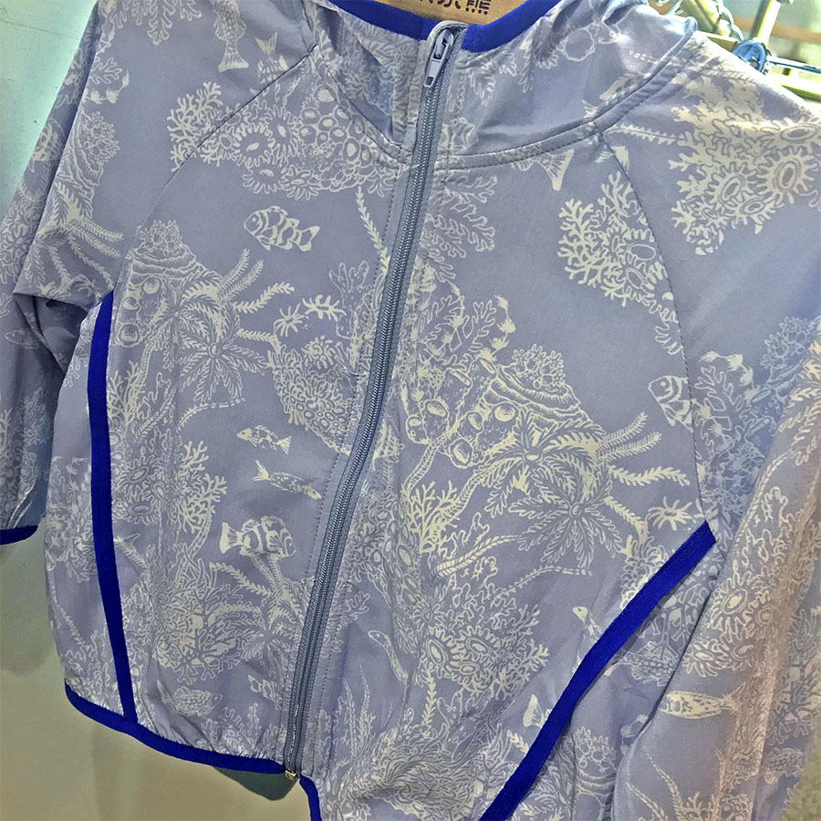
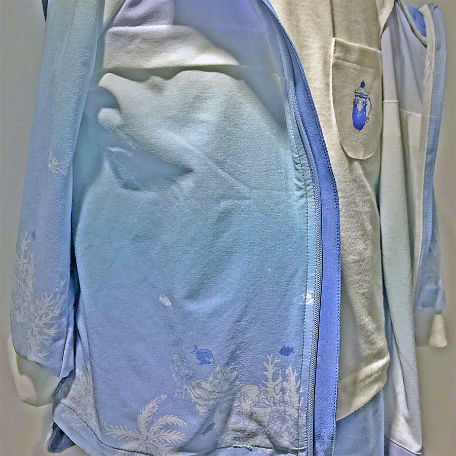
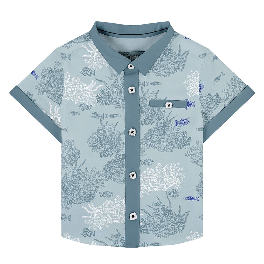
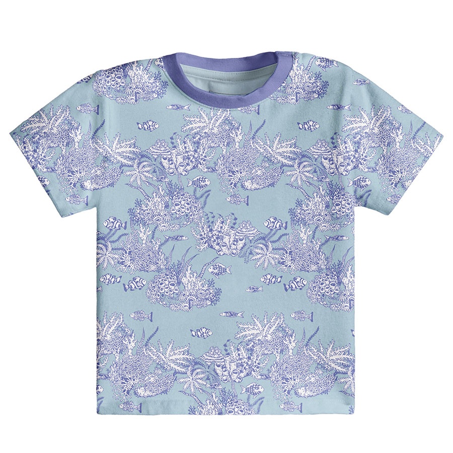
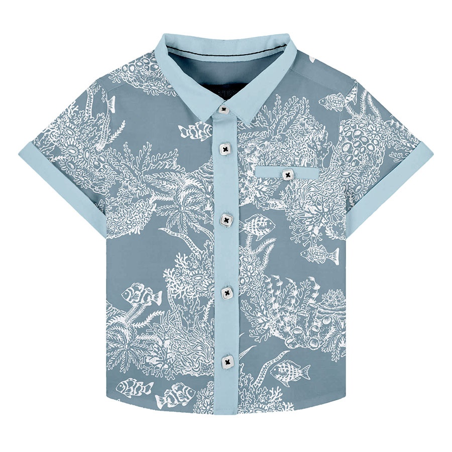
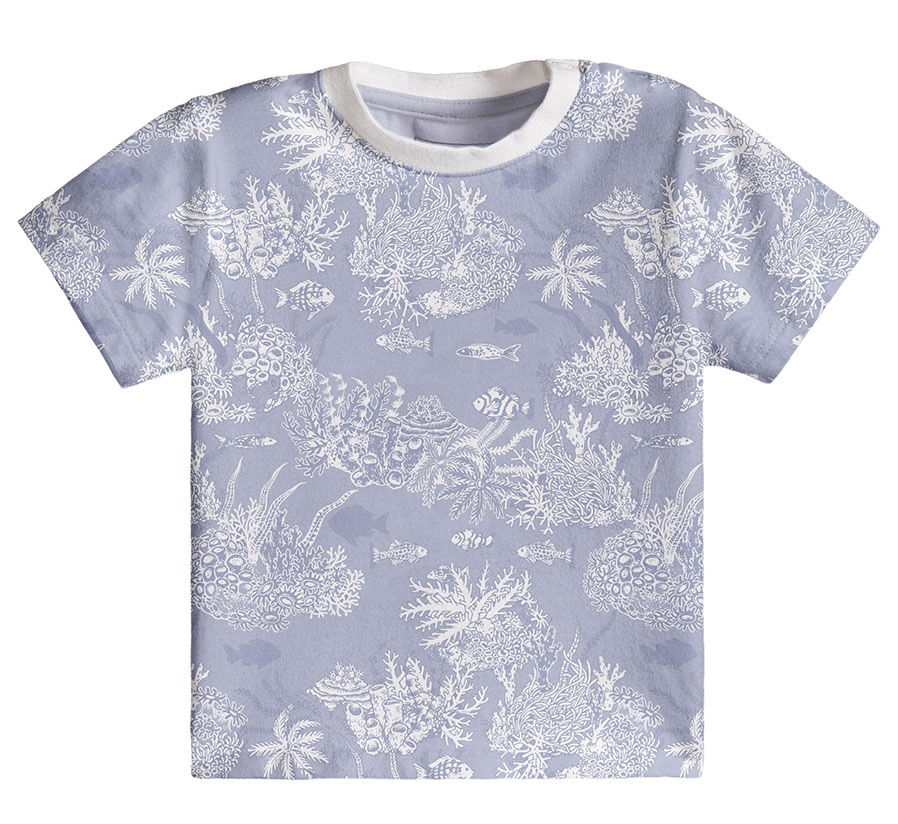
Please browse through a selection of examples of the Underwater pattern in print. These were produced to launch the client’s overall Spring-Summer collection and to promote it at trading fairs.
Apart from clothes aimed at kids aged 18 – 36 months old, I’ve also added a few samples from their Newborn group, which includes baby accessories like blankets and hats.
My favourite is an ombré coloured jumper with an illustrated rim and a matching spot illustration that I also created which was printed on the t‑shirt’s front pockets.
Please note that these images are provided courtesy of the client and Kidspattern and are used for portfolio purposes only.
Alternative Colourways
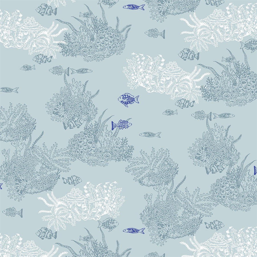
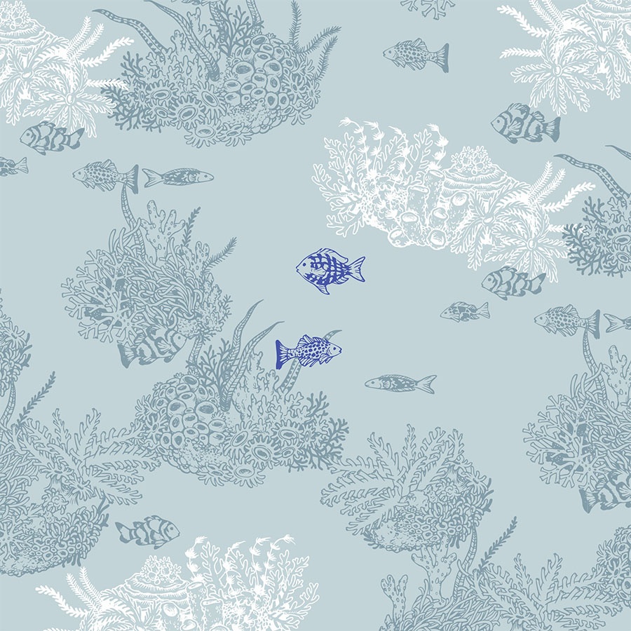
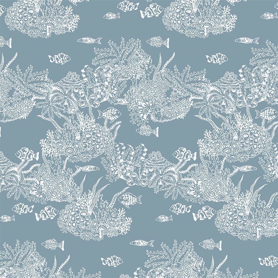
Continuing to explore the breadth of this inspiring colour palette, I opted for a colourway based on one of the darker greens. The artwork blends into the background as outlines only, whilst bringing in a white colour in few areas for a balanced and smooth finish.
To break it up a bit, recolouring of some of the fish in lapis lazuli injects spots of freshness and catches the eye. All the elements are arranged spaciously to give an impression of free-flowing movement
Darker Colour Scheme
Further experimentation offers a selection of designs that focus on the darker end of the colour palette, which you may browse through below. These include a slightly bolder colour combination, with the elements outlined in a shade of cobalt filled with white that pops out from the vibrant light teal of the material. This palette is inspired by uplifting colours of the ocean changing with the amount of light hitting its surface.
Additionally, other recolouring changes turn this pattern’s mood into more mysterious, as going deeper into the waters would do. It’s now more evocative of the vast submarine, unexplored worlds full of shipwrecks, lost treasures and deep sea creatures of enormous sizes capable of living in abiotic conditions.
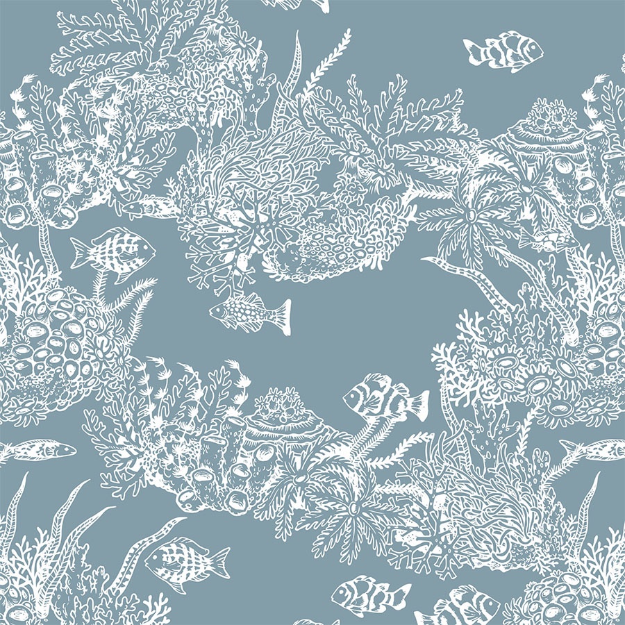
A simplified, white outline only version placed against a dark background in an oversize arrangement allows one to appreciate the biodiversity of coral reefs, and the details of the drawing. Additionally, this gives the design a more textured look.
“The sea is everything. It covers seven tenths of the terrestrial globe. Its breath is pure and healthy. It is an immense desert, where man is never lonely, for he feels life stirring on all sides.“


