Vines of Clematis
This pattern design series was inspired by the resplendent blooms of clématis, a trailing plant grown for ornamental purposes. Its flowers are meant to symbolise the beauty of ingenuity and the trait of artifice.
These interpretations are due to its seemingly clever ability to climb around trellises and walls, and as such, it is admired for its resilience.
This pattern design project was a part of my ongoing collaboration with Kidspattern. If you’d like to learn more about them please visit their website HERE. Alternatively, view the archive of our previous projects HERE, in which I discuss in detail the history and nature of our work.
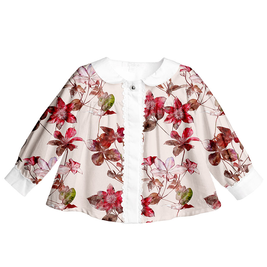
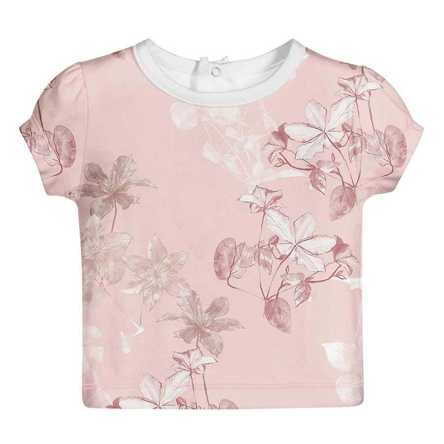
All clothing-mockups presented here are provided courtesy of Kidspattern and are used for visualisation purposes only
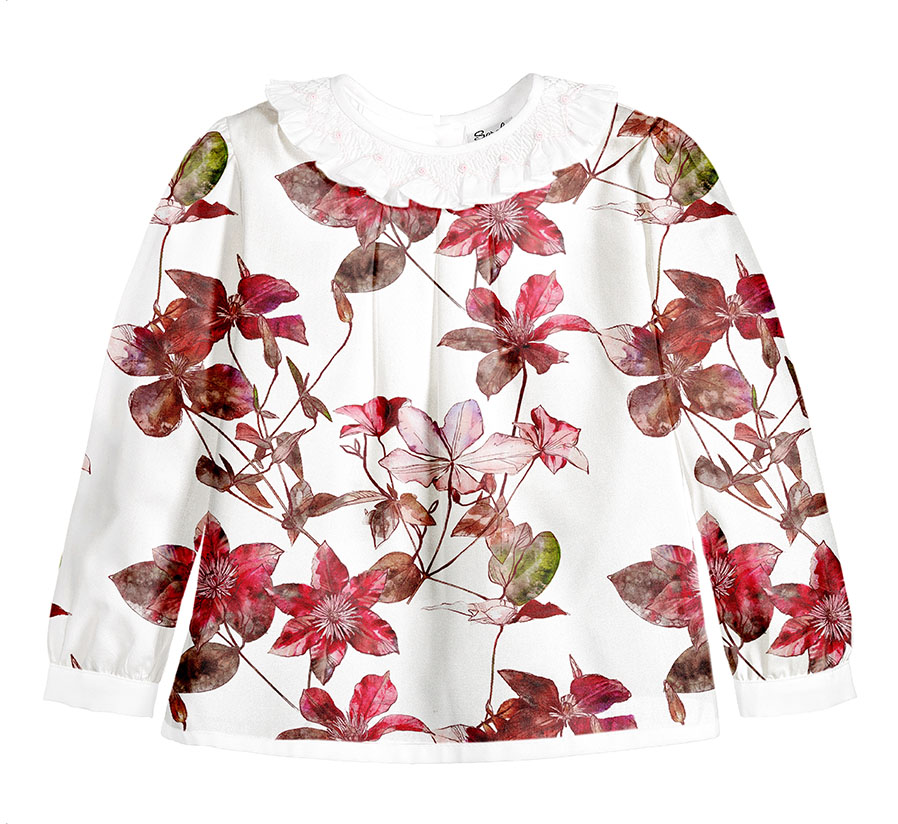
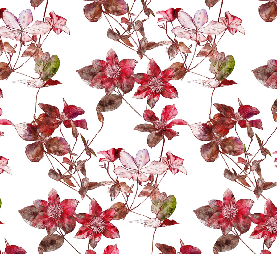
Overview
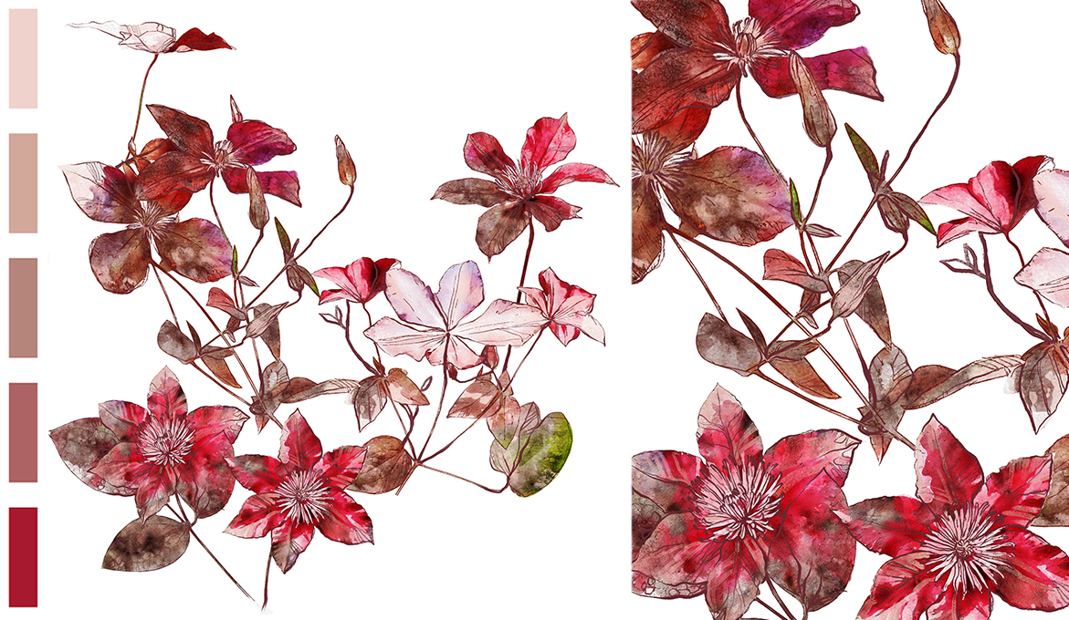
This pattern design series of florals were commissioned for a client’s Autumn collection addressed to girls aged up to 36 months old. It was imagined in a colour palette composed by Kidspattern from powdery shades of rose, café au lait and warm taupe. This tasteful selection of hues was then contrasted with a full-bodied wine maroon.
The technique employed to create the illustrated elements used throughout this design involved a unique mixed-media development. It is an interesting result of a bespoke combination.
The base was made from manipulation of photographic material, which was then topped with an additional layer of digital drawing. This pattern design was commissioned to be a digital print, hence this printing method allowed to fully exhibit the watercolour effect and the textural gradation.
Starting Point
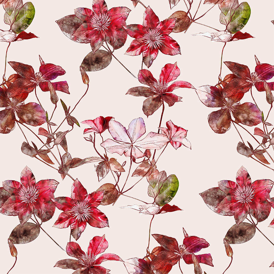
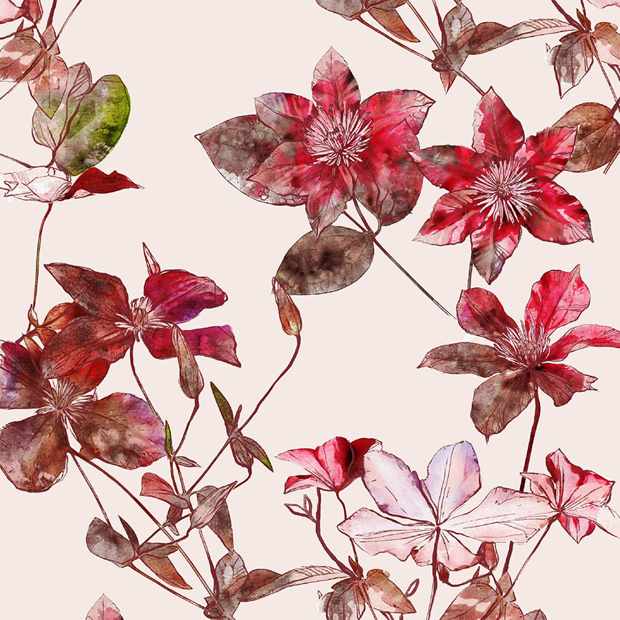
This first base pattern is presented in a medium size on a light, creamy background.
The use of the full spectrum of this rich colour palette contributed to this design being bold and distinct. However, a regular arrangement and a fair amount of spacing in between the elements provides an offset balance.
Monochromes
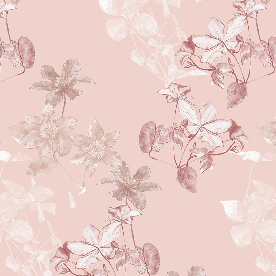
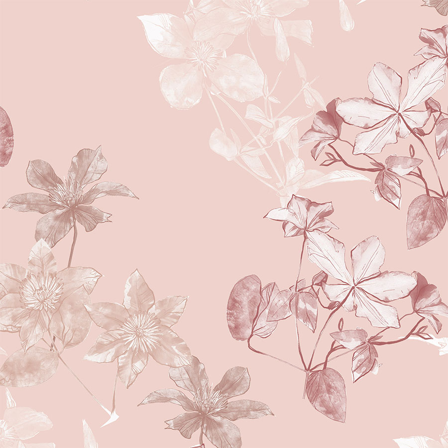
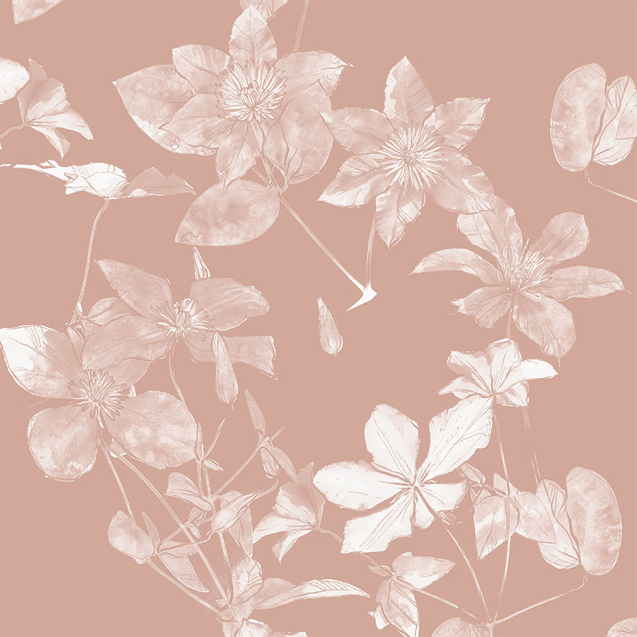
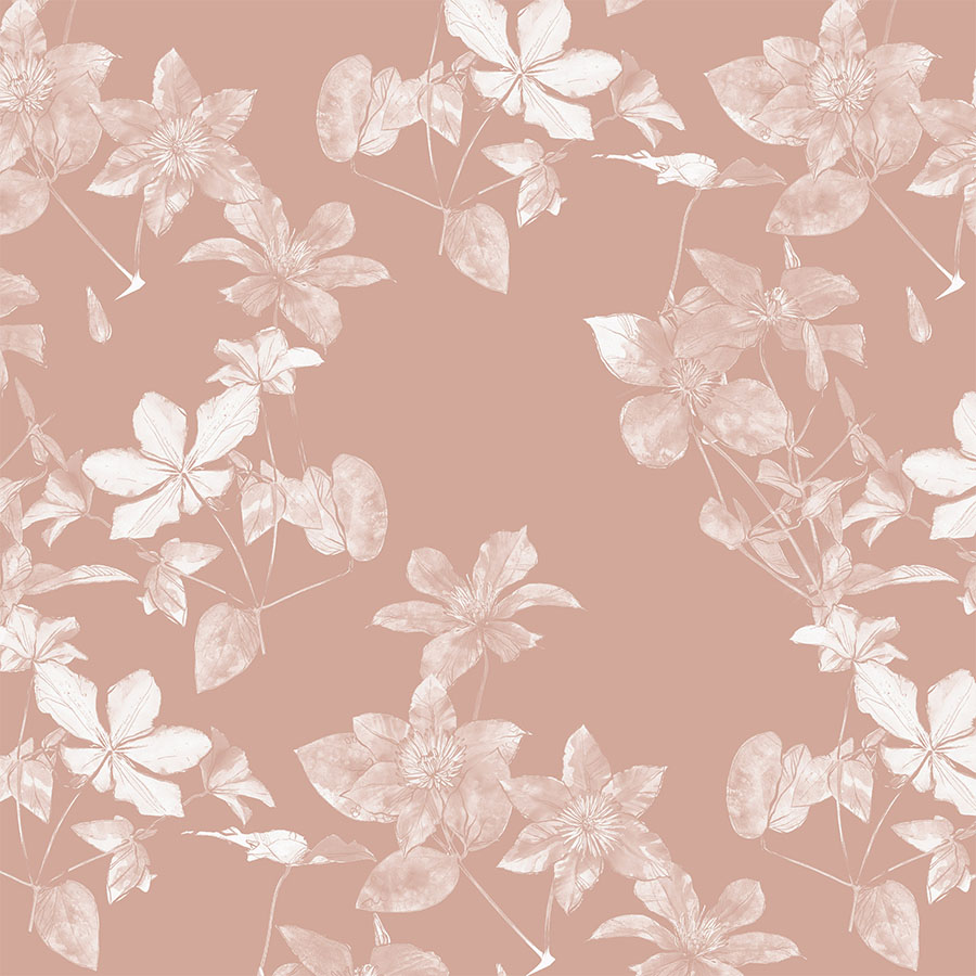
Here, the focus was shifted to the neutral aspect of the palette, which makes this pattern feel more nostalgic, in tune with litter fall colours from this autumnal palette. It now also features an addition of white to stand against the medium blush background. Each floral was recoloured in a monochromatic shade.
Moreover, the arrangement of the elements changed to be more irregular, which adds further to this design’s spacing. These adjustments produced a calm and pared down version represented in a larger scale as an oversized placement print.
Dark Background
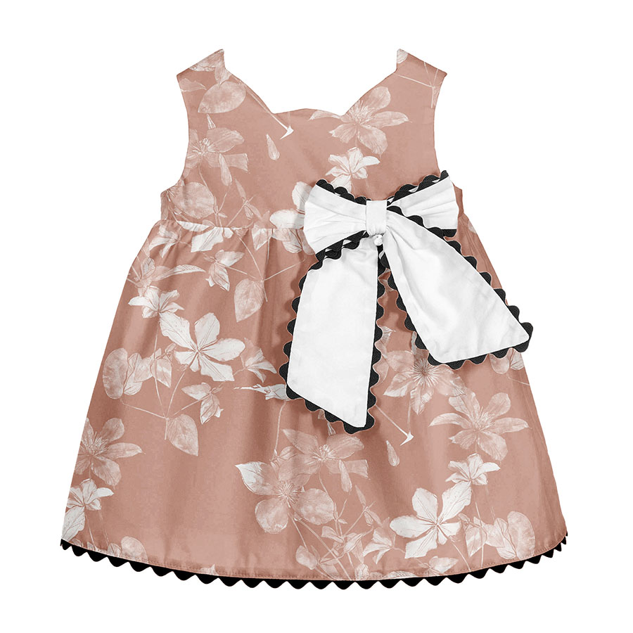
The last design is suffused in a blanket of warm, soft, milk chocolate hues. Softly blending with a darker background, all the elements were merged and recoloured into one monochrome white artwork.
This resulted in a ghostly negative of the initial fully coloured striking option, which makes this one a great complementary pattern. This version is the most simplified, yet charmingly subtle and sophisticated.


